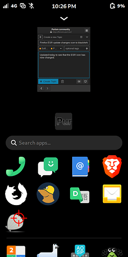
Updated today to see that the ESR icon has now changed.
Assuming it is expected, if not, I can purge and reinstall.
Can you confirm the precise version of the Firefox ESR package that you have?
I have 128.8.0esr-1~deb11u1 and I don’t experience that behaviour.
However I have an upgrade for that package available. … … …
… … … now at 128.9.0esr-1~deb11u1 and the icon has gone black-and-white, so it’s not just you.
Pretty sure that’s the version I have. Looks cool, but I want the other lol
I think we have a different opinion about “looks cool”. ![]()

If you put browser into the Icon= line in the firefox-esr ___ .desktop file in ~/.local/share/applications it will return to the old icon
Nice I’ll try that, just an edit of the .desktop file?
It’s always just an edit of the .desktop file when it has to do with .desktop files (like icon or context menu - you can even add “open private window” via .desktop to Firefox on Phosh).
Fixing things by our own is the one thing - strong defaults are the better thing. So it’s still a good thing that bugs or bad design decisions will be reported.
This was a Debian packaging bug that has already been fixed in sid yesterday, but the version that got backported into bullseye and bookworm does not contain that fix yet - so I’d expect it to get fixed with the next minor release.
As this is going to be fixed soon, it may be better not to just edit the .desktop file. It’s not as if this is a showstopper! Firefox still works just fine. By leaving it as it is, you will know when the bug is fixed and you won’t have to undo any changes.
Also, the suggestion was to make a private copy of the .desktop file and edit it i.e. to override the real .desktop file but leave the real .desktop file untouched.
Aside: Is it possible to override the icon assuming that the system will allow some kind of .local override for the icon?
It actually looks completely different on my phone as compared with what you posted in this forum??
I guess I can see why someone would say that black-and-white looks “arty” or “cool” - but for me that gets away from the main point of an icon - instant recognisability through literally a decade of “muscle” memory training. Whatever the icon is, as long as it is distinct, that’s fine - but change is bad because it undermines muscle memory. Clearly though, in this case, the change was unintentional.
For me it looks like what nerd7473 posted. The only difference: I’m using a background image which has some white spots (unluckily on same position as Firefox-icon when at least one app is running).
