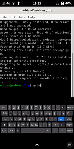
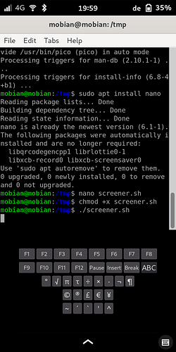
I made a layout for squeekboard. I wanted to reduce the number of switches betweem views as much as I can. I decided to replicate an ordinary US layout as much as possible.
There are only two layers. You get to the second layer by pressing the “>_” button on the right beside the cursor up button. You get back to the first layer by pressing the “ABC” button.
The first layer is full of buttons. That results in a small size per button. This may be a challenge for some users. If we would find ways to access some functions quickly and easily without having an extra button this situation can relax.
An example is the Home, End, Page Up and Page Down functions. On Android I use “Hacker’s keyboard” which allows to access these function by first pressing Alt followed by a cursor button.
There is empty black space above and below the keyboard which I was not able to remove. Seems like squeekboard does not adjust to the actual size of the keyboard.
There is also a little bit of empty black space on the left and the right side of some rows. I was not able to adjust some of the buttons e.g. Del to flexibly expand its width and occupy the space.
I wanted to make a pull request but I could not work on this for month and I don’t want the work to get lost so I decided to at least publish it here.
You can use it by copying the code into
/home/mobian/.local/share/squeekboard/keyboards/terminal/us.yaml
and
/home/mobian/.local/share/squeekboard/keyboards/terminal/us_wide.yaml
Create the missing directories. Here comes the code:
Update: There was a little mistake from copy & paste in the first line which is now corrected.
---
outlines:
    default: { width: 35.33, height: 46 }
    action:  { width: 59,    height: 46 }
    altline: { width: 52.67, height: 46 }
    wide: { width: 59, height: 46 }
    spaceline: { width: 187.96, height: 46 }
    special: { width: 44, height: 46 }
    small: { width: 59, height: 22 }

views:
    base:
        - "Esc 1 2 3 4 5 6 7 8 9 0 - = BackSpace Home"
        - "Tab q w e r t y u i o p [ ] \\ End"
        - "Del a s d f g h j k l ; , Return PgUp"
        - "Shift_L   z x c v b n m , . / Up show_actions PgDn"
        - "Ctrl Alt preferences space Left Down Right Menu"
    upper:
        - "Esc ! @ # $ % ^ & * ( ) _ + BackSpace Home"
        - "Tab Q W E R T Y U I O P { } | End"
        - "Del A S D F G H J K L : \" Return PgUp"
        - "Shift_L   Z X C V B N M < > ? Up show_actions PgDn"
        - "Ctrl Alt preferences space Left Down Right Menu"
    actions:
        - "F1  F2  F3  F4  F5  F6 F7  F8"
        - "F9 F10 F11 F12 Pause Insert Break show_letters"
        - "° √ π τ ÷ × · ¬ ¶"
        - "© ® £ € ¥"
        - "~ ´ ` ' ^"

buttons:
    Shift_L:
        action:
            locking:
                lock_view: "upper"
                unlock_view: "base"
        outline: "altline"
        icon: "key-shift"
    BackSpace:
        outline: "altline"
        icon: "edit-clear-symbolic"
        action: erase
    preferences:
        action: "show_prefs"
        outline: "special"
        icon: "keyboard-mode-symbolic"
    show_numbers:
        action:
            set_view: "numbers"
        outline: "wide"
        label: "123"
    show_numbers_from_symbols:
        action:
            set_view: "numbers"
        outline: "altline"
        label: "123"
    show_letters:
        action:
            set_view: "base"
        outline: "wide"
        label: "ABC"
    show_symbols:
        action:
            set_view: "symbols"
        outline: "altline"
        label: "τ=\\"
    show_actions:
        action:
            locking:
                lock_view: "actions"
                unlock_view: "base"
        outline: "altline"
        label: ">_"
    period:
        outline: "altline"
        text: "."
    space:
        outline: "spaceline"
        text: " "
    Return:
        outline: "wide"
        icon: "key-enter"
        keysym: "Return"
    colon:
        text: ":"
    F1:
        outline: "action"
        keysym: "F1"
    F2:
        outline: "action"
        keysym: "F2"
    F3:
        outline: "action"
        keysym: "F3"
    F4:
        outline: "action"
        keysym: "F4"
    F5:
        outline: "action"
        keysym: "F5"
    F6:
        outline: "action"
        keysym: "F6"
    F7:
        outline: "action"
        keysym: "F7"
    F8:
        outline: "action"
        keysym: "F8"
    F9:
        outline: "action"
        keysym: "F9"
    F10:
        outline: "action"
        keysym: "F10"
    F11:
        outline: "action"
        keysym: "F11"
    F12:
        outline: "action"
        keysym: "F12"
    Esc:
        outline: "action"
        keysym: "Escape"
    Tab:
        outline: "action"
        keysym: "Tab"
    Del:
        outline: "action"
        keysym: "Delete"
    Insert:
        outline: "action"
        keysym: "Insert"
    Menu:
        outline: "action"
        keysym: "Menu"
    Pause:
        outline: "action"
        keysym: "Pause"
    Break:
        outline: "action"
        keysym: "Break"
    Home:
        outline: "action"
        keysym: "Home"
    End:
        outline: "action"
        keysym: "End"
    PgUp:
        outline: "action"
        keysym: "Page_Up"
    PgDn:
        outline: "action"
        keysym: "Page_Down"
    Up:
        label: "↑"
        outline: "action"
        keysym: "Up"
    Left:
        label: "←"
        outline: "action"
        keysym: "Left"
    Down:
        label: "↓"
        outline: "action"
        keysym: "Down"
    Right:
        label: "→"
        outline: "action"
        keysym: "Right"
    Ctrl:
        modifier: "Control"
        outline: "action"
        label: "Ctrl"
    Alt:
        modifier: "Alt"
        outline: "action"
        label: "Alt"


