This article seems outdated to me (like mentioning they still need to implement a flashlight toggle or calls on the lockscreen). Or are the talking about “gnome at large?”
I saw the article today. I can say that this UI is really beautiful and seems to be ergonomic too.
Is it a standalone GNOME progress or can we hope Pure OS to look like this ?
For me it seems that is talkimg about that Gnome needs to implement all that missing stuff.
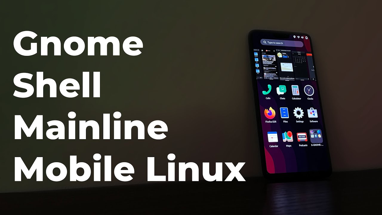
As far as I understand it’s about making the normal Gnome Shell adaptive to work on smaller screens and touch screens, such as smartphones and tablets. During the design of Gnome 40 they made some experimental designs for mobile devices. Now they are working on implementing this at least partially.
I suggest reading the primary source:
https://blogs.gnome.org/shell-dev/2022/05/30/towards-gnome-shell-on-mobile/
I don’t know how that affects Phosh. I guess Phosh shares already code with parts of Gnome. And PureOS development has already synergy effects going between the Gnome and Linux community. I could imagine that Phosh will be merged into Gnome Shell and PureOS using Gnome Shell everywhere, which could even increase the synergy effects. Be aware that I am not an insider in any of that stuff and I am not a developer for PureOS or Gnome. The above is only my imagination.
Maybe someone of Purism can tell us about their view of the new development and how Phosh is affected or if this is something that has not been tackled, yet.
Here are the images of the primary source in 1:1 full size:
I think that phosh uses wlroots for its compositor and only works with Wayland. phosh does not share anything with the GNOME shell stack [which is based on clutter (for accelerated X11 or wayland graphics)].
“parts of GNOME” is not well-defined. “GNOME Shell” is different than “GNOME DE” or “GNOME Toolkit (gtk)” or “GNOME applications” or “GNOME project”.
I imagine Purism is working with the GNOME team on this as Tobias Bernard’s name, who is Purism’s Lead UI/UX Designer, is listed on the project page.
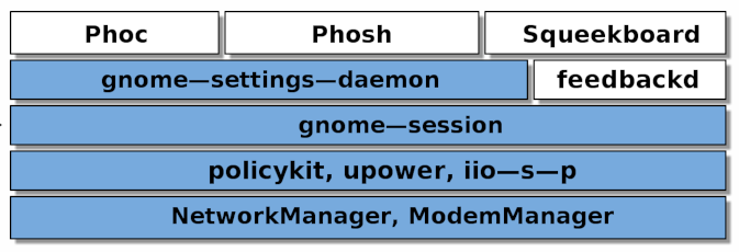
To be a nitpicker, this image illustrates well what the “phosh stack” is and the parts that it currently has in common with the GNOME Environment. The parts in blue are basically the same as you would find in the GNOME session.
From here: Colors of Noise
In my opinion one should seek conversation and uniting the effort as much as possible.
At the stage where mobile Linux is currently, competition is still counterproductive. The real competition is iOS and Android. Competition between the different Linux Phone projects is a blessing for Google and Apple. Divide and conquer in action.
The final price is then paid by the consumers who are left with several half working mobile Linux projects and Google and Apple abusing their olygopoly position.
Thanks. You’ve clarified that the “phosh stack” uses parts of the “GNOME DE”, but not part of the “GNOME Shell”. The article, of course, is addressing expanding the “GNOME Shell” to be “mobile friendly”.
My issue is that people use “GNOME” as a catch-all. The “GNOME Foundation” is a 501.c.3 that supports the “GNOME Project” (but only funds about 2 developers; it’s mostly about “brand” (philosophy), sponsoring conferences, etc.). The “GNOME Project” is big and informal. It includes “evince” and other document viewers. It includes “Nautilus” and other similar tools. It includes things people have probably never even heard of (radio, Setzer, Games, …). These are lead by their developers (who are members), but they are not funded/directed by “The GNOME Foundation”. But, importantly, the GNOME Project includes GTK (of various versions) which is the foundational widget library for GNOME (although originally the “G” stood for GIMP) and to which Purism has helped contribute libadwaita (but should not be confused with phosh or what the article is talking about). The “GNOME DE” includes all of the components for the desktop environment … of which the “GNOME Shell” is just one component.
Yes, I agree the terms can be confusing, and sometimes used as a catch all.
There was an update on GNOME Shell mobile last week: GNOME Shell on mobile: An update – GNOME Shell & Mutter
See the article for pictures, videos, and full details on the changes.
Here is a summary of the changes:
- They’ve made the overview thumbnails smaller.
After some experimentation and informal user research we realized that it’s not really adding any value over the row of thumbnails in the app grid state. The smaller thumbnails are more than large enough to interact with, and more useful because you can see more of them at the same time.
- The search experience is now a single-column layout.
We ported the shell search experience to a single-column layout for the narrower screen, which coincidentally is a direction we’re also exploring for the desktop search layout.
- The on-screen keyboard (OSK) behaviour has been adjusted to be more in line with other mobile OSes.
We completely replaced the on-screen keyboard gesture input, applying several tricks that OSKs on other mobile OSes employ, e.g. releasing the currently pressed key when another one is pressed.
- The OSK got a redesign to fit a narrower frame.
The keyboard layout was adapted to the narrower size and the emoji keyboard got a redesign. There’s also a very fancy new gesture for hiding the keyboard, and it automatically hides when scrolling the view.
- The app grid in the overview was adjusted to better fit the portrait orientation.
The app grid layout was adapted to portrait sizes, including a new style for folders and lots of spacing and padding tweaks to make it work well for the phone use case. All the advanced re-ordering and organizing features the app grid already had before are of course available.
- A new quick settings menu was implemented for the top swipe-down menu which include notifications that can be dismissed.
These work great on the phone layout, but on top of that we also added notifications to that same menu, to get a unified system menu you can open with a swipe from the top. This is not as mature as other parts of the mobile shell yet and needs further work, which we’ll hopefully get to soon as part of the planned notifications overhaul.
Bonus: At the bottom of the article, they mentioned that the Librem 5 has the best hardware currently.
The Librem 5 is probably the best option in both hardware support and performance, but it still takes a long time to ship.
The videos in that post are very encouraging.
I understood that the OnePlus 6 still needs call to be considered as a daily driver. I hope they will succeed, I would be very interested
I really hope that the mobile Linux device with best performance will be something else.
I want to be able to choose a device that is not a Chinese brand made in China.
to me the most encouraging aspect would be that the gnome foundation would need to make the apps all adaptable and all the settings pages like advanced network manager settings etc, so that way purism does not have to do that themselves any longer.
Definitely cool.
This just shows how much potential there is if one could invest serious money in paying one of the big SoC manufacturers to implement full Linux support for a high end SoC.
40+ Billion USD for a time and life wasting microblogging platform used for spreading misinformation.
200+ Billion USD for a soccer World cup.
How much would it cost to pay Qualcomm to provide Linux support for Snapdragon 8 or Snapdragon 888? I can imagine that for 9- or 10-digit amount, they would do it.


