Will this still become the final look of PureOS/Librem5, if so I like alot!
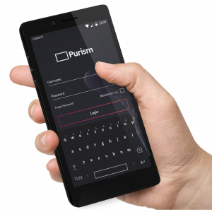
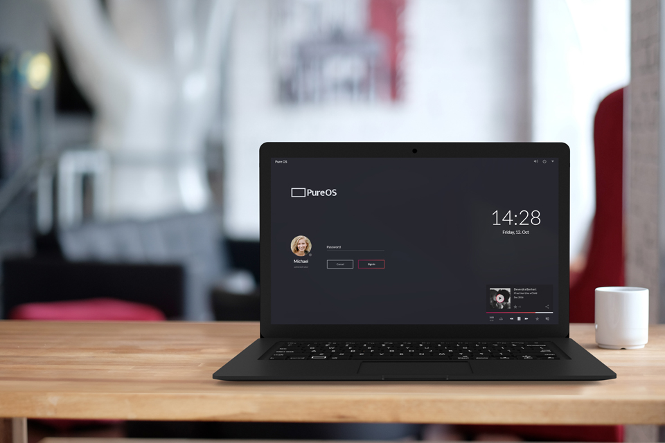
Also why isn’t there any update progress on PureOS? That lock/loginscreen is sick! I need that right now
The colors are so good aswell!! Very modern and pleasing.
I agree. Android, iOS, Windows all use bright colors indiscriminately. It makes everything look like a circus and distracts. Darkness is easy on the eyes and screen (as in burn-in); colors should only be used to bring attention to items needing attention.
The design has diverged from the original campaign mock-ups as I understand it. We recently simplified the developer documentation to reflect this, because it was otherwise either confusing or misleading.
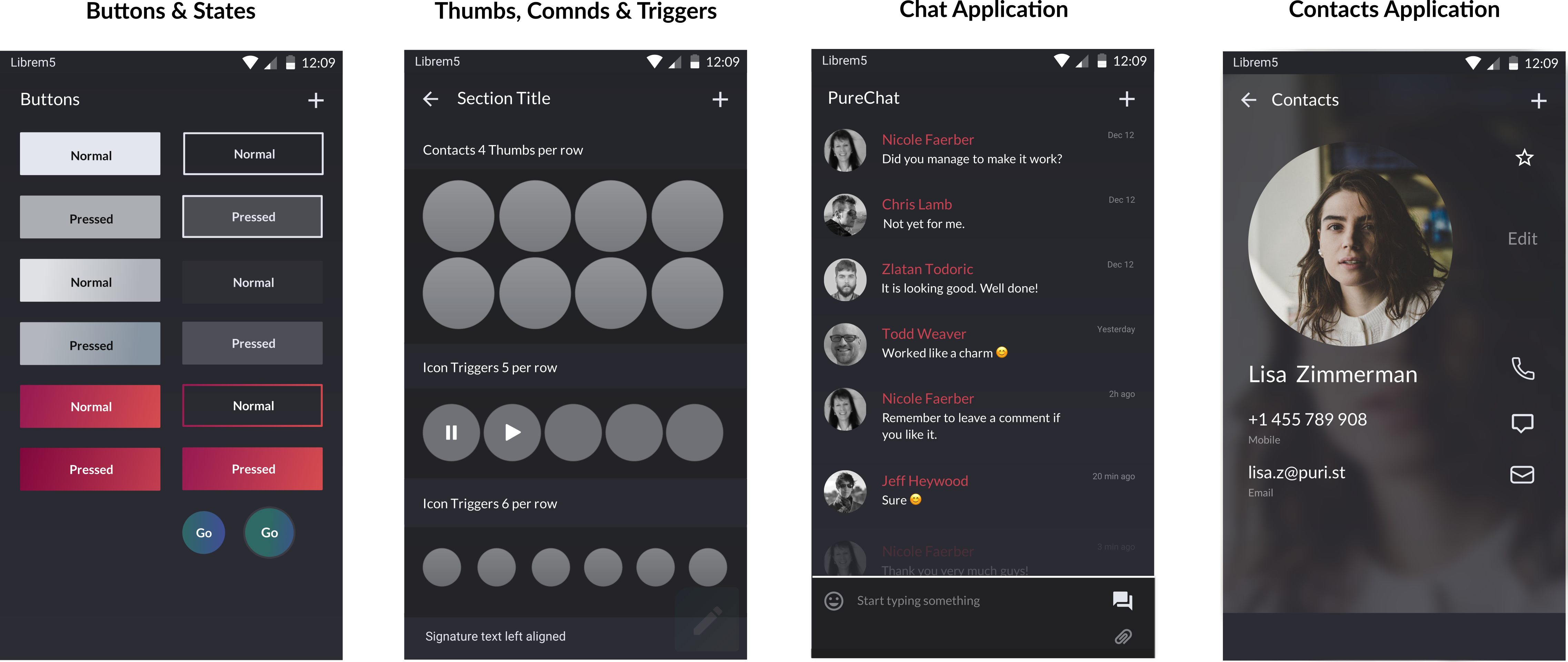
A lot of the design ideas can be seen in these app mockups, though you should be aware that they don’t always show the shell/environment in the mock-ups and tend to use a lighter theme. There is a corresponding dark theme.
Sorry, I’m slow. I don’t really understand the situation. But are you saying that these mockups are hard to understand for devs and will probably not be used at all? And the design is the default GNOME look?
I’m not saying that the mockups are hard to understand for devs. I was saying that the developer documentation contained design information that was outdated - I had actually just answered a related question about this, so I was probably conflating issues.
The design is not the default GNOME look. There have been changes to apps to make them more phone-friendly, and the shell (window system, etc.) is more oriented towards small-screen computing. That said, there are parts of the user interface that may cause debate, so there will be discussion about those things. Also, while the immediate goal is to get a working phone out to users, that doesn’t mean that current design decisions are fixed in stone forever. I’m sure that those working on the interaction design will want to revisit it later once they get more hands-on experience and user feedback.
It would be good to know what people like about the original mockups, including anything in common with the GNOME mockups, and just generally what stands out.
I should also mention that there are issues about Librem 5 design being tracked in this project, for those interested in following up on specific issues.
I personally like dark themes, so the dark colors on the original immediately grabbed me, and the accent color is not one that I’ve seen often. The whole look (particularly of the lock screen) looks unique, clean, and stylish. Good choice of fonts, good layout. And definitely unique - everyone who saw it would know that it is not a common variant of iOS or Android, and that might invite them to ask and learn what it is. Now, the more GNOME-ish look will also clearly be distinct from iOS and Android, but it does not distinguish PureOS from Debian or Fedora or any other distro running GNOME. Obviously, people can change their GNOME theme, but having a nice, unique default I think would go a long way towards branding.
I tend to use the Adapta theme for GNOME, but if those original mockups ended up as a GNOME theme, I would switch in a heartbeat.
I’m a dark theme lover too, i like everythings from this mockup, for my taste you should follow this mockup to make the beautiest UI ever seen on mobile