I like this suggestion of how landscape should work on Librem 5. What do you think?
I like the placement of the notifications area, i.e. the fact that it doesn’t move from the portrait mode placement.
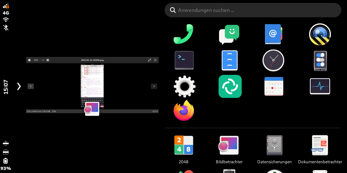
I thought about “how to improve Phosh on landscape” and had nearly the same idea. I was creating pictures and wanted to create a new topic, but saw that @fsflover already created one 2.5 years ago. However, since I already created those pictures, I also want to share them. Also because there are little improvements.
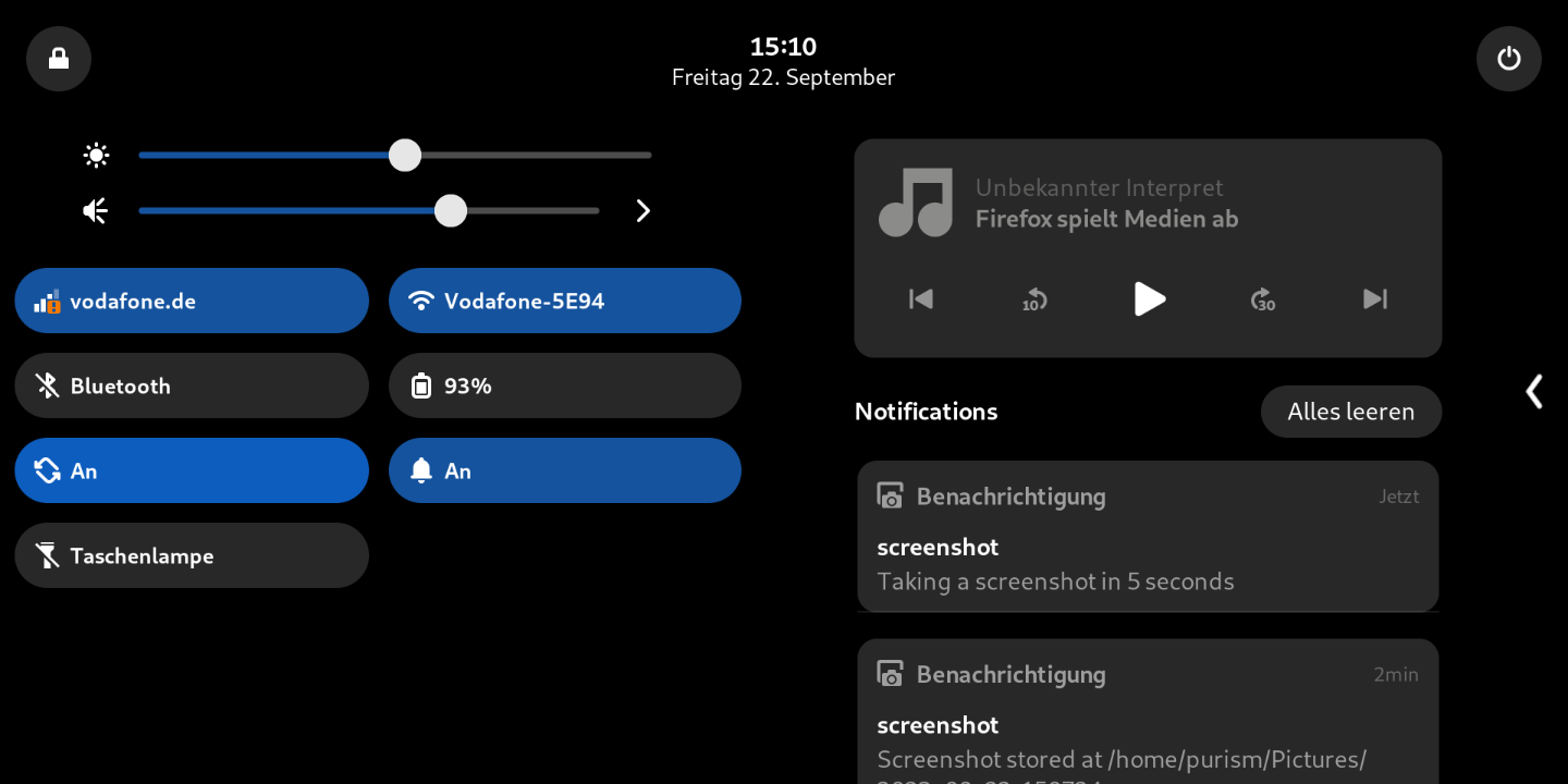
Top panel:
It is split into 2 scrolling elements to use all the space.
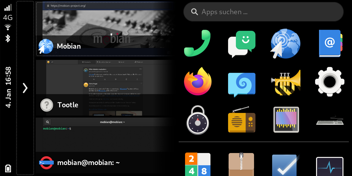
App view:
Squeekboard button should be at bottom - very important!
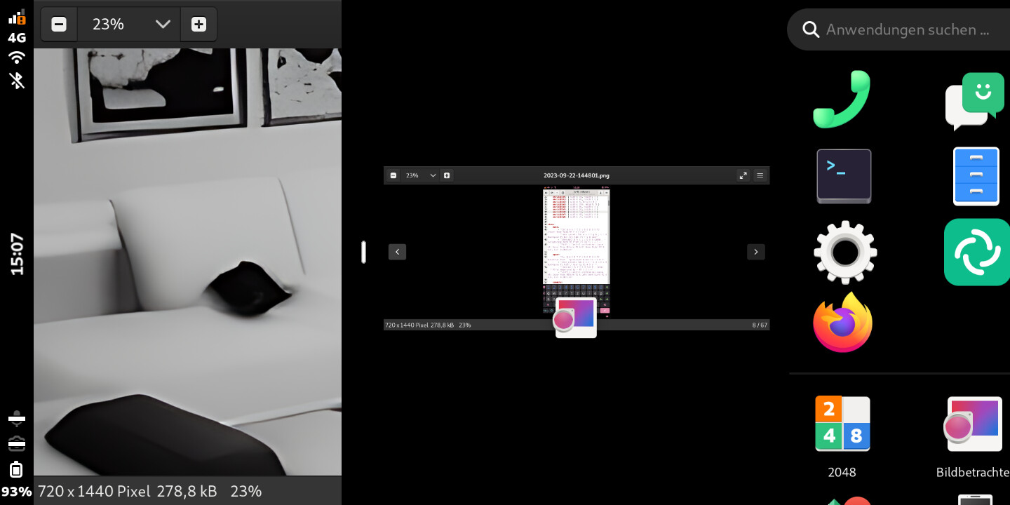
Scrolling between app and desktop:
Desktop view:
The current version of Phosh has huge problems with vertical pixels on landscape view. We loose a lot of space by home-slider and top-panel and that is really really annoying. That’s even more annoying with apps like Firefox which come with an own big header and where you also need Squeekboard sometimes. Each pixel less helps a lot!
I also noticed, that app grid has a hard coded value of app icons in row (exactly 7). That’s a waste of space. Mathematically it should be twice the amount of portrait view (on 200% screen scale 8, on 150% sceen scale 10 and on 100% screen scale even 14).
PS: Pictures are made in 150% screen scale. On 200% it’s even more important to save some space. The free space left and right of notifications of the first picture is a scaling issue (it’s filled with notification widget on 200% screen scale).
I would like to know what other users think about. So please vote for your opinion.