Personally I think the Librem Social logo could use some improvement, the current stock megaphone image is a bit boring. I think a graphic artist could spiff it up a bit, I know this is a small issue and the developers are probably focusing on more important things but I think appearance and little details like this can help with adoption. I’m specifically referring to the logo on the Play Store and the one that gets used when you pin the website on mobile. I actually think the logo on the Librem One website for Social is better, maybe that is an issue as well that there is no consistency across platforms, it would help improve recognition. Again I know this is not a but deal when you look at everything Purism has to offer but I think the great looking appearance of PureOS should try to be duplicated across all offerings.
1 Like
Hello,
That sounds like a really good idea to me! Hell, if I was better at art, I would submit some proposals myself.
Braillynn
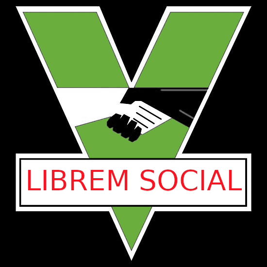
Or go full dystopian, like the INGSOC logo from 1984! The V has the Roman number 5 and can be used for the Librem 5. Also note the handshake, it promotes diversity. Then change INGSOC to LIBREM SOCIAL in smaller letters, twenty percent of the art to avoid copyright, the “V” can also be changed to green.
2 Likes
Kudos for a dark sense of humour 
1 Like