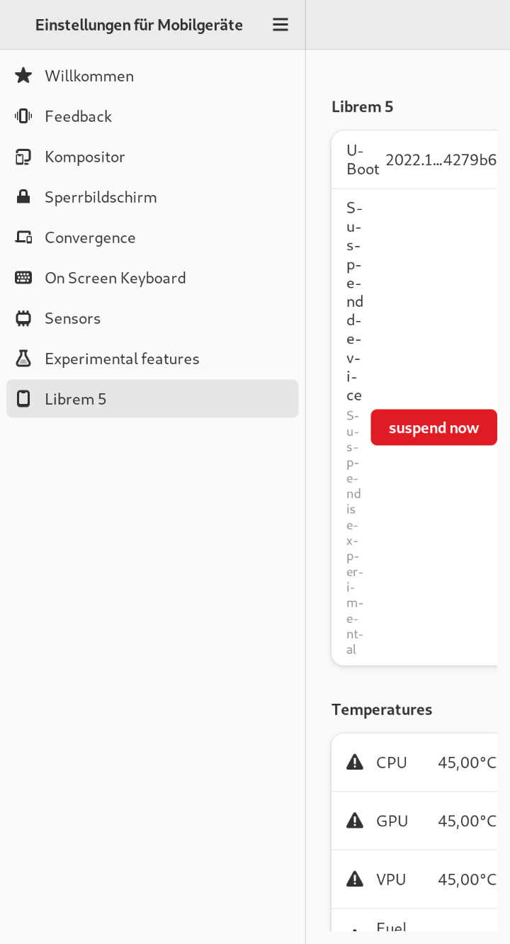
As you can see, the widgets on the right side have too little space. I thought I can adjust this via *.css file for myself (lower left space, expand right space), but it seems that I have no access to these widgets. I compared the code of Phoshs top panel with the code of Mobile Settings app and I found out, that files in Phosh have lines like gtk_widget_class_set_css_name (widget_class, "phosh-top-panel");, while Mobile Settings has not. I think that is the reason why Mobile Settings ignore any css-Input.
Does it mean that I have completely no access or does some way exist? I’m just looking for solutions where I just need one or two lines with console or text editor edits, nothing where I have to change the source code itself.
This sounds like a bug in phosh-mobile-settings, that it starts expanding when the window is clearly too small to fit its contents. So I think it needs to be fixed in the source code. Changing css can change how widgets in GTK looks, but usually it does not change the layout of the widgets.
When I look at the .ui files in phosh-mobile-settings, the AdwLeaflet has fold-threshold-policy set to the default “minimum” and the MsPanelSwitcher has a width-request of 270, I think that to fold at larger window sizes the GtkStack should also set a width-request. When you do this, the AdwLeaflet will know how much space the GtkStack needs to it can know when it should fold. So the fix is likely a one-liner in the .ui files. Setting the width-request of the GtkStack to be the same as the MsPanelSwitcher might be a good start.
This problem can be solved in many ways in code. For example it can be changed in the way I would like to do in CSS (just in UI-files). It also could be done in reorganizing right space widgets (buttons below descriptions if space not enough) or it could stuck to full screen like default settings app or even just change the number when it has to be folded.
However I just wanted a quick dirty fix for myself without changing code. I also want to not waste time of devs thinking about that minor issue right now (there is enough work with crimson and more important developments), that’s why I just asked here (and maybe to learn something new).
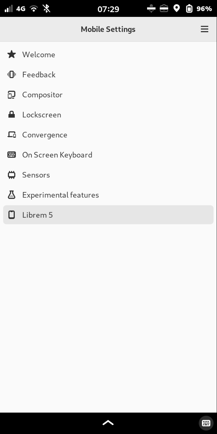
Are you sure that your scaling is set to 150% on the screenshots? For example the word “Experimental features” takes 327 pixels from left edge while it takes 282 pixels on my screenshot (-45). Also the vertical sizes are bigger on your screenshot. It looks like you’re running 175% (at least for me it looks exactly like this on 175%).
 .
.