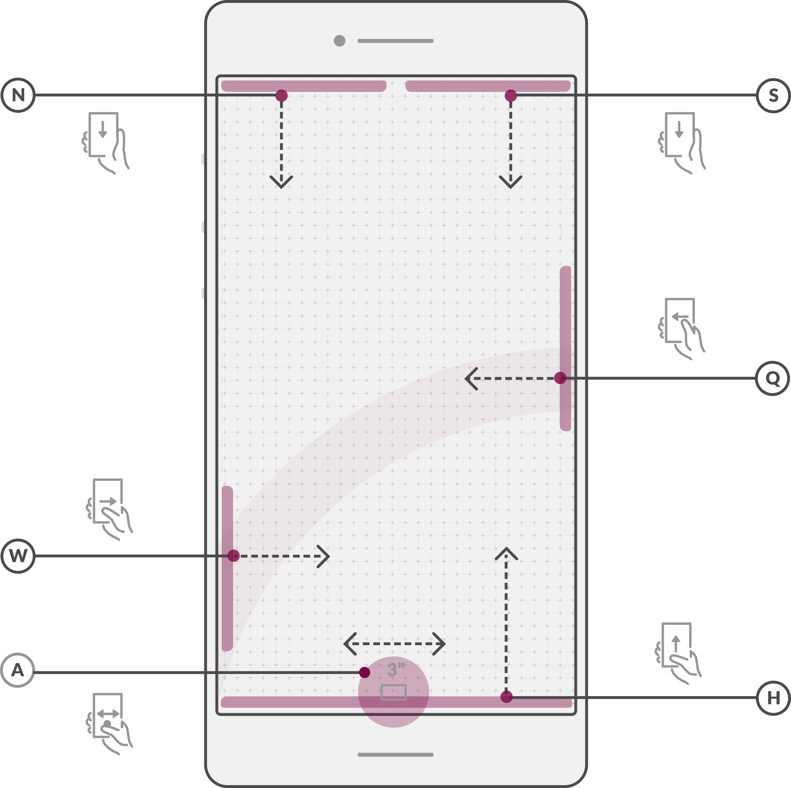
In the report I see, (A) is used for multitasking. My concern is that multitasking is used to speed up progress and efficiency, but the method to activate it is holding the bottom screen for 3 seconds…
3 seconds may not see like much, but I’m pretty sure within 3 seconds I can navigate to just about anywhere on my current phone.
So I think my concern is multi-tasking might not be using an efficient method where a swipe or a double-tap would be a much faster way of accessing multitasking and being that multitasking is about speed and efficiency I would hope this design decision could be re-reviewed.
maybe it’s only three seconds when inside an app, but less on the home screen. Swipe up + tap might be faster then.
It’s free software, so there will be a way to change that value.
This is a very early draft. They will notice that 3 seconds suck
But, admittedly I don’t like it either, now that you point me to it. I don’t really use that feature very frequently, but on my S3 it takes about one second.
Now, all Galaxy phones before the S8 had a hardware home button (long-press for task list) plus two “soft touch” buttons next to the home button. I don’t really need those soft touch buttons, but I think the home button is really useful. But somehow the design seems to imply the absence of a home button.
That smells like function follows design.
Even on Android, those overlay buttons at the bottom of the screen don’t always work as flawlessly as they should. I say “even”, because sooner or later all android apps must use new API and are therefore, in theory, aware of those overlay buttons.
Could be that all non-default apps would have to be adapted for the Librem 5. Hmm… except you give non-aware apps a different screen size so they cannot cover the button area.
I’m not sure this is very ergonomic. What if you want a case to put on? I’m not saying it’s impossible to build a case for that but Purism decided to stick with mainstream things (I’ve read somewhere on their website) because they can’t afford “custom” things because that would imply extra costs and because they buy in small quantities (which is restrictive). Wow that was a lot of "because"s lol.
I’d love though to have the power button open a default terminal if clicked twice
I also realize that 3 seconds is very long. It was basically saying ‘3s’ to represent some delay so if we go for the same gesture, it should be shorter than 3s for sure.
Saying that, those designs are proposals that will need to be tested on the real hardware. While the features of the shell may remain the same, the gesture (events) to trigger them is supposed to change if we feel that they are not useful. Waiting for 3s is definitely not useful.
Thank you for spending some time to keep the community posted @francois-techene
I do have a question regarding the proposed UX: are all these gestures expected to be performed with a thumb? It seems some parts of a 5 or 5.5" screen are hard to reach when using in single handed mode.
Plus, this is not exactly design, but if the phone is designed for a one handed use, the case should probably be made of “grippy” material. The iPhones are a perfect counter example of what should be done for the case, they tend to slip a lot. I actually dropped mine a few times.
One should be able to easily access the most important features of the phone when holding it with one hand; it supposes touching the screen with the thumb only. That doesn’t necessarily mean that all the screen surface and features must be accessible by the thumb (given the planned 5.5″ screen size, that would not be physically possible), but that the lower area is preferable to access the most useful phone features by default. Those features would include answering an audio or video call, reviewing notifications, unlocking the phone, accessing the home screen, requesting a search or launching the most frequently used applications.
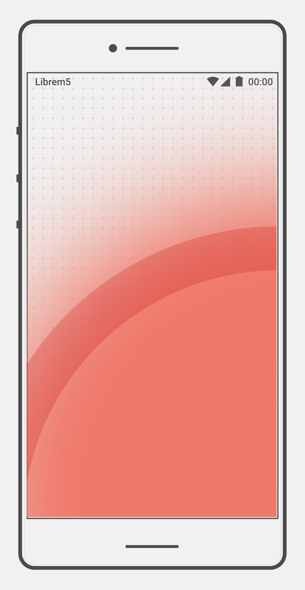
The red area is the area of effect that the thumb will be able to reach to
I suppose gesture use is fairly dependent on hand size/finger length. I have a 5.7 inch display on my phone right now, and swiping down from the top to reveal more notifications (on Android) is pretty simple to do with the thumb. It just takes a slight shift in my grip. The only thing I do that requires two hands is occasionally typing, but even that I frequently do one-handed. I realize that I don’t tend to grip my phone so much as let it rest on my fingers, as this is what allows me to easily use my phone one-handed and have my thumb reach everything. So a “grippy” material would indeed be beneficial.
In short, I think reaching all parts of a 5.5" display with the thumb is not at all unreasonable, and is certainly physically possible, but commonly used features should be reserved for the bottom part of the screen, as is planned. Grippy material is good for facilitating such one-handed usage.
@francois-techene I somehow missed this design report first time around.
I noticed the mention of not necessarily making things app-centric. This is something I’ve thought about myself and I’m glad to see that the team are not just going to blindly copy what already exists without thought for why it takes the form it has!

 home buttons