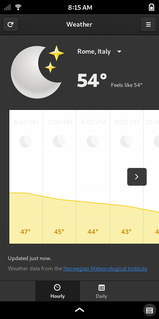
I think the pale gray items within the white area could use some darkening:
Agree/disagree?
I agree based this visual, but want to check that the contrast isn’t some indicator of how (in)accurate the weather forecast thinks it is… 
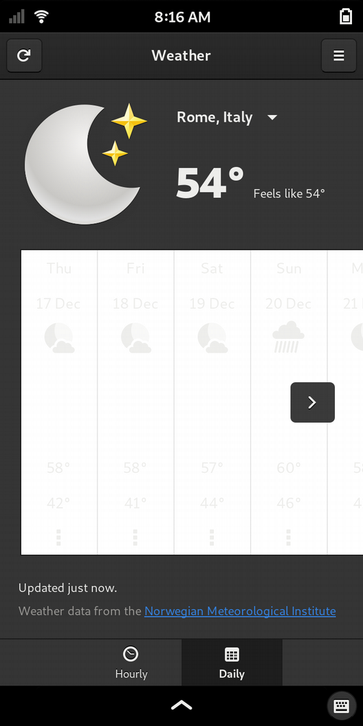
By the way, I haven’t found a way to delete a location from the Weather app once you’ve added it manually.
I’m a weather nerd, can you load the Windy linux app on your Librem?
That looks like dark mode gone wrong.
I don’t know anything about WebCatalog, so I wouldn’t want to install their app. That said, the actual website windy.com looks pretty good in the browser, so I think that’s a good option.
You’re right. Those items look much blacker if you set it to eyeball-scorching-white mode.
Ok good, thank you.