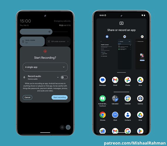
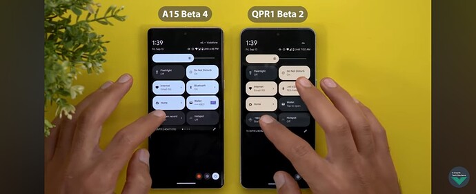
Did google steal deaign cues from phosh or it is the other way aroound?
Hard to say anything without context. How about some screen grabs and details for comparison?
Who even uses Android? ![]()
Most of the phone-carrying world, probably.
Well yes but among those who participate in this forum?
If you are more than averagely concerned about privacy, you wouldn’t voluntarily use anything Google.
Understood, but I continue to use (mostly-)degoogled Android (with all-FOSS applications from F-Droid - yay! open source!) despite my concerns about privacy. And I throw in an additional tracker blocker app for good measure, and a sprinkling of privacy add-ons in the Firefox-based browser.
That reflects “involuntary” on your part though because your Librem 5 can’t yet fully meet your needs?
Anyway, if you have Android 15, I guess you can help with some screenshots then?
I’m waiting for the day when I can have a multi-region modem, and improved functionality, especially navigation and web-browsing. Maybe Crimson or Dawn will bring at least some of that.
A more lightweight Linux phone somewhere down the line wouldn’t suck, either.
![]()
And my Android’s iodeOS is on Android 14, but you can find screenshots of 15 online; it can probably be seen at arstechnica.com.
(And my Android is a 2017 model that officially stopped at Android 9, so it got a reprieve from the e-recycle bin.)
See: Android 15 Developer Preview 1 is out for the Pixel 6 and up | Ars Technica
and: Android 15 gets “Private Space,” theft detection, and AV1 support | Ars Technica
and: Android 15 gets satellite messaging, starts foldable cover app support | Ars Technica
(…sporting the garish, blinding white default looks, but customizable, I imagine.)
I do. As I’ve said before, I use GrapheneOS on a Pixel 7a.
Anything??? Disagree again. From Google:
-
Pixel 7a.
-
AOSP, which is from Google, forms the core of GrapheneOS
-
Tools such as: TensorFlow and Go. I wouldn’t rule out flutter or dart either.
Would you avoid something like Gerritt just because it’s a Google project?
All your discussion is fine and so far, but the initial question still has no context to discuss about.
Looks like @carlosgonz was right:
Phosh’s App Grid does have a Search bar above Favourites, whereas it is absent from the first screenshot.
The white stripe in Phosh comes from Android (I’m pretty sure), but Phoshs over all design comes from 2019 or even before. So seems like Google was watching Phosh (or just had the same idea without knowing Phosh).
I made Mockups last year. See this. The first row is without search bar (hidden), while OSK opens search bar (2nd row). Maybe Google stole from my design? ![]()
I think just the static image doesn’t tell much without the functionalities. And the dark theme just adds to the similar appearance. If Android copied something, then linux community gets to use the playgorund burn “we had that first” ![]() …?
…?
Is this like in the 80’s/90’s when IBM (?) made that design manual for desktop GUIs and Windows and OS/2 (and many linux desktops as well) ended up looking similar because they were trying to make something usable…? Don’t all good design choices get emulated (to both directions)?
Even the rotation button is identical
Of course @JR-Fi . Android 15 will also get an improved “desktop mode” which is “still not as good as Samsungs solution” (YouTuber said). What is about our convergence mode? Sometimes all the changes for all systems come at the same time, because the time is ready. But one is always the first one - even if people do not know.
That is not. Hard to be sure, but there seems to be a few pixels difference and the L5 rotate is at at an angle. I’m not saying they aren’t close or may have had influences from the same sources or something like that but not identical.
I haven’t used phosh. However, the full app grid (pull up from bottom), frequently used app section, user placed icons (on home screens which navigate left-right), and search bar (when you’ve pulled up the app grid) has been in Android for a long time. I’m not really observant of UI changes, but I really haven’t noticed any — it all seems the same to me. I have an old Motorolla phone with Android 10 … it didn’t have the white lines, but IIRC my Pixel 7a (before I put on GrapheneOS) was Android 14 and had the white lines as well as an Android 13 tablet I have. Furthermore that kind of “look” or “theme” variation is what you would expect between vendors of even the same version of the base Android.
The only “noticeable” UI changes that I’m aware of has been the move from a 3 button top level navigation ( “back” (triangle), “home” circle, “choose running app” square) to a gesture based navigation was done, IIRC, in Android 13 although Android still allows the “classic” 3-button navigation.


