Mobile-Friendly Firefox Customizations for Librem 5

True Mobile Modes & Dynamic Popups:

true_mobile_landscape-alt.css
/* Copyright 2023 user0
 * SPDX-License-Identifier: MPL-2.0 */

/******************************************/
/*               IMPORTANT:               */
/*                                        */
/* One of the things this code will do is */
/* to move the Tab Manager Menu button to */
/* the right side of the URL Bar.         */
/*                                        */
/* For the best results, consider moving  */
/* the Unified Extensions Menu button to  */
/* the left of the URL Bar and removing   */
/* less important toolbar items by using  */
/* the "Customize Toolbar" feature, or by */
/* using a user.js file in your profile.  */
/******************************************/

/* Apply this customization only on smaller screens in landscape mode */
@media (orientation: landscape) and (max-height: 650px) {

    /* Density variables */
    :root:not([uidensity="touch"]) {
        --PanelUI-menu-button-position: 4px;
        --alltabs-button-height: 32px;
        --alltabs-button-width: 32px;
        --alltabs-button-position: 4px;
        --urlbar-width: calc(100vw - 205.5px);
    }
    :root[uidensity="touch"] {
        --PanelUI-menu-button-position: 5px;
        --alltabs-button-height: 34px;
        --alltabs-button-width: 34px;
        --alltabs-button-position: 5px;
        --urlbar-width: calc(100vw - 209.5px);
    }

    /* Remove items from Main App Menu (≡) */
    #appMenu-fxa-status2,
    #appMenu-fxa-separator,
    #appMenu-protonMainView toolbarseparator,
    #appMenu-fullscreen-button2,
    #appMenu-passwords-button,
    .subviewbutton[shortcut]::after {
        display: none !important;
    }
    
    /* Remove extra space above zoom controls in Main App Menu (≡) */
    #appMenu-zoom-controls {
        margin-top: 0 !important;
    }

    /* Fix flickering of Main App Menu (≡) */
    #appMenu-popup {
        width: 260px !important;
    }
    #appMenu-protonMainView vbox.panel-subview-body {
        height: 253px !important;
        max-height: 253px !important;
        width: 250px !important;
    }

    /* Move Main App Menu (≡) button to allow room for Tab Manager Menu button */
    #PanelUI-menu-button {
        position: absolute !important;
        right: 0px !important;
        bottom: var(--PanelUI-menu-button-position) !important;
    }

    /* Hide Tab Bar and Private Browsing indicator */
    #tabbrowser-tabs,
    #private-browsing-indicator-with-label {
        visibility: collapse !important;
    }

    /* Edit Bookmark Panel */
    #editBookmarkPanel {
        background-color: var(--arrowpanel-background) !important;
        max-height: 100vh !important;
        max-width: 100vw !important;
        width: 100vw !important;
    }
    #editBookmarkPanel box.panel-header,
    #editBookmarkHeaderSeparator,
    #editBookmarkPanelInfoArea,
    #editBookmarkSeparator,
    #editBMPanel_folderRow,
    #editBMPanel_tagsRow {
        display: none !important;
    }
    #editBookmarkPanelContent {
        padding-top: 0 !important;
        padding-bottom: 0 !important;
    }
    #editBookmarkPanelBottomButtons {
        margin-top: -5px !important;
        margin-left: -50px !important;
    }

    /* Remove items from Tab Manager Menu */
    #allTabsMenu-searchTabs,
    #allTabsMenu-tabsSeparator {
        display: none;
    }

    /* Fix flickering of Tab Manager Menu and extension popups */
    #customizationui-widget-panel,
    #customizationui-widget-multiview box.panel-viewstack {
        height: calc(100vh - 35px) !important;
        max-height: calc(100vh - 35px) !important;
        width: 100vw !important;
        max-width: 100vw !important;
    }

    /* Expand Tab Manager Menu */
    #customizationui-widget-multiview panelview {
        max-width: 100% !important;
        width: 100% !important;
    }

    /* Move Tab Manager Menu button to right of URL Bar */
    :root {
        --tab-border-radius: var(--toolbarbutton-border-radius) !important;
    }
    #alltabs-button > .toolbarbutton-badge-stack {
        height: var(--alltabs-button-height) !important;
        width: var(--alltabs-button-width) !important;
    }
    #alltabs-button {
        position: absolute;
        top: var(--alltabs-button-position) !important;
        right: 41.5px;
        z-index: 2 !important;
    }
    #alltabs-button > .toolbarbutton-badge-stack::before {
        bottom: calc(var(--toolbarbutton-inner-padding) * 0.7 ) !important;
    }

    /* Allow room for Tab Manager Menu button */
    #nav-bar {
        padding-right: 67px !important;
    }

    /* Reduce URL Bar width */
    #urlbar-container {
        max-width: var(--urlbar-width) !important;
    }

    /* Remove items from Unified Extensions Menu */
    #unified-extensions-panel .panel-header,
    #unified-extensions-panel toolbarseparator,
    #unified-extensions-manage-extensions {
        display: none !important;
    }

    /* Adjust button padding and font size for secondary text in Unified Extensions Menu */
    #unified-extensions-panel .subviewbutton {
        padding: 6px !important;
    }
    .unified-extensions-item-message {
        font-size: 75% !important;
    }

    /* Fix flickering of Unified Extensions Menu */
    #unified-extensions-panel {
        --uei-icon-size: 20px;
        width: 360px !important;
    }
    #unified-extensions-view {
        margin-top: 6px !important;
        height: 230px !important;
        max-height: 230px !important;
        width: 350px !important;
    }

    /* Add padding to bottom of Unified Extensions Menu to look better */
    #unified-extensions-area {
        padding-bottom: 5px !important;
    }

    /* Allow extensions to use full display */
    .webextension-popup-browser {
        height: 100% !important;
        min-height: 100% !important;
        width: 100vw !important;
        min-width: 100vw !important;
    }

    /* Adjust "Saved to Library!" popup notification */
    #confirmation-hint {
        padding: 10px !important;
        width: 100vw !important;
    }

}

/* Apply this customization only on smaller screens in portrait mode */
@media (orientation: portrait) and (max-width: 720px) {

    /* Added extra space to bottom of Main App Menu (≡) to compensate for orientation problem that would leave some items hidden in portrait mode when Main App Menu (≡) is first opened in landscape mode */
    #appMenu-quit-button2 {
        margin-bottom: 64px !important;
    }

    /* Added extra space to bottom of Unified Extensions Menu to compensate for orientation problem that would leave some extensions hidden in portrait mode when Unified Extentions Menu is first opened in landscape mode */
    #unified-extensions-area {
        padding-bottom: 120px !important;
    }

}
true_mobile_landscape.css
/* Copyright 2023 user0
 * SPDX-License-Identifier: MPL-2.0 */

/******************************************/
/*               IMPORTANT:               */
/*                                        */
/* One of the things this code will do is */
/* to move the Tab Manager Menu button to */
/* the right side of the URL Bar.         */
/*                                        */
/* For the best results, consider moving  */
/* the Unified Extensions Menu button to  */
/* the left of the URL Bar and removing   */
/* less important toolbar items by using  */
/* the "Customize Toolbar" feature, or by */
/* using a user.js file in your profile.  */
/******************************************/

/* Apply this customization only on smaller screens in landscape mode */
@media (orientation: landscape) and (max-height: 650px) {

    /* Density variables */
    :root:not([uidensity="touch"]) {
        --PanelUI-menu-button-position: 4px;
        --alltabs-button-height: 32px;
        --alltabs-button-width: 32px;
        --alltabs-button-position: 3.5px;
        --urlbar-width: calc(100vw - 205.5px);
    }
    :root[uidensity="touch"] {
        --PanelUI-menu-button-position: 5px;
        --alltabs-button-height: 34px;
        --alltabs-button-width: 34px;
        --alltabs-button-position: 4.5px;
        --urlbar-width: calc(100vw - 209.5px);
    }

    /* Remove items from Main App Menu (≡) */
    #appMenu-fxa-status2,
    #appMenu-fxa-separator,
    #appMenu-protonMainView toolbarseparator,
    #appMenu-fullscreen-button2,
    #appMenu-passwords-button,
    .subviewbutton[shortcut]::after {
        display: none !important;
    }
    
    /* Remove extra space above zoom controls in Main App Menu (≡) */
    #appMenu-zoom-controls {
        margin-top: 0 !important;
    }

    /* Fix flickering of Main App Menu (≡) */
    #appMenu-popup {
        width: 260px !important;
    }
    #appMenu-protonMainView vbox.panel-subview-body {
        height: 253px !important;
        max-height: 253px !important;
        width: 250px !important;
    }

    /* Move Main App Menu (≡) button to allow room for Tab Manager Menu button */
    #PanelUI-menu-button {
        position: absolute !important;
        right: 0px !important;
        bottom: var(--PanelUI-menu-button-position) !important;
    }

    /* Hide Tab Bar and Private Browsing indicator */
    #tabbrowser-tabs,
    #private-browsing-indicator-with-label {
        visibility: collapse !important;
    }

    /* Move Nav Bar to bottom */
    :root:not([uidensity="touch"],[inFullscreen]) {
        --uc-bottom-toolbar-height: calc(39px + var(--toolbarbutton-outer-padding) )
    }
    :root[uidensity="touch"]:not([inFullscreen]){
        --uc-bottom-toolbar-height: calc(43px + var(--toolbarbutton-outer-padding) )
    }
    #browser,
    #customization-container {
        margin-bottom: var(--uc-bottom-toolbar-height,0px)
    }
    #nav-bar{
        position: fixed !important;
        bottom: 0px;
        width: 100%;
        z-index: 1;
    }
    #nav-bar[inFullscreen],
    #TabsToolbar[inFullscreen],
    .titlebar-buttonbox-container {
        display: none;
    }
    .panel-viewstack {
        max-height: unset !important;
    }

    /* Edit Bookmark Panel */
    #editBookmarkPanel {
        background-color: var(--arrowpanel-background) !important;
        max-height: 100vh !important;
        max-width: 100vw !important;
        width: 100vw !important;
    }
    #editBookmarkPanel box.panel-header,
    #editBookmarkHeaderSeparator,
    #editBookmarkPanelInfoArea,
    #editBookmarkSeparator,
    #editBMPanel_folderRow,
    #editBMPanel_tagsRow {
        display: none !important;
    }
    #editBookmarkPanelContent {
        padding-top: 0 !important;
        padding-bottom: 0 !important;
    }
    #editBookmarkPanelBottomButtons {
        margin-top: -5px !important;
        margin-left: -50px !important;
    }

    /* Remove items from Tab Manager Menu */
    #allTabsMenu-searchTabs,
    #allTabsMenu-tabsSeparator {
        display: none;
    }

    /* Fix flickering of Tab Manager Menu and extension popups */
    #customizationui-widget-panel,
    #customizationui-widget-multiview box.panel-viewstack {
        height: calc(100vh - 35px) !important;
        max-height: calc(100vh - 35px) !important;
        width: 100vw !important;
        max-width: 100vw !important;
    }

    /* Expand Tab Manager Menu */
    #customizationui-widget-multiview panelview {
        max-width: 100% !important;
        width: 100% !important;
    }

    /* Move Tab Manager Menu button to right of URL Bar */
    :root {
        --tab-border-radius: var(--toolbarbutton-border-radius) !important;
    }
    #alltabs-button > .toolbarbutton-badge-stack {
        height: var(--alltabs-button-height) !important;
        width: var(--alltabs-button-width) !important;
    }
    #alltabs-button {
        position: absolute;
        bottom: var(--alltabs-button-position) !important;
        right: 41.5px;
        z-index: 2 !important;
    }
    #alltabs-button > .toolbarbutton-badge-stack::before {
        bottom: calc(var(--toolbarbutton-inner-padding) * 0.7 ) !important;
    }

    /* Allow room for Tab Manager Menu button */
    #nav-bar {
        padding-right: 67px !important;
    }

    /* Reduce URL Bar width */
    #urlbar-container {
        max-width: var(--urlbar-width) !important;
    }

    /* Remove items from Unified Extensions Menu */
    #unified-extensions-panel .panel-header,
    #unified-extensions-panel toolbarseparator,
    #unified-extensions-manage-extensions {
        display: none !important;
    }

    /* Adjust button padding and font size for secondary text in Unified Extensions Menu */
    #unified-extensions-panel .subviewbutton {
        padding: 6px !important;
    }
    .unified-extensions-item-message {
        font-size: 75% !important;
    }

    /* Fix flickering of Unified Extensions Menu */
    #unified-extensions-panel {
        --uei-icon-size: 20px;
        width: 360px !important;
    }
    #unified-extensions-view {
        margin-top: 6px !important;
        height: 230px !important;
        max-height: 230px !important;
        width: 350px !important;
    }

    /* Add padding to bottom of Unified Extensions Menu to look better */
    #unified-extensions-area {
        padding-bottom: 5px !important;
    }

    /* Allow extensions to use full display */
    .webextension-popup-browser {
        height: 100% !important;
        min-height: 100% !important;
        width: 100vw !important;
        min-width: 100vw !important;
    }

    /* Adjust "Saved to Library!" popup notification */
    #confirmation-hint {
        padding: 10px !important;
        width: 100vw !important;
    }

}

/* Apply this customization only on smaller screens in portrait mode */
@media (orientation: portrait) and (max-width: 720px) {

    /* Added extra space to bottom of Main App Menu (≡) to compensate for orientation problem that would leave some items hidden in portrait mode when Main App Menu (≡) is first opened in landscape mode */
    #appMenu-quit-button2 {
        margin-bottom: 64px !important;
    }

    /* Added extra space to bottom of Unified Extensions Menu to compensate for orientation problem that would leave some extensions hidden in portrait mode when Unified Extentions Menu is first opened in landscape mode */
    #unified-extensions-area {
        padding-bottom: 120px !important;
    }

}
true_mobile_mode-alt.css
/* Copyright 2023 user0
 * SPDX-License-Identifier: MPL-2.0 */

/******************************************/
/*               IMPORTANT:               */
/*                                        */
/* One of the things this code will do is */
/* to move the Tab Manager Menu button to */
/* the right side of the URL Bar.         */
/*                                        */
/* For the best results, consider moving  */
/* the Unified Extensions Menu button to  */
/* the left of the URL Bar and removing   */
/* less important toolbar items by using  */
/* the "Customize Toolbar" feature, or by */
/* using a user.js file in your profile.  */
/******************************************/

/* Apply this customization only on smaller screens in portrait mode */
@media (orientation: portrait) and (max-width: 720px) {

    /* Density variables */
    :root:not([uidensity="touch"]) {
        --PanelUI-menu-button-position: 4px;
        --alltabs-button-height: 32px;
        --alltabs-button-width: 32px;
        --alltabs-button-position: 4px;
        --urlbar-width: calc(100vw - 166px);
    }
    :root[uidensity="touch"] {
        --PanelUI-menu-button-position: 5px;
        --alltabs-button-height: 34px;
        --alltabs-button-width: 34px;
        --alltabs-button-position: 5px;
        --urlbar-width: calc(100vw - 171.5px);
    }

    /* Move Main App Menu (≡) button to allow room for Tab Manager Menu button */
    #PanelUI-menu-button {
        position: absolute !important;
        right: 0px !important;
        bottom: var(--PanelUI-menu-button-position) !important;
    }

    /* Hide Tab Bar and Private Browsing Indicator */
    #tabbrowser-tabs,
    #private-browsing-indicator-with-label {
        visibility: collapse !important;
    }

    /* Move Tab Manager Menu button to right of urlbar */
    :root {
        --tab-border-radius: var(--toolbarbutton-border-radius) !important;
    }
    #alltabs-button > .toolbarbutton-badge-stack {
        height: var(--alltabs-button-height) !important;
        width: var(--alltabs-button-width) !important;
    }
    #alltabs-button {
        position: absolute;
        top: var(--alltabs-button-position) !important;
        right: 41.5px;
        z-index: 2 !important;
    }
    #alltabs-button > .toolbarbutton-badge-stack::before {
        bottom: calc(var(--toolbarbutton-inner-padding) * 0.7 ) !important;
    }

    /* Allow room for Tab Manager Menu button */
    #nav-bar {
        padding-right: 67px !important;
    }

    /* Reduce URL Bar width */
    #urlbar-container {
        max-width: var(--urlbar-width) !important;
    }

}
true_mobile_mode.css
/* Copyright 2023 user0
 * SPDX-License-Identifier: MPL-2.0 */

/******************************************/
/*               IMPORTANT:               */
/*                                        */
/* One of the things this code will do is */
/* to move the Tab Manager Menu button to */
/* the right side of the URL Bar.         */
/*                                        */
/* For the best results, consider moving  */
/* the Unified Extensions Menu button to  */
/* the left of the URL Bar and removing   */
/* less important toolbar items by using  */
/* the "Customize Toolbar" feature, or by */
/* using a user.js file in your profile.  */
/******************************************/

/* Apply this customization only on smaller screens in portrait mode */
@media (orientation: portrait) and (max-width: 720px) {

    /* Density variables */
    :root:not([uidensity="touch"]) {
        --PanelUI-menu-button-position: 4px;
        --alltabs-button-height: 32px;
        --alltabs-button-width: 32px;
        --alltabs-button-position: 3.5px;
        --urlbar-width: calc(100vw - 166px);
    }
    :root[uidensity="touch"] {
        --PanelUI-menu-button-position: 5px;
        --alltabs-button-height: 34px;
        --alltabs-button-width: 34px;
        --alltabs-button-position: 4.5px;
        --urlbar-width: calc(100vw - 171.5px);
    }

    /* Move Main App Menu (≡) button to allow room for Tab Manager Menu button */
    #PanelUI-menu-button {
        position: absolute !important;
        right: 0px !important;
        bottom: var(--PanelUI-menu-button-position) !important;
    }

    /* Hide Tab Bar and Private Browsing Indicator */
    #tabbrowser-tabs,
    #private-browsing-indicator-with-label {
        visibility: collapse !important;
    }

    /* Move Tab Manager Menu button to right of urlbar */
    :root {
        --tab-border-radius: var(--toolbarbutton-border-radius) !important;
    }
    #alltabs-button > .toolbarbutton-badge-stack {
        height: var(--alltabs-button-height) !important;
        width: var(--alltabs-button-width) !important;
    }
    #alltabs-button {
        position: absolute;
        bottom: var(--alltabs-button-position) !important;
        right: 41.5px;
        z-index: 2 !important;
    }
    #alltabs-button > .toolbarbutton-badge-stack::before {
        bottom: calc(var(--toolbarbutton-inner-padding) * 0.7 ) !important;
    }

    /* Allow room for Tab Manager Menu button */
    #nav-bar {
        padding-right: 67px !important;
    }

    /* Reduce URL Bar width */
    #urlbar-container {
        max-width: var(--urlbar-width) !important;
    }

}
dynamic_popups.css
/* Copyright 2023 user0
 * SPDX-License-Identifier: MPL-2.0 */

/* Apply this customization only on smaller screens in portrait mode */
@media (orientation: portrait) and (max-width: 720px) {

    /* Density variables */
    :root:not([uidensity="touch"]) {
        --unified-extensions-panel-padding: 112px;
        --customizationui-widget-panel-padding: 112px;
    }
    :root[uidensity="touch"] {
        --unified-extensions-panel-padding: 110px;
        --customizationui-widget-panel-padding: 110px;
    }

    /* Dynamically expand popups */
    #unified-extensions-view {
        height: calc(100vh - 171px) !important;
        max-height: calc(100vh - 171px) !important;
    }
    #customizationui-widget-multiview box.panel-viewstack {
        height: calc(100vh - 165px) !important;
        max-height: calc(100vh - 165px) !important;
    }
    #appMenu-popup,
    #appMenu-protonMainView vbox.panel-subview-body {
        margin-top: 0 !important;
        height: calc(100vh - 107px) !important;
        max-height: calc(100vh - 107px) !important;
    }

    /* Adjust Unified Extensions Menu and Tab Manager Menu to fill screen width */
    #unified-extensions-panel,
    #customizationui-widget-panel {
        padding: 0 !important;
    }
    #customizationui-widget-multiview {
        width: 100vw !important;
    }
    #allTabsMenu-allTabsView-tabs {
        max-width: calc(100vw - 10px) !important;
    }
    #unified-extensions-view,
    #allTabsMenu-containerTabsButton,
    .all-tabs-item {
        width: calc(100vw - 10px) !important;
    }

    /* Adjust Unified Extensions Menu spawn height */
    #unified-extensions-panel {
        margin-bottom: 6px !important;
        padding-top: var(--unified-extensions-panel-padding) !important;
    }

    /* Adjust Tab Manager Menu spawn height */
    #customizationui-widget-panel {
        margin-bottom: 6px !important;
        padding-top: var(--customizationui-widget-panel-padding) !important;
    }

    /* Blend panels into background */
    #unified-extensions-panel,
    #customizationui-widget-panel {
        background-color: black !important;
    }

    /* Allow extensions to use full popup */
    .webextension-popup-browser {
        height: 100% !important;
        min-height: 100% !important;
        width: 100vw !important;
        min-width: 100vw !important;
    }

    /* Added extra space to bottom of Unified Extensions Menu to compensate for orientation problem that would leave some extensions hidden in portrait mode when Unified Extentions Menu is first opened in landscape mode */
    #unified-extensions-area {
        padding-bottom: 350px !important;
    }

    /* Added extra space to bottom of Main App Menu (≡) to compensate for orientation problem that would leave some items hidden in portrait mode when Main App Menu (≡) is first opened in landscape mode */
    #appMenu-quit-button2 {
        margin-bottom: 300px !important;
    }

}
dynamic_popups_plus.css
/* Copyright 2023 user0
 * SPDX-License-Identifier: MPL-2.0 */

/* Apply this customization only on smaller screens in portrait mode */
@media (orientation: portrait) and (max-width: 720px) {

    /* Density variables */
    :root:not([uidensity="touch"]) {
        --unified-extensions-panel-padding: 25px;
        --customizationui-widget-panel-padding: 25px;
    }
    :root[uidensity="touch"] {
        --unified-extensions-panel-padding: 22px;
        --customizationui-widget-panel-padding: 22px;
    }

    /* Dynamically expand popups */
    #unified-extensions-view {
        height: calc(100vh - 100px) !important;
        max-height: calc(100vh - 100px) !important;
    }
    #customizationui-widget-multiview box.panel-viewstack {
        height: calc(100vh - 95px) !important;
        max-height: calc(100vh - 95px) !important;
    }
    #appMenu-popup,
    #appMenu-protonMainView vbox.panel-subview-body {
        margin-top: 0 !important;
        height: calc(100vh - 107px) !important;
        max-height: calc(100vh - 107px) !important;
    }

    /* Adjust Unified Extensions Menu spawn height */
    #unified-extensions-panel {
        margin-bottom: 6px !important;
        padding-top: var(--unified-extensions-panel-padding) !important;
        padding-bottom: 17px !important;
    }

    /* Adjust Tab Manager Menu spawn height */
    #customizationui-widget-panel {
        margin-bottom: 6px !important;
        padding-top: var(--customizationui-widget-panel-padding) !important;
        padding-bottom: 17px !important;
    }

    /* Blend panels into background */
    #unified-extensions-panel,
    #customizationui-widget-panel {
        background-color: black !important;
    }

    /* Allow extensions to use full popup */
    .webextension-popup-browser {
        height: 100% !important;
        min-height: 100% !important;
        width: calc(100vw - 20px) !important;
        min-width: calc(100vw - 20px) !important;
    }

    /* Added extra space to bottom of Unified Extensions Menu to compensate for orientation problem that would leave some extensions hidden in portrait mode when Unified Extentions Menu is first opened in landscape mode */
    #unified-extensions-area {
        padding-bottom: 350px !important;
    }

    /* Added extra space to bottom of Main App Menu (≡) to compensate for orientation problem that would leave some items hidden in portrait mode when Main App Menu (≡) is first opened in landscape mode */
    #appMenu-quit-button2 {
        margin-bottom: 300px !important;
    }

}
dynamic_popups_max.css
/* Copyright 2023 user0
 * SPDX-License-Identifier: MPL-2.0 */

/* Apply this customization only on smaller screens in portrait mode */
@media (orientation: portrait) and (max-width: 720px) {

    /* Density variables */
    :root:not([uidensity="touch"]) {
        --unified-extensions-view-height: calc(100vh - 57px);
        --customizationui-widget-height: calc(100vh - 51px);
        --unified-extensions-panel-margin: 5px;
        --customizationui-widget-panel-margin: 5px;
    }
    :root[uidensity="touch"] {
        --unified-extensions-view-height: calc(100vh - 61px);
        --customizationui-widget-height: calc(100vh - 55px);
        --unified-extensions-panel-margin: 6px;
        --customizationui-widget-panel-margin: 6px;
    }

    /* Dynamically expand popups */
    #unified-extensions-view {
        height: var(--unified-extensions-view-height) !important;
        max-height: var(--unified-extensions-view-height) !important;
    }
    #customizationui-widget-multiview box.panel-viewstack {
        height: var(--customizationui-widget-height) !important;
        max-height: var(--customizationui-widget-height) !important;
    }
    #appMenu-popup,
    #appMenu-protonMainView vbox.panel-subview-body {
        margin-top: 0 !important;
        height: calc(100vh - 107px) !important;
        max-height: calc(100vh - 107px) !important;
    }

    /* Adjust Unified Extensions Menu and Tab Manager Menu to fill screen width */
    #unified-extensions-panel,
    #customizationui-widget-panel {
        padding: 0 !important;
    }
    #customizationui-widget-multiview {
        width: 100vw !important;
    }
    #allTabsMenu-allTabsView-tabs {
        max-width: calc(100vw - 10px) !important;
    }
    #unified-extensions-view,
    #allTabsMenu-containerTabsButton,
    .all-tabs-item {
        width: calc(100vw - 10px) !important;
    }

    /* Adjust Unified Extensions Menu spawn height */
    #unified-extensions-panel {
        margin-bottom: var(--unified-extensions-panel-margin) !important;
    }

    /* Adjust Tab Manager Menu spawn height */
    #customizationui-widget-panel {
        margin-bottom: var(--customizationui-widget-panel-margin) !important;
    }

    /* Blend panels into background */
    #unified-extensions-panel,
    #customizationui-widget-panel {
        background-color: black !important;
    }

    /* Allow extensions to use full popup */
    .webextension-popup-browser {
        height: 100% !important;
        min-height: 100% !important;
        width: 100vw !important;
        min-width: 100vw !important;
    }

    /* Added extra space to bottom of Unified Extensions Menu to compensate for orientation problem that would leave some extensions hidden in portrait mode when Unified Extentions Menu is first opened in landscape mode */
    #unified-extensions-area {
        padding-bottom: 370px !important;
    }

    /* Added extra space to bottom of Main App Menu (≡) to compensate for orientation problem that would leave some items hidden in portrait mode when Main App Menu (≡) is first opened in landscape mode */
    #appMenu-quit-button2 {
        margin-bottom: 300px !important;
    }

}
dynamic_popups_pro.css
/* Copyright 2023 user0
 * SPDX-License-Identifier: MPL-2.0 */

/* Apply this customization only on smaller screens in portrait mode */
@media (orientation: portrait) and (max-width: 720px) {

    /* Dynamically expand popups */
    #unified-extensions-view {
        height: calc(100vh - 171px) !important;
        max-height: calc(100vh - 171px) !important;
    }
    #customizationui-widget-multiview box.panel-viewstack {
        height: calc(100vh - 165px) !important;
        max-height: calc(100vh - 165px) !important;
    }
    #appMenu-popup,
    #appMenu-protonMainView vbox.panel-subview-body {
        margin-top: 0 !important;
        height: calc(100vh - 107px) !important;
        max-height: calc(100vh - 107px) !important;
    }

    /* Adjust Unified Extensions Menu and Tab Manager Menu to fill screen width */
    #unified-extensions-panel,
    #customizationui-widget-panel {
        padding: 0 !important;
    }
    #customizationui-widget-multiview {
        width: 100vw !important;
    }
    #allTabsMenu-allTabsView-tabs {
        max-width: calc(100vw - 10px) !important;
    }
    #unified-extensions-view,
    #allTabsMenu-containerTabsButton,
    .all-tabs-item {
        width: calc(100vw - 10px) !important;
    }

    /* Adjust Unified Extensions Menu spawn height */
    #unified-extensions-panel {
        margin-bottom: 6px !important;
    }

    /* Adjust Tab Manager Menu spawn height */
    #customizationui-widget-panel {
        margin-bottom: 6px !important;
    }

    /* Blend panels with views */
    panel {
        /* Default color: */
        /*--panel-background: var(--arrowpanel-background) !important;*/
        /* Fenix color: */
        --panel-background: var(--toolbar-bgcolor) !important;
        --panel-shadow: none !important;
    }
    #unified-extensions-panel {
        background-color: var(--arrowpanel-background) !important;
    }
    #customizationui-widget-panel {
        /* Default color: */
        /*background-color: var(--arrowpanel-background) !important;*/
        /* Fenix color: */
        background-color: var(--toolbar-bgcolor) !important;
    }

    /* Allow extensions to use full popup */
    .webextension-popup-browser {
        height: 100% !important;
        min-height: 100% !important;
        width: 100vw !important;
        min-width: 100vw !important;
    }

    /* Added extra space to bottom of Unified Extensions Menu to compensate for orientation problem that would leave some extensions hidden in portrait mode when Unified Extentions Menu is first opened in landscape mode */
    #unified-extensions-area {
        padding-bottom: 350px !important;
    }

    /* Added extra space to bottom of Main App Menu (≡) to compensate for orientation problem that would leave some items hidden in portrait mode when Main App Menu (≡) is first opened in landscape mode */
    #appMenu-quit-button2 {
        margin-bottom: 300px !important;
    }

}
dynamic_popups_pro_max.css
/* Copyright 2023 user0
 * SPDX-License-Identifier: MPL-2.0 */

/* Apply this customization only on smaller screens in portrait mode */
@media (orientation: portrait) and (max-width: 720px) {

    /* Density variables */
    :root:not([uidensity="touch"]) {
        --unified-extensions-view-height: calc(100vh - 57px);
        --customizationui-widget-height: calc(100vh - 51px);
        --unified-extensions-panel-margin: 5px;
        --customizationui-widget-panel-margin: 5px;
    }
    :root[uidensity="touch"] {
        --unified-extensions-view-height: calc(100vh - 61px);
        --customizationui-widget-height: calc(100vh - 55px);
        --unified-extensions-panel-margin: 6px;
        --customizationui-widget-panel-margin: 6px;
    }

    /* Dynamically expand popups */
    #unified-extensions-view {
        height: var(--unified-extensions-view-height) !important;
        max-height: var(--unified-extensions-view-height) !important;
    }
    #customizationui-widget-multiview box.panel-viewstack {
        height: var(--customizationui-widget-height) !important;
        max-height: var(--customizationui-widget-height) !important;
    }
    #appMenu-popup,
    #appMenu-protonMainView vbox.panel-subview-body {
        margin-top: 0 !important;
        height: calc(100vh - 107px) !important;
        max-height: calc(100vh - 107px) !important;
    }

    /* Adjust Unified Extensions Menu and Tab Manager Menu to fill screen width */
    #unified-extensions-panel,
    #customizationui-widget-panel {
        padding: 0 !important;
    }
    #customizationui-widget-multiview {
        width: 100vw !important;
    }
    #allTabsMenu-allTabsView-tabs {
        max-width: calc(100vw - 10px) !important;
    }
    #unified-extensions-view,
    #allTabsMenu-containerTabsButton,
    .all-tabs-item {
        width: calc(100vw - 10px) !important;
    }

    /* Adjust Unified Extensions Menu spawn height */
    #unified-extensions-panel {
        margin-bottom: var(--unified-extensions-panel-margin) !important;
    }

    /* Adjust Tab Manager Menu spawn height */
    #customizationui-widget-panel {
        margin-bottom: var(--customizationui-widget-panel-margin) !important;
    }

    /* Blend panels with views */
    panel {
        /* Default color: */
        /*--panel-background: var(--arrowpanel-background) !important;*/
        /* Fenix color: */
        --panel-background: var(--toolbar-bgcolor) !important;
        --panel-shadow: none !important;
    }
    #unified-extensions-panel {
        background-color: var(--arrowpanel-background) !important;
    }
    #customizationui-widget-panel {
        /* Default color: */
        /*background-color: var(--arrowpanel-background) !important;*/
        /* Fenix color: */
        background-color: var(--toolbar-bgcolor) !important;
    }

    /* Allow extensions to use full popup */
    .webextension-popup-browser {
        height: 100% !important;
        min-height: 100% !important;
        width: 100vw !important;
        min-width: 100vw !important;
    }

    /* Added extra space to bottom of Unified Extensions Menu to compensate for orientation problem that would leave some extensions hidden in portrait mode when Unified Extentions Menu is first opened in landscape mode */
    #unified-extensions-area {
        padding-bottom: 370px !important;
    }

    /* Added extra space to bottom of Main App Menu (≡) to compensate for orientation problem that would leave some items hidden in portrait mode when Main App Menu (≡) is first opened in landscape mode */
    #appMenu-quit-button2 {
        margin-bottom: 300px !important;
    }

}

Note:

  • true_mobile_landscape-alt.css = No Tab Bar + Nav Bar at top of screen

  • true_mobile_landscape.css = No Tab Bar + Nav Bar at bottom of screen

  • true_mobile_mode-alt.css = No Tab Bar + Nav Bar at top of screen

  • true_mobile_mode.css = No Tab Bar + Nav Bar at bottom of screen

  • dynamic_popups.css = black screen + max-width popup at bottom

  • dynamic_popups_plus.css = black screen + tall floating popup

  • dynamic_popups_max.css = black screen + maximized popup

  • dynamic_popups_pro.css = max-width popup at bottom + no curves

  • dynamic_popups_pro_max.css = maximized popup + no curves

Fenix:

fenix_colors.css
/* Copyright 2023 user0
 * SPDX-License-Identifier: MPL-2.0 */

/* Source file https://github.com/MrOtherGuy/firefox-csshacks/tree/master/chrome/color_variable_template.css made available under Mozilla Public License v. 2.0
See the above repository for updates as well as full license text. */

:root {
    /* Popup panels */
    --arrowpanel-background: rgb(41,29,79) !important;
    --arrowpanel-border-color: transparent !important;
    --arrowpanel-color: white !important;
    --arrowpanel-dimmed: rgb(97,84,124) !important;
    --arrowpanel-dimmed-further: rgb(66,50,98) !important;
    --panel-background: rgb(41,29,79) !important;
    --panel-border-color: transparent !important;
    --panel-color: white !important;
    --panel-separator-color: transparent !important;
    --panel-item-hover-bgcolor: rgba(255,255,255,0.2) !important;
    --panel-item-active-bgcolor: rgba(255,255,255,0.2) !important;
    --panel-banner-item-background-color: rgb(117,66,228) !important;
    --panel-banner-item-hover-bgcolor: rgb(69,68,76) !important;
    --panel-banner-item-active-bgcolor: rgb(69,68,76) !important;
    --panel-banner-item-update-supported-bgcolor: rgb(117,66,228) !important;
    --panel-banner-item-info-icon-bgcolor: rgb(117,66,228) !important;
    --panel-banner-item-color: white !important;
    --panel-description-color: white !important;
    --panel-disabled-color: gray !important;
    --menuitem-disabled-hover-background-color: transparent !important;

    /* window and toolbar background */
    --lwt-accent-color: rgb(117,66,228) !important;
    --lwt-accent-color-inactive: rgba(117,66,228,0.3) !important;
    --toolbar-non-lwt-bgcolor: rgb(41,29,79) !important;
    --toolbar-non-lwt-textcolor: white !important;
    --toolbar-bgcolor: rgb(43,42,51) !important;
    --toolbar-color: rgb(171,113,255) !important;
    --tabpanel-background-color: black !important;

    /* tabs with system theme - text is not controlled by variable */
    --tab-selected-bgcolor: rgb(117,66,228) !important;

    /* tabs with any other theme */
    --lwt-text-color: white !important;
    --lwt-selected-tab-background-color: rgb(117,66,228) !important;

    /* toolbar area */
    --toolbarbutton-icon-fill: white !important;
    --toolbarbutton-icon-fill-attention: white !important;
    --toolbarbutton-hover-background: rgba(255,255,255,0.2) !important;
    --toolbarbutton-active-background: rgba(255,255,255,0.2) !important;
    --lwt-toolbarbutton-icon-fill-attention: white !important;
    --lwt-toolbarbutton-hover-background: rgba(255,255,255,0.2) !important;
    --lwt-toolbarbutton-active-background: rgba(255,255,255,0.2) !important;
    --toolbarseparator-color: black !important;

    /* urlbar */
    --toolbar-field-border-color: rgb(28,27,34) !important;
    --toolbar-field-focus-border-color: rgb(28,27,34) !important;
    --urlbar-popup-url-color: white !important;
    --urlbar-box-bgcolor: var(--button-bgcolor);
    --urlbar-box-focus-bgcolor: var(--button-bgcolor);
    --urlbar-box-hover-bgcolor: var(--button-hover-bgcolor);
    --urlbar-box-active-bgcolor: var(--button-active-bgcolor);
    --urlbar-box-text-color: inherit;
    --urlbar-box-hover-text-color: var(--urlbar-box-text-color);
    --lwt-brighttext-url-color: #00ddff;

    /* urlbar Firefox < 92 */
    --lwt-toolbar-field-background-color: rgb(28,27,34) !important;
    --lwt-toolbar-field-focus: white !important;
    --lwt-toolbar-field-color: white !important;
    --lwt-toolbar-field-focus-color: white !important;

    /* urlbar Firefox 92+ */
    --toolbar-field-background-color: rgb(28,27,34) !important;
    --toolbar-field-focus-background-color: rgb(28,27,34) !important;
    --toolbar-field-icon-fill-attention: rgb(117,66,228) !important;
    --toolbar-field-color: white !important;
    --toolbar-field-focus-color: white !important;

    /* sidebar - note the sidebar-box rule for the header-area */
    --lwt-sidebar-background-color: rgb(41,29,79) !important;
    --lwt-sidebar-text-color: white !important;

    /* findbar */
    --focus-outline-color: rgb(117,66,228) !important;
    --input-border-color: rgb(117,66,228) !important;

    /* buttons and checkboxes */
    --button-bgcolor: rgb(117,66,228) !important;
    --button-color: white !important;
    --button-hover-bgcolor: rgb(144,89,255) !important;
    --button-active-bgcolor: rgb(144,89,255) !important;
    --button-primary-bgcolor: rgb(117,66,228) !important;
    --button-primary-hover-bgcolor: rgb(144,89,255) !important;
    --button-primary-active-bgcolor: rgb(144,89,255) !important;
    --button-primary-color: white !important;
    --in-content-primary-button-background: rgb(117,66,228) !important;
    --in-content-primary-button-background-hover: rgb(144,89,255) !important;
    --in-content-primary-button-background-active: rgb(144,89,255) !important;
    --buttons-destructive-bgcolor: #e22850;
    --buttons-destructive-hover-bgcolor: #c50042;
    --buttons-destructive-active-bgcolor: #810220;
    --buttons-destructive-color: #fbfbfe;
    --checkbox-unchecked-bgcolor: rgb(41,29,79) !important;
    --checkbox-unchecked-hover-bgcolor: rgb(144,89,255) !important;
    --checkbox-unchecked-active-bgcolor: rgb(144,89,255) !important;
    --checkbox-checked-border-color: rgb(117,66,228) !important;
    --checkbox-checked-bgcolor: rgb(117,66,228) !important;
    --checkbox-checked-color: white !important;
    --checkbox-checked-hover-bgcolor: rgba(144,89,255) !important;
    --checkbox-checked-active-bgcolor: rgba(144,89,255) !important;
    --uc-checkbox-checked-bgcolor: rgb(117,66,228) !important;

    /* icon glow */
    --uc-icon-glow-primary: rgb(117,66,228);
    --uc-icon-glow-secondary: white;
    --uc-icon-glow-hover-primary: rgb(117,66,228);
    --uc-icon-glow-hover-secondary: white;
}

/* line between nav-bar and tabs toolbar,
        also fallback color for border around selected tab */
#navigator-toolbox {
    --lwt-tabs-border-color: rgb(65,64,72) !important;
}

/* Line above tabs */
#tabbrowser-tabs {
    --lwt-tab-line-color: none !important;
}

/* the header-area of sidebar needs this to work */
#sidebar-box {
    --sidebar-background-color: rgb(41,29,79) !important;
}

/* Find Bar */
.findbar-find-previous,
.findbar-find-next,
input.findbar-textbox,
findbar {
    border: none !important;
    box-shadow: none !important;
    background-color: var(--arrowpanel-background) !important;
    color: var(--toolbar-field-color) !important;
}

/* Context Menus */
menupopup {
    --panel-background: rgb(41,29,79) !important;
    --panel-border-color: transparent !important;
    --panel-color: white !important;
    --panel-separator-color: transparent !important;
}
menuseparator {
    display: none !important;
}
menu:hover,
menuitem:hover {
    background-color: var(--panel-item-hover-bgcolor) !important;
    color: var(--panel-color) !important;
}

/* Menu popup shadow */
.menupopup-arrowscrollbox {
    box-shadow: 0 5px 5px -3px rgba(0,0,0,0.2),
                0 8px 10px 1px rgba(0,0,0,0.14),
                0 3px 14px 2px rgba(0,0,0,0.12) !important;
}

/* "Saved to Library!" popup notification */
#confirmation-hint {
    --panel-background: var(--lwt-accent-color) !important;
    --panel-border-color: var(--lwt-accent-color) !important;
    --panel-color: var(--lwt-text-color) !important;
}

/* "Confirm before closing multiple tabs" popup checkboxes and dialog buttons */
.checkbox-check {
    background-color: var(--buttons-destructive-bgcolor) !important;
    color: var(--buttons-destructive-color) !important;
}
.dialog-button-box > button:nth-child(6) {
    background-color: var(--buttons-destructive-bgcolor) !important;
    color: var(--buttons-destructive-color) !important;
}

/* Main App Menu (≡), Tab Manager Menu, and Unified Extensions Menu */
panel {
    --panel-background: black !important;
    --panel-shadow: none !important;
}
.panel-viewstack {
    background-color: var(--arrowpanel-background) !important;
    border-color: var(--arrowpanel-background) !important;
}

/* Tab Manager Menu */
#allTabsMenu-allTabsView-tabs,
#allTabsMenu-allTabsView,
#allTabsMenu-containerTabsView {
    background-color: var(--toolbar-bgcolor) !important;
}
#allTabsMenu-containerTabsButton,
#allTabsMenu-containerTabsView > .panel-header {
    color: var(--toolbar-color) !important;
}
#allTabsMenu-containerTabsButton:hover {
    background-color: var(--panel-banner-item-hover-bgcolor) !important;
}
.all-tabs-item[selected] {
    background-color: var(--arrowpanel-dimmed-further) !important;
}
.all-tabs-item:hover[selected] {
    --panel-item-active-bgcolor: transparent !important;
    --panel-item-hover-bgcolor: transparent !important;
    background-color: var(--arrowpanel-dimmed) !important;
}
.all-tabs-item:hover:not([selected]) {
    --panel-item-active-bgcolor: transparent !important;
    --panel-item-hover-bgcolor: transparent !important;
    background-color: var(--panel-banner-item-hover-bgcolor) !important;
}
.all-tabs-close-button:hover {
    background-color: var(--toolbarbutton-hover-background) !important;
}

/* Private Browsing Mode theme for URL Bar and Nav Bar */
:root {
    --toolbar-field-border-color: var(--arrowpanel-background) !important;
    --toolbar-field-focus-border-color: var(--arrowpanel-background) !important;
    --lwt-toolbar-field-background-color: var(--arrowpanel-background) !important;
    --toolbar-field-background-color: var(--arrowpanel-background) !important;
    --toolbar-field-focus-background-color: var(--arrowpanel-background) !important;
}
#nav-bar {
    background-image: -moz-linear-gradient(to right, rgb(112,34,145), rgb(57,52,115)) !important;
}
#navigator-toolbox {
    --lwt-tabs-border-color: rgb(134,93,180) !important;
}
fenix_theme.css
/* Copyright 2023 user0
 * SPDX-License-Identifier: MPL-2.0 */

/******************************************/
/*               IMPORTANT:               */
/*                                        */
/* One of the things this code will do is */
/* to move the Tab Manager Menu button to */
/* the right side of the URL Bar.         */
/*                                        */
/* For the best results, consider moving  */
/* the Unified Extensions Menu button to  */
/* the left of the URL Bar and removing   */
/* less important toolbar items by using  */
/* the "Customize Toolbar" feature, or by */
/* using a user.js file in your profile.  */
/******************************************/

/* Main App Menu (≡) item icons */
#appMenu-zoom-controls::before,
#appMenu-fxa-status2[fxastatus] > toolbarbutton::before,
#appMenu-protonMainView > .panel-subview-body > toolbarbutton > image {
  fill: currentColor;
  -moz-context-properties: fill;
  margin-inline: 0 20px !important;
}
#appMenu-zoom-controls::before,
#appMenu-fxa-status2[fxastatus] > toolbarbutton::before {
  display: flex;
  content: "";
  width: 16px;
  height: 16px;
}
#appMenu-new-tab-button2 {
    order: 1 !important;
    list-style-image: url("chrome://global/skin/icons/plus.svg");
}
#appMenu-bookmarks-button {
    order: 2 !important;
    list-style-image: url("chrome://browser/skin/bookmark-star-on-tray.svg");
}
#appMenu-history-button {
    order: 3 !important;
    list-style-image: url("chrome://browser/skin/history.svg");
}
#appMenu-downloads-button {
    order: 4 !important;
    list-style-image: url("chrome://browser/skin/downloads/downloads.svg");
}
#appMenu-extensions-themes-button {
    order: 5 !important;
    list-style-image: url("chrome://mozapps/skin/extensions/extension.svg");
}
#appMenu-passwords-button {
    order: 6 !important;
    list-style-image: url("chrome://browser/skin/login.svg");
}
#appMenu-find-button2 {
    order: 7 !important;
    list-style-image: url("chrome://global/skin/icons/search-glass.svg");
}
#appMenu-zoom-controls {
    order: 8 !important;
}
#appMenu-zoom-controls::before {
    background-image: url("chrome://browser/skin/fullscreen.svg");
}
#appMenu-new-window-button2 {
    order: 9 !important;
    list-style-image: url("chrome://browser/skin/window.svg");
}
#appMenu-new-private-window-button2 {
    order: 10 !important;
    list-style-image: url("chrome://browser/skin/privateBrowsing.svg");
}
#appMenu-save-file-button2 {
    order: 11 !important;
    list-style-image: url("chrome://browser/skin/save.svg");
}
#appMenu-print-button2 {
    order: 12 !important;
    list-style-image: url("chrome://global/skin/icons/print.svg");
}
#appMenu-help-button2 {
    order: 13 !important;
    list-style-image: url("chrome://global/skin/icons/help.svg");
}
#appMenu-more-button2 {
    order: 14 !important;
    list-style-image: url("chrome://global/skin/icons/developer.svg");
}
#appMenu-settings-button {
    order: 15 !important;
    list-style-image: url("chrome://global/skin/icons/settings.svg");
}
#appMenu-quit-button2 {
    order: 16 !important;
    list-style-image: url("chrome://devtools/skin/images/search-clear.svg");
}
/* Use account-button icon for signed in sync item */
#appMenu-fxa-status2[fxastatus] > toolbarbutton::before {
    background-image: var(--avatar-image-url)
}

/* Apply this customization only on smaller screens in landscape mode */
@media (orientation: landscape) and (max-height: 650px) {

    /* Density variables */
    :root:not([uidensity="touch"]) {
        --urlbar-width: calc(100vw - 188.5px);
    }
    :root[uidensity="touch"] {
        --urlbar-width: calc(100vw - 196.5px);
    }

    /* Change Main App Menu (≡) button to its mobile equivalent (⋮) */
    #PanelUI-menu-button {
        margin-right: -10px !important;
    }
    #PanelUI-menu-button > .toolbarbutton-badge-stack > .toolbarbutton-icon {
        visibility: collapse !important;
    }
    #PanelUI-menu-button > .toolbarbutton-badge-stack {
        position: relative !important;
        width: 75% !important;
    }
    #PanelUI-menu-button > .toolbarbutton-badge-stack::before {
        content: "⋮";
        color: var(--toolbarbutton-icon-fill);
        opacity: var(--toolbarbutton-icon-fill-opacity);
        position: absolute;
        bottom: calc(var(--toolbarbutton-inner-padding) * 0.9 );
        left: 50%;
        transform: translateX(-50%);
        font-size: 18px !important;
        font-weight: bold !important;
    }

    /* Find Bar */
    input.findbar-textbox {
        font-size: 12pt !important;
    }

    /* Tab Manager Menu inspired by Firefox for Android */
    #allTabsMenu-containerTabsButton {
        border-radius: 0 !important;
        margin: 0 !important;
        padding-left: 10px !important;
        padding-right: 10px !important;
        width: calc(100vw - 18px) !important;
    }
    .all-tabs-item {
        border-radius: 0 !important;
        height: calc(var(--urlbar-min-height) * 2.25 ) !important;
    }
    .all-tabs-close-button {
        border-radius: 100% !important;
        margin-left: calc(var(--urlbar-min-height) * -0.6 ) !important;
        margin-right: calc(var(--urlbar-min-height) * -0.6 ) !important;
        height: calc(var(--urlbar-min-height) * 2.25 ) !important;
        width: calc(var(--urlbar-min-height) * 2.25 ) !important;
    }
    .all-tabs-close-button > .toolbarbutton-icon {
        margin-left: calc(var(--urlbar-min-height) * 0.625 ) !important;
        height: calc(var(--urlbar-min-height) * 0.5 ) !important;
        width: calc(var(--urlbar-min-height) * 0.5 ) !important;
    }

    /* Tab Manager Menu button inspired by Firefox for Android */
    #alltabs-button > .toolbarbutton-badge-stack::before {
        border: 1px solid var(--toolbarbutton-icon-fill);
        border-radius: 2px;
        bottom: calc(var(--toolbarbutton-inner-padding) * 0.85 ) !important;
        padding: 0 5px 0 5px;
        font-size: 8px !important;
        font-weight: 600 !important;
        font-family: "Noto Sans" !important;
    }

    /* Move Tab Manager Menu button to right of URL Bar */
    :root {
        --tab-border-radius: var(--toolbarbutton-border-radius) !important;
    }
    #alltabs-button > .toolbarbutton-badge-stack {
        height: var(--alltabs-button-height) !important;
        width: var(--alltabs-button-width) !important;
    }
    #alltabs-button {
        position: absolute;
        right: 28.5px;
        z-index: 2 !important;
    }

    /* Allow room for Tab Manager Menu button */
    #nav-bar {
        padding-right: 67px !important;
    }

    /* URL Bar */
    #urlbar {
        width: var(--urlbar-width) !important;
    }
    #urlbar,
    #searchbar,
    #urlbar-input,
    #urlbar-input-container,
    #urlbar-background {
        border-radius: 7px !important;
    }

    /* Change Unified Extensions Menu button icon to Home button icon */
    #unified-extensions-button {
        list-style-image: url("chrome://browser/skin/home.svg") !important;
    }

}

/* Apply this customization only on smaller screens in portrait mode */
@media (orientation: portrait) and (max-width: 720px) {

    /* Density variables */
    :root:not([uidensity="touch"]) {
        --urlbar-width: calc(100vw - 110.5px);
    }
    :root[uidensity="touch"] {
        --urlbar-width: calc(100vw - 114.5px);
    }

    /* Main App Menu (≡) */
    #appMenu-popup {
        width: 260px !important;
    }
    #appMenu-protonMainView vbox.panel-subview-body {
        padding-top: 8px !important;
        width: 230px !important;
    }

    /* Change Main App Menu (≡) button to its mobile equivalent (⋮) */
    #PanelUI-menu-button {
        margin-right: -10px !important;
    }
    #PanelUI-menu-button > .toolbarbutton-badge-stack > .toolbarbutton-icon {
        visibility: collapse !important;
    }
    #PanelUI-menu-button > .toolbarbutton-badge-stack {
        position: relative !important;
        width: 75% !important;
    }
    #PanelUI-menu-button > .toolbarbutton-badge-stack::before {
        content: "⋮";
        color: var(--toolbarbutton-icon-fill);
        opacity: var(--toolbarbutton-icon-fill-opacity);
        position: absolute;
        bottom: calc(var(--toolbarbutton-inner-padding) * 0.9 );
        left: 50%;
        transform: translateX(-50%);
        font-size: 18px !important;
        font-weight: bold !important;
    }

    /* Remove Back button */
    #back-button {
        display: none !important;
    }

    /* Hide Private Browsing Indicator */
    #private-browsing-indicator-with-label {
        visibility: collapse !important;
    }

    /* Find Bar */
    input.findbar-textbox {
        font-size: 12pt !important;
    }

    /* Tab Manager Menu inspired by Firefox for Android */
    #allTabsMenu-containerTabsButton {
        border-radius: 0 !important;
        margin: 0 !important;
        padding-left: 10px !important;
        padding-right: 10px !important;
        width: calc(100vw - 30px) !important;
    }
    .all-tabs-item {
        border-radius: 0 !important;
        height: calc(var(--urlbar-min-height) * 2.25 ) !important;
        width: calc(100vw - 30px) !important;
    }
    .all-tabs-close-button {
        border-radius: 100% !important;
        margin-left: calc(var(--urlbar-min-height) * -0.6 ) !important;
        margin-right: calc(var(--urlbar-min-height) * -0.6 ) !important;
        height: calc(var(--urlbar-min-height) * 2.25 ) !important;
        width: calc(var(--urlbar-min-height) * 2.25 ) !important;
    }
    .all-tabs-close-button > .toolbarbutton-icon {
        margin-left: calc(var(--urlbar-min-height) * 0.625 ) !important;
        height: calc(var(--urlbar-min-height) * 0.5 ) !important;
        width: calc(var(--urlbar-min-height) * 0.5 ) !important;
    }

    /* Tab Manager Menu button inspired by Firefox for Android */
    #alltabs-button > .toolbarbutton-badge-stack::before {
        border: 1px solid var(--toolbarbutton-icon-fill);
        border-radius: 2px;
        bottom: calc(var(--toolbarbutton-inner-padding) * 0.85 ) !important;
        padding: 0 5px 0 5px;
        font-size: 9px !important;
        font-weight: 600 !important;
    }

    /* Move Tab Manager Menu button to right of urlbar */
    :root {
        --tab-border-radius: var(--toolbarbutton-border-radius) !important;
    }
    #alltabs-button > .toolbarbutton-badge-stack {
        height: var(--alltabs-button-height) !important;
        width: var(--alltabs-button-width) !important;
    }
    #alltabs-button {
        position: absolute;
        right: 28.5px;
        z-index: 2 !important;
    }

    /* Allow room for Tab Manager Menu button */
    #nav-bar {
        padding-right: 67px !important;
    }

    /* URL Bar */
    #urlbar-container {
        max-width: var(--urlbar-width) !important;
    }
    #urlbar,
    #searchbar,
    #urlbar-input,
    #urlbar-input-container,
    #urlbar-background {
        border-radius: 7px !important;
    }

    /* Change Unified Extensions Menu button icon to Home button icon */
    #unified-extensions-button {
        list-style-image: url("chrome://browser/skin/home.svg") !important;
    }

}
fenix-alt.css
/* Copyright 2023 user0
 * SPDX-License-Identifier: MPL-2.0 */

/******************************************/
/*               IMPORTANT:               */
/*                                        */
/* One of the things this code will do is */
/* to move the Tab Manager Menu button to */
/* the right side of the URL Bar.         */
/*                                        */
/* For the best results, consider moving  */
/* the Unified Extensions Menu button to  */
/* the left of the URL Bar and removing   */
/* less important toolbar items by using  */
/* the "Customize Toolbar" feature, or by */
/* using a user.js file in your profile.  */
/******************************************/

/* Main App Menu (≡) item icons */
#appMenu-zoom-controls::before,
#appMenu-fxa-status2[fxastatus] > toolbarbutton::before,
#appMenu-protonMainView > .panel-subview-body > toolbarbutton > image {
  fill: currentColor;
  -moz-context-properties: fill;
  margin-inline: 0 20px !important;
}
#appMenu-zoom-controls::before,
#appMenu-fxa-status2[fxastatus] > toolbarbutton::before {
  display: flex;
  content: "";
  width: 16px;
  height: 16px;
}
#appMenu-new-tab-button2 {
    order: 1 !important;
    list-style-image: url("chrome://global/skin/icons/plus.svg");
}
#appMenu-bookmarks-button {
    order: 2 !important;
    list-style-image: url("chrome://browser/skin/bookmark-star-on-tray.svg");
}
#appMenu-history-button {
    order: 3 !important;
    list-style-image: url("chrome://browser/skin/history.svg");
}
#appMenu-downloads-button {
    order: 4 !important;
    list-style-image: url("chrome://browser/skin/downloads/downloads.svg");
}
#appMenu-extensions-themes-button {
    order: 5 !important;
    list-style-image: url("chrome://mozapps/skin/extensions/extension.svg");
}
#appMenu-passwords-button {
    order: 6 !important;
    list-style-image: url("chrome://browser/skin/login.svg");
}
#appMenu-find-button2 {
    order: 7 !important;
    list-style-image: url("chrome://global/skin/icons/search-glass.svg");
}
#appMenu-zoom-controls {
    order: 8 !important;
}
#appMenu-zoom-controls::before {
    background-image: url("chrome://browser/skin/fullscreen.svg");
}
#appMenu-new-window-button2 {
    order: 9 !important;
    list-style-image: url("chrome://browser/skin/window.svg");
}
#appMenu-new-private-window-button2 {
    order: 10 !important;
    list-style-image: url("chrome://browser/skin/privateBrowsing.svg");
}
#appMenu-save-file-button2 {
    order: 11 !important;
    list-style-image: url("chrome://browser/skin/save.svg");
}
#appMenu-print-button2 {
    order: 12 !important;
    list-style-image: url("chrome://global/skin/icons/print.svg");
}
#appMenu-help-button2 {
    order: 13 !important;
    list-style-image: url("chrome://global/skin/icons/help.svg");
}
#appMenu-more-button2 {
    order: 14 !important;
    list-style-image: url("chrome://global/skin/icons/developer.svg");
}
#appMenu-settings-button {
    order: 15 !important;
    list-style-image: url("chrome://global/skin/icons/settings.svg");
}
#appMenu-quit-button2 {
    order: 16 !important;
    list-style-image: url("chrome://devtools/skin/images/search-clear.svg");
}
/* Use account-button icon for signed in sync item */
#appMenu-fxa-status2[fxastatus] > toolbarbutton::before {
    background-image: var(--avatar-image-url)
}

/* Apply this customization only on smaller screens in landscape mode */
@media (orientation: landscape) and (max-height: 650px) {

    /* Density variables */
    :root:not([uidensity="touch"]) {
        --PanelUI-menu-button-position: 4px;
        --urlbar-width: calc(100vw - 188.5px);
    }
    :root[uidensity="touch"] {
        --PanelUI-menu-button-position: 5px;
        --urlbar-width: calc(100vw - 196.5px);
    }

    /* Change Main App Menu (≡) button to its mobile equivalent (⋮) */
    #PanelUI-menu-button {
        position: absolute !important;
        right: 0px !important;
        bottom: var(--PanelUI-menu-button-position) !important;
        margin-right: -10px !important;
    }
    #PanelUI-menu-button > .toolbarbutton-badge-stack > .toolbarbutton-icon {
        visibility: collapse !important;
    }
    #PanelUI-menu-button > .toolbarbutton-badge-stack {
        position: relative !important;
        width: 75% !important;
    }
    #PanelUI-menu-button > .toolbarbutton-badge-stack::before {
        content: "⋮";
        color: var(--toolbarbutton-icon-fill);
        opacity: var(--toolbarbutton-icon-fill-opacity);
        position: absolute;
        bottom: calc(var(--toolbarbutton-inner-padding) * 0.9 );
        left: 50%;
        transform: translateX(-50%);
        font-size: 18px !important;
        font-weight: bold !important;
    }

    /* Find Bar */
    input.findbar-textbox {
        font-size: 12pt !important;
    }

    /* Tab Manager Menu inspired by Firefox for Android */
    #allTabsMenu-containerTabsButton {
        border-radius: 0 !important;
        margin: 0 !important;
        padding-left: 10px !important;
        padding-right: 10px !important;
        width: calc(100vw - 18px) !important;
    }
    .all-tabs-item {
        border-radius: 0 !important;
        height: calc(var(--urlbar-min-height) * 2.25 ) !important;
    }
    .all-tabs-close-button {
        border-radius: 100% !important;
        margin-left: calc(var(--urlbar-min-height) * -0.6 ) !important;
        margin-right: calc(var(--urlbar-min-height) * -0.6 ) !important;
        height: calc(var(--urlbar-min-height) * 2.25 ) !important;
        width: calc(var(--urlbar-min-height) * 2.25 ) !important;
    }
    .all-tabs-close-button > .toolbarbutton-icon {
        margin-left: calc(var(--urlbar-min-height) * 0.625 ) !important;
        height: calc(var(--urlbar-min-height) * 0.5 ) !important;
        width: calc(var(--urlbar-min-height) * 0.5 ) !important;
    }

    /* Tab Manager Menu button inspired by Firefox for Android */
    #alltabs-button > .toolbarbutton-badge-stack::before {
        border: 1px solid var(--toolbarbutton-icon-fill);
        border-radius: 2px;
        bottom: calc(var(--toolbarbutton-inner-padding) * 0.85 ) !important;
        padding: 0 5px 0 5px;
        font-size: 8px !important;
        font-weight: 600 !important;
        font-family: "Noto Sans" !important;
    }

    /* Move Tab Manager Menu button to right of URL Bar */
    :root {
        --tab-border-radius: var(--toolbarbutton-border-radius) !important;
    }
    #alltabs-button > .toolbarbutton-badge-stack {
        height: var(--alltabs-button-height) !important;
        width: var(--alltabs-button-width) !important;
    }
    #alltabs-button {
        position: absolute;
        top: var(--alltabs-button-position) !important;
        right: 28.5px;
        z-index: 2 !important;
    }

    /* Allow room for Tab Manager Menu button */
    #nav-bar {
        padding-right: 67px !important;
    }

    /* URL Bar */
    #urlbar {
        width: var(--urlbar-width) !important;
    }
    #urlbar,
    #searchbar,
    #urlbar-input,
    #urlbar-input-container,
    #urlbar-background {
        border-radius: 7px !important;
    }

    /* Change Unified Extensions Menu button icon to Home button icon */
    #unified-extensions-button {
        list-style-image: url("chrome://browser/skin/home.svg") !important;
    }

}

/* Apply this customization only on smaller screens in portrait mode */
@media (orientation: portrait) and (max-width: 720px) {

    /* Density variables */
    :root:not([uidensity="touch"]) {
        --PanelUI-menu-button-position: 4px;
        --alltabs-button-height: 32px;
        --alltabs-button-width: 32px;
        --alltabs-button-position: 4px;
        --urlbar-width: calc(100vw - 110.5px);
    }
    :root[uidensity="touch"] {
        --PanelUI-menu-button-position: 5px;
        --alltabs-button-height: 34px;
        --alltabs-button-width: 34px;
        --alltabs-button-position: 5px;
        --urlbar-width: calc(100vw - 114.5px);
    }

    /* Main App Menu (≡) */
    #appMenu-popup {
        width: 260px !important;
    }
    #appMenu-protonMainView vbox.panel-subview-body {
        padding-top: 8px !important;
        width: 230px !important;
    }

    /* Change Main App Menu (≡) button to its mobile equivalent (⋮) */
    #PanelUI-menu-button {
        position: absolute !important;
        right: 0px !important;
        bottom: var(--PanelUI-menu-button-position) !important;
        margin-right: -10px !important;
    }
    #PanelUI-menu-button > .toolbarbutton-badge-stack > .toolbarbutton-icon {
        visibility: collapse !important;
    }
    #PanelUI-menu-button > .toolbarbutton-badge-stack {
        position: relative !important;
        width: 75% !important;
    }
    #PanelUI-menu-button > .toolbarbutton-badge-stack::before {
        content: "⋮";
        color: var(--toolbarbutton-icon-fill);
        opacity: var(--toolbarbutton-icon-fill-opacity);
        position: absolute;
        bottom: calc(var(--toolbarbutton-inner-padding) * 0.9 );
        left: 50%;
        transform: translateX(-50%);
        font-size: 18px !important;
        font-weight: bold !important;
    }

    /* Remove Back button */
    #back-button {
        display: none !important;
    }

    /* Hide Tab Bar and Private Browsing Indicator */
    #tabbrowser-tabs,
    #private-browsing-indicator-with-label {
        visibility: collapse !important;
    }

    /* Find Bar */
    input.findbar-textbox {
        font-size: 12pt !important;
    }

    /* Tab Manager Menu inspired by Firefox for Android */
    #allTabsMenu-containerTabsButton {
        border-radius: 0 !important;
        margin: 0 !important;
        padding-left: 10px !important;
        padding-right: 10px !important;
        width: calc(100vw - 30px) !important;
    }
    .all-tabs-item {
        border-radius: 0 !important;
        height: calc(var(--urlbar-min-height) * 2.25 ) !important;
        width: calc(100vw - 30px) !important;
    }
    .all-tabs-close-button {
        border-radius: 100% !important;
        margin-left: calc(var(--urlbar-min-height) * -0.6 ) !important;
        margin-right: calc(var(--urlbar-min-height) * -0.6 ) !important;
        height: calc(var(--urlbar-min-height) * 2.25 ) !important;
        width: calc(var(--urlbar-min-height) * 2.25 ) !important;
    }
    .all-tabs-close-button > .toolbarbutton-icon {
        margin-left: calc(var(--urlbar-min-height) * 0.625 ) !important;
        height: calc(var(--urlbar-min-height) * 0.5 ) !important;
        width: calc(var(--urlbar-min-height) * 0.5 ) !important;
    }

    /* Tab Manager Menu button inspired by Firefox for Android */
    #alltabs-button > .toolbarbutton-badge-stack::before {
        border: 1px solid var(--toolbarbutton-icon-fill);
        border-radius: 2px;
        bottom: calc(var(--toolbarbutton-inner-padding) * 0.85 ) !important;
        padding: 0 5px 0 5px;
        font-size: 9px !important;
        font-weight: 600 !important;
    }

    /* Move Tab Manager Menu button to right of urlbar */
    :root {
        --tab-border-radius: var(--toolbarbutton-border-radius) !important;
    }
    #alltabs-button > .toolbarbutton-badge-stack {
        height: var(--alltabs-button-height) !important;
        width: var(--alltabs-button-width) !important;
    }
    #alltabs-button {
        position: absolute;
        top: var(--alltabs-button-position) !important;
        right: 28.5px;
        z-index: 2 !important;
    }

    /* Allow room for Tab Manager Menu button */
    #nav-bar {
        padding-right: 67px !important;
    }

    /* URL Bar */
    #urlbar-container {
        max-width: var(--urlbar-width) !important;
    }
    #urlbar,
    #searchbar,
    #urlbar-input,
    #urlbar-input-container,
    #urlbar-background {
        border-radius: 7px !important;
    }

    /* Change Unified Extensions Menu button icon to Home button icon */
    #unified-extensions-button {
        list-style-image: url("chrome://browser/skin/home.svg") !important;
    }

}
fenix.css
/* Copyright 2023 user0
 * SPDX-License-Identifier: MPL-2.0 */

/******************************************/
/*               IMPORTANT:               */
/*                                        */
/* One of the things this code will do is */
/* to move the Tab Manager Menu button to */
/* the right side of the URL Bar.         */
/*                                        */
/* For the best results, consider moving  */
/* the Unified Extensions Menu button to  */
/* the left of the URL Bar and removing   */
/* less important toolbar items by using  */
/* the "Customize Toolbar" feature, or by */
/* using a user.js file in your profile.  */
/******************************************/

/* Main App Menu (≡) item icons */
#appMenu-zoom-controls::before,
#appMenu-fxa-status2[fxastatus] > toolbarbutton::before,
#appMenu-protonMainView > .panel-subview-body > toolbarbutton > image {
  fill: currentColor;
  -moz-context-properties: fill;
  margin-inline: 0 20px !important;
}
#appMenu-zoom-controls::before,
#appMenu-fxa-status2[fxastatus] > toolbarbutton::before {
  display: flex;
  content: "";
  width: 16px;
  height: 16px;
}
#appMenu-new-tab-button2 {
    order: 1 !important;
    list-style-image: url("chrome://global/skin/icons/plus.svg");
}
#appMenu-bookmarks-button {
    order: 2 !important;
    list-style-image: url("chrome://browser/skin/bookmark-star-on-tray.svg");
}
#appMenu-history-button {
    order: 3 !important;
    list-style-image: url("chrome://browser/skin/history.svg");
}
#appMenu-downloads-button {
    order: 4 !important;
    list-style-image: url("chrome://browser/skin/downloads/downloads.svg");
}
#appMenu-extensions-themes-button {
    order: 5 !important;
    list-style-image: url("chrome://mozapps/skin/extensions/extension.svg");
}
#appMenu-passwords-button {
    order: 6 !important;
    list-style-image: url("chrome://browser/skin/login.svg");
}
#appMenu-find-button2 {
    order: 7 !important;
    list-style-image: url("chrome://global/skin/icons/search-glass.svg");
}
#appMenu-zoom-controls {
    order: 8 !important;
}
#appMenu-zoom-controls::before {
    background-image: url("chrome://browser/skin/fullscreen.svg");
}
#appMenu-new-window-button2 {
    order: 9 !important;
    list-style-image: url("chrome://browser/skin/window.svg");
}
#appMenu-new-private-window-button2 {
    order: 10 !important;
    list-style-image: url("chrome://browser/skin/privateBrowsing.svg");
}
#appMenu-save-file-button2 {
    order: 11 !important;
    list-style-image: url("chrome://browser/skin/save.svg");
}
#appMenu-print-button2 {
    order: 12 !important;
    list-style-image: url("chrome://global/skin/icons/print.svg");
}
#appMenu-help-button2 {
    order: 13 !important;
    list-style-image: url("chrome://global/skin/icons/help.svg");
}
#appMenu-more-button2 {
    order: 14 !important;
    list-style-image: url("chrome://global/skin/icons/developer.svg");
}
#appMenu-settings-button {
    order: 15 !important;
    list-style-image: url("chrome://global/skin/icons/settings.svg");
}
#appMenu-quit-button2 {
    order: 16 !important;
    list-style-image: url("chrome://devtools/skin/images/search-clear.svg");
}
/* Use account-button icon for signed in sync item */
#appMenu-fxa-status2[fxastatus] > toolbarbutton::before {
    background-image: var(--avatar-image-url)
}

/* Apply this customization only on smaller screens in landscape mode */
@media (orientation: landscape) and (max-height: 650px) {

    /* Density variables */
    :root:not([uidensity="touch"]) {
        --PanelUI-menu-button-position: 4px;
        --urlbar-width: calc(100vw - 188.5px);
    }
    :root[uidensity="touch"] {
        --PanelUI-menu-button-position: 5px;
        --urlbar-width: calc(100vw - 196.5px);
    }

    /* Change Main App Menu (≡) button to its mobile equivalent (⋮) */
    #PanelUI-menu-button {
        position: absolute !important;
        right: 0px !important;
        bottom: var(--PanelUI-menu-button-position) !important;
        margin-right: -10px !important;
    }
    #PanelUI-menu-button > .toolbarbutton-badge-stack > .toolbarbutton-icon {
        visibility: collapse !important;
    }
    #PanelUI-menu-button > .toolbarbutton-badge-stack {
        position: relative !important;
        width: 75% !important;
    }
    #PanelUI-menu-button > .toolbarbutton-badge-stack::before {
        content: "⋮";
        color: var(--toolbarbutton-icon-fill);
        opacity: var(--toolbarbutton-icon-fill-opacity);
        position: absolute;
        bottom: calc(var(--toolbarbutton-inner-padding) * 0.9 );
        left: 50%;
        transform: translateX(-50%);
        font-size: 18px !important;
        font-weight: bold !important;
    }

    /* Find Bar */
    input.findbar-textbox {
        font-size: 12pt !important;
    }

    /* Tab Manager Menu inspired by Firefox for Android */
    #allTabsMenu-containerTabsButton {
        border-radius: 0 !important;
        margin: 0 !important;
        padding-left: 10px !important;
        padding-right: 10px !important;
        width: calc(100vw - 18px) !important;
    }
    .all-tabs-item {
        border-radius: 0 !important;
        height: calc(var(--urlbar-min-height) * 2.25 ) !important;
    }
    .all-tabs-close-button {
        border-radius: 100% !important;
        margin-left: calc(var(--urlbar-min-height) * -0.6 ) !important;
        margin-right: calc(var(--urlbar-min-height) * -0.6 ) !important;
        height: calc(var(--urlbar-min-height) * 2.25 ) !important;
        width: calc(var(--urlbar-min-height) * 2.25 ) !important;
    }
    .all-tabs-close-button > .toolbarbutton-icon {
        margin-left: calc(var(--urlbar-min-height) * 0.625 ) !important;
        height: calc(var(--urlbar-min-height) * 0.5 ) !important;
        width: calc(var(--urlbar-min-height) * 0.5 ) !important;
    }

    /* Tab Manager Menu button inspired by Firefox for Android */
    #alltabs-button > .toolbarbutton-badge-stack::before {
        border: 1px solid var(--toolbarbutton-icon-fill);
        border-radius: 2px;
        bottom: calc(var(--toolbarbutton-inner-padding) * 0.85 ) !important;
        padding: 0 5px 0 5px;
        font-size: 8px !important;
        font-weight: 600 !important;
        font-family: "Noto Sans" !important;
    }

    /* Move Tab Manager Menu button to right of URL Bar */
    :root {
        --tab-border-radius: var(--toolbarbutton-border-radius) !important;
    }
    #alltabs-button > .toolbarbutton-badge-stack {
        height: var(--alltabs-button-height) !important;
        width: var(--alltabs-button-width) !important;
    }
    #alltabs-button {
        position: absolute;
        bottom: var(--alltabs-button-position) !important;
        right: 28.5px;
        z-index: 2 !important;
    }

    /* Allow room for Tab Manager Menu button */
    #nav-bar {
        padding-right: 67px !important;
    }

    /* URL Bar */
    #urlbar {
        width: var(--urlbar-width) !important;
    }
    #urlbar,
    #searchbar,
    #urlbar-input,
    #urlbar-input-container,
    #urlbar-background {
        border-radius: 7px !important;
    }

    /* Change Unified Extensions Menu button icon to Home button icon */
    #unified-extensions-button {
        list-style-image: url("chrome://browser/skin/home.svg") !important;
    }

}

/* Apply this customization only on smaller screens in portrait mode */
@media (orientation: portrait) and (max-width: 720px) {

    /* Density variables */
    :root:not([uidensity="touch"]) {
        --PanelUI-menu-button-position: 4px;
        --alltabs-button-height: 32px;
        --alltabs-button-width: 32px;
        --alltabs-button-position: 3.5px;
        --urlbar-width: calc(100vw - 110.5px);
    }
    :root[uidensity="touch"] {
        --PanelUI-menu-button-position: 5px;
        --alltabs-button-height: 34px;
        --alltabs-button-width: 34px;
        --alltabs-button-position: 4.5px;
        --urlbar-width: calc(100vw - 114.5px);
    }

    /* Main App Menu (≡) */
    #appMenu-popup {
        width: 260px !important;
    }
    #appMenu-protonMainView vbox.panel-subview-body {
        padding-top: 8px !important;
        width: 230px !important;
    }

    /* Change Main App Menu (≡) button to its mobile equivalent (⋮) */
    #PanelUI-menu-button {
        position: absolute !important;
        right: 0px !important;
        bottom: var(--PanelUI-menu-button-position) !important;
        margin-right: -10px !important;
    }
    #PanelUI-menu-button > .toolbarbutton-badge-stack > .toolbarbutton-icon {
        visibility: collapse !important;
    }
    #PanelUI-menu-button > .toolbarbutton-badge-stack {
        position: relative !important;
        width: 75% !important;
    }
    #PanelUI-menu-button > .toolbarbutton-badge-stack::before {
        content: "⋮";
        color: var(--toolbarbutton-icon-fill);
        opacity: var(--toolbarbutton-icon-fill-opacity);
        position: absolute;
        bottom: calc(var(--toolbarbutton-inner-padding) * 0.9 );
        left: 50%;
        transform: translateX(-50%);
        font-size: 18px !important;
        font-weight: bold !important;
    }

    /* Remove Back button */
    #back-button {
        display: none !important;
    }

    /* Hide Tab Bar and Private Browsing Indicator */
    #tabbrowser-tabs,
    #private-browsing-indicator-with-label {
        visibility: collapse !important;
    }

    /* Find Bar */
    input.findbar-textbox {
        font-size: 12pt !important;
    }

    /* Tab Manager Menu inspired by Firefox for Android */
    #allTabsMenu-containerTabsButton {
        border-radius: 0 !important;
        margin: 0 !important;
        padding-left: 10px !important;
        padding-right: 10px !important;
        width: calc(100vw - 30px) !important;
    }
    .all-tabs-item {
        border-radius: 0 !important;
        height: calc(var(--urlbar-min-height) * 2.25 ) !important;
        width: calc(100vw - 30px) !important;
    }
    .all-tabs-close-button {
        border-radius: 100% !important;
        margin-left: calc(var(--urlbar-min-height) * -0.6 ) !important;
        margin-right: calc(var(--urlbar-min-height) * -0.6 ) !important;
        height: calc(var(--urlbar-min-height) * 2.25 ) !important;
        width: calc(var(--urlbar-min-height) * 2.25 ) !important;
    }
    .all-tabs-close-button > .toolbarbutton-icon {
        margin-left: calc(var(--urlbar-min-height) * 0.625 ) !important;
        height: calc(var(--urlbar-min-height) * 0.5 ) !important;
        width: calc(var(--urlbar-min-height) * 0.5 ) !important;
    }

    /* Tab Manager Menu button inspired by Firefox for Android */
    #alltabs-button > .toolbarbutton-badge-stack::before {
        border: 1px solid var(--toolbarbutton-icon-fill);
        border-radius: 2px;
        bottom: calc(var(--toolbarbutton-inner-padding) * 0.85 ) !important;
        padding: 0 5px 0 5px;
        font-size: 9px !important;
        font-weight: 600 !important;
    }

    /* Move Tab Manager Menu button to right of urlbar */
    :root {
        --tab-border-radius: var(--toolbarbutton-border-radius) !important;
    }
    #alltabs-button > .toolbarbutton-badge-stack {
        height: var(--alltabs-button-height) !important;
        width: var(--alltabs-button-width) !important;
    }
    #alltabs-button {
        position: absolute;
        bottom: var(--alltabs-button-position) !important;
        right: 28.5px;
        z-index: 2 !important;
    }

    /* Allow room for Tab Manager Menu button */
    #nav-bar {
        padding-right: 67px !important;
    }

    /* URL Bar */
    #urlbar-container {
        max-width: var(--urlbar-width) !important;
    }
    #urlbar,
    #searchbar,
    #urlbar-input,
    #urlbar-input-container,
    #urlbar-background {
        border-radius: 7px !important;
    }

    /* Change Unified Extensions Menu button icon to Home button icon */
    #unified-extensions-button {
        list-style-image: url("chrome://browser/skin/home.svg") !important;
    }

}

Note:

  • fenix_colors.css can be added to any userChrome to add colors to match Firefox for Android.

  • fenix_theme.css is designed to be used with a mobile style, for those that want the Firefox for Android (fenix) theme and don’t want to hide the Tab Bar. It must be imported into the userChrome.css file below the single_tab import, as shown in the userChrome section of Styles & Screenshots (post 61).

  • fenix-alt.css is a combination of the following files:

    • fenix_theme.css
    • true_mobile_mode-alt.css
  • fenix.css is a combination of the following files:

    • fenix_theme.css
    • true_mobile_mode.css

Fenix Fox (alt) & Fenix Fox:

fenix_fox-alt.css
/* Copyright 2023 user0
 * SPDX-License-Identifier: MPL-2.0 */

/******************************************/
/*               IMPORTANT:               */
/*                                        */
/* One of the things this code will do is */
/* to move the Tab Manager Menu button to */
/* the right side of the URL Bar.         */
/*                                        */
/* For the best results, consider moving  */
/* the Unified Extensions Menu button to  */
/* the left of the URL Bar and removing   */
/* less important toolbar items by using  */
/* the "Customize Toolbar" feature, or by */
/* using a user.js file in your profile.  */
/******************************************/

/* Resist Fingerprinting Letterbox background color and minimum width for display and URL Bar */
:root {
    --tabpanel-background-color: black !important;
    min-width: 300px !important;
}
#urlbar-container {
    min-width: 150px !important;
    flex-shrink: 1 !important;
}

/* Menu Bar color
   (hides the line at the top/bottom of the screen when Menubar is hidden) */
toolbar[type=menubar] {
    background-color: black !important;
    color: var(--toolbar-color) !important;
}

/* Nav Bar bottom border color */
#navigator-toolbox {
    border-bottom-color: black !important;
}

/* Remove popup warning when enterimg Fullscreen */
.pointerlockfswarning {
    display: none !important;
}

/* Main App Menu (≡) item icons */
#appMenu-zoom-controls::before,
#appMenu-fxa-status2[fxastatus] > toolbarbutton::before,
#appMenu-protonMainView > .panel-subview-body > toolbarbutton > image {
  fill: currentColor;
  -moz-context-properties: fill;
  margin-inline: 0 20px !important;
}
#appMenu-zoom-controls::before,
#appMenu-fxa-status2[fxastatus] > toolbarbutton::before {
  display: flex;
  content: "";
  width: 16px;
  height: 16px;
}
#appMenu-new-tab-button2 {
    order: 1 !important;
    list-style-image: url("chrome://global/skin/icons/plus.svg");
}
#appMenu-bookmarks-button {
    order: 2 !important;
    list-style-image: url("chrome://browser/skin/bookmark-star-on-tray.svg");
}
#appMenu-history-button {
    order: 3 !important;
    list-style-image: url("chrome://browser/skin/history.svg");
}
#appMenu-downloads-button {
    order: 4 !important;
    list-style-image: url("chrome://browser/skin/downloads/downloads.svg");
}
#appMenu-extensions-themes-button {
    order: 5 !important;
    list-style-image: url("chrome://mozapps/skin/extensions/extension.svg");
}
#appMenu-passwords-button {
    order: 6 !important;
    list-style-image: url("chrome://browser/skin/login.svg");
}
#appMenu-find-button2 {
    order: 7 !important;
    list-style-image: url("chrome://global/skin/icons/search-glass.svg");
}
#appMenu-zoom-controls {
    order: 8 !important;
}
#appMenu-zoom-controls::before {
    background-image: url("chrome://browser/skin/fullscreen.svg");
}
#appMenu-new-window-button2 {
    order: 9 !important;
    list-style-image: url("chrome://browser/skin/window.svg");
}
#appMenu-new-private-window-button2 {
    order: 10 !important;
    list-style-image: url("chrome://browser/skin/privateBrowsing.svg");
}
#appMenu-save-file-button2 {
    order: 11 !important;
    list-style-image: url("chrome://browser/skin/save.svg");
}
#appMenu-print-button2 {
    order: 12 !important;
    list-style-image: url("chrome://global/skin/icons/print.svg");
}
#appMenu-help-button2 {
    order: 13 !important;
    list-style-image: url("chrome://global/skin/icons/help.svg");
}
#appMenu-more-button2 {
    order: 14 !important;
    list-style-image: url("chrome://global/skin/icons/developer.svg");
}
#appMenu-settings-button {
    order: 15 !important;
    list-style-image: url("chrome://global/skin/icons/settings.svg");
}
#appMenu-quit-button2 {
    order: 16 !important;
    list-style-image: url("chrome://devtools/skin/images/search-clear.svg");
}
/* Use account-button icon for signed in sync item */
#appMenu-fxa-status2[fxastatus] > toolbarbutton::before {
    background-image: var(--avatar-image-url)
}

/* Show Tab Manager Menu button */
#alltabs-button {
    display: -moz-box !important;
}

/* Tab Manager Menu button tab counter */
#TabsToolbar-customization-target {
    counter-reset: tabCount;
}
.tabbrowser-tab {
    counter-increment: tabCount;
}
#alltabs-button > .toolbarbutton-badge-stack > .toolbarbutton-icon {
    visibility: collapse !important;
}
#alltabs-button > .toolbarbutton-badge-stack {
     position: relative !important;
}
#alltabs-button > .toolbarbutton-badge-stack::before {
    content: counter(tabCount);
    color: var(--toolbarbutton-icon-fill);
    opacity: var(--toolbarbutton-icon-fill-opacity);
    position: absolute;
    bottom: var(--toolbarbutton-inner-padding);
    left: 50%;
    transform: translateX(-50%);
}
#alltabs-button > .toolbarbutton-badge-stack {
    border-radius: var(--toolbarbutton-border-radius);
}

/* Tab Manager Menu tab counter */
#allTabsMenu-allTabsViewTabs, /* before FF 106 */
#allTabsMenu-allTabsView-tabs { /* since FF 106 */
    counter-reset: nn_tabs 0 !important;
}
.all-tabs-button::before {
    display: -moz-inline-box !important;
    -moz-padding-end: 8px !important;
    content: counter(nn_tabs) !important;
    font-size: 12px !important; 
    margin-top: -2px !important; 
    margin-right: -2px !important;
}
.all-tabs-item {
    counter-increment: nn_tabs !important;
}

/* Apply this customization only on smaller screens in landscape mode */
@media (orientation: landscape) and (max-height: 650px) {

    /* Density variables */
    :root:not([uidensity="touch"]) {
        --PanelUI-menu-button-position: 4px;
        --alltabs-button-height: 32px;
        --alltabs-button-width: 32px;
        --alltabs-button-position: 4px;
        --urlbar-width: calc(100vw - 188.5px);
    }
    :root[uidensity="touch"] {
        --PanelUI-menu-button-position: 5px;
        --alltabs-button-height: 34px;
        --alltabs-button-width: 34px;
        --alltabs-button-position: 5px;
        --urlbar-width: calc(100vw - 196.5px);
    }

    /* Remove items from Main App Menu (≡) */
    #appMenu-fxa-status2,
    #appMenu-fxa-separator,
    #appMenu-protonMainView toolbarseparator,
    #appMenu-fullscreen-button2,
    #appMenu-passwords-button,
    .subviewbutton[shortcut]::after {
        display: none !important;
    }

    /* Fix flickering of Main App Menu (≡) */
    #appMenu-popup {
        width: 260px !important;
    }
    #appMenu-protonMainView vbox.panel-subview-body {
        height: 253px !important;
        max-height: 253px !important;
        width: 250px !important;
    }

    /* Change Main App Menu (≡) button to its mobile equivalent (⋮) */
    #PanelUI-menu-button {
        position: absolute !important;
        right: 0px !important;
        bottom: var(--PanelUI-menu-button-position) !important;
        margin-right: -10px !important;
    }
    #PanelUI-menu-button > .toolbarbutton-badge-stack > .toolbarbutton-icon {
        visibility: collapse !important;
    }
    #PanelUI-menu-button > .toolbarbutton-badge-stack {
        position: relative !important;
        width: 75% !important;
    }
    #PanelUI-menu-button > .toolbarbutton-badge-stack::before {
        content: "⋮";
        color: var(--toolbarbutton-icon-fill);
        opacity: var(--toolbarbutton-icon-fill-opacity);
        position: absolute;
        bottom: calc(var(--toolbarbutton-inner-padding) * 0.9 );
        left: 50%;
        transform: translateX(-50%);
        font-size: 18px !important;
        font-weight: bold !important;
    }

    /* Hide Tab Bar and Private Browsing indicator */
    #tabbrowser-tabs,
    #private-browsing-indicator-with-label {
        visibility: collapse !important;
    }

    /* Hide Nav Bar and Tab Bar when in Fullscreen mode and hide and Title Bar */
    #nav-bar[inFullscreen],
    #TabsToolbar[inFullscreen],
    .titlebar-buttonbox-container {
        display: none;
    }

    /* Edit Bookmark Panel */
    #editBookmarkPanel {
        background-color: var(--arrowpanel-background) !important;
        max-height: 100vh !important;
        max-width: 100vw !important;
        width: 100vw !important;
    }
    #editBookmarkPanel box.panel-header,
    #editBookmarkHeaderSeparator,
    #editBookmarkPanelInfoArea,
    #editBookmarkSeparator,
    #editBMPanel_folderRow,
    #editBMPanel_tagsRow {
        display: none !important;
    }
    #editBookmarkPanelContent {
        padding-top: 0 !important;
        padding-bottom: 0 !important;
    }
    #editBookmarkPanelBottomButtons {
        margin-top: -5px !important;
        margin-left: -50px !important;
    }

    /* Find Bar*/
    input.findbar-textbox {
        font-size: 12pt !important;
    }

    /* Remove items from Tab Manager Menu */
    #allTabsMenu-searchTabs,
    #allTabsMenu-tabsSeparator {
        display: none;
    }

    /* Fix flickering of Tab Manager Menu and extension popups */
    #customizationui-widget-panel,
    #customizationui-widget-multiview box.panel-viewstack {
        height: calc(100vh - 35px) !important;
        max-height: calc(100vh - 35px) !important;
        width: 100vw !important;
        max-width: 100vw !important;
    }

    /* Expand Tab Manager Menu */
    #customizationui-widget-multiview panelview {
        max-width: 100% !important;
        width: 100% !important;
    }

    /* Tab Manager Menu inspired by Firefox for Android */
    #allTabsMenu-containerTabsButton {
        border-radius: 0 !important;
        margin: 0 !important;
        padding-left: 10px !important;
        padding-right: 10px !important;
        width: calc(100vw - 18px) !important;
    }
    .all-tabs-item {
        border-radius: 0 !important;
        height: calc(var(--urlbar-min-height) * 2.25 ) !important;
    }
    .all-tabs-close-button {
        border-radius: 100% !important;
        margin-left: calc(var(--urlbar-min-height) * -0.6 ) !important;
        margin-right: calc(var(--urlbar-min-height) * -0.6 ) !important;
        height: calc(var(--urlbar-min-height) * 2.25 ) !important;
        width: calc(var(--urlbar-min-height) * 2.25 ) !important;
    }
    .all-tabs-close-button > .toolbarbutton-icon {
        margin-left: calc(var(--urlbar-min-height) * 0.625 ) !important;
        height: calc(var(--urlbar-min-height) * 0.5 ) !important;
        width: calc(var(--urlbar-min-height) * 0.5 ) !important;
    }

    /* Tab Manager Menu button inspired by Firefox for Android */
    #alltabs-button > .toolbarbutton-badge-stack::before {
        border: 1px solid var(--toolbarbutton-icon-fill);
        border-radius: 2px;
        bottom: calc(var(--toolbarbutton-inner-padding) * 0.85 ) !important;
        padding: 0 5px 0 5px;
        font-size: 8px !important;
        font-weight: 600 !important;
        font-family: "Noto Sans" !important;
    }

    /* Move Tab Manager Menu button to right of URL Bar */
    :root {
        --tab-border-radius: var(--toolbarbutton-border-radius) !important;
    }
    #alltabs-button > .toolbarbutton-badge-stack {
        height: var(--alltabs-button-height) !important;
        width: var(--alltabs-button-width) !important;
    }
    #alltabs-button {
        position: absolute;
        top: var(--alltabs-button-position) !important;
        right: 28.5px;
        z-index: 2 !important;
    }

    /* Allow room for Tab Manager Menu button */
    #nav-bar {
        padding-right: 67px !important;
    }

    /* URL Bar */
    #urlbar-container {
        max-width: var(--urlbar-width) !important;
    }
    #urlbar,
    #searchbar,
    #urlbar-input,
    #urlbar-input-container,
    #urlbar-background {
        border-radius: 7px !important;
    }

    /* Remove items from Unified Extensions Menu */
    #unified-extensions-panel .panel-header,
    #unified-extensions-panel toolbarseparator,
    #unified-extensions-manage-extensions {
        display: none !important;
    }

    /* Adjust button padding and font size for secondary text in Unified Extensions Menu */
    #unified-extensions-panel .subviewbutton {
        padding: 6px !important;
    }
    .unified-extensions-item-message {
        font-size: 75% !important;
    }

    /* Fix flickering of Unified Extensions Menu */
    #unified-extensions-panel {
        --uei-icon-size: 20px;
        width: 360px !important;
    }
    #unified-extensions-view {
        margin-top: 6px !important;
        height: 230px !important;
        max-height: 230px !important;
        width: 350px !important;
    }

    /* Add padding to bottom of Unified Extensions Menu to look better */
    #unified-extensions-area {
        padding-bottom: 5px !important;
    }

    /* Allow extensions to use full display */
    .webextension-popup-browser {
        height: 100% !important;
        min-height: 100% !important;
        width: 100vw !important;
        min-width: 100vw !important;
    }

    /* Change Unified Extensions Menu button icon to Home button icon */
    #unified-extensions-button {
        list-style-image: url("chrome://browser/skin/home.svg") !important;
    }

    /* Adjust "Saved to Library!" popup notification */
    #confirmation-hint {
        padding: 10px !important;
        width: 100vw !important;
    }

    /* Adjust "Confirm before closing multiple tabs" popup */
    .dialogFrame {
        width: 100vw !important;
        max-width: 100vw !important;
    }

}

/* Apply this customization only on smaller screens in portrait mode */
@media (orientation: portrait) and (max-width: 720px) {

    /* Density variables */
    :root:not([uidensity="touch"]) {
        --PanelUI-menu-button-position: 4px;
        --alltabs-button-height: 32px;
        --alltabs-button-width: 32px;
        --alltabs-button-position: 4px;
        --urlbar-width: calc(100vw - 110.5px);
    }
    :root[uidensity="touch"] {
        --PanelUI-menu-button-position: 5px;
        --alltabs-button-height: 34px;
        --alltabs-button-width: 34px;
        --alltabs-button-position: 5px;
        --urlbar-width: calc(100vw - 114.5px);
    }

    /* Main App Menu (≡) */
    #appMenu-popup {
        padding-left: 10px !important;
        padding-right: 10px !important;
        height: 340px;
        max-height: 340px;
        width: 260px !important;
    }
    #appMenu-protonMainView vbox.panel-subview-body {
        margin-top: 4px !important;
        height: 318px !important;
        max-height: 318px !important;
        width: 230px !important;
    }
    #appMenu-multiView box.panel-viewstack:first-child {
        height: calc(100vh - 100px) !important;
        max-height: calc(100vh - 100px) !important;
    }
    #appMenu-fxa-status2,
    #appMenu-fxa-separator,
    #appMenu-protonMainView toolbarseparator,
    #appMenu-fullscreen-button2,
    #appMenu-passwords-button,
    .subviewbutton[shortcut]::after {
        display: none !important;
    }

    /* Change Main App Menu (≡) button to its mobile equivalent (⋮) */
    #PanelUI-menu-button {
        position: absolute !important;
        right: 0px !important;
        bottom: var(--PanelUI-menu-button-position) !important;
        margin-right: -10px !important;
    }
    #PanelUI-menu-button > .toolbarbutton-badge-stack > .toolbarbutton-icon {
        visibility: collapse !important;
    }
    #PanelUI-menu-button > .toolbarbutton-badge-stack {
        position: relative !important;
        width: 75% !important;
    }
    #PanelUI-menu-button > .toolbarbutton-badge-stack::before {
        content: "⋮";
        color: var(--toolbarbutton-icon-fill);
        opacity: var(--toolbarbutton-icon-fill-opacity);
        position: absolute;
        bottom: calc(var(--toolbarbutton-inner-padding) * 0.9 );
        left: 50%;
        transform: translateX(-50%);
        font-size: 18px !important;
        font-weight: bold !important;
    }

    /* Hide Tab Bar and Private Browsing Indicator */
    #tabbrowser-tabs,
    #private-browsing-indicator-with-label {
        visibility: collapse !important;
    }

    /* Hide Nav Bar and Tab Bar when in Fullscreen mode and hide and Title Bar */
    #nav-bar[inFullscreen],
    #TabsToolbar[inFullscreen],
    .titlebar-buttonbox-container {
        display: none;
    }

    /* Edit Bookmark Panel */
    #editBookmarkPanel {
        background-color: var(--arrowpanel-background) !important;
        margin-bottom: 225px !important;
        max-height: 100vh !important;
        max-width: 100vw !important;
        width: 100vw !important;
    }
    #editBookmarkPanel box.panel-header,
    #editBookmarkHeaderSeparator,
    #editBookmarkPanelInfoArea,
    #editBookmarkSeparator,
    #editBMPanel_folderRow,
    #editBMPanel_tagsRow {
        display: none !important;
    }
    #editBookmarkPanelContent {
        padding-top: 0 !important;
        padding-bottom: 0 !important;
    }
    #editBookmarkPanelBottomButtons {
        margin-top: -5px !important;
        margin-left: -50px !important;
    }

    /* Find Bar */
    .findbar-container {
        display: flex;
        flex-direction: row;
        flex-wrap: wrap;
        height: 40px !important;
    }
    .findbar-textbox {
        width: 100% !important;
    }
    .findbar-container checkbox {
        padding: 10px 0px;
    }
    .findbar-highlight,
    .findbar-case-sensitive,
    .findbar-match-diacritics,
    .findbar-entire-word,
    /*.found-matches,*/
    .findbar-find-status,
    .find-status-icon {
        display: none;
    }
    input.findbar-textbox {
        font-size: 12pt !important;
    }

    /* Fix Popups */
    #notification-popup {
        margin-top: -500px !important;
        margin-right: -500px !important;
        height: calc(100vh - 250px) !important;
        max-width: 100vw !important;
    }
    #downloadsPanel-mainView {
        max-width: calc(100vw - 10px);
    }
    #backForwardMenu {
        margin-top: -250px;
        height: 200px;
        min-height: 200px;
        max-width: 100vw !important;
    }
    #context-inspect,
    #context-inspect-a11y,
    #context-savelinktopocket,
    #context-searchselect,
    #context-sendlinktodevice,
    #context-viewpartialsource-selection,
    #inspect-separator {
        display: none !important
    }
    #protections-popup,
    #permission-popup,
    #widget-overflow,
    #identity-popup {
        max-width: 100vw !important;
    }
    #protections-popup-mainView {
        min-width: 100vw !important;
        max-width: 100vw !important;
    }
    #widget-overflow,
    #widget-overflow-mainView {
        height: calc(100vh - 80px) !important;
    }
    #customizationui-widget-panel {
        width: 100vw !important;
    }
    #BMB_bookmarksPopup {
        padding-left: 10px !important;
        padding-right: 10px !important;
        width: 100vw !important;
    }

    /* Tab Manager Menu */
    #allTabsMenu-searchTabs,
    #allTabsMenu-tabsSeparator {
        display: none;
    }
    #customizationui-widget-panel {
        padding-left: 10px !important;
        padding-right: 10px !important;
    }
    #allTabsMenu-multiView box.panel-viewstack {
        height: calc(100vh - 100px) !important;
        max-height: calc(100vh - 100px) !important;
    }
    #customizationui-widget-multiview box.panel-viewstack {
        height: 330px !important;
        max-height: 330px !important;
    }
    #allTabsMenu-allTabsViewTabs,
    #allTabsMenu-allTabsView-tabs {
        max-width: calc(100vw - 30px);
        padding-top: 2px !important;
    }

    /* Expand Tab Manager Menu */
    #customizationui-widget-multiview panelview {
        max-width: 100% !important;
        width: 100% !important;
    }

    /* Tab Manager Menu inspired by Firefox for Android */
    #allTabsMenu-containerTabsButton {
        border-radius: 0 !important;
        margin: 0 !important;
        padding-left: 10px !important;
        padding-right: 10px !important;
        width: calc(100vw - 30px) !important;
    }
    .all-tabs-item {
        border-radius: 0 !important;
        height: calc(var(--urlbar-min-height) * 2.25 ) !important;
        width: calc(100vw - 30px) !important;
    }
    .all-tabs-close-button {
        border-radius: 100% !important;
        margin-left: calc(var(--urlbar-min-height) * -0.6 ) !important;
        margin-right: calc(var(--urlbar-min-height) * -0.6 ) !important;
        height: calc(var(--urlbar-min-height) * 2.25 ) !important;
        width: calc(var(--urlbar-min-height) * 2.25 ) !important;
    }
    .all-tabs-close-button > .toolbarbutton-icon {
        margin-left: calc(var(--urlbar-min-height) * 0.625 ) !important;
        height: calc(var(--urlbar-min-height) * 0.5 ) !important;
        width: calc(var(--urlbar-min-height) * 0.5 ) !important;
    }

    /* Tab Manager Menu button inspired by Firefox for Android */
    #alltabs-button > .toolbarbutton-badge-stack::before {
        border: 1px solid var(--toolbarbutton-icon-fill);
        border-radius: 2px;
        bottom: calc(var(--toolbarbutton-inner-padding) * 0.85 ) !important;
        padding: 0 5px 0 5px;
        font-size: 8px !important;
        font-weight: 600 !important;
        font-family: "Noto Sans" !important;
    }

    /* Move Tab Manager Menu button to right of urlbar */
    :root {
        --tab-border-radius: var(--toolbarbutton-border-radius) !important;
    }
    #alltabs-button > .toolbarbutton-badge-stack {
        height: var(--alltabs-button-height) !important;
        width: var(--alltabs-button-width) !important;
    }
    #alltabs-button {
        position: absolute;
        top: var(--alltabs-button-position) !important;
        right: 28.5px;
        z-index: 2 !important;
    }

    /* Nav Bar */
    #back-button,
    #forward-button,
    #customizableui-special-spring1,
    #customizableui-special-spring2,
    #library-button,
    #sidebar-button,
    #fxa-toolbar-menu-button {
        display: none !important;
    }

    /* Allow room for Tab Manager Menu button */
    #nav-bar {
        padding-right: 67px !important;
    }

    /* URL Bar */
    #urlbar-container {
        max-width: var(--urlbar-width) !important;
    }
    #urlbar {
        padding: 0px 5px;
    }
    #urlbar-input {
        font-size: 10pt !important;
    }
    #urlbar[focused] #urlbar-input {
        font-size: calc(var(--urlbar-height) - 9px) !important;
    }
    #urlbar[focused] #remote-control-box,
    #urlbar[focused] #identity-box,
    #urlbar[focused] #tracking-protection-icon-container,
    #urlbar[focused] #reader-mode-button,
    #urlbar[focused] #page-action-buttons,
    #tracking-protection-icon-container,
    #identity-permission-box,
    #userContext-indicator,
    #pageActionButton {
        display: none;
    }
    #identity-icon-label {
        display: none;
    }
    .urlbarView {
        position: fixed !important;
        inset: 0px 0px 84px 0px;
        width: 100% !important;
        background: var(--arrowpanel-background);
        margin: 0px !important;
        margin-inline: 0px !important;
        border-inline: 0px !important;
        overflow-y:  auto !important;
        overflow-x: none !important;
        scrollbar-width: none;
    }
    #PersonalToolbar {
        display: none;
    }
    :root {
        --bookmarks-toolbar-overlapping-browser-height: 0 !important;
    }
    #urlbar,
    #searchbar,
    #urlbar-input,
    #urlbar-input-container,
    #urlbar-background {
        border-radius: 7px !important;
    }

    /* Remove items from Unified Extensions Menu */
    #unified-extensions-panel .panel-header,
    #unified-extensions-panel toolbarseparator,
    #unified-extensions-manage-extensions {
        display: none !important;
    }

    /* Adjust button padding and font size for secondary text in Unified Extensions Menu */
    #unified-extensions-panel .subviewbutton {
        padding: 6px !important;
    }
    .unified-extensions-item-message {
        font-size: 75% !important;
    }

    /* Fix flickering for Unified Extensions Menu */
    #unified-extensions-panel {
        --uei-icon-size: 20px;
        padding-left: 10px !important;
        padding-right: 10px !important;
        width: 100vw !important;
    }
    #unified-extensions-view {
        margin-top: 6px !important;
        height: 325px !important;
        max-height: 325px !important;
        width: calc(100vw - 30px) !important;
    }

    /* Allow extensions to use full popup */
    .webextension-popup-browser {
        height: 100% !important;
        min-height: 100% !important;
        width: calc(100vw - 20px) !important;
        min-width: calc(100vw - 20px) !important;
    }

    /* Change Unified Extensions Menu button icon to Home button icon */
    #unified-extensions-button {
        list-style-image: url("chrome://browser/skin/home.svg") !important;
    }

    /* Adjust "Saved to Library!" popup notification */
    #confirmation-hint {
        padding: 10px !important;
        width: 100vw !important;
    }

    /* Adjust "Confirm before closing multiple tabs" popup */
    .dialogFrame {
        width: 100vw !important;
        max-width: 100vw !important;
    }

    /* Added extra space to bottom of Unified Extensions Menu to compensate for orientation problem that would leave some extensions hidden in portrait mode when Unified Extentions Menu is first opened in landscape mode */
    #unified-extensions-area {
        padding-bottom: 120px !important;
    }

    /* Added extra space to bottom of Main App Menu (≡) to compensate for orientation problem that would leave some items hidden in portrait mode when Main App Menu (≡) is first opened in landscape mode */
    #appMenu-quit-button2 {
        margin-bottom: 64px !important;
    }

}
fenix_fox.css
/* Copyright 2023 user0
 * SPDX-License-Identifier: MPL-2.0 */

/******************************************/
/*               IMPORTANT:               */
/*                                        */
/* One of the things this code will do is */
/* to move the Tab Manager Menu button to */
/* the right side of the URL Bar.         */
/*                                        */
/* For the best results, consider moving  */
/* the Unified Extensions Menu button to  */
/* the left of the URL Bar and removing   */
/* less important toolbar items by using  */
/* the "Customize Toolbar" feature, or by */
/* using a user.js file in your profile.  */
/******************************************/

/* Resist Fingerprinting Letterbox background color and minimum width for display and URL Bar */
:root {
    --tabpanel-background-color: black !important;
    min-width: 300px !important;
}
#urlbar-container {
    min-width: 150px !important;
    flex-shrink: 1 !important;
}

/* Menu Bar color
   (hides the line at the top/bottom of the screen when Menubar is hidden) */
toolbar[type=menubar] {
    background-color: black !important;
    color: var(--toolbar-color) !important;
}

/* Nav Bar bottom border color */
#navigator-toolbox {
    border-bottom-color: black !important;
}

/* Remove popup warning when enterimg Fullscreen */
.pointerlockfswarning {
    display: none !important;
}

/* Main App Menu (≡) item icons */
#appMenu-zoom-controls::before,
#appMenu-fxa-status2[fxastatus] > toolbarbutton::before,
#appMenu-protonMainView > .panel-subview-body > toolbarbutton > image {
  fill: currentColor;
  -moz-context-properties: fill;
  margin-inline: 0 20px !important;
}
#appMenu-zoom-controls::before,
#appMenu-fxa-status2[fxastatus] > toolbarbutton::before {
  display: flex;
  content: "";
  width: 16px;
  height: 16px;
}
#appMenu-new-tab-button2 {
    order: 1 !important;
    list-style-image: url("chrome://global/skin/icons/plus.svg");
}
#appMenu-bookmarks-button {
    order: 2 !important;
    list-style-image: url("chrome://browser/skin/bookmark-star-on-tray.svg");
}
#appMenu-history-button {
    order: 3 !important;
    list-style-image: url("chrome://browser/skin/history.svg");
}
#appMenu-downloads-button {
    order: 4 !important;
    list-style-image: url("chrome://browser/skin/downloads/downloads.svg");
}
#appMenu-extensions-themes-button {
    order: 5 !important;
    list-style-image: url("chrome://mozapps/skin/extensions/extension.svg");
}
#appMenu-passwords-button {
    order: 6 !important;
    list-style-image: url("chrome://browser/skin/login.svg");
}
#appMenu-find-button2 {
    order: 7 !important;
    list-style-image: url("chrome://global/skin/icons/search-glass.svg");
}
#appMenu-zoom-controls {
    order: 8 !important;
}
#appMenu-zoom-controls::before {
    background-image: url("chrome://browser/skin/fullscreen.svg");
}
#appMenu-new-window-button2 {
    order: 9 !important;
    list-style-image: url("chrome://browser/skin/window.svg");
}
#appMenu-new-private-window-button2 {
    order: 10 !important;
    list-style-image: url("chrome://browser/skin/privateBrowsing.svg");
}
#appMenu-save-file-button2 {
    order: 11 !important;
    list-style-image: url("chrome://browser/skin/save.svg");
}
#appMenu-print-button2 {
    order: 12 !important;
    list-style-image: url("chrome://global/skin/icons/print.svg");
}
#appMenu-help-button2 {
    order: 13 !important;
    list-style-image: url("chrome://global/skin/icons/help.svg");
}
#appMenu-more-button2 {
    order: 14 !important;
    list-style-image: url("chrome://global/skin/icons/developer.svg");
}
#appMenu-settings-button {
    order: 15 !important;
    list-style-image: url("chrome://global/skin/icons/settings.svg");
}
#appMenu-quit-button2 {
    order: 16 !important;
    list-style-image: url("chrome://devtools/skin/images/search-clear.svg");
}
/* Use account-button icon for signed in sync item */
#appMenu-fxa-status2[fxastatus] > toolbarbutton::before {
    background-image: var(--avatar-image-url)
}

/* Show Tab Manager Menu button */
#alltabs-button {
    display: -moz-box !important;
}

/* Tab Manager Menu button tab counter */
#TabsToolbar-customization-target {
    counter-reset: tabCount;
}
.tabbrowser-tab {
    counter-increment: tabCount;
}
#alltabs-button > .toolbarbutton-badge-stack > .toolbarbutton-icon {
    visibility: collapse !important;
}
#alltabs-button > .toolbarbutton-badge-stack {
     position: relative !important;
}
#alltabs-button > .toolbarbutton-badge-stack::before {
    content: counter(tabCount);
    color: var(--toolbarbutton-icon-fill);
    opacity: var(--toolbarbutton-icon-fill-opacity);
    position: absolute;
    bottom: var(--toolbarbutton-inner-padding);
    left: 50%;
    transform: translateX(-50%);
}
#alltabs-button > .toolbarbutton-badge-stack {
    border-radius: var(--toolbarbutton-border-radius);
}

/* Tab Manager Menu tab counter */
#allTabsMenu-allTabsViewTabs, /* before FF 106 */
#allTabsMenu-allTabsView-tabs { /* since FF 106 */
    counter-reset: nn_tabs 0 !important;
}
.all-tabs-button::before {
    display: -moz-inline-box !important;
    -moz-padding-end: 8px !important;
    content: counter(nn_tabs) !important;
    font-size: 12px !important; 
    margin-top: -2px !important; 
    margin-right: -2px !important;
}
.all-tabs-item {
    counter-increment: nn_tabs !important;
}

/* Apply this customization only on smaller screens in landscape mode */
@media (orientation: landscape) and (max-height: 650px) {

    /* Density variables */
    :root:not([uidensity="touch"]) {
        --PanelUI-menu-button-position: 4px;
        --alltabs-button-height: 32px;
        --alltabs-button-width: 32px;
        --alltabs-button-position: 3.5px;
        --urlbar-width: calc(100vw - 188.5px);
    }
    :root[uidensity="touch"] {
        --PanelUI-menu-button-position: 5px;
        --alltabs-button-height: 34px;
        --alltabs-button-width: 34px;
        --alltabs-button-position: 4.5px;
        --urlbar-width: calc(100vw - 196.5px);
    }

    /* Remove items from Main App Menu (≡) */
    #appMenu-fxa-status2,
    #appMenu-fxa-separator,
    #appMenu-protonMainView toolbarseparator,
    #appMenu-fullscreen-button2,
    #appMenu-passwords-button,
    .subviewbutton[shortcut]::after {
        display: none !important;
    }

    /* Fix flickering of Main App Menu (≡) */
    #appMenu-popup {
        width: 260px !important;
    }
    #appMenu-protonMainView vbox.panel-subview-body {
        height: 253px !important;
        max-height: 253px !important;
        width: 250px !important;
    }

    /* Change Main App Menu (≡) button to its mobile equivalent (⋮) */
    #PanelUI-menu-button {
        position: absolute !important;
        right: 0px !important;
        bottom: var(--PanelUI-menu-button-position) !important;
        margin-right: -10px !important;
    }
    #PanelUI-menu-button > .toolbarbutton-badge-stack > .toolbarbutton-icon {
        visibility: collapse !important;
    }
    #PanelUI-menu-button > .toolbarbutton-badge-stack {
        position: relative !important;
        width: 75% !important;
    }
    #PanelUI-menu-button > .toolbarbutton-badge-stack::before {
        content: "⋮";
        color: var(--toolbarbutton-icon-fill);
        opacity: var(--toolbarbutton-icon-fill-opacity);
        position: absolute;
        bottom: calc(var(--toolbarbutton-inner-padding) * 0.9 );
        left: 50%;
        transform: translateX(-50%);
        font-size: 18px !important;
        font-weight: bold !important;
    }

    /* Hide Tab Bar and Private Browsing indicator */
    #tabbrowser-tabs,
    #private-browsing-indicator-with-label {
        visibility: collapse !important;
    }

    /* Hide Nav Bar and Tab Bar when in Fullscreen mode and hide and Title Bar */
    #nav-bar[inFullscreen],
    #TabsToolbar[inFullscreen],
    .titlebar-buttonbox-container {
        display: none;
    }

    /* Move Nav Bar to bottom */
    :root:not([uidensity="touch"],[inFullscreen]) {
        --uc-bottom-toolbar-height: calc(39px + var(--toolbarbutton-outer-padding) )
    }
    :root[uidensity="touch"]:not([inFullscreen]){
        --uc-bottom-toolbar-height: calc(43px + var(--toolbarbutton-outer-padding) )
    }
    #browser,
    #customization-container {
        margin-bottom: var(--uc-bottom-toolbar-height,0px)
    }
    #nav-bar{
        position: fixed !important;
        bottom: 0px;
        width: 100%;
        z-index: 1;
    }
    .panel-viewstack {
        max-height: unset !important;
    }

    /* Edit Bookmark Panel */
    #editBookmarkPanel {
        background-color: var(--arrowpanel-background) !important;
        max-height: 100vh !important;
        max-width: 100vw !important;
        width: 100vw !important;
    }
    #editBookmarkPanel box.panel-header,
    #editBookmarkHeaderSeparator,
    #editBookmarkPanelInfoArea,
    #editBookmarkSeparator,
    #editBMPanel_folderRow,
    #editBMPanel_tagsRow {
        display: none !important;
    }
    #editBookmarkPanelContent {
        padding-top: 0 !important;
        padding-bottom: 0 !important;
    }
    #editBookmarkPanelBottomButtons {
        margin-top: -5px !important;
        margin-left: -50px !important;
    }

    /* Find Bar*/
    input.findbar-textbox {
        font-size: 12pt !important;
    }

    /* Remove items from Tab Manager Menu */
    #allTabsMenu-searchTabs,
    #allTabsMenu-tabsSeparator {
        display: none;
    }

    /* Fix flickering of Tab Manager Menu and extension popups */
    #customizationui-widget-panel,
    #customizationui-widget-multiview box.panel-viewstack {
        height: calc(100vh - 35px) !important;
        max-height: calc(100vh - 35px) !important;
        width: 100vw !important;
        max-width: 100vw !important;
    }

    /* Expand Tab Manager Menu */
    #customizationui-widget-multiview panelview {
        max-width: 100% !important;
        width: 100% !important;
    }

    /* Tab Manager Menu inspired by Firefox for Android */
    #allTabsMenu-containerTabsButton {
        border-radius: 0 !important;
        margin: 0 !important;
        padding-left: 10px !important;
        padding-right: 10px !important;
        width: calc(100vw - 18px) !important;
    }
    .all-tabs-item {
        border-radius: 0 !important;
        height: calc(var(--urlbar-min-height) * 2.25 ) !important;
    }
    .all-tabs-close-button {
        border-radius: 100% !important;
        margin-left: calc(var(--urlbar-min-height) * -0.6 ) !important;
        margin-right: calc(var(--urlbar-min-height) * -0.6 ) !important;
        height: calc(var(--urlbar-min-height) * 2.25 ) !important;
        width: calc(var(--urlbar-min-height) * 2.25 ) !important;
    }
    .all-tabs-close-button > .toolbarbutton-icon {
        margin-left: calc(var(--urlbar-min-height) * 0.625 ) !important;
        height: calc(var(--urlbar-min-height) * 0.5 ) !important;
        width: calc(var(--urlbar-min-height) * 0.5 ) !important;
    }

    /* Tab Manager Menu button inspired by Firefox for Android */
    #alltabs-button > .toolbarbutton-badge-stack::before {
        border: 1px solid var(--toolbarbutton-icon-fill);
        border-radius: 2px;
        bottom: calc(var(--toolbarbutton-inner-padding) * 0.85 ) !important;
        padding: 0 5px 0 5px;
        font-size: 8px !important;
        font-weight: 600 !important;
        font-family: "Noto Sans" !important;
    }

    /* Move Tab Manager Menu button to right of URL Bar */
    :root {
        --tab-border-radius: var(--toolbarbutton-border-radius) !important;
    }
    #alltabs-button > .toolbarbutton-badge-stack {
        height: var(--alltabs-button-height) !important;
        width: var(--alltabs-button-width) !important;
    }
    #alltabs-button {
        position: absolute;
        bottom: var(--alltabs-button-position) !important;
        right: 28.5px;
        z-index: 2 !important;
    }

    /* Allow room for Tab Manager Menu button */
    #nav-bar {
        padding-right: 67px !important;
    }

    /* URL Bar */
    #urlbar-container {
        max-width: var(--urlbar-width) !important;
    }
    #urlbar,
    #searchbar,
    #urlbar-input,
    #urlbar-input-container,
    #urlbar-background {
        border-radius: 7px !important;
    }

    /* Remove items from Unified Extensions Menu */
    #unified-extensions-panel .panel-header,
    #unified-extensions-panel toolbarseparator,
    #unified-extensions-manage-extensions {
        display: none !important;
    }

    /* Adjust button padding and font size for secondary text in Unified Extensions Menu */
    #unified-extensions-panel .subviewbutton {
        padding: 6px !important;
    }
    .unified-extensions-item-message {
        font-size: 75% !important;
    }

    /* Fix flickering of Unified Extensions Menu */
    #unified-extensions-panel {
        --uei-icon-size: 20px;
        width: 360px !important;
    }
    #unified-extensions-view {
        margin-top: 6px !important;
        height: 230px !important;
        max-height: 230px !important;
        width: 350px !important;
    }

    /* Add padding to bottom of Unified Extensions Menu to look better */
    #unified-extensions-area {
        padding-bottom: 5px !important;
    }

    /* Allow extensions to use full display */
    .webextension-popup-browser {
        height: 100% !important;
        min-height: 100% !important;
        width: 100vw !important;
        min-width: 100vw !important;
    }

    /* Change Unified Extensions Menu button icon to Home button icon */
    #unified-extensions-button {
        list-style-image: url("chrome://browser/skin/home.svg") !important;
    }

    /* Adjust "Saved to Library!" popup notification */
    #confirmation-hint {
        padding: 10px !important;
        width: 100vw !important;
    }

    /* Adjust "Confirm before closing multiple tabs" popup */
    .dialogFrame {
        width: 100vw !important;
        max-width: 100vw !important;
    }

}

/* Apply this customization only on smaller screens in portrait mode */
@media (orientation: portrait) and (max-width: 720px) {

    /* Density variables */
    :root:not([uidensity="touch"]) {
        --PanelUI-menu-button-position: 4px;
        --widget-overflow-margin: 22px;
        --unified-extensions-panel-margin: 22px;
        --customizationui-widget-panel-margin: 22px;
        --appMenu-popup-margin: 22px;
        --BMB_bookmarksPopup-margin: 22px;
        --alltabs-button-height: 32px;
        --alltabs-button-width: 32px;
        --alltabs-button-position: 3.5px;
        --urlbar-width: calc(100vw - 110.5px);
    }
    :root[uidensity="touch"] {
        --PanelUI-menu-button-position: 5px;
        --widget-overflow-margin: 23px;
        --unified-extensions-panel-margin: 23px;
        --customizationui-widget-panel-margin: 23px;
        --appMenu-popup-margin: 23px;
        --BMB_bookmarksPopup-margin: 23px;
        --alltabs-button-height: 34px;
        --alltabs-button-width: 34px;
        --alltabs-button-position: 4.5px;
        --urlbar-width: calc(100vw - 114.5px);
    }

    /* Main App Menu (≡) */
    #appMenu-popup {
        padding-left: 10px !important;
        padding-right: 10px !important;
        height: 340px;
        max-height: 340px;
        width: 260px !important;
    }
    #appMenu-protonMainView vbox.panel-subview-body {
        margin-top: 4px !important;
        height: 318px !important;
        max-height: 318px !important;
        width: 230px !important;
    }
    #appMenu-multiView box.panel-viewstack:first-child {
        height: calc(100vh - 100px) !important;
        max-height: calc(100vh - 100px) !important;
    }
    #appMenu-fxa-status2,
    #appMenu-fxa-separator,
    #appMenu-protonMainView toolbarseparator,
    #appMenu-fullscreen-button2,
    #appMenu-passwords-button,
    .subviewbutton[shortcut]::after {
        display: none !important;
    }

    /* Change Main App Menu (≡) button to its mobile equivalent (⋮) */
    #PanelUI-menu-button {
        position: absolute !important;
        right: 0px !important;
        bottom: var(--PanelUI-menu-button-position) !important;
        margin-right: -10px !important;
    }
    #PanelUI-menu-button > .toolbarbutton-badge-stack > .toolbarbutton-icon {
        visibility: collapse !important;
    }
    #PanelUI-menu-button > .toolbarbutton-badge-stack {
        position: relative !important;
        width: 75% !important;
    }
    #PanelUI-menu-button > .toolbarbutton-badge-stack::before {
        content: "⋮";
        color: var(--toolbarbutton-icon-fill);
        opacity: var(--toolbarbutton-icon-fill-opacity);
        position: absolute;
        bottom: calc(var(--toolbarbutton-inner-padding) * 0.9 );
        left: 50%;
        transform: translateX(-50%);
        font-size: 18px !important;
        font-weight: bold !important;
    }

    /* Hide Tab Bar and Private Browsing Indicator */
    #tabbrowser-tabs,
    #private-browsing-indicator-with-label {
        visibility: collapse !important;
    }

    /* Hide Nav Bar and Tab Bar when in Fullscreen mode and hide and Title Bar */
    #nav-bar[inFullscreen],
    #TabsToolbar[inFullscreen],
    .titlebar-buttonbox-container {
        display: none;
    }

    /* Move Nav Bar to bottom */
    :root:not([uidensity="touch"],[inFullscreen]) {
        --uc-bottom-toolbar-height: calc(39px + var(--toolbarbutton-outer-padding) )
    }
    :root[uidensity="touch"]:not([inFullscreen]){
        --uc-bottom-toolbar-height: calc(43px + var(--toolbarbutton-outer-padding) )
    }
    #browser,
    #customization-container {
        margin-bottom: var(--uc-bottom-toolbar-height,0px)
    }
    #nav-bar{
        position: fixed !important;
        bottom: 0px;
        width: 100%;
        z-index: 1;
    }
    .panel-viewstack {
        max-height: unset !important;
    }

    /* Adjust Widget Overflow Menu (») spawn height */
    #widget-overflow {
        margin-bottom: var(--widget-overflow-margin) !important;
    }

    /* Adjust Unified Extensions Menu spawn height */
    #unified-extensions-panel {
        margin-bottom: var(--unified-extensions-panel-margin) !important;
    }

    /* Adjust Tab Manager Menu spawn height */
    #customizationui-widget-panel {
        margin-bottom: var(--customizationui-widget-panel-margin) !important;
    }

    /* Adjust Main App Menu (≡) spawn height */
    #appMenu-popup {
        margin-bottom: var(--appMenu-popup-margin) !important;
    }

    /* Adjust Bookmarks Menu (★) spawn height */
    #BMB_bookmarksPopup {
        margin-bottom: var(--BMB_bookmarksPopup-margin) !important;
    }

    /* Edit Bookmark Panel */
    #editBookmarkPanel {
        background-color: var(--arrowpanel-background) !important;
        margin-bottom: 225px !important;
        max-height: 100vh !important;
        max-width: 100vw !important;
        width: 100vw !important;
    }
    #editBookmarkPanel box.panel-header,
    #editBookmarkHeaderSeparator,
    #editBookmarkPanelInfoArea,
    #editBookmarkSeparator,
    #editBMPanel_folderRow,
    #editBMPanel_tagsRow {
        display: none !important;
    }
    #editBookmarkPanelContent {
        padding-top: 0 !important;
        padding-bottom: 0 !important;
    }
    #editBookmarkPanelBottomButtons {
        margin-top: -5px !important;
        margin-left: -50px !important;
    }

    /* Find Bar */
    .findbar-container {
        display: flex;
        flex-direction: row;
        flex-wrap: wrap;
        height: 40px !important;
    }
    .findbar-textbox {
        width: 100% !important;
    }
    .findbar-container checkbox {
        padding: 10px 0px;
    }
    .findbar-highlight,
    .findbar-case-sensitive,
    .findbar-match-diacritics,
    .findbar-entire-word,
    /*.found-matches,*/
    .findbar-find-status,
    .find-status-icon {
        display: none;
    }
    input.findbar-textbox {
        font-size: 12pt !important;
    }

    /* Fix Popups */
    #notification-popup {
        margin-top: -500px !important;
        margin-right: -500px !important;
        height: calc(100vh - 250px) !important;
        max-width: 100vw !important;
    }
    #downloadsPanel-mainView {
        max-width: calc(100vw - 10px);
    }
    #backForwardMenu {
        margin-top: -250px;
        height: 200px;
        min-height: 200px;
        max-width: 100vw !important;
    }
    #context-inspect,
    #context-inspect-a11y,
    #context-savelinktopocket,
    #context-searchselect,
    #context-sendlinktodevice,
    #context-viewpartialsource-selection,
    #inspect-separator {
        display: none !important
    }
    #protections-popup,
    #permission-popup,
    #widget-overflow,
    #identity-popup {
        max-width: 100vw !important;
    }
    #protections-popup-mainView {
        min-width: 100vw !important;
        max-width: 100vw !important;
    }
    #widget-overflow,
    #widget-overflow-mainView {
        height: calc(100vh - 80px) !important;
    }
    #customizationui-widget-panel {
        width: 100vw !important;
    }
    #BMB_bookmarksPopup {
        padding-left: 10px !important;
        padding-right: 10px !important;
        width: 100vw !important;
    }

    /* Tab Manager Menu */
    #allTabsMenu-searchTabs,
    #allTabsMenu-tabsSeparator {
        display: none;
    }
    #customizationui-widget-panel {
        padding-left: 10px !important;
        padding-right: 10px !important;
    }
    #allTabsMenu-multiView box.panel-viewstack {
        height: calc(100vh - 100px) !important;
        max-height: calc(100vh - 100px) !important;
    }
    #customizationui-widget-multiview box.panel-viewstack {
        height: 330px !important;
        max-height: 330px !important;
    }
    #allTabsMenu-allTabsViewTabs,
    #allTabsMenu-allTabsView-tabs {
        max-width: calc(100vw - 30px);
        padding-top: 2px !important;
    }

    /* Expand Tab Manager Menu */
    #customizationui-widget-multiview panelview {
        max-width: 100% !important;
        width: 100% !important;
    }

    /* Tab Manager Menu inspired by Firefox for Android */
    #allTabsMenu-containerTabsButton {
        border-radius: 0 !important;
        margin: 0 !important;
        padding-left: 10px !important;
        padding-right: 10px !important;
        width: calc(100vw - 30px) !important;
    }
    .all-tabs-item {
        border-radius: 0 !important;
        height: calc(var(--urlbar-min-height) * 2.25 ) !important;
        width: calc(100vw - 30px) !important;
    }
    .all-tabs-close-button {
        border-radius: 100% !important;
        margin-left: calc(var(--urlbar-min-height) * -0.6 ) !important;
        margin-right: calc(var(--urlbar-min-height) * -0.6 ) !important;
        height: calc(var(--urlbar-min-height) * 2.25 ) !important;
        width: calc(var(--urlbar-min-height) * 2.25 ) !important;
    }
    .all-tabs-close-button > .toolbarbutton-icon {
        margin-left: calc(var(--urlbar-min-height) * 0.625 ) !important;
        height: calc(var(--urlbar-min-height) * 0.5 ) !important;
        width: calc(var(--urlbar-min-height) * 0.5 ) !important;
    }

    /* Tab Manager Menu button inspired by Firefox for Android */
    #alltabs-button > .toolbarbutton-badge-stack::before {
        border: 1px solid var(--toolbarbutton-icon-fill);
        border-radius: 2px;
        bottom: calc(var(--toolbarbutton-inner-padding) * 0.85 ) !important;
        padding: 0 5px 0 5px;
        font-size: 8px !important;
        font-weight: 600 !important;
        font-family: "Noto Sans" !important;
    }

    /* Move Tab Manager Menu button to right of urlbar */
    :root {
        --tab-border-radius: var(--toolbarbutton-border-radius) !important;
    }
    #alltabs-button > .toolbarbutton-badge-stack {
        height: var(--alltabs-button-height) !important;
        width: var(--alltabs-button-width) !important;
    }
    #alltabs-button {
        position: absolute;
        bottom: var(--alltabs-button-position) !important;
        right: 28.5px;
        z-index: 2 !important;
    }

    /* Nav Bar */
    #back-button,
    #forward-button,
    #customizableui-special-spring1,
    #customizableui-special-spring2,
    #library-button,
    #sidebar-button,
    #fxa-toolbar-menu-button {
        display: none !important;
    }

    /* Allow room for Tab Manager Menu button */
    #nav-bar {
        padding-right: 67px !important;
    }

    /* URL Bar */
    #urlbar-container {
        max-width: var(--urlbar-width) !important;
    }
    #urlbar {
        padding: 0px 5px;
    }
    #urlbar-input {
        font-size: 10pt !important;
    }
    #urlbar[focused] #urlbar-input {
        font-size: calc(var(--urlbar-height) - 9px) !important;
    }
    #urlbar[focused] #remote-control-box,
    #urlbar[focused] #identity-box,
    #urlbar[focused] #tracking-protection-icon-container,
    #urlbar[focused] #reader-mode-button,
    #urlbar[focused] #page-action-buttons,
    #tracking-protection-icon-container,
    #identity-permission-box,
    #userContext-indicator,
    #pageActionButton {
        display: none;
    }
    #identity-icon-label {
        display: none;
    }
    .urlbarView {
        position: fixed !important;
        inset: 0px 0px 84px 0px;
        width: 100% !important;
        background: var(--arrowpanel-background);
        margin: 0px !important;
        margin-inline: 0px !important;
        border-inline: 0px !important;
        overflow-y:  auto !important;
        overflow-x: none !important;
        scrollbar-width: none;
    }
    #PersonalToolbar {
        display: none;
    }
    :root {
        --bookmarks-toolbar-overlapping-browser-height: 0 !important;
    }
    #urlbar,
    #searchbar,
    #urlbar-input,
    #urlbar-input-container,
    #urlbar-background {
        border-radius: 7px !important;
    }

    /* Remove items from Unified Extensions Menu */
    #unified-extensions-panel .panel-header,
    #unified-extensions-panel toolbarseparator,
    #unified-extensions-manage-extensions {
        display: none !important;
    }

    /* Adjust button padding and font size for secondary text in Unified Extensions Menu */
    #unified-extensions-panel .subviewbutton {
        padding: 6px !important;
    }
    .unified-extensions-item-message {
        font-size: 75% !important;
    }

    /* Fix flickering for Unified Extensions Menu */
    #unified-extensions-panel {
        --uei-icon-size: 20px;
        padding-left: 10px !important;
        padding-right: 10px !important;
        width: 100vw !important;
    }
    #unified-extensions-view {
        margin-top: 6px !important;
        height: 325px !important;
        max-height: 325px !important;
        width: calc(100vw - 30px) !important;
    }

    /* Allow extensions to use full popup */
    .webextension-popup-browser {
        height: 100% !important;
        min-height: 100% !important;
        width: calc(100vw - 20px) !important;
        min-width: calc(100vw - 20px) !important;
    }

    /* Change Unified Extensions Menu button icon to Home button icon */
    #unified-extensions-button {
        list-style-image: url("chrome://browser/skin/home.svg") !important;
    }

    /* Adjust "Saved to Library!" popup notification */
    #confirmation-hint {
        padding: 10px !important;
        width: 100vw !important;
    }

    /* Adjust "Confirm before closing multiple tabs" popup */
    .dialogFrame {
        width: 100vw !important;
        max-width: 100vw !important;
    }

    /* Added extra space to bottom of Unified Extensions Menu to compensate for orientation problem that would leave some extensions hidden in portrait mode when Unified Extentions Menu is first opened in landscape mode */
    #unified-extensions-area {
        padding-bottom: 120px !important;
    }

    /* Added extra space to bottom of Main App Menu (≡) to compensate for orientation problem that would leave some items hidden in portrait mode when Main App Menu (≡) is first opened in landscape mode */
    #appMenu-quit-button2 {
        margin-bottom: 64px !important;
    }

}

Note:

  • fenix_fox-alt.css is a combination of the following files:

    • root.css
    • custom_rules.css
    • fenix-alt.css
    • true_mobile_landscape-alt.css
    • appMenu.css
    • editBookmarkPanel.css
    • findbar.css
    • popups.css
    • tabmenu.css
    • urlbar.css
    • extensions_menu.css
    • tab_counter.css
  • fenix_fox.css is a combination of the following files:

    • root.css
    • custom_rules.css
    • fenix.css
    • true_mobile_landscape.css
    • appMenu.css
    • alt-browser-alt.css
    • editBookmarkPanel.css
    • findbar.css
    • popups.css
    • tabmenu.css
    • urlbar.css
    • extensions_menu.css
    • tab_counter.css

Fenix One (alt):

fenix_one-alt.css
/* Copyright 2023 user0
 * SPDX-License-Identifier: MPL-2.0 */

/******************************************/
/*               IMPORTANT:               */
/*                                        */
/* One of the things this code will do is */
/* to move the Tab Manager Menu button to */
/* the right side of the URL Bar.         */
/*                                        */
/* For the best results, consider moving  */
/* the Unified Extensions Menu button to  */
/* the left of the URL Bar and removing   */
/* less important toolbar items by using  */
/* the "Customize Toolbar" feature, or by */
/* using a user.js file in your profile.  */
/******************************************/

/* Resist Fingerprinting Letterbox background color and minimum width for display and URL Bar */
:root {
    --tabpanel-background-color: black !important;
    min-width: 300px !important;
}
#urlbar-container {
    min-width: 150px !important;
    flex-shrink: 1 !important;
}

/* Menu Bar color
   (hides the line at the top/bottom of the screen when Menubar is hidden) */
toolbar[type=menubar] {
    background-color: black !important;
    color: var(--toolbar-color) !important;
}

/* Nav Bar bottom border color */
#navigator-toolbox {
    border-bottom-color: black !important;
}

/* Remove popup warning when enterimg Fullscreen */
.pointerlockfswarning {
    display: none !important;
}

/* Fenix Colors */
:root {
    /* Popup panels */
    --arrowpanel-background: rgb(41,29,79) !important;
    --arrowpanel-border-color: transparent !important;
    --arrowpanel-color: white !important;
    --arrowpanel-dimmed: rgb(97,84,124) !important;
    --arrowpanel-dimmed-further: rgb(66,50,98) !important;
    --panel-background: rgb(41,29,79) !important;
    --panel-border-color: transparent !important;
    --panel-color: white !important;
    --panel-separator-color: transparent !important;
    --panel-item-hover-bgcolor: rgba(255,255,255,0.2) !important;
    --panel-item-active-bgcolor: rgba(255,255,255,0.2) !important;
    --panel-banner-item-background-color: rgb(117,66,228) !important;
    --panel-banner-item-hover-bgcolor: rgb(69,68,76) !important;
    --panel-banner-item-active-bgcolor: rgb(69,68,76) !important;
    --panel-banner-item-update-supported-bgcolor: rgb(117,66,228) !important;
    --panel-banner-item-info-icon-bgcolor: rgb(117,66,228) !important;
    --panel-banner-item-color: white !important;
    --panel-description-color: white !important;
    --panel-disabled-color: gray !important;
    --menuitem-disabled-hover-background-color: transparent !important;

    /* window and toolbar background */
    --lwt-accent-color: rgb(117,66,228) !important;
    --lwt-accent-color-inactive: rgba(117,66,228,0.3) !important;
    --toolbar-non-lwt-bgcolor: rgb(41,29,79) !important;
    --toolbar-non-lwt-textcolor: white !important;
    --toolbar-bgcolor: rgb(43,42,51) !important;
    --toolbar-color: rgb(171,113,255) !important;
    --tabpanel-background-color: black !important;

    /* tabs with system theme - text is not controlled by variable */
    --tab-selected-bgcolor: rgb(117,66,228) !important;

    /* tabs with any other theme */
    --lwt-text-color: white !important;
    --lwt-selected-tab-background-color: rgb(117,66,228) !important;

    /* toolbar area */
    --toolbarbutton-icon-fill: white !important;
    --toolbarbutton-icon-fill-attention: white !important;
    --toolbarbutton-hover-background: rgba(255,255,255,0.2) !important;
    --toolbarbutton-active-background: rgba(255,255,255,0.2) !important;
    --lwt-toolbarbutton-icon-fill-attention: white !important;
    --lwt-toolbarbutton-hover-background: rgba(255,255,255,0.2) !important;
    --lwt-toolbarbutton-active-background: rgba(255,255,255,0.2) !important;
    --toolbarseparator-color: black !important;

    /* urlbar */
    --toolbar-field-border-color: rgb(28,27,34) !important;
    --toolbar-field-focus-border-color: rgb(28,27,34) !important;
    --urlbar-popup-url-color: white !important;
    --urlbar-box-bgcolor: var(--button-bgcolor);
    --urlbar-box-focus-bgcolor: var(--button-bgcolor);
    --urlbar-box-hover-bgcolor: var(--button-hover-bgcolor);
    --urlbar-box-active-bgcolor: var(--button-active-bgcolor);
    --urlbar-box-text-color: inherit;
    --urlbar-box-hover-text-color: var(--urlbar-box-text-color);
    --lwt-brighttext-url-color: #00ddff;

    /* urlbar Firefox < 92 */
    --lwt-toolbar-field-background-color: rgb(28,27,34) !important;
    --lwt-toolbar-field-focus: white !important;
    --lwt-toolbar-field-color: white !important;
    --lwt-toolbar-field-focus-color: white !important;

    /* urlbar Firefox 92+ */
    --toolbar-field-background-color: rgb(28,27,34) !important;
    --toolbar-field-focus-background-color: rgb(28,27,34) !important;
    --toolbar-field-icon-fill-attention: rgb(117,66,228) !important;
    --toolbar-field-color: white !important;
    --toolbar-field-focus-color: white !important;

    /* sidebar - note the sidebar-box rule for the header-area */
    --lwt-sidebar-background-color: rgb(41,29,79) !important;
    --lwt-sidebar-text-color: white !important;

    /* findbar */
    --focus-outline-color: rgb(117,66,228) !important;
    --input-border-color: rgb(117,66,228) !important;

    /* buttons and checkboxes */
    --button-bgcolor: rgb(117,66,228) !important;
    --button-color: white !important;
    --button-hover-bgcolor: rgb(144,89,255) !important;
    --button-active-bgcolor: rgb(144,89,255) !important;
    --button-primary-bgcolor: rgb(117,66,228) !important;
    --button-primary-hover-bgcolor: rgb(144,89,255) !important;
    --button-primary-active-bgcolor: rgb(144,89,255) !important;
    --button-primary-color: white !important;
    --in-content-primary-button-background: rgb(117,66,228) !important;
    --in-content-primary-button-background-hover: rgb(144,89,255) !important;
    --in-content-primary-button-background-active: rgb(144,89,255) !important;
    --buttons-destructive-bgcolor: #e22850;
    --buttons-destructive-hover-bgcolor: #c50042;
    --buttons-destructive-active-bgcolor: #810220;
    --buttons-destructive-color: #fbfbfe;
    --checkbox-unchecked-bgcolor: rgb(41,29,79) !important;
    --checkbox-unchecked-hover-bgcolor: rgb(144,89,255) !important;
    --checkbox-unchecked-active-bgcolor: rgb(144,89,255) !important;
    --checkbox-checked-border-color: rgb(117,66,228) !important;
    --checkbox-checked-bgcolor: rgb(117,66,228) !important;
    --checkbox-checked-color: white !important;
    --checkbox-checked-hover-bgcolor: rgba(144,89,255) !important;
    --checkbox-checked-active-bgcolor: rgba(144,89,255) !important;
    --uc-checkbox-checked-bgcolor: rgb(117,66,228) !important;

    /* icon glow */
    --uc-icon-glow-primary: rgb(117,66,228);
    --uc-icon-glow-secondary: white;
    --uc-icon-glow-hover-primary: rgb(117,66,228);
    --uc-icon-glow-hover-secondary: white;
}

/* line between nav-bar and tabs toolbar,
        also fallback color for border around selected tab */
#navigator-toolbox {
    --lwt-tabs-border-color: rgb(65,64,72) !important;
}

/* Line above tabs */
#tabbrowser-tabs {
    --lwt-tab-line-color: none !important;
}

/* the header-area of sidebar needs this to work */
#sidebar-box {
    --sidebar-background-color: rgb(41,29,79) !important;
}

/* Find Bar */
.findbar-find-previous,
.findbar-find-next,
input.findbar-textbox,
findbar {
    border: none !important;
    box-shadow: none !important;
    background-color: var(--arrowpanel-background) !important;
    color: var(--toolbar-field-color) !important;
}

/* Context Menus */
menupopup {
    --panel-background: rgb(41,29,79) !important;
    --panel-border-color: transparent !important;
    --panel-color: white !important;
    --panel-separator-color: transparent !important;
}
menuseparator {
    display: none !important;
}
menu:hover,
menuitem:hover {
    background-color: var(--panel-item-hover-bgcolor) !important;
    color: var(--panel-color) !important;
}

/* Menu popup shadow */
.menupopup-arrowscrollbox {
    box-shadow: 0 5px 5px -3px rgba(0,0,0,0.2),
                0 8px 10px 1px rgba(0,0,0,0.14),
                0 3px 14px 2px rgba(0,0,0,0.12) !important;
}

/* "Saved to Library!" popup notification */
#confirmation-hint {
    --panel-background: var(--lwt-accent-color) !important;
    --panel-border-color: var(--lwt-accent-color) !important;
    --panel-color: var(--lwt-text-color) !important;
}

/* "Confirm before closing multiple tabs" popup checkboxes and dialog buttons */
.checkbox-check {
    background-color: var(--buttons-destructive-bgcolor) !important;
    color: var(--buttons-destructive-color) !important;
}
.dialog-button-box > button:nth-child(6) {
    background-color: var(--buttons-destructive-bgcolor) !important;
    color: var(--buttons-destructive-color) !important;
}

/* Main App Menu (≡), Tab Manager Menu, and Unified Extensions Menu */
panel {
    --panel-background: black !important;
    --panel-shadow: none !important;
}
.panel-viewstack {
    background-color: var(--arrowpanel-background) !important;
    border-color: var(--arrowpanel-background) !important;
}

/* Tab Manager Menu */
#allTabsMenu-allTabsView-tabs,
#allTabsMenu-allTabsView,
#allTabsMenu-containerTabsView {
    background-color: var(--toolbar-bgcolor) !important;
}
#allTabsMenu-containerTabsButton,
#allTabsMenu-containerTabsView > .panel-header {
    color: var(--toolbar-color) !important;
}
#allTabsMenu-containerTabsButton:hover {
    background-color: var(--panel-banner-item-hover-bgcolor) !important;
}
.all-tabs-item[selected] {
    background-color: var(--arrowpanel-dimmed-further) !important;
}
.all-tabs-item:hover[selected] {
    --panel-item-active-bgcolor: transparent !important;
    --panel-item-hover-bgcolor: transparent !important;
    background-color: var(--arrowpanel-dimmed) !important;
}
.all-tabs-item:hover:not([selected]) {
    --panel-item-active-bgcolor: transparent !important;
    --panel-item-hover-bgcolor: transparent !important;
    background-color: var(--panel-banner-item-hover-bgcolor) !important;
}
.all-tabs-close-button:hover {
    background-color: var(--toolbarbutton-hover-background) !important;
}

/* Main App Menu (≡) item icons */
#appMenu-zoom-controls::before,
#appMenu-fxa-status2[fxastatus] > toolbarbutton::before,
#appMenu-protonMainView > .panel-subview-body > toolbarbutton > image {
  fill: currentColor;
  -moz-context-properties: fill;
  margin-inline: 0 20px !important;
}
#appMenu-zoom-controls::before,
#appMenu-fxa-status2[fxastatus] > toolbarbutton::before {
  display: flex;
  content: "";
  width: 16px;
  height: 16px;
}
#appMenu-new-tab-button2 {
    order: 1 !important;
    list-style-image: url("chrome://global/skin/icons/plus.svg");
}
#appMenu-bookmarks-button {
    order: 2 !important;
    list-style-image: url("chrome://browser/skin/bookmark-star-on-tray.svg");
}
#appMenu-history-button {
    order: 3 !important;
    list-style-image: url("chrome://browser/skin/history.svg");
}
#appMenu-downloads-button {
    order: 4 !important;
    list-style-image: url("chrome://browser/skin/downloads/downloads.svg");
}
#appMenu-extensions-themes-button {
    order: 5 !important;
    list-style-image: url("chrome://mozapps/skin/extensions/extension.svg");
}
#appMenu-passwords-button {
    order: 6 !important;
    list-style-image: url("chrome://browser/skin/login.svg");
}
#appMenu-find-button2 {
    order: 7 !important;
    list-style-image: url("chrome://global/skin/icons/search-glass.svg");
}
#appMenu-zoom-controls {
    order: 8 !important;
}
#appMenu-zoom-controls::before {
    background-image: url("chrome://browser/skin/fullscreen.svg");
}
#appMenu-new-window-button2 {
    order: 9 !important;
    list-style-image: url("chrome://browser/skin/window.svg");
}
#appMenu-new-private-window-button2 {
    order: 10 !important;
    list-style-image: url("chrome://browser/skin/privateBrowsing.svg");
}
#appMenu-save-file-button2 {
    order: 11 !important;
    list-style-image: url("chrome://browser/skin/save.svg");
}
#appMenu-print-button2 {
    order: 12 !important;
    list-style-image: url("chrome://global/skin/icons/print.svg");
}
#appMenu-help-button2 {
    order: 13 !important;
    list-style-image: url("chrome://global/skin/icons/help.svg");
}
#appMenu-more-button2 {
    order: 14 !important;
    list-style-image: url("chrome://global/skin/icons/developer.svg");
}
#appMenu-settings-button {
    order: 15 !important;
    list-style-image: url("chrome://global/skin/icons/settings.svg");
}
#appMenu-quit-button2 {
    order: 16 !important;
    list-style-image: url("chrome://devtools/skin/images/search-clear.svg");
}
/* Use account-button icon for signed in sync item */
#appMenu-fxa-status2[fxastatus] > toolbarbutton::before {
    background-image: var(--avatar-image-url)
}

/* Tab Manager Menu button tab counter */
#alltabs-button {
    display: -moz-box !important;
}
#TabsToolbar-customization-target {
    counter-reset: tabCount;
}
.tabbrowser-tab {
    counter-increment: tabCount;
}
#alltabs-button > .toolbarbutton-badge-stack > .toolbarbutton-icon {
    visibility: collapse !important;
}
#alltabs-button > .toolbarbutton-badge-stack {
     position: relative !important;
}
#alltabs-button > .toolbarbutton-badge-stack::before {
    content: counter(tabCount);
    color: var(--toolbarbutton-icon-fill);
    opacity: var(--toolbarbutton-icon-fill-opacity);
    position: absolute;
    bottom: var(--toolbarbutton-inner-padding);
    left: 50%;
    transform: translateX(-50%);
}
#alltabs-button > .toolbarbutton-badge-stack {
    border-radius: var(--toolbarbutton-border-radius);
}

/* Tab Manager Menu tab counter */
#allTabsMenu-allTabsViewTabs, /* before FF 106 */
#allTabsMenu-allTabsView-tabs { /* since FF 106 */
    counter-reset: nn_tabs 0 !important;
}
.all-tabs-button::before {
    display: -moz-inline-box !important;
    -moz-padding-end: 8px !important;
    content: counter(nn_tabs) !important;
    font-size: 12px !important; 
    margin-top: -2px !important; 
    margin-right: -2px !important;
}
.all-tabs-item {
    counter-increment: nn_tabs !important;
}

/* Apply this customization only on smaller screens in landscape mode */
@media (orientation: landscape) and (max-height: 650px) {

    /* Density variables */
    :root:not([uidensity="touch"]) {
        --PanelUI-menu-button-position: 4px;
        --alltabs-button-height: 32px;
        --alltabs-button-width: 32px;
        --alltabs-button-position: 4px;
        --urlbar-width: calc(100vw - 188.5px);
    }
    :root[uidensity="touch"] {
        --PanelUI-menu-button-position: 5px;
        --alltabs-button-height: 34px;
        --alltabs-button-width: 34px;
        --alltabs-button-position: 5px;
        --urlbar-width: calc(100vw - 196.5px);
    }

    /* Remove items from Main App Menu (≡) */
    #appMenu-fxa-status2,
    #appMenu-fxa-separator,
    #appMenu-protonMainView toolbarseparator,
    #appMenu-fullscreen-button2,
    #appMenu-passwords-button,
    .subviewbutton[shortcut]::after {
        display: none !important;
    }

    /* Fix flickering of Main App Menu (≡) */
    #appMenu-popup {
        width: 260px !important;
    }
    #appMenu-protonMainView vbox.panel-subview-body {
        height: 253px !important;
        max-height: 253px !important;
        width: 250px !important;
    }

    /* Change Main App Menu (≡) button to its mobile equivalent (⋮) */
    #PanelUI-menu-button {
        position: absolute !important;
        right: 0px !important;
        bottom: var(--PanelUI-menu-button-position) !important;
        margin-right: -10px !important;
    }
    #PanelUI-menu-button > .toolbarbutton-badge-stack > .toolbarbutton-icon {
        visibility: collapse !important;
    }
    #PanelUI-menu-button > .toolbarbutton-badge-stack {
        position: relative !important;
        width: 75% !important;
    }
    #PanelUI-menu-button > .toolbarbutton-badge-stack::before {
        content: "⋮";
        color: var(--toolbarbutton-icon-fill);
        opacity: var(--toolbarbutton-icon-fill-opacity);
        position: absolute;
        bottom: calc(var(--toolbarbutton-inner-padding) * 0.9 );
        left: 50%;
        transform: translateX(-50%);
        font-size: 18px !important;
        font-weight: bold !important;
    }

    /* Hide Tab Bar and Private Browsing indicator */
    #tabbrowser-tabs,
    #private-browsing-indicator-with-label {
        visibility: collapse !important;
    }

    /* Hide Nav Bar and Tab Bar when in Fullscreen mode and hide and Title Bar */
    #nav-bar[inFullscreen],
    #TabsToolbar[inFullscreen],
    .titlebar-buttonbox-container {
        display: none;
    }

    /* Edit Bookmark Panel */
    #editBookmarkPanel {
        background-color: var(--arrowpanel-background) !important;
        max-height: 100vh !important;
        max-width: 100vw !important;
        width: 100vw !important;
    }
    #editBookmarkPanel box.panel-header,
    #editBookmarkHeaderSeparator,
    #editBookmarkPanelInfoArea,
    #editBookmarkSeparator,
    #editBMPanel_folderRow,
    #editBMPanel_tagsRow {
        display: none !important;
    }
    #editBookmarkPanelContent {
        padding-top: 0 !important;
        padding-bottom: 0 !important;
    }
    #editBookmarkPanelBottomButtons {
        margin-top: -5px !important;
        margin-left: -50px !important;
    }

    /* Find Bar*/
    input.findbar-textbox {
        font-size: 12pt !important;
    }

    /* Remove items from Tab Manager Menu */
    #allTabsMenu-searchTabs,
    #allTabsMenu-tabsSeparator {
        display: none;
    }

    /* Fix flickering of Tab Manager Menu and extension popups */
    #customizationui-widget-panel,
    #customizationui-widget-multiview box.panel-viewstack {
        height: calc(100vh - 35px) !important;
        max-height: calc(100vh - 35px) !important;
        width: 100vw !important;
        max-width: 100vw !important;
    }

    /* Expand Tab Manager Menu */
    #customizationui-widget-multiview panelview {
        max-width: 100% !important;
        width: 100% !important;
    }

    /* Tab Manager Menu inspired by Firefox for Android */
    #allTabsMenu-containerTabsButton {
        border-radius: 0 !important;
        margin: 0 !important;
        padding-left: 10px !important;
        padding-right: 10px !important;
        width: calc(100vw - 18px) !important;
    }
    .all-tabs-item {
        border-radius: 0 !important;
        height: calc(var(--urlbar-min-height) * 2.25 ) !important;
    }
    .all-tabs-close-button {
        border-radius: 100% !important;
        margin-left: calc(var(--urlbar-min-height) * -0.6 ) !important;
        margin-right: calc(var(--urlbar-min-height) * -0.6 ) !important;
        height: calc(var(--urlbar-min-height) * 2.25 ) !important;
        width: calc(var(--urlbar-min-height) * 2.25 ) !important;
    }
    .all-tabs-close-button > .toolbarbutton-icon {
        margin-left: calc(var(--urlbar-min-height) * 0.625 ) !important;
        height: calc(var(--urlbar-min-height) * 0.5 ) !important;
        width: calc(var(--urlbar-min-height) * 0.5 ) !important;
    }

    /* Tab Manager Menu button inspired by Firefox for Android */
    #alltabs-button > .toolbarbutton-badge-stack::before {
        border: 1px solid var(--toolbarbutton-icon-fill);
        border-radius: 2px;
        bottom: calc(var(--toolbarbutton-inner-padding) * 0.85 ) !important;
        padding: 0 5px 0 5px;
        font-size: 8px !important;
        font-weight: 600 !important;
        font-family: "Noto Sans" !important;
    }

    /* Move Tab Manager Menu button to right of URL Bar */
    :root {
        --tab-border-radius: var(--toolbarbutton-border-radius) !important;
    }
    #alltabs-button > .toolbarbutton-badge-stack {
        height: var(--alltabs-button-height) !important;
        width: var(--alltabs-button-width) !important;
    }
    #alltabs-button {
        position: absolute;
        top: var(--alltabs-button-position) !important;
        right: 28.5px;
        z-index: 2 !important;
    }

    /* Allow room for Tab Manager Menu button */
    #nav-bar {
        padding-right: 67px !important;
    }

    /* URL Bar */
    #urlbar-container {
        max-width: var(--urlbar-width) !important;
    }
    #urlbar,
    #searchbar,
    #urlbar-input,
    #urlbar-input-container,
    #urlbar-background {
        border-radius: 7px !important;
    }

    /* Remove items from Unified Extensions Menu */
    #unified-extensions-panel .panel-header,
    #unified-extensions-panel toolbarseparator,
    #unified-extensions-manage-extensions {
        display: none !important;
    }

    /* Adjust button padding and font size for secondary text in Unified Extensions Menu */
    #unified-extensions-panel .subviewbutton {
        padding: 6px !important;
    }
    .unified-extensions-item-message {
        font-size: 75% !important;
    }

    /* Fix flickering of Unified Extensions Menu */
    #unified-extensions-panel {
        --uei-icon-size: 20px;
        width: 360px !important;
    }
    #unified-extensions-view {
        margin-top: 6px !important;
        height: 230px !important;
        max-height: 230px !important;
        width: 350px !important;
    }

    /* Add padding to bottom of Unified Extensions Menu to look better */
    #unified-extensions-area {
        padding-bottom: 5px !important;
    }

    /* Allow extensions to use full display */
    .webextension-popup-browser {
        height: 100% !important;
        min-height: 100% !important;
        width: 100vw !important;
        min-width: 100vw !important;
    }

    /* Change Unified Extensions Menu button icon to Home button icon */
    #unified-extensions-button {
        list-style-image: url("chrome://browser/skin/home.svg") !important;
    }

    /* Adjust "Saved to Library!" popup notification */
    #confirmation-hint {
        padding: 10px !important;
        width: 100vw !important;
    }

    /* Adjust "Confirm before closing multiple tabs" popup */
    .dialogFrame {
        width: 100vw !important;
        max-width: 100vw !important;
    }

}

/* Apply this customization only on smaller screens in portrait mode */
@media (orientation: portrait) and (max-width: 720px) {

    /* Density variables */
    :root:not([uidensity="touch"]) {
        --PanelUI-menu-button-position: 4px;
        --alltabs-button-height: 32px;
        --alltabs-button-width: 32px;
        --alltabs-button-position: 4px;
        --urlbar-width: calc(100vw - 110.5px);
    }
    :root[uidensity="touch"] {
        --PanelUI-menu-button-position: 5px;
        --alltabs-button-height: 34px;
        --alltabs-button-width: 34px;
        --alltabs-button-position: 5px;
        --urlbar-width: calc(100vw - 114.5px);
    }

    /* Main App Menu (≡) */
    #appMenu-popup {
        padding-left: 10px !important;
        padding-right: 10px !important;
        height: 340px;
        max-height: 340px;
        width: 260px !important;
    }
    #appMenu-protonMainView vbox.panel-subview-body {
        margin-top: 4px !important;
        height: 318px !important;
        max-height: 318px !important;
        width: 230px !important;
    }
    #appMenu-multiView box.panel-viewstack:first-child {
        height: calc(100vh - 100px) !important;
        max-height: calc(100vh - 100px) !important;
    }
    #appMenu-fxa-status2,
    #appMenu-fxa-separator,
    #appMenu-protonMainView toolbarseparator,
    #appMenu-fullscreen-button2,
    #appMenu-passwords-button,
    .subviewbutton[shortcut]::after {
        display: none !important;
    }

    /* Change Main App Menu (≡) button to its mobile equivalent (⋮) */
    #PanelUI-menu-button {
        position: absolute !important;
        right: 0px !important;
        bottom: var(--PanelUI-menu-button-position) !important;
        margin-right: -10px !important;
    }
    #PanelUI-menu-button > .toolbarbutton-badge-stack > .toolbarbutton-icon {
        visibility: collapse !important;
    }
    #PanelUI-menu-button > .toolbarbutton-badge-stack {
        position: relative !important;
        width: 75% !important;
    }
    #PanelUI-menu-button > .toolbarbutton-badge-stack::before {
        content: "⋮";
        color: var(--toolbarbutton-icon-fill);
        opacity: var(--toolbarbutton-icon-fill-opacity);
        position: absolute;
        bottom: calc(var(--toolbarbutton-inner-padding) * 0.9 );
        left: 50%;
        transform: translateX(-50%);
        font-size: 18px !important;
        font-weight: bold !important;
    }

    /* Hide Tab Bar and Private Browsing Indicator */
    #tabbrowser-tabs,
    #private-browsing-indicator-with-label {
        visibility: collapse !important;
    }

    /* Hide Nav Bar and Tab Bar when in Fullscreen mode and hide and Title Bar */
    #nav-bar[inFullscreen],
    #TabsToolbar[inFullscreen],
    .titlebar-buttonbox-container {
        display: none;
    }

    /* Edit Bookmark Panel */
    #editBookmarkPanel {
        background-color: var(--arrowpanel-background) !important;
        margin-bottom: 225px !important;
        max-height: 100vh !important;
        max-width: 100vw !important;
        width: 100vw !important;
    }
    #editBookmarkPanel box.panel-header,
    #editBookmarkHeaderSeparator,
    #editBookmarkPanelInfoArea,
    #editBookmarkSeparator,
    #editBMPanel_folderRow,
    #editBMPanel_tagsRow {
        display: none !important;
    }
    #editBookmarkPanelContent {
        padding-top: 0 !important;
        padding-bottom: 0 !important;
    }
    #editBookmarkPanelBottomButtons {
        margin-top: -5px !important;
        margin-left: -50px !important;
    }

    /* Find Bar */
    .findbar-container {
        display: flex;
        flex-direction: row;
        flex-wrap: wrap;
        height: 40px !important;
    }
    .findbar-textbox {
        width: 100% !important;
    }
    .findbar-container checkbox {
        padding: 10px 0px;
    }
    .findbar-highlight,
    .findbar-case-sensitive,
    .findbar-match-diacritics,
    .findbar-entire-word,
    /*.found-matches,*/
    .findbar-find-status,
    .find-status-icon {
        display: none;
    }
    input.findbar-textbox {
        font-size: 12pt !important;
    }

    /* Fix Popups */
    #notification-popup {
        margin-top: -500px !important;
        margin-right: -500px !important;
        height: calc(100vh - 250px) !important;
        max-width: 100vw !important;
    }
    #downloadsPanel-mainView {
        max-width: calc(100vw - 10px);
    }
    #backForwardMenu {
        margin-top: -250px;
        height: 200px;
        min-height: 200px;
        max-width: 100vw !important;
    }
    #context-inspect,
    #context-inspect-a11y,
    #context-savelinktopocket,
    #context-searchselect,
    #context-sendlinktodevice,
    #context-viewpartialsource-selection,
    #inspect-separator {
        display: none !important
    }
    #protections-popup,
    #permission-popup,
    #widget-overflow,
    #identity-popup {
        max-width: 100vw !important;
    }
    #protections-popup-mainView {
        min-width: 100vw !important;
        max-width: 100vw !important;
    }
    #widget-overflow,
    #widget-overflow-mainView {
        height: calc(100vh - 80px) !important;
    }
    #customizationui-widget-panel {
        width: 100vw !important;
    }
    #BMB_bookmarksPopup {
        padding-left: 10px !important;
        padding-right: 10px !important;
        width: 100vw !important;
    }

    /* Tab Manager Menu */
    #allTabsMenu-searchTabs,
    #allTabsMenu-tabsSeparator {
        display: none;
    }
    #customizationui-widget-panel {
        padding-left: 10px !important;
        padding-right: 10px !important;
    }
    #allTabsMenu-multiView box.panel-viewstack {
        height: calc(100vh - 100px) !important;
        max-height: calc(100vh - 100px) !important;
    }
    #customizationui-widget-multiview box.panel-viewstack {
        height: 330px !important;
        max-height: 330px !important;
    }
    #allTabsMenu-allTabsViewTabs,
    #allTabsMenu-allTabsView-tabs {
        max-width: calc(100vw - 30px);
        padding-top: 2px !important;
    }

    /* Expand Tab Manager Menu */
    #customizationui-widget-multiview panelview {
        max-width: 100% !important;
        width: 100% !important;
    }

    /* Tab Manager Menu inspired by Firefox for Android */
    #allTabsMenu-containerTabsButton {
        border-radius: 0 !important;
        margin: 0 !important;
        padding-left: 10px !important;
        padding-right: 10px !important;
        width: calc(100vw - 30px) !important;
    }
    .all-tabs-item {
        border-radius: 0 !important;
        height: calc(var(--urlbar-min-height) * 2.25 ) !important;
        width: calc(100vw - 30px) !important;
    }
    .all-tabs-close-button {
        border-radius: 100% !important;
        margin-left: calc(var(--urlbar-min-height) * -0.6 ) !important;
        margin-right: calc(var(--urlbar-min-height) * -0.6 ) !important;
        height: calc(var(--urlbar-min-height) * 2.25 ) !important;
        width: calc(var(--urlbar-min-height) * 2.25 ) !important;
    }
    .all-tabs-close-button > .toolbarbutton-icon {
        margin-left: calc(var(--urlbar-min-height) * 0.625 ) !important;
        height: calc(var(--urlbar-min-height) * 0.5 ) !important;
        width: calc(var(--urlbar-min-height) * 0.5 ) !important;
    }

    /* Tab Manager Menu button inspired by Firefox for Android */
    #alltabs-button > .toolbarbutton-badge-stack::before {
        border: 1px solid var(--toolbarbutton-icon-fill);
        border-radius: 2px;
        bottom: calc(var(--toolbarbutton-inner-padding) * 0.85 ) !important;
        padding: 0 5px 0 5px;
        font-size: 8px !important;
        font-weight: 600 !important;
        font-family: "Noto Sans" !important;
    }

    /* Move Tab Manager Menu button to right of urlbar */
    :root {
        --tab-border-radius: var(--toolbarbutton-border-radius) !important;
    }
    #alltabs-button > .toolbarbutton-badge-stack {
        height: var(--alltabs-button-height) !important;
        width: var(--alltabs-button-width) !important;
    }
    #alltabs-button {
        position: absolute;
        top: var(--alltabs-button-position) !important;
        right: 28.5px;
        z-index: 2 !important;
    }

    /* Nav Bar */
    #back-button,
    #forward-button,
    #customizableui-special-spring1,
    #customizableui-special-spring2,
    #library-button,
    #sidebar-button,
    #fxa-toolbar-menu-button {
        display: none !important;
    }

    /* Allow room for Tab Manager Menu button */
    #nav-bar {
        padding-right: 67px !important;
    }

    /* URL Bar */
    #urlbar-container {
        max-width: var(--urlbar-width) !important;
    }
    #urlbar {
        padding: 0px 5px;
    }
    #urlbar-input {
        font-size: 10pt !important;
    }
    #urlbar[focused] #urlbar-input {
        font-size: calc(var(--urlbar-height) - 9px) !important;
    }
    #urlbar[focused] #remote-control-box,
    #urlbar[focused] #identity-box,
    #urlbar[focused] #tracking-protection-icon-container,
    #urlbar[focused] #reader-mode-button,
    #urlbar[focused] #page-action-buttons,
    #tracking-protection-icon-container,
    #identity-permission-box,
    #userContext-indicator,
    #pageActionButton {
        display: none;
    }
    #identity-icon-label {
        display: none;
    }
    .urlbarView {
        position: fixed !important;
        inset: 0px 0px 84px 0px;
        width: 100% !important;
        background: var(--arrowpanel-background);
        margin: 0px !important;
        margin-inline: 0px !important;
        border-inline: 0px !important;
        overflow-y:  auto !important;
        overflow-x: none !important;
        scrollbar-width: none;
    }
    #PersonalToolbar {
        display: none;
    }
    :root {
        --bookmarks-toolbar-overlapping-browser-height: 0 !important;
    }
    #urlbar,
    #searchbar,
    #urlbar-input,
    #urlbar-input-container,
    #urlbar-background {
        border-radius: 7px !important;
    }

    /* Remove items from Unified Extensions Menu */
    #unified-extensions-panel .panel-header,
    #unified-extensions-panel toolbarseparator,
    #unified-extensions-manage-extensions {
        display: none !important;
    }

    /* Adjust button padding and font size for secondary text in Unified Extensions Menu */
    #unified-extensions-panel .subviewbutton {
        padding: 6px !important;
    }
    .unified-extensions-item-message {
        font-size: 75% !important;
    }

    /* Fix flickering for Unified Extensions Menu */
    #unified-extensions-panel {
        --uei-icon-size: 20px;
        padding-left: 10px !important;
        padding-right: 10px !important;
        width: 100vw !important;
    }
    #unified-extensions-view {
        margin-top: 6px !important;
        height: 325px !important;
        max-height: 325px !important;
        width: calc(100vw - 30px) !important;
    }

    /* Allow extensions to use full popup */
    .webextension-popup-browser {
        height: 100% !important;
        min-height: 100% !important;
        width: calc(100vw - 20px) !important;
        min-width: calc(100vw - 20px) !important;
    }

    /* Change Unified Extensions Menu button icon to Home button icon */
    #unified-extensions-button {
        list-style-image: url("chrome://browser/skin/home.svg") !important;
    }

    /* Adjust "Saved to Library!" popup notification */
    #confirmation-hint {
        padding: 10px !important;
        width: 100vw !important;
    }

    /* Adjust "Confirm before closing multiple tabs" popup */
    .dialogFrame {
        width: 100vw !important;
        max-width: 100vw !important;
    }

    /* Added extra space to bottom of Unified Extensions Menu to compensate for orientation problem that would leave some extensions hidden in portrait mode when Unified Extentions Menu is first opened in landscape mode */
    #unified-extensions-area {
        padding-bottom: 120px !important;
    }

    /* Added extra space to bottom of Main App Menu (≡) to compensate for orientation problem that would leave some items hidden in portrait mode when Main App Menu (≡) is first opened in landscape mode */
    #appMenu-quit-button2 {
        margin-bottom: 64px !important;
    }

}

/* Private Browsing Mode theme for URL Bar and Nav Bar */
:root {
    --toolbar-field-border-color: var(--arrowpanel-background) !important;
    --toolbar-field-focus-border-color: var(--arrowpanel-background) !important;
    --lwt-toolbar-field-background-color: var(--arrowpanel-background) !important;
    --toolbar-field-background-color: var(--arrowpanel-background) !important;
    --toolbar-field-focus-background-color: var(--arrowpanel-background) !important;
}
#nav-bar {
    background-image: -moz-linear-gradient(to right, rgb(112,34,145), rgb(57,52,115)) !important;
}
#navigator-toolbox {
    --lwt-tabs-border-color: rgb(134,93,180) !important;
}

Note:

  • fenix_one-alt.css is a combination of the following files:

    • fenix_colors.css
    • fenix_fox-alt.css

Fenix One:

fenix_one.css
/* Copyright 2023 user0
 * SPDX-License-Identifier: MPL-2.0 */

/******************************************/
/*               IMPORTANT:               */
/*                                        */
/* One of the things this code will do is */
/* to move the Tab Manager Menu button to */
/* the right side of the URL Bar.         */
/*                                        */
/* For the best results, consider moving  */
/* the Unified Extensions Menu button to  */
/* the left of the URL Bar and removing   */
/* less important toolbar items by using  */
/* the "Customize Toolbar" feature, or by */
/* using a user.js file in your profile.  */
/******************************************/

/* Resist Fingerprinting Letterbox background color and minimum width for display and URL Bar */
:root {
    --tabpanel-background-color: black !important;
    min-width: 300px !important;
}
#urlbar-container {
    min-width: 150px !important;
    flex-shrink: 1 !important;
}

/* Menu Bar color
   (hides the line at the top/bottom of the screen when Menubar is hidden) */
toolbar[type=menubar] {
    background-color: black !important;
    color: var(--toolbar-color) !important;
}

/* Nav Bar bottom border color */
#navigator-toolbox {
    border-bottom-color: black !important;
}

/* Remove popup warning when enterimg Fullscreen */
.pointerlockfswarning {
    display: none !important;
}

/* Fenix Colors */
:root {
    /* Popup panels */
    --arrowpanel-background: rgb(41,29,79) !important;
    --arrowpanel-border-color: transparent !important;
    --arrowpanel-color: white !important;
    --arrowpanel-dimmed: rgb(97,84,124) !important;
    --arrowpanel-dimmed-further: rgb(66,50,98) !important;
    --panel-background: rgb(41,29,79) !important;
    --panel-border-color: transparent !important;
    --panel-color: white !important;
    --panel-separator-color: transparent !important;
    --panel-item-hover-bgcolor: rgba(255,255,255,0.2) !important;
    --panel-item-active-bgcolor: rgba(255,255,255,0.2) !important;
    --panel-banner-item-background-color: rgb(117,66,228) !important;
    --panel-banner-item-hover-bgcolor: rgb(69,68,76) !important;
    --panel-banner-item-active-bgcolor: rgb(69,68,76) !important;
    --panel-banner-item-update-supported-bgcolor: rgb(117,66,228) !important;
    --panel-banner-item-info-icon-bgcolor: rgb(117,66,228) !important;
    --panel-banner-item-color: white !important;
    --panel-description-color: white !important;
    --panel-disabled-color: gray !important;
    --menuitem-disabled-hover-background-color: transparent !important;

    /* window and toolbar background */
    --lwt-accent-color: rgb(117,66,228) !important;
    --lwt-accent-color-inactive: rgba(117,66,228,0.3) !important;
    --toolbar-non-lwt-bgcolor: rgb(41,29,79) !important;
    --toolbar-non-lwt-textcolor: white !important;
    --toolbar-bgcolor: rgb(43,42,51) !important;
    --toolbar-color: rgb(171,113,255) !important;
    --tabpanel-background-color: black !important;

    /* tabs with system theme - text is not controlled by variable */
    --tab-selected-bgcolor: rgb(117,66,228) !important;

    /* tabs with any other theme */
    --lwt-text-color: white !important;
    --lwt-selected-tab-background-color: rgb(117,66,228) !important;

    /* toolbar area */
    --toolbarbutton-icon-fill: white !important;
    --toolbarbutton-icon-fill-attention: white !important;
    --toolbarbutton-hover-background: rgba(255,255,255,0.2) !important;
    --toolbarbutton-active-background: rgba(255,255,255,0.2) !important;
    --lwt-toolbarbutton-icon-fill-attention: white !important;
    --lwt-toolbarbutton-hover-background: rgba(255,255,255,0.2) !important;
    --lwt-toolbarbutton-active-background: rgba(255,255,255,0.2) !important;
    --toolbarseparator-color: black !important;

    /* urlbar */
    --toolbar-field-border-color: rgb(28,27,34) !important;
    --toolbar-field-focus-border-color: rgb(28,27,34) !important;
    --urlbar-popup-url-color: white !important;
    --urlbar-box-bgcolor: var(--button-bgcolor);
    --urlbar-box-focus-bgcolor: var(--button-bgcolor);
    --urlbar-box-hover-bgcolor: var(--button-hover-bgcolor);
    --urlbar-box-active-bgcolor: var(--button-active-bgcolor);
    --urlbar-box-text-color: inherit;
    --urlbar-box-hover-text-color: var(--urlbar-box-text-color);
    --lwt-brighttext-url-color: #00ddff;

    /* urlbar Firefox < 92 */
    --lwt-toolbar-field-background-color: rgb(28,27,34) !important;
    --lwt-toolbar-field-focus: white !important;
    --lwt-toolbar-field-color: white !important;
    --lwt-toolbar-field-focus-color: white !important;

    /* urlbar Firefox 92+ */
    --toolbar-field-background-color: rgb(28,27,34) !important;
    --toolbar-field-focus-background-color: rgb(28,27,34) !important;
    --toolbar-field-icon-fill-attention: rgb(117,66,228) !important;
    --toolbar-field-color: white !important;
    --toolbar-field-focus-color: white !important;

    /* sidebar - note the sidebar-box rule for the header-area */
    --lwt-sidebar-background-color: rgb(41,29,79) !important;
    --lwt-sidebar-text-color: white !important;

    /* findbar */
    --focus-outline-color: rgb(117,66,228) !important;
    --input-border-color: rgb(117,66,228) !important;

    /* buttons and checkboxes */
    --button-bgcolor: rgb(117,66,228) !important;
    --button-color: white !important;
    --button-hover-bgcolor: rgb(144,89,255) !important;
    --button-active-bgcolor: rgb(144,89,255) !important;
    --button-primary-bgcolor: rgb(117,66,228) !important;
    --button-primary-hover-bgcolor: rgb(144,89,255) !important;
    --button-primary-active-bgcolor: rgb(144,89,255) !important;
    --button-primary-color: white !important;
    --in-content-primary-button-background: rgb(117,66,228) !important;
    --in-content-primary-button-background-hover: rgb(144,89,255) !important;
    --in-content-primary-button-background-active: rgb(144,89,255) !important;
    --buttons-destructive-bgcolor: #e22850;
    --buttons-destructive-hover-bgcolor: #c50042;
    --buttons-destructive-active-bgcolor: #810220;
    --buttons-destructive-color: #fbfbfe;
    --checkbox-unchecked-bgcolor: rgb(41,29,79) !important;
    --checkbox-unchecked-hover-bgcolor: rgb(144,89,255) !important;
    --checkbox-unchecked-active-bgcolor: rgb(144,89,255) !important;
    --checkbox-checked-border-color: rgb(117,66,228) !important;
    --checkbox-checked-bgcolor: rgb(117,66,228) !important;
    --checkbox-checked-color: white !important;
    --checkbox-checked-hover-bgcolor: rgba(144,89,255) !important;
    --checkbox-checked-active-bgcolor: rgba(144,89,255) !important;
    --uc-checkbox-checked-bgcolor: rgb(117,66,228) !important;

    /* icon glow */
    --uc-icon-glow-primary: rgb(117,66,228);
    --uc-icon-glow-secondary: white;
    --uc-icon-glow-hover-primary: rgb(117,66,228);
    --uc-icon-glow-hover-secondary: white;
}

/* line between nav-bar and tabs toolbar,
        also fallback color for border around selected tab */
#navigator-toolbox {
    --lwt-tabs-border-color: rgb(65,64,72) !important;
}

/* Line above tabs */
#tabbrowser-tabs {
    --lwt-tab-line-color: none !important;
}

/* the header-area of sidebar needs this to work */
#sidebar-box {
    --sidebar-background-color: rgb(41,29,79) !important;
}

/* Find Bar */
.findbar-find-previous,
.findbar-find-next,
input.findbar-textbox,
findbar {
    border: none !important;
    box-shadow: none !important;
    background-color: var(--arrowpanel-background) !important;
    color: var(--toolbar-field-color) !important;
}

/* Context Menus */
menupopup {
    --panel-background: rgb(41,29,79) !important;
    --panel-border-color: transparent !important;
    --panel-color: white !important;
    --panel-separator-color: transparent !important;
}
menuseparator {
    display: none !important;
}
menu:hover,
menuitem:hover {
    background-color: var(--panel-item-hover-bgcolor) !important;
    color: var(--panel-color) !important;
}

/* Menu popup shadow */
.menupopup-arrowscrollbox {
    box-shadow: 0 5px 5px -3px rgba(0,0,0,0.2),
                0 8px 10px 1px rgba(0,0,0,0.14),
                0 3px 14px 2px rgba(0,0,0,0.12) !important;
}

/* "Saved to Library!" popup notification */
#confirmation-hint {
    --panel-background: var(--lwt-accent-color) !important;
    --panel-border-color: var(--lwt-accent-color) !important;
    --panel-color: var(--lwt-text-color) !important;
}

/* "Confirm before closing multiple tabs" popup checkboxes and dialog buttons */
.checkbox-check {
    background-color: var(--buttons-destructive-bgcolor) !important;
    color: var(--buttons-destructive-color) !important;
}
.dialog-button-box > button:nth-child(6) {
    background-color: var(--buttons-destructive-bgcolor) !important;
    color: var(--buttons-destructive-color) !important;
}

/* Main App Menu (≡), Tab Manager Menu, and Unified Extensions Menu */
panel {
    --panel-background: black !important;
    --panel-shadow: none !important;
}
.panel-viewstack {
    background-color: var(--arrowpanel-background) !important;
    border-color: var(--arrowpanel-background) !important;
}

/* Tab Manager Menu */
#allTabsMenu-allTabsView-tabs,
#allTabsMenu-allTabsView,
#allTabsMenu-containerTabsView {
    background-color: var(--toolbar-bgcolor) !important;
}
#allTabsMenu-containerTabsButton,
#allTabsMenu-containerTabsView > .panel-header {
    color: var(--toolbar-color) !important;
}
#allTabsMenu-containerTabsButton:hover {
    background-color: var(--panel-banner-item-hover-bgcolor) !important;
}
.all-tabs-item[selected] {
    background-color: var(--arrowpanel-dimmed-further) !important;
}
.all-tabs-item:hover[selected] {
    --panel-item-active-bgcolor: transparent !important;
    --panel-item-hover-bgcolor: transparent !important;
    background-color: var(--arrowpanel-dimmed) !important;
}
.all-tabs-item:hover:not([selected]) {
    --panel-item-active-bgcolor: transparent !important;
    --panel-item-hover-bgcolor: transparent !important;
    background-color: var(--panel-banner-item-hover-bgcolor) !important;
}
.all-tabs-close-button:hover {
    background-color: var(--toolbarbutton-hover-background) !important;
}

/* Main App Menu (≡) item icons */
#appMenu-zoom-controls::before,
#appMenu-fxa-status2[fxastatus] > toolbarbutton::before,
#appMenu-protonMainView > .panel-subview-body > toolbarbutton > image {
  fill: currentColor;
  -moz-context-properties: fill;
  margin-inline: 0 20px !important;
}
#appMenu-zoom-controls::before,
#appMenu-fxa-status2[fxastatus] > toolbarbutton::before {
  display: flex;
  content: "";
  width: 16px;
  height: 16px;
}
#appMenu-new-tab-button2 {
    order: 1 !important;
    list-style-image: url("chrome://global/skin/icons/plus.svg");
}
#appMenu-bookmarks-button {
    order: 2 !important;
    list-style-image: url("chrome://browser/skin/bookmark-star-on-tray.svg");
}
#appMenu-history-button {
    order: 3 !important;
    list-style-image: url("chrome://browser/skin/history.svg");
}
#appMenu-downloads-button {
    order: 4 !important;
    list-style-image: url("chrome://browser/skin/downloads/downloads.svg");
}
#appMenu-extensions-themes-button {
    order: 5 !important;
    list-style-image: url("chrome://mozapps/skin/extensions/extension.svg");
}
#appMenu-passwords-button {
    order: 6 !important;
    list-style-image: url("chrome://browser/skin/login.svg");
}
#appMenu-find-button2 {
    order: 7 !important;
    list-style-image: url("chrome://global/skin/icons/search-glass.svg");
}
#appMenu-zoom-controls {
    order: 8 !important;
}
#appMenu-zoom-controls::before {
    background-image: url("chrome://browser/skin/fullscreen.svg");
}
#appMenu-new-window-button2 {
    order: 9 !important;
    list-style-image: url("chrome://browser/skin/window.svg");
}
#appMenu-new-private-window-button2 {
    order: 10 !important;
    list-style-image: url("chrome://browser/skin/privateBrowsing.svg");
}
#appMenu-save-file-button2 {
    order: 11 !important;
    list-style-image: url("chrome://browser/skin/save.svg");
}
#appMenu-print-button2 {
    order: 12 !important;
    list-style-image: url("chrome://global/skin/icons/print.svg");
}
#appMenu-help-button2 {
    order: 13 !important;
    list-style-image: url("chrome://global/skin/icons/help.svg");
}
#appMenu-more-button2 {
    order: 14 !important;
    list-style-image: url("chrome://global/skin/icons/developer.svg");
}
#appMenu-settings-button {
    order: 15 !important;
    list-style-image: url("chrome://global/skin/icons/settings.svg");
}
#appMenu-quit-button2 {
    order: 16 !important;
    list-style-image: url("chrome://devtools/skin/images/search-clear.svg");
}
/* Use account-button icon for signed in sync item */
#appMenu-fxa-status2[fxastatus] > toolbarbutton::before {
    background-image: var(--avatar-image-url)
}

/* Tab Manager Menu button tab counter */
#alltabs-button {
    display: -moz-box !important;
}
#TabsToolbar-customization-target {
    counter-reset: tabCount;
}
.tabbrowser-tab {
    counter-increment: tabCount;
}
#alltabs-button > .toolbarbutton-badge-stack > .toolbarbutton-icon {
    visibility: collapse !important;
}
#alltabs-button > .toolbarbutton-badge-stack {
     position: relative !important;
}
#alltabs-button > .toolbarbutton-badge-stack::before {
    content: counter(tabCount);
    color: var(--toolbarbutton-icon-fill);
    opacity: var(--toolbarbutton-icon-fill-opacity);
    position: absolute;
    bottom: var(--toolbarbutton-inner-padding);
    left: 50%;
    transform: translateX(-50%);
}
#alltabs-button > .toolbarbutton-badge-stack {
    border-radius: var(--toolbarbutton-border-radius);
}

/* Tab Manager Menu tab counter */
#allTabsMenu-allTabsViewTabs, /* before FF 106 */
#allTabsMenu-allTabsView-tabs { /* since FF 106 */
    counter-reset: nn_tabs 0 !important;
}
.all-tabs-button::before {
    display: -moz-inline-box !important;
    -moz-padding-end: 8px !important;
    content: counter(nn_tabs) !important;
    font-size: 12px !important; 
    margin-top: -2px !important; 
    margin-right: -2px !important;
}
.all-tabs-item {
    counter-increment: nn_tabs !important;
}

/* Apply this customization only on smaller screens in landscape mode */
@media (orientation: landscape) and (max-height: 650px) {

    /* Density variables */
    :root:not([uidensity="touch"]) {
        --PanelUI-menu-button-position: 4px;
        --alltabs-button-height: 32px;
        --alltabs-button-width: 32px;
        --alltabs-button-position: 3.5px;
        --urlbar-width: calc(100vw - 188.5px);
    }
    :root[uidensity="touch"] {
        --PanelUI-menu-button-position: 5px;
        --alltabs-button-height: 34px;
        --alltabs-button-width: 34px;
        --alltabs-button-position: 4.5px;
        --urlbar-width: calc(100vw - 196.5px);
    }

    /* Remove items from Main App Menu (≡) */
    #appMenu-fxa-status2,
    #appMenu-fxa-separator,
    #appMenu-protonMainView toolbarseparator,
    #appMenu-fullscreen-button2,
    #appMenu-passwords-button,
    .subviewbutton[shortcut]::after {
        display: none !important;
    }

    /* Fix flickering of Main App Menu (≡) */
    #appMenu-popup {
        width: 260px !important;
    }
    #appMenu-protonMainView vbox.panel-subview-body {
        height: 253px !important;
        max-height: 253px !important;
        width: 250px !important;
    }

    /* Change Main App Menu (≡) button to its mobile equivalent (⋮) */
    #PanelUI-menu-button {
        position: absolute !important;
        right: 0px !important;
        bottom: var(--PanelUI-menu-button-position) !important;
        margin-right: -10px !important;
    }
    #PanelUI-menu-button > .toolbarbutton-badge-stack > .toolbarbutton-icon {
        visibility: collapse !important;
    }
    #PanelUI-menu-button > .toolbarbutton-badge-stack {
        position: relative !important;
        width: 75% !important;
    }
    #PanelUI-menu-button > .toolbarbutton-badge-stack::before {
        content: "⋮";
        color: var(--toolbarbutton-icon-fill);
        opacity: var(--toolbarbutton-icon-fill-opacity);
        position: absolute;
        bottom: calc(var(--toolbarbutton-inner-padding) * 0.9 );
        left: 50%;
        transform: translateX(-50%);
        font-size: 18px !important;
        font-weight: bold !important;
    }

    /* Hide Tab Bar and Private Browsing indicator */
    #tabbrowser-tabs,
    #private-browsing-indicator-with-label {
        visibility: collapse !important;
    }

    /* Hide Nav Bar and Tab Bar when in Fullscreen mode and hide and Title Bar */
    #nav-bar[inFullscreen],
    #TabsToolbar[inFullscreen],
    .titlebar-buttonbox-container {
        display: none;
    }

    /* Move Nav Bar to bottom */
    :root:not([uidensity="touch"],[inFullscreen]) {
        --uc-bottom-toolbar-height: calc(39px + var(--toolbarbutton-outer-padding) )
    }
    :root[uidensity="touch"]:not([inFullscreen]){
        --uc-bottom-toolbar-height: calc(43px + var(--toolbarbutton-outer-padding) )
    }
    #browser,
    #customization-container {
        margin-bottom: var(--uc-bottom-toolbar-height,0px)
    }
    #nav-bar{
        position: fixed !important;
        bottom: 0px;
        width: 100%;
        z-index: 1;
    }
    .panel-viewstack {
        max-height: unset !important;
    }

    /* Edit Bookmark Panel */
    #editBookmarkPanel {
        background-color: var(--arrowpanel-background) !important;
        max-height: 100vh !important;
        max-width: 100vw !important;
        width: 100vw !important;
    }
    #editBookmarkPanel box.panel-header,
    #editBookmarkHeaderSeparator,
    #editBookmarkPanelInfoArea,
    #editBookmarkSeparator,
    #editBMPanel_folderRow,
    #editBMPanel_tagsRow {
        display: none !important;
    }
    #editBookmarkPanelContent {
        padding-top: 0 !important;
        padding-bottom: 0 !important;
    }
    #editBookmarkPanelBottomButtons {
        margin-top: -5px !important;
        margin-left: -50px !important;
    }

    /* Find Bar*/
    input.findbar-textbox {
        font-size: 12pt !important;
    }

    /* Remove items from Tab Manager Menu */
    #allTabsMenu-searchTabs,
    #allTabsMenu-tabsSeparator {
        display: none;
    }

    /* Fix flickering of Tab Manager Menu and extension popups */
    #customizationui-widget-panel,
    #customizationui-widget-multiview box.panel-viewstack {
        height: calc(100vh - 35px) !important;
        max-height: calc(100vh - 35px) !important;
        width: 100vw !important;
        max-width: 100vw !important;
    }

    /* Expand Tab Manager Menu */
    #customizationui-widget-multiview panelview {
        max-width: 100% !important;
        width: 100% !important;
    }

    /* Tab Manager Menu inspired by Firefox for Android */
    #allTabsMenu-containerTabsButton {
        border-radius: 0 !important;
        margin: 0 !important;
        padding-left: 10px !important;
        padding-right: 10px !important;
        width: calc(100vw - 18px) !important;
    }
    .all-tabs-item {
        border-radius: 0 !important;
        height: calc(var(--urlbar-min-height) * 2.25 ) !important;
    }
    .all-tabs-close-button {
        border-radius: 100% !important;
        margin-left: calc(var(--urlbar-min-height) * -0.6 ) !important;
        margin-right: calc(var(--urlbar-min-height) * -0.6 ) !important;
        height: calc(var(--urlbar-min-height) * 2.25 ) !important;
        width: calc(var(--urlbar-min-height) * 2.25 ) !important;
    }
    .all-tabs-close-button > .toolbarbutton-icon {
        margin-left: calc(var(--urlbar-min-height) * 0.625 ) !important;
        height: calc(var(--urlbar-min-height) * 0.5 ) !important;
        width: calc(var(--urlbar-min-height) * 0.5 ) !important;
    }

    /* Tab Manager Menu button inspired by Firefox for Android */
    #alltabs-button > .toolbarbutton-badge-stack::before {
        border: 1px solid var(--toolbarbutton-icon-fill);
        border-radius: 2px;
        bottom: calc(var(--toolbarbutton-inner-padding) * 0.85 ) !important;
        padding: 0 5px 0 5px;
        font-size: 8px !important;
        font-weight: 600 !important;
        font-family: "Noto Sans" !important;
    }

    /* Move Tab Manager Menu button to right of URL Bar */
    :root {
        --tab-border-radius: var(--toolbarbutton-border-radius) !important;
    }
    #alltabs-button > .toolbarbutton-badge-stack {
        height: var(--alltabs-button-height) !important;
        width: var(--alltabs-button-width) !important;
    }
    #alltabs-button {
        position: absolute;
        bottom: var(--alltabs-button-position) !important;
        right: 28.5px;
        z-index: 2 !important;
    }

    /* Allow room for Tab Manager Menu button */
    #nav-bar {
        padding-right: 67px !important;
    }

    /* URL Bar */
    #urlbar-container {
        max-width: var(--urlbar-width) !important;
    }
    #urlbar,
    #searchbar,
    #urlbar-input,
    #urlbar-input-container,
    #urlbar-background {
        border-radius: 7px !important;
    }

    /* Remove items from Unified Extensions Menu */
    #unified-extensions-panel .panel-header,
    #unified-extensions-panel toolbarseparator,
    #unified-extensions-manage-extensions {
        display: none !important;
    }

    /* Adjust button padding and font size for secondary text in Unified Extensions Menu */
    #unified-extensions-panel .subviewbutton {
        padding: 6px !important;
    }
    .unified-extensions-item-message {
        font-size: 75% !important;
    }

    /* Fix flickering of Unified Extensions Menu */
    #unified-extensions-panel {
        --uei-icon-size: 20px;
        width: 360px !important;
    }
    #unified-extensions-view {
        margin-top: 6px !important;
        height: 230px !important;
        max-height: 230px !important;
        width: 350px !important;
    }

    /* Add padding to bottom of Unified Extensions Menu to look better */
    #unified-extensions-area {
        padding-bottom: 5px !important;
    }

    /* Allow extensions to use full display */
    .webextension-popup-browser {
        height: 100% !important;
        min-height: 100% !important;
        width: 100vw !important;
        min-width: 100vw !important;
    }

    /* Change Unified Extensions Menu button icon to Home button icon */
    #unified-extensions-button {
        list-style-image: url("chrome://browser/skin/home.svg") !important;
    }

    /* Adjust "Saved to Library!" popup notification */
    #confirmation-hint {
        padding: 10px !important;
        width: 100vw !important;
    }

    /* Adjust "Confirm before closing multiple tabs" popup */
    .dialogFrame {
        width: 100vw !important;
        max-width: 100vw !important;
    }

}

/* Apply this customization only on smaller screens in portrait mode */
@media (orientation: portrait) and (max-width: 720px) {

    /* Density variables */
    :root:not([uidensity="touch"]) {
        --PanelUI-menu-button-position: 4px;
        --widget-overflow-margin: 22px;
        --unified-extensions-panel-margin: 22px;
        --customizationui-widget-panel-margin: 22px;
        --appMenu-popup-margin: 22px;
        --BMB_bookmarksPopup-margin: 22px;
        --alltabs-button-height: 32px;
        --alltabs-button-width: 32px;
        --alltabs-button-position: 3.5px;
        --urlbar-width: calc(100vw - 110.5px);
    }
    :root[uidensity="touch"] {
        --PanelUI-menu-button-position: 5px;
        --widget-overflow-margin: 23px;
        --unified-extensions-panel-margin: 23px;
        --customizationui-widget-panel-margin: 23px;
        --appMenu-popup-margin: 23px;
        --BMB_bookmarksPopup-margin: 23px;
        --alltabs-button-height: 34px;
        --alltabs-button-width: 34px;
        --alltabs-button-position: 4.5px;
        --urlbar-width: calc(100vw - 114.5px);
    }

    /* Main App Menu (≡) */
    #appMenu-popup {
        padding-left: 10px !important;
        padding-right: 10px !important;
        height: 340px;
        max-height: 340px;
        width: 260px !important;
    }
    #appMenu-protonMainView vbox.panel-subview-body {
        margin-top: 4px !important;
        height: 318px !important;
        max-height: 318px !important;
        width: 230px !important;
    }
    #appMenu-multiView box.panel-viewstack:first-child {
        height: calc(100vh - 100px) !important;
        max-height: calc(100vh - 100px) !important;
    }
    #appMenu-fxa-status2,
    #appMenu-fxa-separator,
    #appMenu-protonMainView toolbarseparator,
    #appMenu-fullscreen-button2,
    #appMenu-passwords-button,
    .subviewbutton[shortcut]::after {
        display: none !important;
    }

    /* Change Main App Menu (≡) button to its mobile equivalent (⋮) */
    #PanelUI-menu-button {
        position: absolute !important;
        right: 0px !important;
        bottom: var(--PanelUI-menu-button-position) !important;
        margin-right: -10px !important;
    }
    #PanelUI-menu-button > .toolbarbutton-badge-stack > .toolbarbutton-icon {
        visibility: collapse !important;
    }
    #PanelUI-menu-button > .toolbarbutton-badge-stack {
        position: relative !important;
        width: 75% !important;
    }
    #PanelUI-menu-button > .toolbarbutton-badge-stack::before {
        content: "⋮";
        color: var(--toolbarbutton-icon-fill);
        opacity: var(--toolbarbutton-icon-fill-opacity);
        position: absolute;
        bottom: calc(var(--toolbarbutton-inner-padding) * 0.9 );
        left: 50%;
        transform: translateX(-50%);
        font-size: 18px !important;
        font-weight: bold !important;
    }

    /* Hide Tab Bar and Private Browsing Indicator */
    #tabbrowser-tabs,
    #private-browsing-indicator-with-label {
        visibility: collapse !important;
    }

    /* Hide Nav Bar and Tab Bar when in Fullscreen mode and hide and Title Bar */
    #nav-bar[inFullscreen],
    #TabsToolbar[inFullscreen],
    .titlebar-buttonbox-container {
        display: none;
    }

    /* Move Nav Bar to bottom */
    :root:not([uidensity="touch"],[inFullscreen]) {
        --uc-bottom-toolbar-height: calc(39px + var(--toolbarbutton-outer-padding) )
    }
    :root[uidensity="touch"]:not([inFullscreen]){
        --uc-bottom-toolbar-height: calc(43px + var(--toolbarbutton-outer-padding) )
    }
    #browser,
    #customization-container {
        margin-bottom: var(--uc-bottom-toolbar-height,0px)
    }
    #nav-bar{
        position: fixed !important;
        bottom: 0px;
        width: 100%;
        z-index: 1;
    }
    .panel-viewstack {
        max-height: unset !important;
    }

    /* Adjust Widget Overflow Menu (») spawn height */
    #widget-overflow {
        margin-bottom: var(--widget-overflow-margin) !important;
    }

    /* Adjust Unified Extensions Menu spawn height */
    #unified-extensions-panel {
        margin-bottom: var(--unified-extensions-panel-margin) !important;
    }

    /* Adjust Tab Manager Menu spawn height */
    #customizationui-widget-panel {
        margin-bottom: var(--customizationui-widget-panel-margin) !important;
    }

    /* Adjust Main App Menu (≡) spawn height */
    #appMenu-popup {
        margin-bottom: var(--appMenu-popup-margin) !important;
    }

    /* Adjust Bookmarks Menu (★) spawn height */
    #BMB_bookmarksPopup {
        margin-bottom: var(--BMB_bookmarksPopup-margin) !important;
    }

    /* Edit Bookmark Panel */
    #editBookmarkPanel {
        background-color: var(--arrowpanel-background) !important;
        margin-bottom: 225px !important;
        max-height: 100vh !important;
        max-width: 100vw !important;
        width: 100vw !important;
    }
    #editBookmarkPanel box.panel-header,
    #editBookmarkHeaderSeparator,
    #editBookmarkPanelInfoArea,
    #editBookmarkSeparator,
    #editBMPanel_folderRow,
    #editBMPanel_tagsRow {
        display: none !important;
    }
    #editBookmarkPanelContent {
        padding-top: 0 !important;
        padding-bottom: 0 !important;
    }
    #editBookmarkPanelBottomButtons {
        margin-top: -5px !important;
        margin-left: -50px !important;
    }

    /* Find Bar */
    .findbar-container {
        display: flex;
        flex-direction: row;
        flex-wrap: wrap;
        height: 40px !important;
    }
    .findbar-textbox {
        width: 100% !important;
    }
    .findbar-container checkbox {
        padding: 10px 0px;
    }
    .findbar-highlight,
    .findbar-case-sensitive,
    .findbar-match-diacritics,
    .findbar-entire-word,
    /*.found-matches,*/
    .findbar-find-status,
    .find-status-icon {
        display: none;
    }
    input.findbar-textbox {
        font-size: 12pt !important;
    }

    /* Fix Popups */
    #notification-popup {
        margin-top: -500px !important;
        margin-right: -500px !important;
        height: calc(100vh - 250px) !important;
        max-width: 100vw !important;
    }
    #downloadsPanel-mainView {
        max-width: calc(100vw - 10px);
    }
    #backForwardMenu {
        margin-top: -250px;
        height: 200px;
        min-height: 200px;
        max-width: 100vw !important;
    }
    #context-inspect,
    #context-inspect-a11y,
    #context-savelinktopocket,
    #context-searchselect,
    #context-sendlinktodevice,
    #context-viewpartialsource-selection,
    #inspect-separator {
        display: none !important
    }
    #protections-popup,
    #permission-popup,
    #widget-overflow,
    #identity-popup {
        max-width: 100vw !important;
    }
    #protections-popup-mainView {
        min-width: 100vw !important;
        max-width: 100vw !important;
    }
    #widget-overflow,
    #widget-overflow-mainView {
        height: calc(100vh - 80px) !important;
    }
    #customizationui-widget-panel {
        width: 100vw !important;
    }
    #BMB_bookmarksPopup {
        padding-left: 10px !important;
        padding-right: 10px !important;
        width: 100vw !important;
    }

    /* Tab Manager Menu */
    #allTabsMenu-searchTabs,
    #allTabsMenu-tabsSeparator {
        display: none;
    }
    #customizationui-widget-panel {
        padding-left: 10px !important;
        padding-right: 10px !important;
    }
    #allTabsMenu-multiView box.panel-viewstack {
        height: calc(100vh - 100px) !important;
        max-height: calc(100vh - 100px) !important;
    }
    #customizationui-widget-multiview box.panel-viewstack {
        height: 330px !important;
        max-height: 330px !important;
    }
    #allTabsMenu-allTabsViewTabs,
    #allTabsMenu-allTabsView-tabs {
        max-width: calc(100vw - 30px);
        padding-top: 2px !important;
    }

    /* Expand Tab Manager Menu */
    #customizationui-widget-multiview panelview {
        max-width: 100% !important;
        width: 100% !important;
    }

    /* Tab Manager Menu inspired by Firefox for Android */
    #allTabsMenu-containerTabsButton {
        border-radius: 0 !important;
        margin: 0 !important;
        padding-left: 10px !important;
        padding-right: 10px !important;
        width: calc(100vw - 30px) !important;
    }
    .all-tabs-item {
        border-radius: 0 !important;
        height: calc(var(--urlbar-min-height) * 2.25 ) !important;
        width: calc(100vw - 30px) !important;
    }
    .all-tabs-close-button {
        border-radius: 100% !important;
        margin-left: calc(var(--urlbar-min-height) * -0.6 ) !important;
        margin-right: calc(var(--urlbar-min-height) * -0.6 ) !important;
        height: calc(var(--urlbar-min-height) * 2.25 ) !important;
        width: calc(var(--urlbar-min-height) * 2.25 ) !important;
    }
    .all-tabs-close-button > .toolbarbutton-icon {
        margin-left: calc(var(--urlbar-min-height) * 0.625 ) !important;
        height: calc(var(--urlbar-min-height) * 0.5 ) !important;
        width: calc(var(--urlbar-min-height) * 0.5 ) !important;
    }

    /* Tab Manager Menu button inspired by Firefox for Android */
    #alltabs-button > .toolbarbutton-badge-stack::before {
        border: 1px solid var(--toolbarbutton-icon-fill);
        border-radius: 2px;
        bottom: calc(var(--toolbarbutton-inner-padding) * 0.85 ) !important;
        padding: 0 5px 0 5px;
        font-size: 8px !important;
        font-weight: 600 !important;
        font-family: "Noto Sans" !important;
    }

    /* Move Tab Manager Menu button to right of urlbar */
    :root {
        --tab-border-radius: var(--toolbarbutton-border-radius) !important;
    }
    #alltabs-button > .toolbarbutton-badge-stack {
        height: var(--alltabs-button-height) !important;
        width: var(--alltabs-button-width) !important;
    }
    #alltabs-button {
        position: absolute;
        bottom: var(--alltabs-button-position) !important;
        right: 28.5px;
        z-index: 2 !important;
    }

    /* Nav Bar */
    #back-button,
    #forward-button,
    #customizableui-special-spring1,
    #customizableui-special-spring2,
    #library-button,
    #sidebar-button,
    #fxa-toolbar-menu-button {
        display: none !important;
    }

    /* Allow room for Tab Manager Menu button */
    #nav-bar {
        padding-right: 67px !important;
    }

    /* URL Bar */
    #urlbar-container {
        max-width: var(--urlbar-width) !important;
    }
    #urlbar {
        padding: 0px 5px;
    }
    #urlbar-input {
        font-size: 10pt !important;
    }
    #urlbar[focused] #urlbar-input {
        font-size: calc(var(--urlbar-height) - 9px) !important;
    }
    #urlbar[focused] #remote-control-box,
    #urlbar[focused] #identity-box,
    #urlbar[focused] #tracking-protection-icon-container,
    #urlbar[focused] #reader-mode-button,
    #urlbar[focused] #page-action-buttons,
    #tracking-protection-icon-container,
    #identity-permission-box,
    #userContext-indicator,
    #pageActionButton {
        display: none;
    }
    #identity-icon-label {
        display: none;
    }
    .urlbarView {
        position: fixed !important;
        inset: 0px 0px 84px 0px;
        width: 100% !important;
        background: var(--arrowpanel-background);
        margin: 0px !important;
        margin-inline: 0px !important;
        border-inline: 0px !important;
        overflow-y:  auto !important;
        overflow-x: none !important;
        scrollbar-width: none;
    }
    #PersonalToolbar {
        display: none;
    }
    :root {
        --bookmarks-toolbar-overlapping-browser-height: 0 !important;
    }
    #urlbar,
    #searchbar,
    #urlbar-input,
    #urlbar-input-container,
    #urlbar-background {
        border-radius: 7px !important;
    }

    /* Remove items from Unified Extensions Menu */
    #unified-extensions-panel .panel-header,
    #unified-extensions-panel toolbarseparator,
    #unified-extensions-manage-extensions {
        display: none !important;
    }

    /* Adjust button padding and font size for secondary text in Unified Extensions Menu */
    #unified-extensions-panel .subviewbutton {
        padding: 6px !important;
    }
    .unified-extensions-item-message {
        font-size: 75% !important;
    }

    /* Fix flickering for Unified Extensions Menu */
    #unified-extensions-panel {
        --uei-icon-size: 20px;
        padding-left: 10px !important;
        padding-right: 10px !important;
        width: 100vw !important;
    }
    #unified-extensions-view {
        margin-top: 6px !important;
        height: 325px !important;
        max-height: 325px !important;
        width: calc(100vw - 30px) !important;
    }

    /* Allow extensions to use full popup */
    .webextension-popup-browser {
        height: 100% !important;
        min-height: 100% !important;
        width: calc(100vw - 20px) !important;
        min-width: calc(100vw - 20px) !important;
    }

    /* Change Unified Extensions Menu button icon to Home button icon */
    #unified-extensions-button {
        list-style-image: url("chrome://browser/skin/home.svg") !important;
    }

    /* Adjust "Saved to Library!" popup notification */
    #confirmation-hint {
        padding: 10px !important;
        width: 100vw !important;
    }

    /* Adjust "Confirm before closing multiple tabs" popup */
    .dialogFrame {
        width: 100vw !important;
        max-width: 100vw !important;
    }

    /* Added extra space to bottom of Unified Extensions Menu to compensate for orientation problem that would leave some extensions hidden in portrait mode when Unified Extentions Menu is first opened in landscape mode */
    #unified-extensions-area {
        padding-bottom: 120px !important;
    }

    /* Added extra space to bottom of Main App Menu (≡) to compensate for orientation problem that would leave some items hidden in portrait mode when Main App Menu (≡) is first opened in landscape mode */
    #appMenu-quit-button2 {
        margin-bottom: 64px !important;
    }

}

/* Private Browsing Mode theme for URL Bar and Nav Bar */
:root {
    --toolbar-field-border-color: var(--arrowpanel-background) !important;
    --toolbar-field-focus-border-color: var(--arrowpanel-background) !important;
    --lwt-toolbar-field-background-color: var(--arrowpanel-background) !important;
    --toolbar-field-background-color: var(--arrowpanel-background) !important;
    --toolbar-field-focus-background-color: var(--arrowpanel-background) !important;
}
#nav-bar {
    background-image: -moz-linear-gradient(to right, rgb(112,34,145), rgb(57,52,115)) !important;
}
#navigator-toolbox {
    --lwt-tabs-border-color: rgb(134,93,180) !important;
}

Note:

  • fenix_one.css is a combination of the following files:

    • fenix_colors.css
    • fenix_fox.css

Styles & Screenshots:

userContent:

userContent.css (fenix)
/* Copyright 2023 user0
 * SPDX-License-Identifier: MPL-2.0 */

@-moz-document
regexp("^(about:).*") {

    /* Fenix Colors */
    :root {
        --addon-card-background: rgba(171,113,255,0.1) !important;
        --brand-color-accent: rgb(80,54,132) !important;
        --brand-color-accent-active: rgb(80,54,132) !important;
        --brand-color-accent-hover: rgb(80,54,132) !important;
        --color-canvas: rgb(167,111,250) !important;
        --card-outline-color: rgb(171,113,255) !important;
        --card-shadow: var(--shadow-10) !important;
        --card-shadow-hover: var(--card-shadow), 0 0 0 5px var(--card-outline-color) !important;
        --checkbox-border-color: white !important;
        --checkbox-checked-active-bgcolor: var(--in-content-box-background-active) !important;
        --checkbox-checked-bgcolor: var(--in-content-box-border-color) !important;
        --checkbox-checked-border-color: var(--in-content-box-border-color) !important;
        --checkbox-checked-color: var(--in-content-box-text-color) !important;
        --checkbox-checked-hover-bgcolor: var(--in-content-box-background-hover) !important;
        --checkbox-unchecked-active-bgcolor: var(--in-content-box-background-active) !important;
        --checkbox-unchecked-bgcolor: var(--in-content-box-background) !important;
       --checkbox-unchecked-hover-bgcolor: var(--in-content-box-background-hover) !important;
        --dialog-warning-text-color: white !important;
       --in-content-accent-color: rgb(171,113,255) !important;
        --in-content-accent-color-active: rgb(203,158,255) !important;
        --in-content-border-color: rgb(171,113,255) !important;
        --in-content-border-active: rgb(203,158,255) !important;
        --in-content-border-active-shadow: rgb(203,158,255) !important;
        --in-content-border-hover: rgb(203,158,255) !important;
        --in-content-border-invalid: rgb(171,113,255) !important;
        --in-content-box-background: rgb(41,29,79) !important;
        --in-content-box-background-active: rgb(203,158,255) !important;
        --in-content-box-background-hover: rgb(203,158,255) !important;
        --in-content-box-background-odd: var(--in-content-box-info-background) !important;
        --in-content-box-border-color: rgb(171,113,255) !important;
        --in-content-box-text-color: white !important;
        --in-content-box-info-background: rgba(171,113,255,0.2) !important;
        --in-content-button-background: rgb(171,113,255) !important;
        --in-content-button-background-active: rgb(203,158,255) !important;
        --in-content-button-background-hover: rgb(203,158,255) !important;
        --in-content-button-border-color: rgb(171,113,255) !important;
        --in-content-button-border-color-active: rgb(203,158,255) !important;
        --in-content-button-border-color-hover: rgb(203,158,255) !important;
        --in-content-button-text-color: white !important;
        --in-content-button-text-color-active: white !important;
        --in-content-button-text-color-hover: white !important;
        --in-content-category-background: rgb(41,29,79) !important;
        --in-content-category-background-hover: rgb(171,113,255) !important;
        --in-content-category-background-selected: rgb(171,113,255) !important;
        --in-content-category-background-selected-hover: rgb(171,113,255) !important;
        --in-content-category-text: white !important;
        --in-content-category-text-selected: white !important;
        --in-content-danger-button-background: darkred !important;
        --in-content-danger-button-background-active: red !important;
        --in-content-danger-button-background-hover: red !important;
        --in-content-deemphasized-text: lightgray !important;
        --in-content-error-text-color: white !important;
        --in-content-focus-outline-color: rgb(171,113,255) !important;
        --in-content-icon-color: white !important;
        --in-content-item-hover: rgb(203,158,255) !important;
        --in-content-item-hover-text: white !important;
        --in-content-item-selected: rgb(203,158,255) !important;
        --in-content-item-selected-text: white !important;
        --in-content-link-color: rgb(171,113,255) !important;
        --in-content-link-color-active: rgb(203,158,255) !important;
        --in-content-link-color-hover: rgb(203,158,255) !important;
        --in-content-link-color-visited: rgb(171,113,255) !important;
        --in-content-page-background: rgb(41,29,79) !important;
        --in-content-page-color: rgb(171,113,255) !important;
        --in-content-primary-button-background: rgb(171,113,255) !important;
        --in-content-primary-button-background-active: rgb(203,158,255) !important;
        --in-content-primary-button-background-hover: rgb(203,158,255) !important;
        --in-content-primary-button-border-color: rgb(171,113,255) !important;
        --in-content-primary-button-border-hover: rgb(203,158,255) !important;
        --in-content-primary-button-text-color: white !important;
        --in-content-primary-button-text-color-hover: white !important;
        --in-content-selected-text: white !important;
        --in-content-table-background: rgb(41,29,79) !important;
        --in-content-table-border-color: rgb(171,113,255) !important;
        --in-content-table-border-dark-color: rgb(144,89,255) !important;
        --in-content-table-header-background: rgb(41,29,79) !important;
        --in-content-table-header-color: white !important;
        --in-content-text-color: white !important;
        --in-content-warning-container: darkorange !important;
        --shadow-10: 0 1px 4px black !important;
        --shadow-30: 0 4px 16px black !important;
        color: white !important;    
    }
    ::selection {
        background: rgb(171,113,255) !important;
        color: white !important;
    }

    /* About:Addons */
    #categories > .category[selected], #categories > .category.selected {
        background-color: var(--in-content-button-background) !important;
        color: var(--in-content-button-text-color) !important;
    }
    .addon.card {
        background-color: var(--addon-card-background) !important;
    }
    .radio-container-with-text > input {
        border: 2px solid !important;
        background-color: var(--in-content-page-background) !important;
        color: var(--in-content-page-color) !important;
    }
    .radio-container-with-text > input:hover {
        background-color: var(--in-content-button-background-hover) !important;
    }
    .radio-container-with-text > input:active {
        background-color: var(--in-content-button-background-active) !important;
    }

    /* About:Preferences */
    .radio-check {
        border: 2px solid !important;
        border-color: white !important;
        background-color: var(--in-content-page-background) !important;
    }
    .radio-check[selected] {
        border-color: var(--in-content-page-color) !important;
        color: var(--in-content-page-color) !important;
    }
    .web-appearance-choice-image-container {
        background-color: var(--in-content-page-background) !important;
    }
    .web-appearance-choice-image-container:hover {
        background-color: var(--in-content-button-background-hover) !important;
    }
    .web-appearance-choice-image-container:active {
        background-color: var(--in-content-button-background-active) !important;
    }
    .web-appearance-choice input {
        background-color: var(--in-content-page-background) !important;
        border: 2px solid !important;
        border-color: var(--in-content-page-color) !important;
        color: var(--in-content-page-color) !important;
    }
    .web-appearance-choice input:hover {
        background-color: var(--in-content-button-background-hover) !important;
    }
    .web-appearance-choice input:active {
        background-color: var(--in-content-button-background-active) !important;
    }

}

@-moz-document
regexp("^(?!about:).*") {

    /* Apply this customization only on smaller screens in portrait mode */
    @media (orientation: portrait) and (max-width: 720px) {

        /* Table font size (prevents horizontal scroll on some web pages) */
        tr {
            font-size: 13px;
        }

    }

}

@-moz-document
url("about:addons"),
url-prefix("about:addons") {

    /* Apply this customization only on smaller screens */
    @media
    (orientation: landscape) and (max-height: 650px),
    (orientation: portrait) and (max-width: 720px) {

        /* Page width */
        :root {
            --in-content-sidebar-width: 50px !important;
            --sidebar-width: 50px !important;
        }
        body {
            min-width: 100vw !important;
            max-width:100vw !important;
            width: 100vw !important;
        }

        /* About:Addons */
        .search-label,
        .textbox-search-icons {
            display: none !important;
        }
        input::placeholder {
            color: white !important;
            opacity: 100% !important;
        }
        search-addons > search-textbox {
            background-color: var(--in-content-button-background) !important;
            color: var(--in-content-button-text-color) !important;
            position: fixed !important;
            top: 0 !important;
            left: 0 !important;
            padding: 0 !important;
            width: 49px !important;
        }
        search-addons > search-textbox:hover {
            background-color: var(--in-content-button-background-hover) !important;
        }
        search-addons > search-textbox:active {
            background-color: var(--in-content-button-background-active) !important;
        }
        search-addons > search-textbox[focused] {
            background-color: var(--in-content-page-background) !important;
            border: 2px solid var(--card-outline-color) !important;
            width: 100vw !important;
            z-index: 2 !important;
        }
        .main-search {
            padding-top: 18px !important;
            padding-bottom: 18px !important;
        }
        .main-heading {
            position: fixed !important;
            top: 0 !important;
            padding: 0 !important;
        }
        .page-options-menu {
            position: fixed !important;
            top: 0 !important;
            right: 0 !important;
        }
        #categories > .category {
            margin-left: 0px !important;
        }
        .sidebar-footer-list {
            margin-inline-start: 0 !important;
        }
        .list-section-heading {
            margin-top: 0 !important;
        }
        .addon-description {
            padding-right: 40px !important;
        }
        .addon-badge-recommended {
            margin-right: 10px !important;
        }
        .more-options-button {
            margin-inline-start: -6px !important;
            min-width: 36px !important;
        }
        .toggle-button {
            margin-right: -60px !important;
            margin-bottom: -60px !important;
            height: 12px !important;
            width: 24px !important;
        }
        .toggle-button:before {
            margin-top: -4px !important;
            margin-left: -6px !important;
            height: 18px !important;
            width: 18px !important;
        }

    }

    /* Apply this customization only on smaller screens in portrait mode */
    @media (orientation: portrait) and (max-width: 720px) {

        /* Reduce addon cards width and font to fit display without horizontal scrolling */
        .card {
            max-width: 250px !important;
            font-size: 8pt !important;
        }

    }

}

@-moz-document
url("about:config") {

    /* Apply this customization only on smaller screens */
    @media
    (orientation: landscape) and (max-height: 650px),
    (orientation: portrait) and (max-width: 720px) {

        /* About:Config */
        #search-container,
        #toolbar,
        #prefs {
            min-width: calc(100vw - 20px) !important;
        }
        #toolbar {
            flex-direction: column;
        }
        #prefs {
            word-wrap: anywhere;
        }
        .checkbox-container {
            margin-top: 6px;
            padding-bottom: 3px;
        }
        tr {
            font-size: 12px;
        }
        th {
            padding-left: 8px !important;
        }

    }

}

@-moz-document
url("about:license") {

    /* Apply this customization only on smaller screens */
    @media
    (orientation: landscape) and (max-height: 650px),
    (orientation: portrait) and (max-width: 720px) {

        /* About:License */
        .license-header {
            background-image: none !important;
            padding-inline-end: unset !important;
        }
        #lic-info > pre {
            font-size: 4pt !important;
        }

    }

}

@-moz-document
url("about:policies"),
url-prefix("about:policies") {

    /* Apply this customization only on smaller screens */
    @media
    (orientation: landscape) and (max-height: 650px),
    (orientation: portrait) and (max-width: 720px) {

        /* Page width */
        :root {
            --in-content-sidebar-width: 50px !important;
            --sidebar-width: 50px !important;
        }

        /* About:Policies */
        #categories > .category {
            margin-left: 0px !important;
        }
        td {
            font-size: 9px;
            padding-left: 5px !important;
            padding-right: 5px !important;
            word-wrap: anywhere;
        }

    }

}

@-moz-document
regexp("about:preferences.*") {

    /* Apply this customization only on smaller screens */
    @media
    (orientation: landscape) and (max-height: 650px),
    (orientation: portrait) and (max-width: 720px) {

        /* Page width */
        :root {
            --in-content-sidebar-width: 50px !important;
            --sidebar-width: 50px !important;
        }

        /* About:Preferences */
        #searchInput {
            display: none !important;
        }
        .pane-container {
            margin-inline-start: 10px !important;
            margin-inline-end: 10px !important;
            width: calc(100vw - 70px) !important;
            min-width: calc(100vw - 70px) !important;
        }
        #category-general,
        #category-home,
        #category-search,
        #category-privacy,
        #category-more-from-mozilla {
            width: 48px !important;
        }
        #categories > .category {
            margin-left: 0px !important;
        }
        .sidebar-footer-list {
            margin-inline-start: 0 !important;
        }
        label.web-appearance-choice:nth-child(1) > div:nth-child(2) > span:nth-child(2) {
            display: none !important;
        }
        label.web-appearance-choice:nth-child(1) > div:nth-child(2)::after {
            content: "Auto" !important;
        }
        .accessory-button {
            min-width: 100px !important;
        }
        #defaultFont,
        #advancedFonts {
            max-width: 100px !important;
            width: 100px !important;
        }
        #defaultFontSizeLabel {
            margin-left: -196px !important;
        }
        #defaultFontSizeLabel,
        #defaultFontSize {
            margin-bottom: -80px !important;
        }
        #primaryBrowserLocale {
            min-width: 20px !important;
        }

        /* About:Preferences#Privacy */
        #contentBlockingHeader {
            padding-left: 28px !important;
        }
        #trackingProtectionShield {
            margin-inline-end: 0 !important;
            margin-top: -34px !important;
            max-height: 20px !important;
            max-width: 20px !important;
            height: 20px !important;
            width: 20px !important;
        }
        #contentBlockingDescription {
            font-size: 9pt !important;
        }
        #trackingProtectionExceptions {
            padding-left: 0 !important;
            padding-right: 0 !important;
            max-width: 30px !important;
            width: 30px !important;
        }
        #historyMode {
            max-width: 235.5px !important;
            width: 235.5px !important;
        }

        /* About:Preferences#MoreFromMozilla */
        .simple .qr-code-box-title {
          max-width: 235px !important;
          width: 235px !important;
        }

    }

}

@-moz-document
url("about:protections") {

    /* Apply this customization only on smaller screens */
    @media
    (orientation: landscape) and (max-height: 650px),
    (orientation: portrait) and (max-width: 720px) {

        /* About:Protections */
        #report-content {
            margin: 0 !important;
            padding: 50px !important;
            max-width: 100vw !important;
            width: 100vw !important;
        }
        #mobile-hanger {
            display: none !important;
        }
        .body-wrapper {
            grid-column-start: 1 !important;
            grid-column-end: -1 !important;
        }
        #manage-protections,
        #sign-up-for-monitor-link,
        #save-passwords-button,
        #get-proxy-extension-link {
            grid-area: 2 / 1 / 2 / 6 !important;
        }
        .card-header .wrapper {
            grid-row-gap: 8px !important;
        }
        .card:not(.has-logins) .wrapper div:nth-child(1) {
            grid-column-end: -1 !important;
        }

    }

}

@-moz-document
url("about:rights") {

    /* Apply this customization only on smaller screens */
    @media
    (orientation: landscape) and (max-height: 650px),
    (orientation: portrait) and (max-width: 720px) {

        /* About:Rights */
        .rights-header {
            background-image: none !important;
            padding-inline-end: unset !important;
        }

    }

}
userContent.css (non-colorized)
/* Copyright 2023 user0
 * SPDX-License-Identifier: MPL-2.0 */

@-moz-document
regexp("^(?!about:).*") {

    /* Apply this customization only on smaller screens in portrait mode */
    @media (orientation: portrait) and (max-width: 720px) {

        /* Table font size (prevents horizontal scroll on some web pages) */
        tr {
            font-size: 13px;
        }

    }

}

@-moz-document
url("about:addons"),
url-prefix("about:addons") {

    /* Apply this customization only on smaller screens */
    @media
    (orientation: landscape) and (max-height: 650px),
    (orientation: portrait) and (max-width: 720px) {

        /* Page width */
        :root {
            --in-content-sidebar-width: 50px !important;
            --sidebar-width: 50px !important;
        }
        body {
            min-width: 100vw !important;
            max-width:100vw !important;
            width: 100vw !important;
        }

        /* About:Addons */
        .search-label,
        .textbox-search-icons {
            display: none !important;
        }
        input::placeholder {
            color: white !important;
            opacity: 100% !important;
        }
        search-addons > search-textbox {
            background-color: var(--in-content-button-background) !important;
            color: var(--in-content-button-text-color) !important;
            position: fixed !important;
            top: 0 !important;
            left: 0 !important;
            padding: 0 !important;
            width: 49px !important;
        }
        search-addons > search-textbox:hover {
            background-color: var(--in-content-button-background-hover) !important;
        }
        search-addons > search-textbox:active {
            background-color: var(--in-content-button-background-active) !important;
        }
        search-addons > search-textbox[focused] {
            background-color: var(--in-content-page-background) !important;
            border: 2px solid var(--card-outline-color) !important;
            width: 100vw !important;
            z-index: 2 !important;
        }
        .main-search {
            padding-top: 18px !important;
            padding-bottom: 18px !important;
        }
        .main-heading {
            position: fixed !important;
            top: 0 !important;
            padding: 0 !important;
        }
        .page-options-menu {
            position: fixed !important;
            top: 0 !important;
            right: 0 !important;
        }
        #categories > .category {
            margin-left: 0px !important;
        }
        .sidebar-footer-list {
            margin-inline-start: 0 !important;
        }
        .list-section-heading {
            margin-top: 0 !important;
        }
        .addon-description {
            padding-right: 40px !important;
        }
        .addon-badge-recommended {
            margin-right: 10px !important;
        }
        .more-options-button {
            margin-inline-start: -6px !important;
            min-width: 36px !important;
        }
        .toggle-button {
            margin-right: -60px !important;
            margin-bottom: -60px !important;
            height: 12px !important;
            width: 24px !important;
        }
        .toggle-button:before {
            margin-top: -4px !important;
            margin-left: -6px !important;
            height: 18px !important;
            width: 18px !important;
        }

    }

    /* Apply this customization only on smaller screens in portrait mode */
    @media (orientation: portrait) and (max-width: 720px) {

        /* Reduce addon cards width and font to fit display without horizontal scrolling */
        .card {
            max-width: 250px !important;
            font-size: 8pt !important;
        }

    }

}

@-moz-document
url("about:config") {

    /* Apply this customization only on smaller screens */
    @media
    (orientation: landscape) and (max-height: 650px),
    (orientation: portrait) and (max-width: 720px) {

        /* About:Config */
        #search-container,
        #toolbar,
        #prefs {
            min-width: calc(100vw - 20px) !important;
        }
        #toolbar {
            flex-direction: column;
        }
        #prefs {
            word-wrap: anywhere;
        }
        .checkbox-container {
            margin-top: 6px;
            padding-bottom: 3px;
        }
        tr {
            font-size: 12px;
        }
        th {
            padding-left: 8px !important;
        }

    }

}

@-moz-document
url("about:license") {

    /* Apply this customization only on smaller screens */
    @media
    (orientation: landscape) and (max-height: 650px),
    (orientation: portrait) and (max-width: 720px) {

        /* About:License */
        .license-header {
            background-image: none !important;
            padding-inline-end: unset !important;
        }
        #lic-info > pre {
            font-size: 4pt !important;
        }

    }

}

@-moz-document
url("about:policies"),
url-prefix("about:policies") {

    /* Apply this customization only on smaller screens */
    @media
    (orientation: landscape) and (max-height: 650px),
    (orientation: portrait) and (max-width: 720px) {

        /* Page width */
        :root {
            --in-content-sidebar-width: 50px !important;
            --sidebar-width: 50px !important;
        }

        /* About:Policies */
        #categories > .category {
            margin-left: 0px !important;
        }
        td {
            font-size: 9px;
            padding-left: 5px !important;
            padding-right: 5px !important;
            word-wrap: anywhere;
        }

    }

}

@-moz-document
regexp("about:preferences.*") {

    /* Apply this customization only on smaller screens */
    @media
    (orientation: landscape) and (max-height: 650px),
    (orientation: portrait) and (max-width: 720px) {

        /* Page width */
        :root {
            --in-content-sidebar-width: 50px !important;
            --sidebar-width: 50px !important;
        }

        /* About:Preferences */
        #searchInput {
            display: none !important;
        }
        .pane-container {
            margin-inline-start: 10px !important;
            margin-inline-end: 10px !important;
            width: calc(100vw - 70px) !important;
            min-width: calc(100vw - 70px) !important;
        }
        #category-general,
        #category-home,
        #category-search,
        #category-privacy,
        #category-more-from-mozilla {
            width: 48px !important;
        }
        #categories > .category {
            margin-left: 0px !important;
        }
        .sidebar-footer-list {
            margin-inline-start: 0 !important;
        }
        label.web-appearance-choice:nth-child(1) > div:nth-child(2) > span:nth-child(2) {
            display: none !important;
        }
        label.web-appearance-choice:nth-child(1) > div:nth-child(2)::after {
            content: "Auto" !important;
        }
        .accessory-button {
            min-width: 100px !important;
        }
        #defaultFont,
        #advancedFonts {
            max-width: 100px !important;
            width: 100px !important;
        }
        #defaultFontSizeLabel {
            margin-left: -196px !important;
        }
        #defaultFontSizeLabel,
        #defaultFontSize {
            margin-bottom: -80px !important;
        }
        #primaryBrowserLocale {
            min-width: 20px !important;
        }

        /* About:Preferences#Privacy */
        #contentBlockingHeader {
            padding-left: 28px !important;
        }
        #trackingProtectionShield {
            margin-inline-end: 0 !important;
            margin-top: -34px !important;
            max-height: 20px !important;
            max-width: 20px !important;
            height: 20px !important;
            width: 20px !important;
        }
        #contentBlockingDescription {
            font-size: 9pt !important;
        }
        #trackingProtectionExceptions {
            padding-left: 0 !important;
            padding-right: 0 !important;
            max-width: 30px !important;
            width: 30px !important;
        }
        #historyMode {
            max-width: 235.5px !important;
            width: 235.5px !important;
        }

        /* About:Preferences#MoreFromMozilla */
        .simple .qr-code-box-title {
          max-width: 235px !important;
          width: 235px !important;
        }

    }

}

@-moz-document
url("about:protections") {

    /* Apply this customization only on smaller screens */
    @media
    (orientation: landscape) and (max-height: 650px),
    (orientation: portrait) and (max-width: 720px) {

        /* About:Protections */
        #report-content {
            margin: 0 !important;
            padding: 50px !important;
            max-width: 100vw !important;
            width: 100vw !important;
        }
        #mobile-hanger {
            display: none !important;
        }
        .body-wrapper {
            grid-column-start: 1 !important;
            grid-column-end: -1 !important;
        }
        #manage-protections,
        #sign-up-for-monitor-link,
        #save-passwords-button,
        #get-proxy-extension-link {
            grid-area: 2 / 1 / 2 / 6 !important;
        }
        .card-header .wrapper {
            grid-row-gap: 8px !important;
        }
        .card:not(.has-logins) .wrapper div:nth-child(1) {
            grid-column-end: -1 !important;
        }

    }

}

@-moz-document
url("about:rights") {

    /* Apply this customization only on smaller screens */
    @media
    (orientation: landscape) and (max-height: 650px),
    (orientation: portrait) and (max-width: 720px) {

        /* About:Rights */
        .rights-header {
            background-image: none !important;
            padding-inline-end: unset !important;
        }

    }

}

userChrome:

userChrome.css (desktop style)
/* Copyright 2023 user0
 * SPDX-License-Identifier: MPL-2.0 */

/* Source files available here:
   https://gitlab.com/postmarketOS/mobile-config-firefox/-/archive/master/mobile-config-firefox-master.zip
   https://github.com/MrOtherGuy/firefox-csshacks/tree/master/chrome/
   https://forums.puri.sm/t/mobile-friendly-firefox-customizations-for-librem-5/20313
*/

/*
@import "fenix_colors.css";
*/
@import "true_mobile_landscape-alt.css";
/*
@import "true_mobile_landscape.css";
*/
@import "appMenu.css";
/*
@import "browser.css";
*/
@import "editBookmarkPanel.css";

@import "findbar.css";

@import "popups.css";

@import "root.css";

@import "tabmenu.css";

@import "urlbar.css";

@import "extensions_menu.css";
/*
@import "alt-browser-alt.css";
*/
@import "custom_rules.css";

@import "hide_tabs_scrollbuttons.css";

@import "tab_close_button_always_on_hover.css";

@import "iconized_main_menu.css";

@import "round_ui_items.css";
/*
@import "tab_counter.css";
*/
@import "hide_tab_manager_menu_button.css";
/*
@import "hide_newtab_+_new-tab_buttons.css";
*/
@import "new-tab-button.css";

@import "tabs_larger_min-width.css";

@import "tabs_fill_available_width.css";
/*
@import "glow.css";

@import "colorful_inactive_tabs.css";

@import "tab_animated_active_border.css";

@import "borderless_transparent_active_tab.css";
*/
userChrome.css (mobile style)
/* Copyright 2023 user0
 * SPDX-License-Identifier: MPL-2.0 */

/* Source files available here:
   https://gitlab.com/postmarketOS/mobile-config-firefox/-/archive/master/mobile-config-firefox-master.zip
   https://github.com/MrOtherGuy/firefox-csshacks/tree/master/chrome/
   https://forums.puri.sm/t/mobile-friendly-firefox-customizations-for-librem-5/20313
*/

/*
@import "fenix_colors.css";

@import "true_mobile_landscape-alt.css";
*/
@import "true_mobile_landscape.css";

@import "appMenu.css";

@import "browser.css";

@import "editBookmarkPanel.css";

@import "findbar.css";

@import "popups.css";

@import "root.css";

@import "tabmenu.css";

@import "urlbar.css";

@import "extensions_menu.css";
/*
@import "alt-browser-alt.css";
*/
@import "custom_rules.css";

@import "hide_tabs_scrollbuttons.css";

@import "tab_close_button_always_on_hover.css";

@import "iconized_main_menu.css";

@import "round_ui_items.css";
/*
@import "single_tab_mode-alt.css";

@import "alt-single_tab_mode-alt.css";
*/
@import "single_tab_mode.css";
/*
@import "fenix_theme.css";
*/
@import "numbered_tabs.css";

@import "tab_counter.css";
/*
@import "new-tab-button.css";

@import "glow.css";

@import "colorful_inactive_tabs.css";

@import "tab_animated_active_border.css";

@import "borderless_transparent_active_tab.css";
*/
userChrome.css (true mobile style)
/* Copyright 2023 user0
 * SPDX-License-Identifier: MPL-2.0 */

/* Source files available here:
   https://gitlab.com/postmarketOS/mobile-config-firefox/-/archive/master/mobile-config-firefox-master.zip
   https://github.com/MrOtherGuy/firefox-csshacks/tree/master/chrome/
   https://forums.puri.sm/t/mobile-friendly-firefox-customizations-for-librem-5/20313
*/

/*
@import "fenix_colors.css";

@import "true_mobile_landscape-alt.css";
*/
@import "true_mobile_landscape.css";

@import "appMenu.css";
/*
@import "browser.css";
*/
@import "editBookmarkPanel.css";

@import "findbar.css";

@import "popups.css";

@import "root.css";

@import "tabmenu.css";

@import "urlbar.css";

@import "extensions_menu.css";

@import "alt-browser-alt.css";

@import "custom_rules.css";

@import "iconized_main_menu.css";

@import "round_ui_items.css";

@import "tab_counter.css";
/*
@import "true_mobile_mode-alt.css";
*/
@import "true_mobile_mode.css";
/*
@import "dynamic_popups.css";

@import "dynamic_popups_plus.css";

@import "dynamic_popups_max.css";
*/
@import "dynamic_popups_pro.css";
/*
@import "dynamic_popups_pro_max.css";
*/
userChrome.css (fenix)
/* Copyright 2023 user0
 * SPDX-License-Identifier: MPL-2.0 */

/* Source files available here:
   https://gitlab.com/postmarketOS/mobile-config-firefox/-/archive/master/mobile-config-firefox-master.zip
   https://github.com/MrOtherGuy/firefox-csshacks/tree/master/chrome/
   https://forums.puri.sm/t/mobile-friendly-firefox-customizations-for-librem-5/20313
*/


@import "fenix_colors.css";
/*
@import "true_mobile_landscape-alt.css";
*/
@import "true_mobile_landscape.css";

@import "appMenu.css";
/*
@import "browser.css";
*/
@import "editBookmarkPanel.css";

@import "findbar.css";

@import "popups.css";

@import "root.css";

@import "tabmenu.css";

@import "urlbar.css";

@import "extensions_menu.css";

@import "alt-browser-alt.css";

@import "custom_rules.css";
/*
@import "round_ui_items.css";
*/
@import "tab_counter.css";
/*
@import "fenix-alt.css";
*/
@import "fenix.css";
/*
@import "dynamic_popups.css";

@import "dynamic_popups_plus.css";

@import "dynamic_popups_max.css";
*/
@import "dynamic_popups_pro.css";
/*
@import "dynamic_popups_pro_max.css";
*/
userChrome.css (fenix_fox)
/* Copyright 2023 user0
 * SPDX-License-Identifier: MPL-2.0 */

/* Source files available here:
   https://gitlab.com/postmarketOS/mobile-config-firefox/-/archive/master/mobile-config-firefox-master.zip
   https://github.com/MrOtherGuy/firefox-csshacks/tree/master/chrome/
   https://forums.puri.sm/t/mobile-friendly-firefox-customizations-for-librem-5/20313
*/

/*
@import "fenix_colors.css";

@import "fenix_fox-alt.css";
*/
@import "fenix_fox.css";
/*
@import "dynamic_popups.css";

@import "dynamic_popups_plus.css";

@import "dynamic_popups_max.css";
*/
@import "dynamic_popups_pro.css";
/*
@import "dynamic_popups_pro_max.css";
*/
userChrome.css (fenix_one)
/* Copyright 2023 user0
 * SPDX-License-Identifier: MPL-2.0 */

/* Source files available here:
   https://gitlab.com/postmarketOS/mobile-config-firefox/-/archive/master/mobile-config-firefox-master.zip
   https://github.com/MrOtherGuy/firefox-csshacks/tree/master/chrome/
   https://forums.puri.sm/t/mobile-friendly-firefox-customizations-for-librem-5/20313
*/

/*
@import "fenix_one-alt.css";
*/
@import "fenix_one.css";
/*
@import "dynamic_popups.css";

@import "dynamic_popups_plus.css";

@import "dynamic_popups_max.css";
*/
@import "dynamic_popups_pro.css";
/*
@import "dynamic_popups_pro_max.css";
*/

Important:

Reminders
  • Remember that you don’t need to save all of the files in this thread; you only need the ones for the styles that you intend to use.

  • Remember to disable files that you don’t want by commenting them out in the userChrome.css file.

    • For instance, if you don’t want the toolbars to be moved to the bottom of the screen, then disable the following files by adding slashes and asterisks like this:
/*
@import "browser.css";
*/
/*
@import "alt-browser-alt.css";
*/
  • Everything between /* and */ is a comment and will be disabled.

  • Remember to enable files that you do want by uncommenting them in the userChrome.css file.

    • For instance, if you want to apply my fenix_colors style, then enable the following file by deleting the slashes and asterisks directly above and below it:

@import "fenix_colors.css";

  • Make sure that for each /* that begins a comment, there is a */ that ends the comment.

  • If you prefer having a single userChrome file, you can simply rename fenix_fox.css or fenix_one.css to userChrome.css.

    • fenix_one.css includes all code from fenix_colors.css, while fenix_fox.css does not.

    • If you want the Nav Bar at the top of the screen, you can use fenix_fox-alt.css or fenix_one-alt.css instead.

    • You can optionally copy and paste the contents of one of the dynamic_popups files to the bottom of the userChrome.css file.

  • Whichever userChrome file or files you decide to use, you will still need a userContent.css file.

  • All CSS code must be placed in a folder named chrome which must be placed in your Firefox profile:
    ~/.mozilla/firefox/PROFILE.default-esr/chrome/

Note:

Unified Extensions Menu, Tab Manager Menu, and Main App Menu (≡) can be scrolled with a scrollbar on the right side of the menu popups, and Main App Menu (≡) has a New-Tab button in the menu popup, which makes the New-Tab button in the Tab Bar unnecessary.
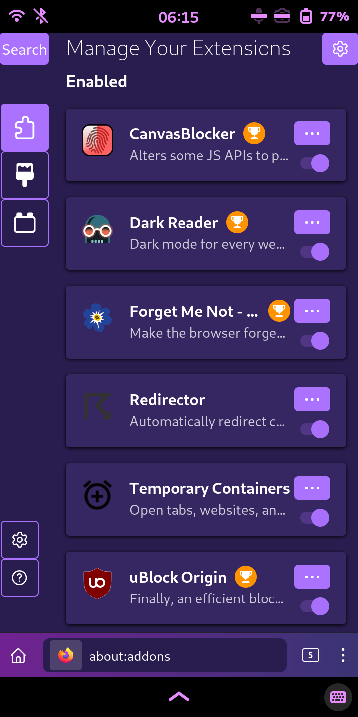
Screenshots:

desktop mode

mobile mode

true mobile mode

fenix

fenix_fox

fenix_one (1)

fenix_one (2)

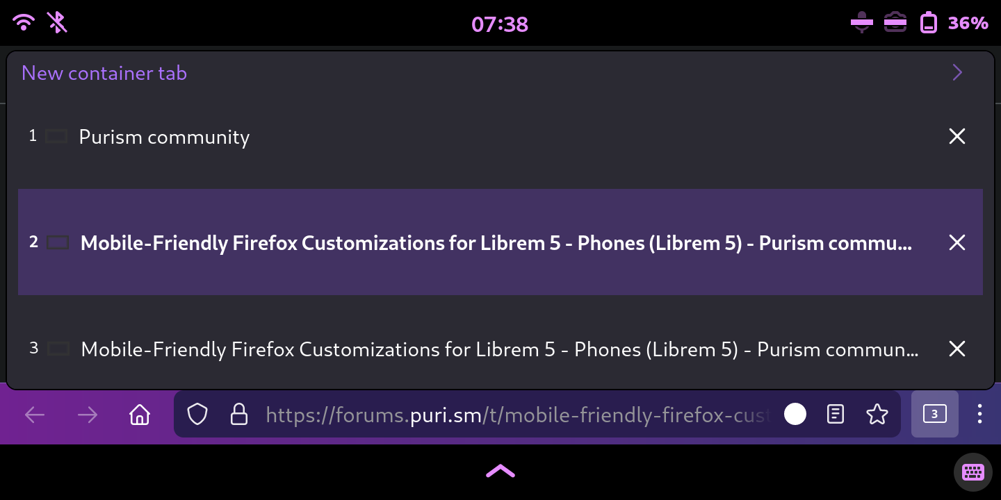
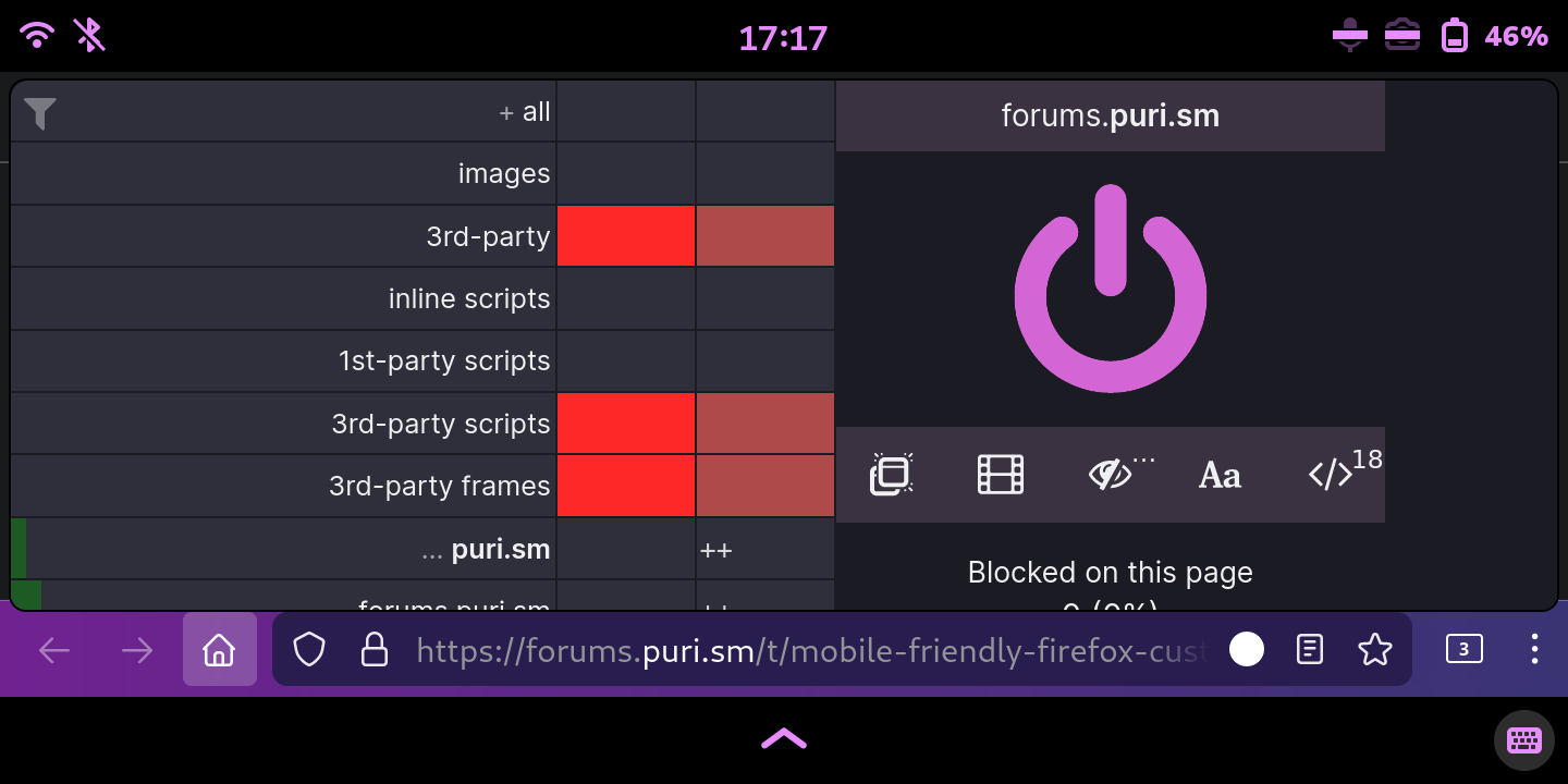
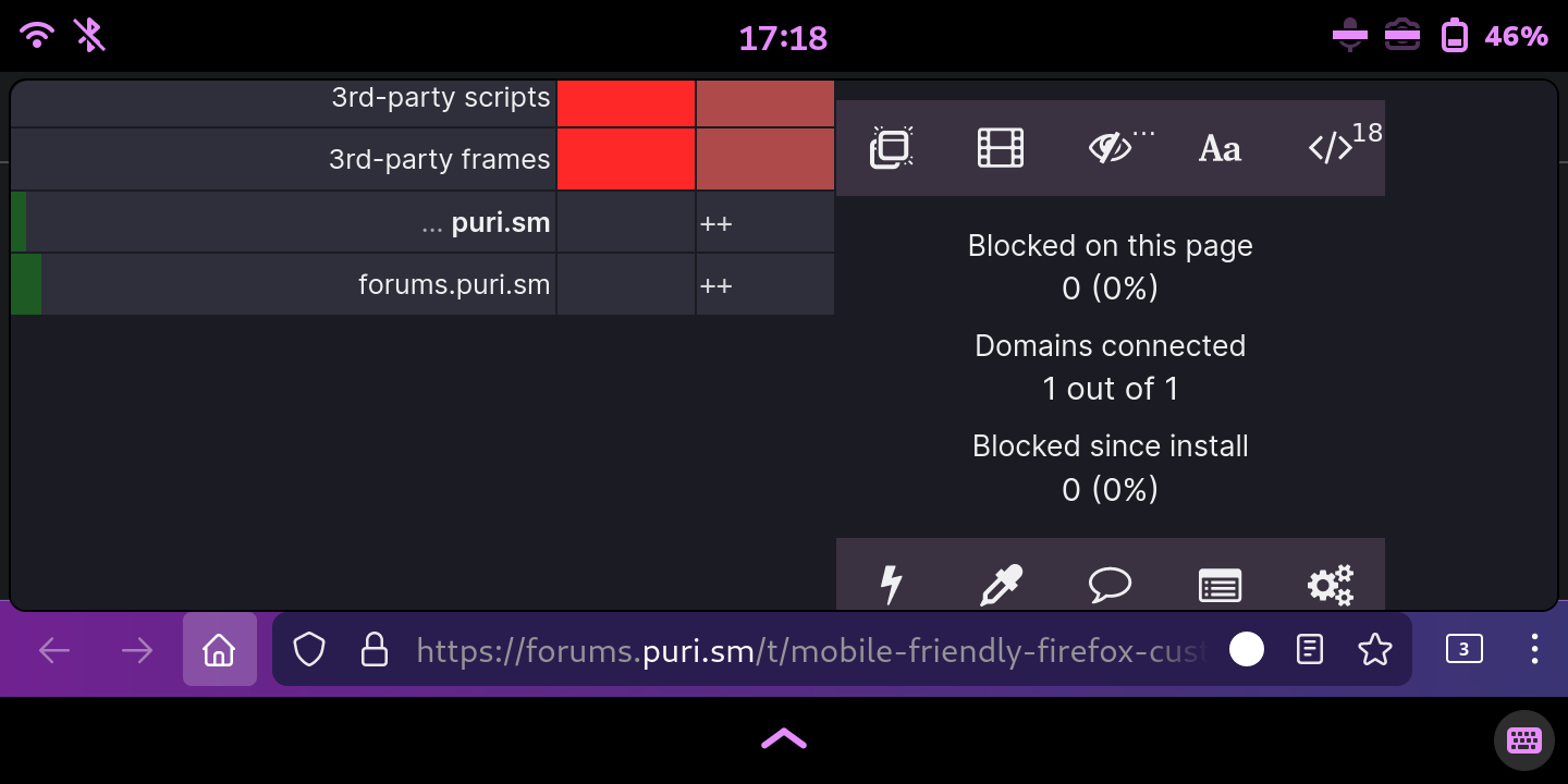
Screenshots showing dynamic_popups:

fenix_one + dynamic_popups (1)

fenix_one + dynamic_popups (2)

fenix_one + dynamic_popups_pro (3)

fenix_one + dynamic_popups_pro (4)

fenix_one + dynamic_popups_pro (5)

fenix_one + dynamic_popups_pro (6)

fenix_one + dynamic_popups_pro_max (1)

fenix_one + dynamic_popups_pro_max (2)

fenix_one + dynamic_popups_pro_max (3)

fenix_one + dynamic_popups_pro_max (4)

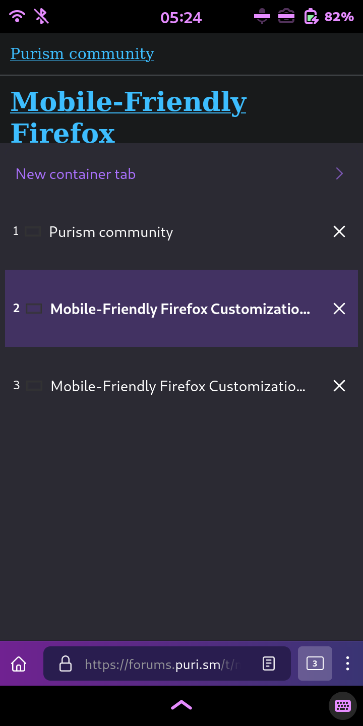
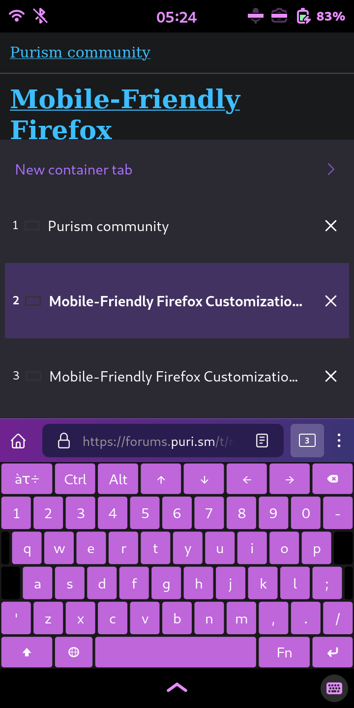
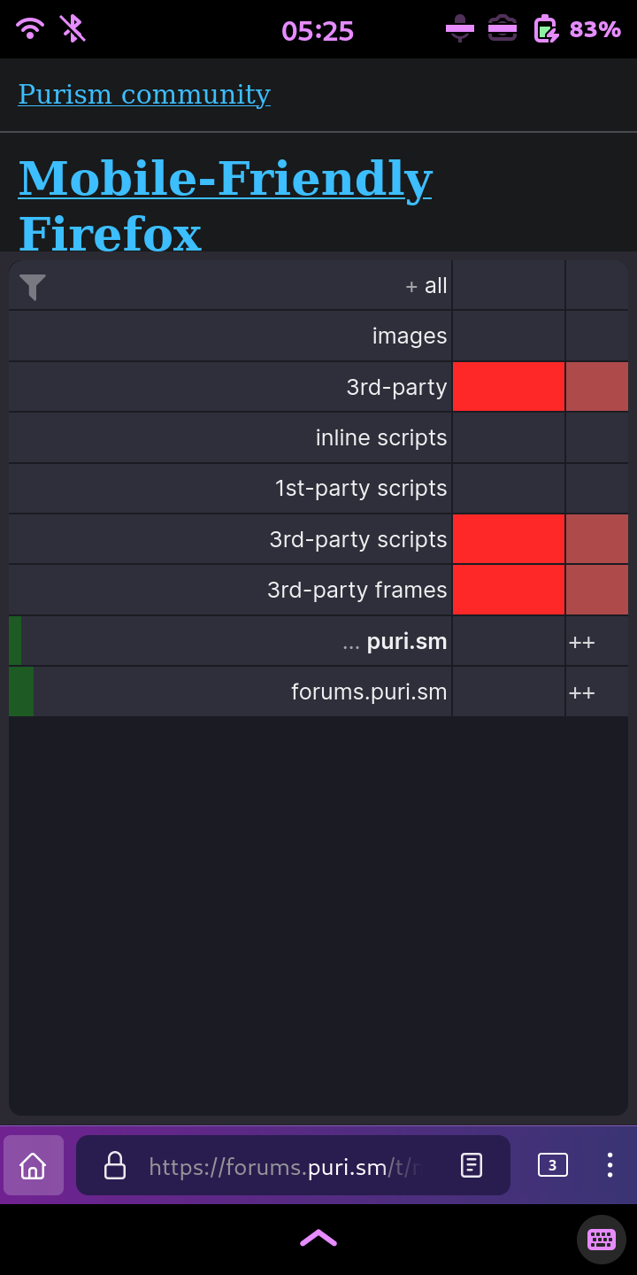
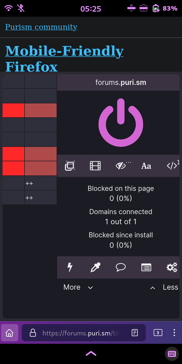
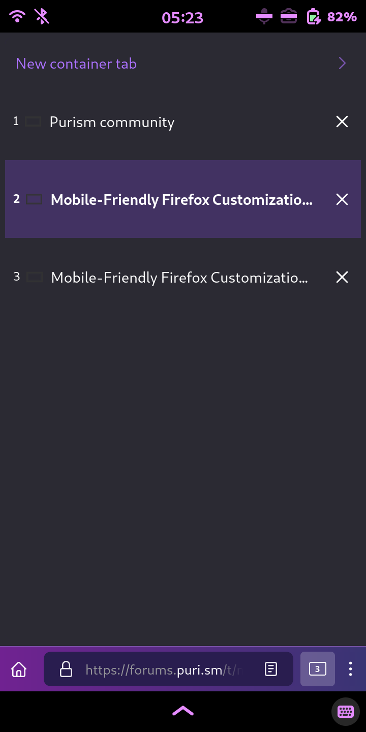
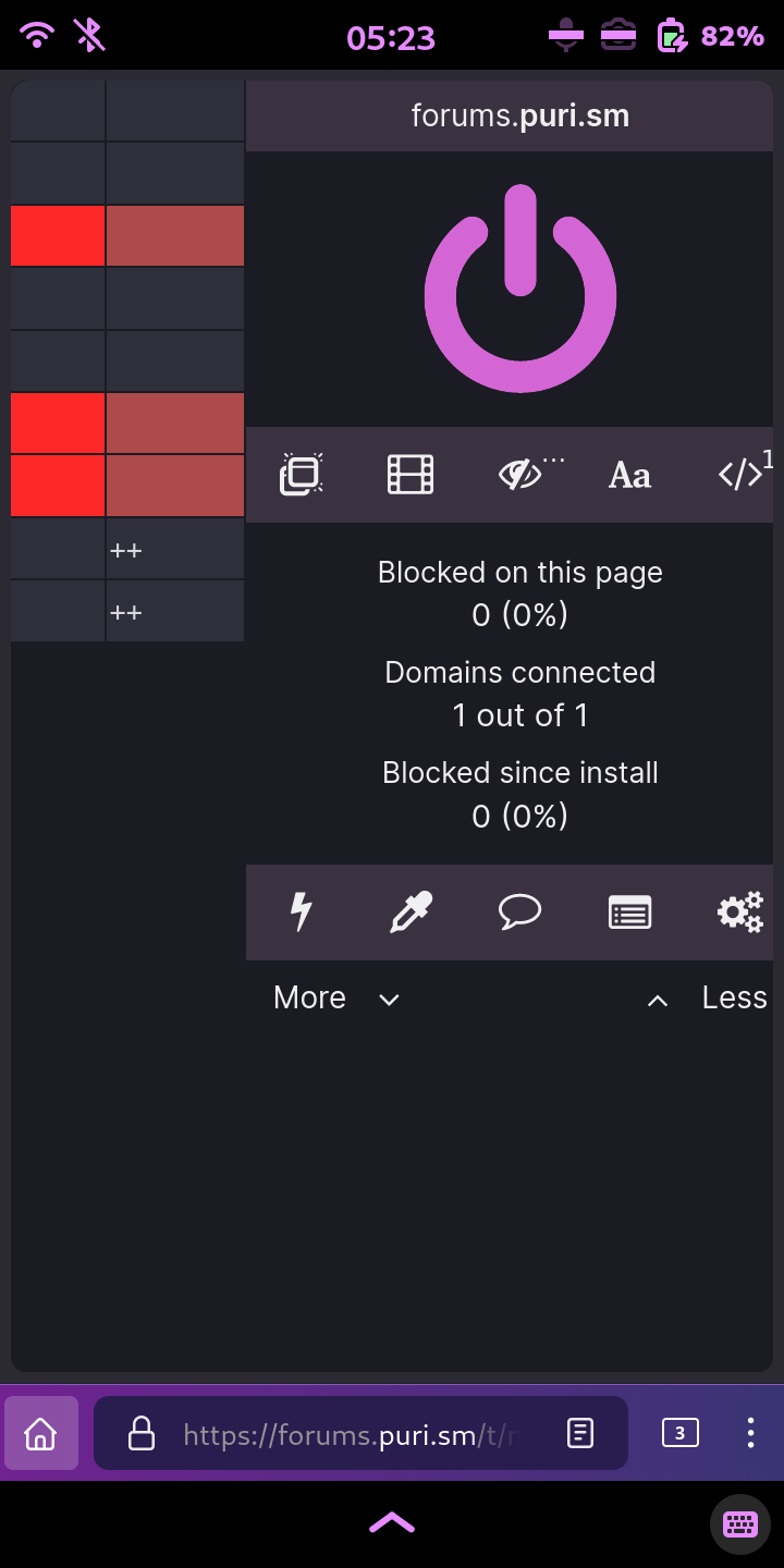
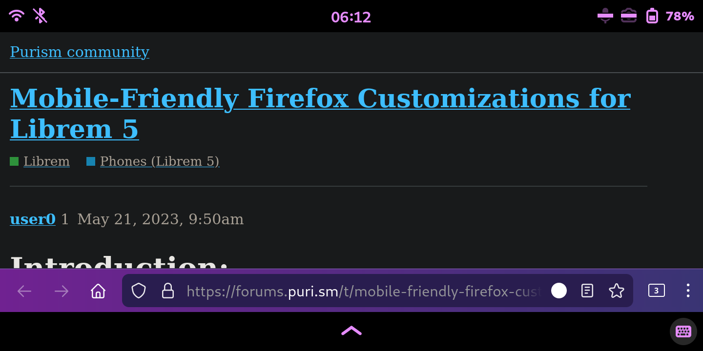
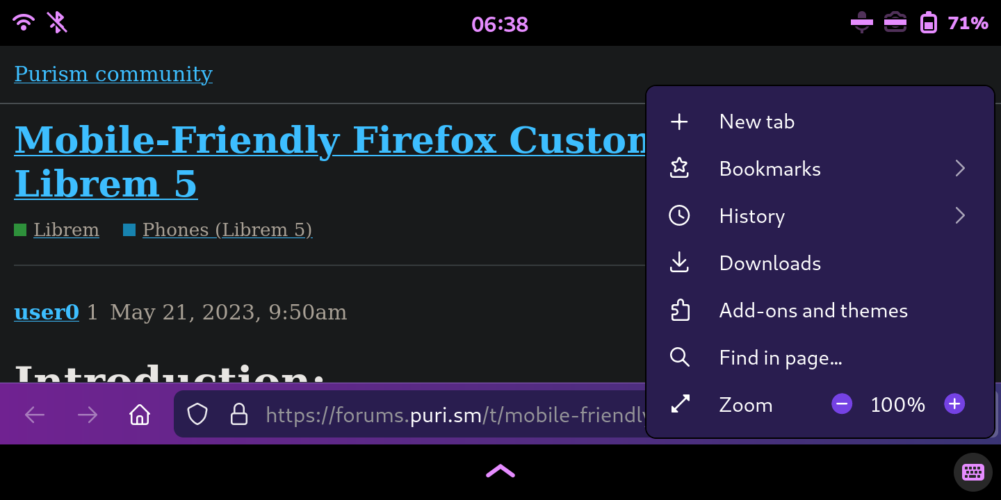
Screenshots showing true_mobile_landscape.css and userContent.css (fenix):
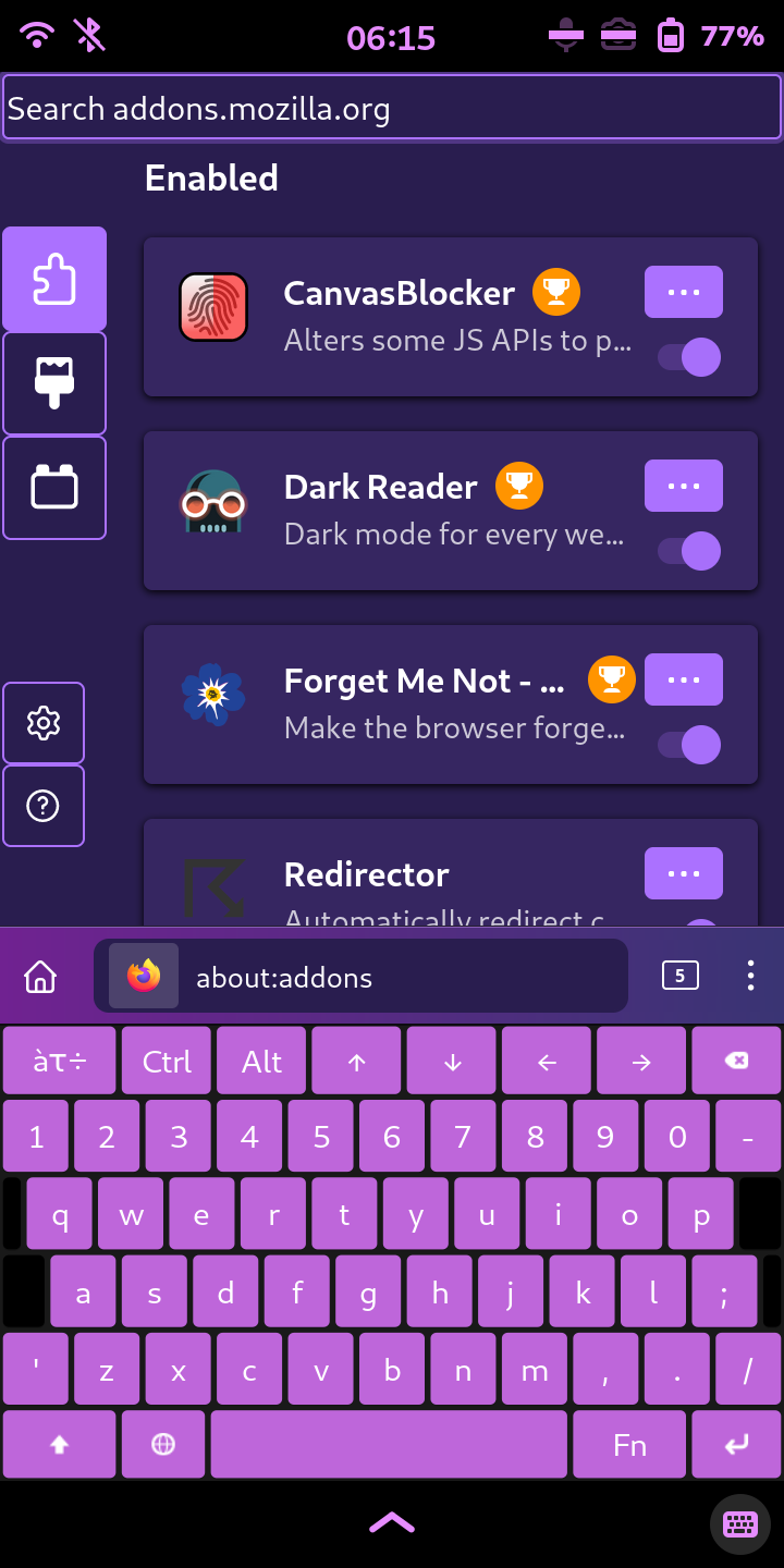
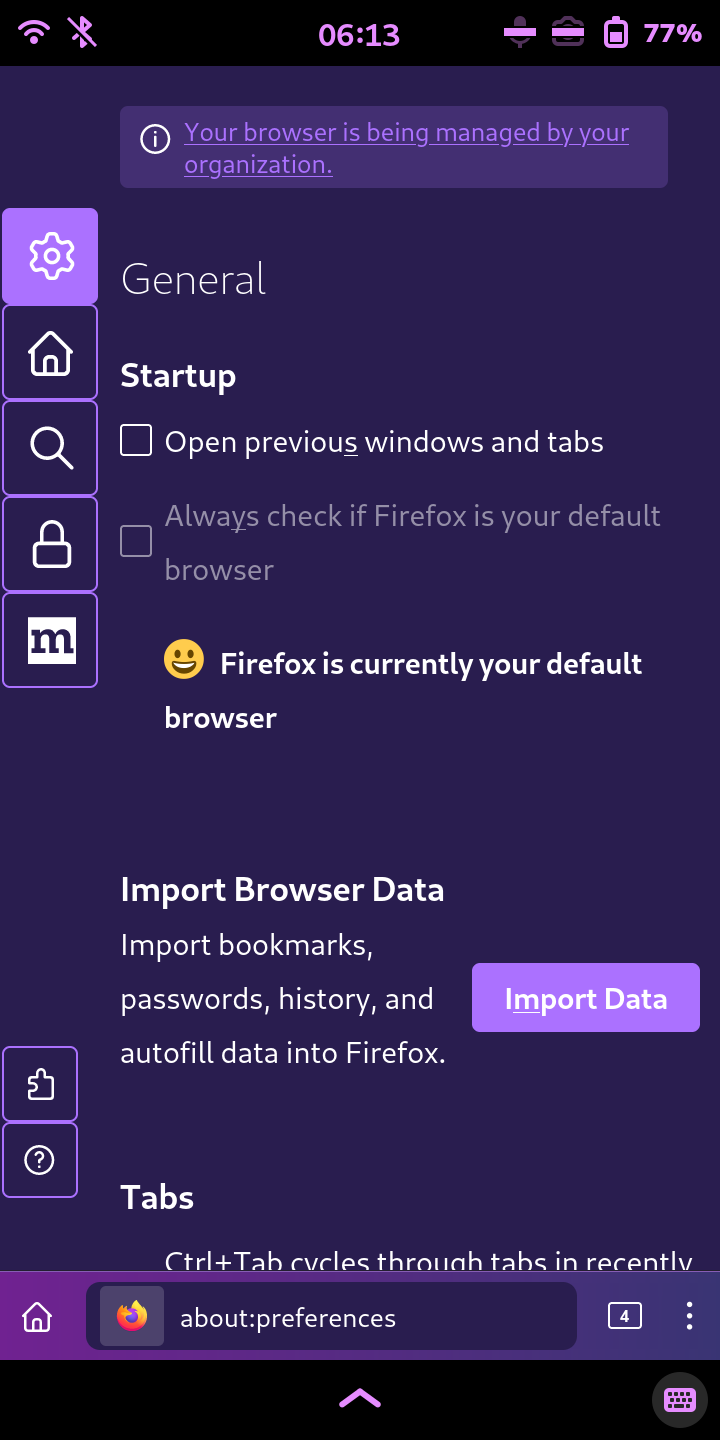
fenix_one (1)

fenix_one (2)

fenix_one (3) (old: see note below)

fenix_one (4) (old: see note below)

fenix_one (5) (old: see note below)

fenix_one (6)

fenix_one (7)

fenix_one (8)

fenix_one (9)

fenix_one (10)

fenix_one (about:addons) (1)

fenix_one (about:addons) (2)

fenix_one (about:addons) (3)

fenix_one (about:preferences)

Note:

While the Unified Extensions Menu and other popups are usable in landscape mode, extension popups themselves still suffer from the flickering bug in landscape mode.

I have fixed the extension popups in landscape mode, at the cost of the Tab Manager Menu having some extra blank space to the right and I have fixed the Tab Manager Menu so that it fully expands to fit the popup.

Conclusion:

  • This is the final post in the October 2023 Halloween Update multi-post.

  • The first post is the October 2023 Halloween Update (post 55).

  • For a summary of the updates that were applied to the October 2023 Halloween Update, see the Final Updates (post 70).

  • For info about a limitation of the true mobile styles and how to address it, see the Question & Answer (post 85).

  • You can follow me on the fediverse:

3 Likes

@user0 Thanks from me as well for making FF ESR 115 usable again! For me, using the fenix.css profile, the extensions button and the tab count button overlapped on the bottom, but luckily I could easily change that myself. Thanks again!

1 Like

Thank you for the appreciation!

Yes, the overlapping of those two buttons was a design choice that I made, in order for everything to be arranged as it is on the Firefox for Android app. Rather than using CSS code to move the Unified Extensions Menu button to the left of the URL Bar, I think it makes much more sense to simply have the user move the button themselves in one of a few different ways.

Edit: This overlapping issue has been completely fixed.

If you are interested, I have a VPS on OVHcloud I can use for hosting a Forgejo instance, among other public services.

https://forums.puri.sm/t/vps-usage-suggestions/21788 (trust level 1 and up)

The condition is that it is gratis until June 4th, 2025, as that is when the VPS contract ends. If you want it to continue past that, we will need to discuss it further within that thread.

Also, this thread is very slow to load using Firefox ESR on the Librem 5, probably due to all the code. If we relocate all of the code to the Forgejo instance, then you can use this thread as a changelog instead.

1 Like

This thread is so long now that it is difficult to follow the discussion, so excuse me if I post problems that have already been covered.

I have downloaded and copied fenix-one.css and userContent.css to my FF account folder. The issues I am having are:

  1. Addon-menu flickers and is not usable on mobile
  2. The addon I use the most, “Mobile View Switcher”, which I have placed left most of all my addons is not visible on mobile, just the button in 1)
  3. Text on forums.puri.sm (maybe other sites too, but none that I know of) is white on white background, i.e. unreadable

I also have the url bar at the top of the screen and not at the bottom, that was however the same before I upgraded FF and installed the Mobile-Friendly customizations.

Any guidance would be much appreciated.

1 Like

One more thing. I have some difficulty finding the most recent css files. So far I have copied them from this thread.

Sorry, but I am not interested. This forum is a simple place to post my code for others, and I don’t want to complicate things with repos and hosting fees. I made this code for myself and decided to share it here for other Librem 5 users. Everyone is free to share or host this code wherever they want.

I agree with some others that have said this code should be merged into the firefox-esr-mobile-config used by PureOS. @nicole.faerber, I know there is a lot of code (and lots of comments), but it would be nice to know that someone from Purism is at least considering reviewing it so it can be merged into (or outright replace) firefox-esr-mobile-config for Librem 5.

It’s actually due to javascript. If you disable javascript in your browser, this thread loads very quickly, just like all the other posts on this and other forums (and most other sites). The only reason you need to enable javascript on this site is to login, but you don’t need to login to view any of my posts as they are all publicly accessible.

There are two important things to note:

  1. These CSS files must be placed into a folder called chrome. This chrome folder must be placed inside your Firefox profile folder.

  2. You must have a file named userContent.css and a file named userChrome.css in the chrome folder.

There are two ways that you can use the fenix_one.css file:

  1. Rename the fenix_one.css file to userChrome.css in order to have a single file for all userChrome code.

  2. Create a userChrome.css file that imports the fenix_one.css file:

userChrome.css
/* Copyright 2023 user0
 * SPDX-License-Identifier: MPL-2.0 */

/* Source file available here:
   https://forums.puri.sm/t/mobile-friendly-firefox-customizations-for-librem-5/20313
*/

@import "fenix_one.css";

So you either placed these files directly into your Firefox profile folder instead of a chrome folder within your Firefox profile folder, or you didn’t create a userChrome.css file, or you misspelled one or more files (in your comment, you used fenix-one.css instead of fenix_one.css) Either way, PureOS is configured to automatically create a userChrome.css file in your Firefox profile’s chrome folder if one does not exist, but it uses the very basic firefox-esr-mobile-config file, which doesn’t yet contain my code.

So to answer your questions:

Naming the files correctly and placing them into the correct folders will solve this.

I originally designed the true_mobile_mode and fenix files assuming that there are no pinned extensions/addons. Your comment has reminded me that this is possible now that extension popups use a dedicated popup instead of relying on the Widget Overflow Menu popup. I have fixed this and will add it soon have updated all true_mobile and fenix files to include it. Check the October 2023 Halloween Update (post 55) for updates.

Note that I have just now updated all true_mobile and fenix files again to properly allow space for the Tab Manager Menu button and pinned toolbar items. The previous method was not good enough. This new one works much better.

This allows for pinned toolbar items (like extensions/addons), while preventing the overlapping issue noted by @tomoqv (thanks for pointing this out so that I could fix it).

I’m not seeing this issue on my end, and you’re not using my code yet (as explained earlier), so I don’t know what is causing this for you.

This is because you are not yet using my Mobile-Friendly customization, as explained earlier.

Since I am not hosting this code on any repo or similar, this thread is where all of my code is located. As I explained to the other user, if you disable javascript, this thread loads quickly and is much easier to navigate. Each post is numbered, making it easier to find specific posts.

My most recent update post begins with the October 2023 Halloween Update (post 55), and the final post from that multi-post update is Styles & Screenshots (post 61). All of my most recent code is in the posts from that update (posts 55-61), and there is no need to use code from earlier posts.

2 Likes

Thanks for the clear explanation, it works much better now. However, there is some kind of overlap for the buttons still as seen in this screenshot:


I also have two “home” buttons, although the one to the right brings up the addon list.
I am using the firefox-esr system theme and I don’t know if the purple colors come from that one or from the fenix_one.css. I would like a lighter color on toolbar and tabs if possible, how do I change this?
One more thing. I find the popups a bit difficult to use on the mobile, especially scroll between open tabs.

I think I have seen somewhere in this post popups covering the whole screen, but I can’t seem to find that css now.

Thanks for your excellent work on this, very useful!

2 Likes

The one on the left is the real Home button. The one on the right is the Unified Extensions Menu button using the icon of the Home button in order to mimic the Firefox for Android app.

If you don’t like that, you can comment out or remove that section of code from the fenix_one.css file. It exists in two places in the file in order to theme the icon in portrait and landscape modes.

Here is the code responsible for the theming of the icon:

    /* Change Unified Extensions Menu button icon to Home button icon */
    #unified-extensions-button {
        list-style-image: url("chrome://browser/skin/home.svg") !important;
    }

You should save the updated version of the fenix_one.css file, which properly allows space for the Tab Manager Menu button and toolbar items while fixing the overlapping issue.

I think you should also consider removing some of the other toolbar buttons. I would recommend removing the Refresh button, and the real Home button (currently on the left of your URL Bar). If you have a use for the Widget Overflow Menu (»), you can put the Home button inside of it, otherwise you can remove them both. And you can tap and hold on a blank area of a page to summon a menu popup that includes buttons for Back, Forward, Refresh, and Add Bookmark.

To disable the colorful toolbar, comment out or remove this section of code from the very bottom of the fenix_one.css file:

/* Private Browsing Mode theme for URL Bar and Nav Bar */
:root {
    --toolbar-field-border-color: var(--arrowpanel-background) !important;
    --toolbar-field-focus-border-color: var(--arrowpanel-background) !important;
    --lwt-toolbar-field-background-color: var(--arrowpanel-background) !important;
    --toolbar-field-background-color: var(--arrowpanel-background) !important;
    --toolbar-field-focus-background-color: var(--arrowpanel-background) !important;
}
#nav-bar {
    background-image: -moz-linear-gradient(to right, rgb(112,34,145), rgb(57,52,115)) !important;
}
#navigator-toolbox {
    --lwt-tabs-border-color: rgb(134,93,180) !important;
}

All other colors are managed at the top of the fenix_one.css and userContent.css (fenix) files. If you don’t want to apply any color themes, then you should use fenix_fox.css which is just fenix_one.css without any color themes applied. I haven’t posted a non-colorized userContent.css file yet, but I could do that. I made a userContent.css (non-colorized) file.

Now, when you say you want a lighter color for the tabs, are you talking about the grey bar at the top of your screenshots with the Firefox logo on the left? That looks like the Title Bar to me, which can be disabled using the “Customize Toolbar” feature. Otherwise, what do you mean when you say tabs? The Tab Manager Menu popup? And if so, which part of it?

What you are looking for is one of my dynamic_popups files, found in True Mobile Modes & Dynamic Popups (post 56). You can see some screenshots of them in Styles & Screenshots (post 61).

For fullscreen popups, you either want dynamic_popups_max.css or dynamic_popups_pro_max.css. They are both fullscreen, but the pro blends the color of the popup container with the popup to make it look truly fullscreen, whereas the other one has a black popup container to show just the rounded popup itself.

Regardless of which dynamic_popups file you use, if any, you should be able to scroll extensions/addons vertically and/or horizontally, depending on the size and shape of the extension/addon popup.

Thank you for the appreciation and the feedback! It’s nice to see some people trying it out.

Final Updates:

Updated November 5th 2023:

Remember, remember, the fifth of November, the extensions, even, I got;
I know of no reason why the extensions season should ever be forgot!

  • Adjusted the following files to allow for vertical scrolling of extension popups:

    • extensions_menu.css
    • true_mobile_landscape-alt.css
    • true_mobile_landscape.css
    • dynamic_popups.css
    • dynamic_popups_plus.css
    • dynamic_popups_max.css
    • dynamic_popups_pro.css
    • dynamic_popups_pro_max.css
    • fenix_fox-alt.css
    • fenix_fox.css
    • fenix_one-alt.css
    • fenix_one.css
  • Adjusted userContent.css (fenix) to apply fenix colors to all about pages using regexp and selectively fix about pages to better fit display.

Updated November 9th 2023:
  • Adjusted userContent.css (fenix) to fix a mistake that I had made. Sidebar size variable was in color section at top, being applied to all screen sizes; it is now properly set for smaller screens only, for the specific about pages that require it.
Updated November 10th-12th 2023:
  • Added userContent.css (non-colorized).

  • Adjusted the following files to properly allow space for Tab Manager Menu button and toolbar items:

    • single_tab_mode-alt.css
    • alt-single_tab_mode-alt.css
    • single_tab_mode.css
    • true_mobile_landscape-alt.css
    • true_mobile_landscape.css
    • true_mobile_mode-alt.css
    • true_mobile_mode.css
    • fenix-alt.css
    • fenix.css
    • fenix_fox-alt.css
    • fenix_fox.css
    • fenix_one-alt.css
    • fenix_one.css
Updated November 13th 2023:
  • Fixed a typo, changing 4px to 5px in the following file:

    • Line 31 of true_mobile_mode.css
  • Changed --panel-background: none !important; to --panel-background: var(--toolbar-bgcolor) !important; in the following files:

    • Line 52 of dynamic_popups_pro.css
    • Line 66 of dynamic_popups_pro_max.css
Updated November 15th 2023:
  • Added code to allow for fully expanded Tab Manager Menu in landscape mode in the following files:

    • Line 114 of true_mobile_landscape-alt.css
    • Line 140 of true_mobile_landscape.css
    • Line 299 of fenix_fox-alt.css
    • Line 320 of fenix_fox.css
    • Line 520 of fenix_one-alt.css
    • Line 541 of fenix_one.css
  • After the additional code was added, changed 207px to 18px in the following files:

    • Line 155 of fenix-alt.css
    • Line 155 of fenix.css
    • Line 312 of fenix_fox-alt.css
    • Line 333 of fenix_fox.css
    • Line 533 of fenix_one-alt.css
    • Line 554 of fenix_one.css
  • After the additional code was added, removed a line of code in the following files:

    • Line 160 of fenix-alt.css
    • Line 160 of fenix.css
    • Line 317 of fenix_fox-alt.css
    • Line 338 of fenix_fox.css
    • Line 538 of fenix_one-alt.css
    • Line 559 of fenix_one.css
Updated November 17th 2023:
  • Added fenix_theme.css for those that want the Firefox for Android (fenix) theme and don’t want to hide the Tab Bar.

  • Added file descriptions to some posts.

  • Adjusted the following files to hide the Tab Bar in Fullscreen and to hide the Title Bar (only useful if you modify these files to prevent hiding the Tab Bar):

    • Lines 251-254 and Lines 511-514 of fenix_fox-alt.css
    • Lines 251-254 and Lines 542-545 of fenix_fox.css
    • Lines 472-475 and Lines 732-735 of fenix_one-alt.css
    • Lines 472-475 and Lines 763-766 of fenix_one.css

Changed this:

    /* Hide Nav Bar when in Fullscreen mode */
    #nav-bar[inFullscreen] {
        display: none;
    }

To this:

    /* Hide Nav Bar and Tab Bar when in Fullscreen mode and hide and Title Bar */
    #nav-bar[inFullscreen],
    #TabsToolbar[inFullscreen],
    .titlebar-buttonbox-container {
        display: none;
    }
Updated November 19th 2023:
  • Renamed hide_tab_counter.css to hide_tab_manager_menu_button.css

  • Adjusted the following files for compatibility with all Display Scales (100%-200%):

    • Line 5 of appMenu.css
    • Line 5 of browser.css
    • Line 5 of editBookmarkPanel.css
    • Line 5 of findbar.css
    • Line 5 of popups.css
    • Line 5 of tabmenu.css
    • Line 11 of urlbar.css
    • Line 5 of alt-browser-alt.css
    • Line 5 of tabs_fill_available_width.css
    • Line 5 of numbered_tabs.css
    • Line 5 of extensions_menu.css
    • Line 35 of custom_rules.css
    • Line 20 of single_tab_mode-alt.css
    • Line 20 of alt-single_tab_mode-alt.css
    • Line 20 of single_tab_mode.css
    • Line 5 of hide_tab_manager_menu_button.css
    • Line 5 of hide_newtab_+_new-tab_buttons.css
    • Line 5 of new-tab-button.css
    • Line 20 & Line 198 of true_mobile_landscape-alt.css
    • Line 20 & Line 224 of true_mobile_landscape.css
    • Line 20 of true_mobile_mode-alt.css
    • Line 20 of true_mobile_mode.css
    • Line 5 of dynamic_popups.css
    • Line 5 of dynamic_popups_plus.css
    • Line 5 of dynamic_popups_max.css
    • Line 5 of dynamic_popups_pro.css
    • Line 5 of dynamic_popups_pro_max.css
    • Line 106 & Line 219 of fenix_theme.css
    • Line 106 & Line 225 of fenix-alt.css
    • Line 106 & Line 225 of fenix.css
    • Line 181 & Line 436 of fenix_fox-alt.css
    • Line 181 & Line 457 of fenix_fox.css
    • Line 402 & Line 657 of fenix_one-alt.css
    • Line 402 & Line 678 of fenix_one.css
    • Line 155, Lines 171-173, Line 265, Lines 281-283, Lines 316-318, Lines 338-340, Lines 367-369, Lines 465-467, & Lines 504-506 of userContent.css (fenix)
    • Line 8, Lines 24-26, Line 118, Lines 134-136, Lines 169-171, Lines 191-193, Lines 220-222, Lines 318-320, & Lines 357-359 of userContent.css (non-colorized)

Changed this:

@media (max-height: 300px) {

To this:

@media (orientation: landscape) and (max-height: 650px) {

Changed this:

@media (max-width: 700px) {

To this:

@media (orientation: portrait) and (max-width: 720px) {

Changed this:

    @media
    (max-height: 300px),
    (max-width: 700px) {

To this:

    @media
    (orientation: landscape) and (max-height: 650px),
    (orientation: portrait) and (max-width: 720px) {
Updated November 20th 2023:
  • Adjusted the following files for compatibility with New-Tab Button (new-tab-button.css):

    • Line 57 & Line 60 of single_tab_mode-alt.css
    • Line 57 & Line 60 of alt-single_tab_mode-alt.css
    • Line 57 & Line 60 of single_tab_mode.css

Changed this:

    /* Expand unpinned active tab */
    #tabbrowser-tabs:not([haspinnedtabs]) > #tabbrowser-arrowscrollbox > .tabbrowser-tab[selected] {
        min-width: 100vw !important;
    }
    #tabbrowser-tabs[haspinnedtabs] > #tabbrowser-arrowscrollbox > .tabbrowser-tab:not([pinned])[selected] {
        min-width: calc(100vw - 40px) !important;
    }

To this:

    /* Expand unpinned active tab */
    #tabbrowser-tabs:not([haspinnedtabs]) > #tabbrowser-arrowscrollbox > .tabbrowser-tab[selected] {
        min-width: 100% !important;
    }
    #tabbrowser-tabs[haspinnedtabs] > #tabbrowser-arrowscrollbox > .tabbrowser-tab:not([pinned])[selected] {
        min-width: 83.5% !important;
    }
  • Adjusted the following files to fix a mistake I had made which prevented adding extensions to toolbar:

    • Lines 261-265 of fenix_theme.css
    • Lines 278-283 of fenix-alt.css
    • Lines 278-283 of fenix.css

Changed this:

    /* Hide Back button and Private Browsing Indicator */
    #back-button,
    #private-browsing-indicator-with-label {
        visibility: collapse !important;
    }

To this:

    /* Remove Back button */
    #back-button {
        display: none !important;
    }

    /* Hide Private Browsing Indicator */
    #private-browsing-indicator-with-label {
        visibility: collapse !important;
    }

Changed this:

    /* Hide Back button, Tab Bar, and Private Browsing Indicator */
    #back-button,
    #tabbrowser-tabs,
    #private-browsing-indicator-with-label {
        visibility: collapse !important;
    }

To this:

    /* Remove Back button */
    #back-button {
        display: none !important;
    }

    /* Hide Tab Bar and Private Browsing Indicator */
    #tabbrowser-tabs,
    #private-browsing-indicator-with-label {
        visibility: collapse !important;
    }
Updated November 21th 2023:
  • Adjusted the following files to better support fully expanded Tab Manager Menu in all Display Scales (100%-200%):

    • Line 101 & Line 102 of tabmenu.css
    • Line 117 & Line 118 of true_mobile_landscape-alt.css
    • Line 143 & Line 144 of true_mobile_landscape.css
    • Line 304, Line 305, Line 644 & Line 645 of fenix_fox-alt.css
    • Line 325, Line 326, Line 721 & Line 722 of fenix_fox.css
    • Line 525, Line 526, Line 865 & Line 866 of fenix_one-alt.css
    • Line 546, Line 547, Line 942 & Line 943 of fenix_one.css

Changed this:

    /* Expand Tab Manager Menu */
    #customizationui-widget-multiview panelview {
        max-width: calc(100vw - 10px) !important;
        width: calc(100vw - 10px) !important;
    }

To this:

    /* Expand Tab Manager Menu */
    #customizationui-widget-multiview panelview {
        max-width: 100% !important;
        width: 100% !important;
    }

Conclusion:

Okay, I think I am done updating files for a while now.

I have fixed all known issues, and everything works well.

So I think it’s safe for everyone to save the files they need now.

  • You can follow me on the fediverse:

Bonus:

I shifted some colors in my phosh color theme to better match the fenix colors.

For anyone interested, backup the gtk.css file located in ~/.config/gtk-3.0/ before replacing it with this file:

gtk.css
@define-color accent_color rgb(230,140,255);
@define-color accent_bg_color rgb(190,102,218);
@define-color accent_fg_color #ffffff;
@define-color destructive_color #f66151;
@define-color destructive_bg_color #f66151;
@define-color destructive_fg_color #ffffff;
@define-color success_color #8ff0a4;
@define-color success_bg_color #8ff0a4;
@define-color success_fg_color #ffffff;
@define-color warning_color #f9f06b;
@define-color warning_bg_color #f9f06b;
@define-color warning_fg_color rgba(0, 0, 0, 0.8);
@define-color error_color #f66151;
@define-color error_bg_color #f66151;
@define-color error_fg_color #ffffff;
@define-color window_bg_color #241f31;
@define-color window_fg_color #ffffff;
@define-color view_bg_color #000000;
@define-color view_fg_color #ffffff;
@define-color headerbar_bg_color #241f31;
@define-color headerbar_fg_color #ffffff;
@define-color headerbar_border_color #ffffff;
@define-color headerbar_backdrop_color @window_bg_color;
@define-color headerbar_shade_color rgba(0, 0, 0, 0.36);
@define-color card_bg_color rgba(255, 255, 255, 0.08);
@define-color card_fg_color #ffffff;
@define-color card_shade_color rgba(0, 0, 0, 0.36);
@define-color dialog_bg_color rgb(41,29,79);
@define-color dialog_fg_color #ffffff;
@define-color popover_bg_color rgb(41,29,79);
@define-color popover_fg_color rgb(230,140,255);
@define-color shade_color rgba(0, 0, 0, 0.36);
@define-color scrollbar_outline_color rgba(0, 0, 0, 0.5);
@define-color blue_1 #99c1f1;
@define-color blue_2 #62a0ea;
@define-color blue_3 #3584e4;
@define-color blue_4 #1c71d8;
@define-color blue_5 #1a5fb4;
@define-color green_1 #8ff0a4;
@define-color green_2 #57e389;
@define-color green_3 #33d17a;
@define-color green_4 #2ec27e;
@define-color green_5 #26a269;
@define-color yellow_1 #f9f06b;
@define-color yellow_2 #f8e45c;
@define-color yellow_3 #f6d32d;
@define-color yellow_4 #f5c211;
@define-color yellow_5 #e5a50a;
@define-color orange_1 #ffbe6f;
@define-color orange_2 #ffa348;
@define-color orange_3 #ff7800;
@define-color orange_4 #e66100;
@define-color orange_5 #c64600;
@define-color red_1 #f66151;
@define-color red_2 #ed333b;
@define-color red_3 #e01b24;
@define-color red_4 #c01c28;
@define-color red_5 #a51d2d;
@define-color purple_1 #dc8add;
@define-color purple_2 #c061cb;
@define-color purple_3 #9141ac;
@define-color purple_4 #813d9c;
@define-color purple_5 #613583;
@define-color brown_1 #cdab8f;
@define-color brown_2 #b5835a;
@define-color brown_3 #986a44;
@define-color brown_4 #865e3c;
@define-color brown_5 #63452c;
@define-color light_1 #ffffff;
@define-color light_2 #f6f5f4;
@define-color light_3 #deddda;
@define-color light_4 #c0bfbc;
@define-color light_5 #9a9996;
@define-color dark_1 #77767b;
@define-color dark_2 #5e5c64;
@define-color dark_3 #3d3846;
@define-color dark_4 #241f31;
@define-color dark_5 #000000;

sq_button.sp1_3,
sq_button.sp2_3,
sq_button.sp4_3,
sq_button.sp5_3,
sq_button.vert_spacer,
sq_button.sp1_3:active,
sq_button.sp2_3:active,
sq_button.sp4_3:active,
sq_button.sp5_3:active,
sq_button.vert_spacer
{
    background: #000000;
    border-color: #000000;
    color: #000000;
}

sq_button
{
    color: mix(@theme_fg_color, #ffffff, 1.0);
    border-color: mix(@borders, rgb(190,102,218), 1.0);
    background: mix(@theme_bg_color, rgb(190,102,218), 1.0);
}

sq_button:active
{
    color: mix(@theme_fg_color, #ffffff, 1.0);
    border-color: mix(@borders, rgb(190,102,218), 1.0);
    background: mix(@theme_bg_color, rgb(230,140,255), 1.0);
}

sq_button.default_punct
{
    color: mix(@theme_fg_color, #ffffff, 1.0);
    border-color: mix(@borders, rgb(190,102,218), 1.0);
    background: mix(@theme_bg_color, rgb(190,102,218), 1.0);
}

sq_button.default_punct:active
{
    color: mix(@theme_fg_color, #ffffff, 1.0);
    border-color: mix(@borders, rgb(190,102,218), 1.0);
    background: mix(@theme_bg_color, rgb(230,140,255), 1.0);
}

sq_button.default_foreign
{
    color: mix(@theme_fg_color, #ffffff, 1.0);
    border-color: mix(@borders, rgb(190,102,218), 1.0);
    background: mix(@theme_bg_color, rgb(190,102,218), 1.0);
}

sq_button.default_foreign:active
{
    color: mix(@theme_fg_color, #ffffff, 1.0);
    border-color: mix(@borders, rgb(190,102,218), 1.0);
    background: mix(@theme_bg_color, rgb(230,140,255), 1.0);
}

sq_button.default_calc
{
    color: mix(@theme_fg_color, #ffffff, 1.0);
    border-color: mix(@borders, rgb(190,102,218), 1.0);
    background: mix(@theme_bg_color, rgb(190,102,218), 1.0);
}

sq_button.default_calc:active
{
    color: mix(@theme_fg_color, #ffffff, 1.0);
    border-color: mix(@borders, rgb(190,102,218), 1.0);
    background: mix(@theme_bg_color, rgb(230,140,255), 1.0);
}

sq_button.default_prgm
{
    color: mix(@theme_fg_color, #ffffff, 1.0);
    border-color: mix(@borders, rgb(190,102,218), 1.0);
    background: mix(@theme_bg_color, rgb(190,102,218), 1.0);
}

sq_button.default_prgm:active
{
    color: mix(@theme_fg_color, #ffffff, 1.0);
    border-color: mix(@borders, rgb(190,102,218), 1.0);
    background: mix(@theme_bg_color, rgb(230,140,255), 1.0);
}

sq_button.default_curr
{
    color: mix(@theme_fg_color, #ffffff, 1.0);
    border-color: mix(@borders, rgb(190,102,218), 1.0);
    background: mix(@theme_bg_color, rgb(190,102,218), 1.0);
}

sq_button.default_curr:active
{
    color: mix(@theme_fg_color, #ffffff, 1.0);
    border-color: mix(@borders, rgb(190,102,218), 1.0);
    background: mix(@theme_bg_color, rgb(230,140,255), 1.0);
}

sq_button.default_misc
{
    color: mix(@theme_fg_color, #ffffff, 1.0);
    border-color: mix(@borders, rgb(190,102,218), 1.0);
    background: mix(@theme_bg_color, rgb(190,102,218), 1.0);
}

sq_button.default_misc:active
{
    color: mix(@theme_fg_color, #ffffff, 1.0);
    border-color: mix(@borders, rgb(190,102,218), 1.0);
    background: mix(@theme_bg_color, rgb(230,140,255), 1.0);
}

sq_button.altline,
sq_button.special,
sq_button.wide {
    color: mix(@theme_fg_color, #ffffff, 1.0);
    border-color: mix(@borders, rgb(190,102,218), 1.0);
    background: mix(@theme_bg_color, rgb(190,102,218), 1.0);
}

sq_button:active,
sq_button.altline:active,
sq_button.special:active,
sq_button.wide:active {
    color: mix(@theme_fg_color, #ffffff, 1.0);
    border-color: mix(@borders, rgb(190,102,218), 1.0);
    background: mix(@theme_bg_color, rgb(230,140,255), 1.0);
}

sq_button.latched,
sq_button.altline.latched
{
    color: mix(@theme_fg_color, #ffffff, 1.0);
    background: mix(@theme_bg_color, rgb(230,140,255), 1.0);
}

sq_button.locked,
sq_button.altline.locked
{
    color: mix(@theme_fg_color, #ffffff, 1.0);
    background: mix(@theme_selected_bg_color, rgb(230,140,255), 1.0);
}

#Return {
    color: mix(@theme_fg_color, #ffffff, 1.0);
    border-color: mix(@borders, rgb(190,102,218), 1.0);
    background: mix(@theme_bg_color, rgb(190,102,218), 1.0);
}

#Return:active {
    color: mix(@theme_fg_color, #ffffff, 1.0);
    border-color: mix(@borders, rgb(190,102,218), 1.0);
    background: mix(@theme_bg_color, rgb(230,140,255), 1.0);
}

phosh-top-panel {
    color: rgb(230,140,255);
}

phosh-home {
    color: rgb(230,140,255);
}

phosh-lockscreen {
    color: rgb(230,140,255);
}

I also altered the landscape keyboard, moving the numbers from the right to the left so that the main keyboard is roughly centered. For completeness, I will include both portrait and landscape keyboard files below.

For anyone interested, backup the us.yaml and us_wide.yaml files located in ~/.local/share/squeekboard/keyboards/ before replacing them with these files:

us.yaml
---
outlines:
    default:         { width: 48,  height: 55 }
    default_punct:   { width: 48,  height: 55 }
    default_foreign: { width: 48,  height: 55 }
    default_calc:    { width: 48,  height: 55 }
    default_prgm:    { width: 48,  height: 55 }
    default_curr:    { width: 48,  height: 55 }
    default_misc:    { width: 48,  height: 55 }
    sp1_3:           { width: 16,  height: 55 }
    sp2_3:           { width: 32,  height: 55 }
    action:          { width: 64,  height: 55 }
    wide:            { width: 80,  height: 55 }
    sp5_3:           { width: 80,  height: 52 }
    action_short:    { width: 64,  height: 52 }
    altline:         { width: 80,  height: 52 }
    spaceline:       { width: 244, height: 52 }
    special:         { width: 60,  height: 52 }
    return_bsp:      { width: 64,  height: 52 }
    vert_spacer:     { width: 100, height: 0 }

views:
    base:
        - "Shift_b_ls Ctrl Alt ↑  ↓  ←  →  BackSpace"
        - "      1  2  3  4  5  6  7  8  9  0  -"
        - "sp1_3  q  w  e  r  t  y  u  i  o  p     sp2_3"
        - "sp2_3   a  s  d  f  g  h  j  k  l  ;    sp1_3"
        - "      '  z  x  c  v  b  n  m  ,  .  /"
        - "Shift_L preferences space  show_actions Return"
        - "vert_spacer"
    upper:
        - "Shift_u_us Ctrl Alt ↑  ↓  ←  →  BackSpace"
        - "      !  @  #  $  %  ^  &  *  (  )  _"
        - "sp1_3  Q  W  E  R  T  Y  U  I  O  P     sp2_3"
        - "sp2_3   A  S  D  F  G  H  J  K  L  :    sp1_3"
        - "     \"  Z  X  C  V  B  N  M  <  >  ?"
        - "Shift_L preferences space  show_actions Return"
        - "vert_spacer"
    lsyms:
        - "Shift_b_ls Ctrl Alt ↑  ↓  ←  →  BackSpace"
        - "      `  à  â  á  é  î  ü  ô  ö  û  ó"
        - "sp1_3  þ  ð  č  ĵ  š  ž  ǧ  ß  ʒ  ğ     sp2_3"
        - "sp2_3   θ  μ  π  σ  τ  φ  =  ·  +  minus    sp1_3"
        - "      \\ |  bang  pct  amp  caret  mulsplat  divslash  √  ×  ÷"
        - "Shift_S preferences space  show_actions Return"
        - "vert_spacer"
    usyms:
        - "Shift_u_us Ctrl Alt ↑  ↓  ←  →  BackSpace"
        - "      ~  À  Â  Á  É  Î  Ü  Ô  Ö  Û  Ó"
        - "sp1_3  Þ  Đ  Č  Ĵ  Š  Ž  Ǧ  ʃ  Ʒ  Ğ     sp2_3"  
        - "sp2_3   «  »  Σ  Δ  ¶  °  ®  ©  dollar  £    sp1_3"
        - "      lst  gtt  lparen  rparen  [  ]  {  }  hash  €  ¥"
        - "Shift_S preferences space  show_actions Return"
        - "vert_spacer"
    actions:
        - "sp5_3     Ctrl   Alt    ↑       ↓     ←       →  BackSpace"
        - "show_lower     F1     F2     F3     F4     Insert Home   PgUp"
        - "show_upper     F5     F6     F7     F8     Del    End    PgDn"
        - "show_lsyms     F9     F10    F11    F12    Esc    Up     Pause"
        - "show_usyms     Menu   Esc    Tab    Break  Left   Down   Right"
        - "sp5_3     preferences space show_actions Return"
        - "vert_spacer"

buttons:


    sp1_3:
        outline: "sp1_3"
        keysym: " "
        text: " "
    sp2_3:
        outline: "sp2_3"
        keysym: " "
        text: " "
    sp5_3:
        outline: "sp5_3"
        keysym: " "
        text: " "
    vert_spacer:
        outline: "vert_spacer"
        text: " "
        keysym: " " 


    Shift_L:
        action:
            locking:
                lock_view: "upper"
                unlock_view: "base"
        outline: "altline"
        icon: "key-shift"
    Shift_S:
        action:
            locking:
                lock_view: "usyms"
                unlock_view: "lsyms"
        outline: "altline"
        icon: "key-shift"
    Shift_b_ls:
        action:
            locking:
                lock_view: "lsyms"
                unlock_view: "base"
        outline: "altline"
        label: "àτ÷"
    Shift_u_us:
        action:
            locking:
                lock_view: "usyms"
                unlock_view: "upper"
        outline: "altline"
        label: "ÀΣ€"             
    show_actions:
        action:
            locking:
                lock_view: "actions"
                unlock_view: "base"
        outline: "altline"
        label: "Fn"


    preferences:
        action: "show_prefs"
        outline: "special"
        icon: "keyboard-mode-symbolic"
    space:
        outline: "spaceline"
        text: " "
    Return:
        outline: "return_bsp"
        icon: "key-enter"
        keysym: "Return"
    BackSpace:
        outline: "return_bsp"
        icon: "edit-clear-symbolic"
        action: erase


    Ctrl:
        modifier: "Control"
        outline: "action_short"
        label: "Ctrl"
    Alt:
        modifier: "Alt"
        outline: "action_short"
        label: "Alt"
    "↑":
        outline: "action_short"
        keysym: "Up"
    "↓":
        outline: "action_short"
        keysym: "Down"
    "←":
        outline: "action_short"
        keysym: "Left"
    "→":
        outline: "action_short"
        keysym: "Right"


    "-":
        outline: "default_punct"
    ";":
        outline: "default_punct"
    "'":
        outline: "default_punct"
    ",":
        outline: "default_punct"
    ".":
        outline: "default_punct"
    "?":
        outline: "default_punct"


    "!":
        outline: "default_punct"
    "@":
        outline: "default_punct"
    "#":
        outline: "default_punct"
    "$":
        outline: "default_punct"
    "%":
        outline: "default_punct"
    "^":
        outline: "default_punct"
    "&":
        outline: "default_punct"
    "*":
        outline: "default_punct"
    "(":
        outline: "default_punct"
    ")":
        outline: "default_punct"
    "_":
        outline: "default_punct"
    ":":
        outline: "default_punct"
    "\"":
        outline: "default_punct"
    "<":
        outline: "default_punct"
    ">":
        outline: "default_punct"
    "/":
        outline: "default_punct"


    "`":
        outline: "default_punct"
    "à":
        outline: "default_foreign"
    "â":
        outline: "default_foreign"
    "á":
        outline: "default_foreign"
    "é":
        outline: "default_foreign"
    "î":
        outline: "default_foreign"
    "ü":
        outline: "default_foreign"
    "ô":
        outline: "default_foreign"
    "ö":
        outline: "default_foreign"
    "û":
        outline: "default_foreign"
    "ó":
        outline: "default_foreign"
    "þ":
        outline: "default_foreign"
    "ð":
        outline: "default_foreign"
    "č":
        outline: "default_foreign"
    "ĵ":
        outline: "default_foreign"
    "š":
        outline: "default_foreign"
    "ž":
        outline: "default_foreign"
    "ǧ":
        outline: "default_foreign"
    "ß":
        outline: "default_foreign"
    "ʒ":
        outline: "default_foreign"
    "ğ":
        outline: "default_foreign"
    "θ":
        outline: "default_foreign"
    "μ":
        outline: "default_foreign"
    "π":
        outline: "default_foreign"
    "σ":
        outline: "default_foreign"
    "τ":
        outline: "default_foreign"
    "φ":
        outline: "default_foreign"
    "=":
        outline: "default_calc"
    "·":
        outline: "default_calc"
    "+":
        outline: "default_calc"
    minus:
        outline: "default_calc"
        text: "-"
    "\\":
        outline: "default_prgm"
    "|":
        outline: "default_prgm"
    bang:
        outline: "default_prgm"
        text: "!"
    pct:
        outline: "default_prgm"
        text: "%"
    amp:
        outline: "default_prgm"
        text: "&"
    caret:
        outline: "default_prgm"
        text: "^"
    mulsplat:
        outline: "default_calc"
        text: "*"
    divslash:
        outline: "default_calc"
        text: "/"
    "√":
        outline: "default_calc"
    "×":
        outline: "default_calc"
    "÷":
        outline: "default_calc"


    "~":
        outline: "default_punct"
    "À":
        outline: "default_foreign"
    "Â":
        outline: "default_foreign"
    "Á":
        outline: "default_foreign"
    "É":
        outline: "default_foreign"
    "Î":
        outline: "default_foreign"
    "Ü":
        outline: "default_foreign"
    "Ô":
        outline: "default_foreign"
    "Ö":
        outline: "default_foreign"
    "Û":
        outline: "default_foreign"
    "Ó":
        outline: "default_foreign"
    "Þ":
        outline: "default_foreign"
    "Đ":
        outline: "default_foreign"
    "Č":
        outline: "default_foreign"
    "Ĵ":
        outline: "default_foreign"
    "Š":
        outline: "default_foreign"
    "Ž":
        outline: "default_foreign"
    "Ǧ":
        outline: "default_foreign"
    "ʃ":
        outline: "default_foreign"
    "Ʒ":
        outline: "default_foreign"
    "Ğ":
        outline: "default_foreign"
    "Σ":
        outline: "default_foreign"
    "Δ":
        outline: "default_foreign"
    "«":
        outline: "default_foreign"
    "»":
        outline: "default_foreign"
    hash:
        outline: "default_prgm"
        text: "#"
    "°":
        outline: "default_misc"
    "®":
        outline: "default_misc"
    "©":
        outline: "default_misc"
    dollar:
        outline: "default_curr"
        text: "$"
    "£":
        outline: "default_curr"
    lst:
        outline: "default_prgm"
        text: "<"
    gtt:
        outline: "default_prgm"
        text: ">"
    lparen:
        label: "("
        outline: "default_prgm"
        text: "("
    rparen:
        outline: "default_prgm"
        text: ")"  
    "[":
        outline: "default_prgm"
    "]":
        outline: "default_prgm"
    "{":
        outline: "default_prgm"
    "}":
        outline: "default_prgm"
    "¶":
        outline: "default_misc"
    "€":
        outline: "default_curr"
    "¥":
        outline: "default_curr"


    show_lower:
        action:
            set_view: "base"
        outline: "wide"
        label: "abc"
    show_upper:
        action:
            set_view: "upper"
        outline: "wide"
        label: "ABC"
    show_lsyms:
        action:
            set_view: "lsyms"
        outline: "wide"
        label: "àτ÷"
    show_usyms:
        action:
            set_view: "usyms"
        outline: "wide"
        label: "ÀΣ€"
    F1:
        outline: "action"
        keysym: "F1"
    F2:
        outline: "action"
        keysym: "F2"
    F3:
        outline: "action"
        keysym: "F3"
    F4:
        outline: "action"
        keysym: "F4"
    F5:
        outline: "action"
        keysym: "F5"
    F6:
        outline: "action"
        keysym: "F6"
    F7:
        outline: "action"
        keysym: "F7"
    F8:
        outline: "action"
        keysym: "F8"
    F9:
        outline: "action"
        keysym: "F9"
    F10:
        outline: "action"
        keysym: "F10"
    F11:
        outline: "action"
        keysym: "F11"
    F12:
        outline: "action"
        keysym: "F12"
    Esc:
        outline: "action"
        keysym: "Escape"
    Tab:
        outline: "action"
        keysym: "Tab"
    Del:
        outline: "action"
        keysym: "Delete"
    Insert:
        outline: "action"
        keysym: "Insert"
    Menu:
        outline: "action"
        keysym: "Menu"
    Pause:
        outline: "action"
        keysym: "Pause"
    Break:
        outline: "action"
        keysym: "Break"
    Home:
        outline: "action"
        keysym: "Home"
    End:
        outline: "action"
        keysym: "End"
    PgUp:
        outline: "action"
        keysym: "Page_Up"
    PgDn:
        outline: "action"
        keysym: "Page_Down"
    Up:
        label: "↑"
        outline: "action"
        keysym: "Up"
    Left:
        label: "←"
        outline: "action"
        keysym: "Left"
    Down:
        label: "↓"
        outline: "action"
        keysym: "Down"
    Right:
        label: "→"
        outline: "action"
        keysym: "Right"
us_wide.yaml
---
outlines:
    default:         { width: 48,  height: 70 }
    default_punct:   { width: 48,  height: 70 }
    default_foreign: { width: 48,  height: 70 }
    default_calc:    { width: 48,  height: 70 }
    default_prgm:    { width: 48,  height: 70 }
    default_curr:    { width: 48,  height: 70 }
    default_misc:    { width: 48,  height: 70 }
    sp1_3:           { width: 16,  height: 70 }
    sp2_3:           { width: 32,  height: 70 }
    sp4_3:           { width: 64,  height: 70 }
    action:          { width: 64,  height: 70 }
    altline:         { width: 80,  height: 70 }
    double:          { width: 96,  height: 70 }
    wide5:           { width: 80,  height: 70 }
    spaceline:       { width: 212, height: 70 }
    widespaceline:   { width: 292, height: 70 }
    special:         { width: 60,  height: 70 }

views:
    base:
        - "7  8  9  minus  =  sp2_3  q  w  e  r  t  y  u  i  o  p  [  ]  BackSpace  sp2_3  Insert  Home  PgUp"
        - "4  5  6  +  ·  sp2_3  sp1_3  a  s  d  f  g  h  j  k  l  ;  '  Return  sp2_3  Del  End  PgDn"
        - "1  2  3  ÷  √  sp2_3  sp2_3  z  x  c  v  b  n  m  ,  .  /  `  \\ sp2_3  sp2_3  sp4_3  ↑  sp4_3"
        - "Zero  DecimalPt  ×  percent  sp2_3  Shift_L preferences Ctrl space  Alt Shift_b_ls  show_actions sp2_3  ←  ↓  →"
    upper:
        - "7  8  9  minus  =  sp2_3  Q  W  E  R  T  Y  U  I  O  P  {  }  BackSpace  sp2_3  Insert  Home  PgUp"
        - "4  5  6  +  ·  sp2_3  sp1_3  A  S  D  F  G  H  J  K  L  :  \"  Return  sp2_3  Del  End  PgDn"
        - "1  2  3  ÷  √  sp2_3  sp2_3  Z  X  C  V  B  N  M  <  >  ?  ~  |  sp2_3  sp2_3  sp4_3  ↑  sp4_3"
        - "Zero  DecimalPt  ×  percent  sp2_3  Shift_L preferences Ctrl space  Alt Shift_u_us  show_actions sp2_3  ←  ↓  →"
    lsyms:
        - "7  8  9  minus  =  sp2_3  à  â  á  é  î  ü  ô  ö  û  ó  &  *  BackSpace  sp2_3  Insert  Home  PgUp"
        - "4  5  6  +  ·  sp2_3  sp1_3  þ  ð  č  ĵ  š  ž  ǧ  ß  ʒ  ğ  -  Return  sp2_3  Del  End  PgDn"
        - "1  2  3  ÷  √  sp2_3  sp2_3   θ  μ  π  σ  τ  φ  !  @  #  $  %  ^   sp2_3  sp2_3  sp4_3  ↑  sp4_3"
        - "Zero  DecimalPt  ×  percent  sp2_3  Shift_S preferences Ctrl space  Alt Shift_b_ls show_actions sp2_3  ←  ↓  →"
    usyms:
        - "7  8  9  minus  =  sp2_3  À  Â  Á  É  Î  Ü  Ô  Ö  Û  Ó  (  )  BackSpace  sp2_3  Insert  Home  PgUp"
        - "4  5  6  +  ·  sp2_3  sp1_3  Þ  Đ  Č  Ĵ  Š  Ž  Ǧ  ʃ  Ʒ  Ğ  _  Return  sp2_3  Del  End  PgDn"  
        - "1  2  3  ÷  √  sp2_3  sp2_3   «  »  Σ  Δ  ¶  °  ®  ©  dollar  £  €  ¥    sp2_3  sp2_3  sp4_3  ↑  sp4_3"
        - "Zero  DecimalPt  ×  percent  sp2_3  Shift_S preferences Ctrl space Alt  Shift_u_us  show_actions sp2_3  ←  ↓  →"
    actions:
        - "7  8  9  minus  =  sp2_3  show_lower  sp1_3 Esc  sp2_3  F1     F2     F3     F4     sp2_3 WideBackSpace  sp2_3  Insert  Home  PgUp"
        - "4  5  6  +  ·  sp2_3  show_upper  sp1_3 Tab sp2_3 F5     F6   F7   F8    sp2_3  Pause   sp2_3  Del  End  PgDn"
        - "1  2  3  ÷  √  sp2_3  show_lsyms  sp1_3   Menu  sp2_3  F9  F10  F11  F12   sp2_3  Break  sp2_3  sp4_3  ↑      sp4_3"
        - "Zero  DecimalPt  ×  percent  sp2_3  show_usyms preferences Ctrl widespace Alt  show_actions  sp2_3  ←  ↓  →"

buttons:


    sp1_3:
        outline: "sp1_3"
        keysym: " "
        text: " "
    sp2_3:
        outline: "sp2_3"
        keysym: " "
        text: " "
    sp4_3:
        outline: "sp4_3"
        keysym: " "
        text: " "


    Shift_L:
        action:
            locking:
                lock_view: "upper"
                unlock_view: "base"
        outline: "altline"
        icon: "key-shift"
    Shift_S:
        action:
            locking:
                lock_view: "usyms"
                unlock_view: "lsyms"
        outline: "altline"
        icon: "key-shift"
    Shift_b_ls:
        action:
            locking:
                lock_view: "lsyms"
                unlock_view: "base"
        outline: "altline"
        label: "àτ÷"
    Shift_u_us:
        action:
            locking:
                lock_view: "usyms"
                unlock_view: "upper"
        outline: "altline"
        label: "ÀΣ€"             
    show_actions:
        action:
            locking:
                lock_view: "actions"
                unlock_view: "base"
        outline: "altline"
        label: "Fn"


    preferences:
        action: "show_prefs"
        outline: "special"
        icon: "keyboard-mode-symbolic"
    space:
        outline: "spaceline"
        text: " "
    widespace:
        outline: "widespaceline"
        text: " "
    Return:
        outline: "double"
        icon: "key-enter"
        keysym: "Return"
    BackSpace:
        outline: "action"
        icon: "edit-clear-symbolic"
        action: erase


    Ctrl:
        modifier: "Control"
        outline: "action"
        label: "Ctrl"
    Alt:
        modifier: "Alt"
        outline: "action"
        label: "Alt"
    "↑":
        outline: "action"
        keysym: "Up"
    "↓":
        outline: "action"
        keysym: "Down"
    "←":
        outline: "action"
        keysym: "Left"
    "→":
        outline: "action"
        keysym: "Right"


    "-":
        outline: "default_punct"
    ";":
        outline: "default_punct"
    "'":
        outline: "default_punct"
    ",":
        outline: "default_punct"
    ".":
        outline: "default_punct"
    "?":
        outline: "default_punct"


    "!":
        outline: "default_punct"
    "@":
        outline: "default_punct"
    "#":
        outline: "default_punct"
    "$":
        outline: "default_punct"
    "%":
        outline: "default_punct"
    "^":
        outline: "default_punct"
    "&":
        outline: "default_punct"
    "*":
        outline: "default_punct"
    "(":
        outline: "default_punct"
    ")":
        outline: "default_punct"
    "_":
        outline: "default_punct"
    ":":
        outline: "default_punct"
    "\"":
        outline: "default_punct"
    "<":
        outline: "default_punct"
    ">":
        outline: "default_punct"
    "/":
        outline: "default_punct"


    "`":
        outline: "default_punct"
    "à":
        outline: "default_foreign"
    "â":
        outline: "default_foreign"
    "á":
        outline: "default_foreign"
    "é":
        outline: "default_foreign"
    "î":
        outline: "default_foreign"
    "ü":
        outline: "default_foreign"
    "ô":
        outline: "default_foreign"
    "ö":
        outline: "default_foreign"
    "û":
        outline: "default_foreign"
    "ó":
        outline: "default_foreign"
    "þ":
        outline: "default_foreign"
    "ð":
        outline: "default_foreign"
    "č":
        outline: "default_foreign"
    "ĵ":
        outline: "default_foreign"
    "š":
        outline: "default_foreign"
    "ž":
        outline: "default_foreign"
    "ǧ":
        outline: "default_foreign"
    "ß":
        outline: "default_foreign"
    "ʒ":
        outline: "default_foreign"
    "ğ":
        outline: "default_foreign"
    "θ":
        outline: "default_foreign"
    "μ":
        outline: "default_foreign"
    "π":
        outline: "default_foreign"
    "σ":
        outline: "default_foreign"
    "τ":
        outline: "default_foreign"
    "φ":
        outline: "default_foreign"
    "=":
        outline: "default_calc"
    "·":
        outline: "default_calc"
    "+":
        outline: "default_calc"
    minus:
        outline: "default_calc"
        text: "-"
    percent:
        outline: "default_calc"
        text: "%"
    "\\":
        outline: "default_punct"
    "|":
        outline: "default_punct"
    bang:
        outline: "default_punct"
        text: "!"
    pct:
        outline: "default_punct"
        text: "%"
    amp:
        outline: "default_punct"
        text: "&"
    caret:
        outline: "default_punct"
        text: "^"
    mulsplat:
        outline: "default_calc"
        text: "*"
    divslash:
        outline: "default_calc"
        text: "/"
    "√":
        outline: "default_calc"
    "×":
        outline: "default_calc"
    "÷":
        outline: "default_calc"


    "~":
        outline: "default_punct"
    "À":
        outline: "default_foreign"
    "Â":
        outline: "default_foreign"
    "Á":
        outline: "default_foreign"
    "É":
        outline: "default_foreign"
    "Î":
        outline: "default_foreign"
    "Ü":
        outline: "default_foreign"
    "Ô":
        outline: "default_foreign"
    "Ö":
        outline: "default_foreign"
    "Û":
        outline: "default_foreign"
    "Ó":
        outline: "default_foreign"
    "Þ":
        outline: "default_foreign"
    "Đ":
        outline: "default_foreign"
    "Č":
        outline: "default_foreign"
    "Ĵ":
        outline: "default_foreign"
    "Š":
        outline: "default_foreign"
    "Ž":
        outline: "default_foreign"
    "Ǧ":
        outline: "default_foreign"
    "ʃ":
        outline: "default_foreign"
    "Ʒ":
        outline: "default_foreign"
    "Ğ":
        outline: "default_foreign"
    "Σ":
        outline: "default_foreign"
    "Δ":
        outline: "default_foreign"
    "«":
        outline: "default_foreign"
    "»":
        outline: "default_foreign"
    hash:
        outline: "default_punct"
        text: "#"
    "°":
        outline: "default_misc"
    "®":
        outline: "default_misc"
    "©":
        outline: "default_misc"
    dollar:
        outline: "default_curr"
        text: "$"
    "£":
        outline: "default_curr"
    lst:
        outline: "default_punct"
        text: "<"
    gtt:
        outline: "default_punct"
        text: ">"
    lparen:
        label: "("
        outline: "default_punct"
        text: "("
    rparen:
        outline: "default_punct"
        text: ")"  
    "[":
        outline: "default_punct"
    "]":
        outline: "default_punct"
    "{":
        outline: "default_punct"
    "}":
        outline: "default_punct"
    "¶":
        outline: "default_misc"
    "€":
        outline: "default_curr"
    "¥":
        outline: "default_curr"


    show_lower:
        action:
            set_view: "base"
        outline: "altline"
        label: "abc"
    show_upper:
        action:
            set_view: "upper"
        outline: "altline"
        label: "ABC"
    show_lsyms:
        action:
            set_view: "lsyms"
        outline: "altline"
        label: "àτ÷"
    show_usyms:
        action:
            set_view: "usyms"
        outline: "altline"
        label: "ÀΣ€"
    F1:
        outline: "wide5"
        keysym: "F1"
    F2:
        outline: "wide5"
        keysym: "F2"
    F3:
        outline: "wide5"
        keysym: "F3"
    F4:
        outline: "wide5"
        keysym: "F4"
    F5:
        outline: "wide5"
        keysym: "F5"
    F6:
        outline: "wide5"
        keysym: "F6"
    F7:
        outline: "wide5"
        keysym: "F7"
    F8:
        outline: "wide5"
        keysym: "F8"
    F9:
        outline: "wide5"
        keysym: "F9"
    F10:
        outline: "wide5"
        keysym: "F10"
    F11:
        outline: "wide5"
        keysym: "F11"
    F12:
        outline: "wide5"
        keysym: "F12"
    Esc:
        outline: "wide5"
        keysym: "Escape"
    WideBackSpace:
        outline: "wide5"
        icon: "edit-clear-symbolic"
        action: erase
    Tab:
        outline: "wide5"
        keysym: "Tab"
    Del:
        outline: "action"
        keysym: "Delete"
    Insert:
        outline: "action"
        keysym: "Insert"
    Menu:
        outline: "wide5"
        keysym: "Menu"
    Pause:
        outline: "wide5"
        keysym: "Pause"
    Break:
        outline: "wide5"
        keysym: "Break"
    Home:
        outline: "action"
        keysym: "Home"
    End:
        outline: "action"
        keysym: "End"
    PgUp:
        outline: "action"
        keysym: "Page_Up"
    PgDn:
        outline: "action"
        keysym: "Page_Down"
    Up:
        label: "↑"
        outline: "action"
        keysym: "Up"
    Left:
        label: "←"
        outline: "action"
        keysym: "Left"
    Down:
        label: "↓"
        outline: "action"
        keysym: "Down"
    Right:
        label: "→"
        outline: "action"
        keysym: "Right"
    Zero:
        outline: "double"
        text: "0"
    DecimalPt:
        text: "."


    period:
        outline: "altline"
        text: "."
    colon:
        text: ":"
1 Like

It’s much better to create a new *.css file like firefoxColors.css and add just one line into gtk.css: @import url("firefoxColors.css"); If you use another directory, it has to be insert to the url. As you see, it’s similar to what you’re doing on userChrome.css.

This is really unfortunate, it would make it so much easier for people if you could host the variants in git branches on some code hosting service, be it forgejo on FrankyFlawless’s server, codeberg.org or sr.ht forked from upstream postmarketOS / mobile-config-firefox · GitLab.

Cloning a git repo and running make install is so much easier than copying a bunch of stuff from forums and making things work somehow.

I have tried to do to bring this into gitlab some weeks ago (with the goal of creating a MR for upstream with the parts that are go beyond ‘different colors’), and (admittedly partially due to not being familiar how firefox-mobile-config combines things) it took me more than an hour) to come up with this Files · user0-css-changes_true_mobile_style-1peter10 · Peter M / mobile-config-firefox · GitLab

I’ll do this again soon, but as I don’t have that much time and enough projects I need to attend, I can’t promise a timeline. I really want to encourage you to put this into some kind of git repo somewhere to make it easier to review your (IMHO great) work to then bring it to PureOS or postmarketOS users without an hour of tediously copying things - I struggle to do this, and I know that people like @dos or ollieparanoid are ususally more busy than I am.

3 Likes

@Lliure has uploaded the code to Codeberg on @user0’s behalf.

2 Likes

Honestly, I know nothing about creating, cloning, mirroring, and managing repos, and it’s really intimidating.

From all hosting options I’ve seen, Codeberg seems to be the best and the only one that I would be willing to try, but they require a non-disposable email address for communications. I hate email and other platforms that are unsecure and unencrypted by default and require javascript or an app, and I don’t like being forced to use it. This is why I use kbin instead of mastodon. Kbin allows browsing, creating an account, and logging in without javascript, while seemingly all mastodon instances require javascript just to browse, and using mastodon in an app requires an account.

Even if I could easily create an account on a site like Codeberg with no email or javascript requirements, I would still have to learn everything necessary to actually use it. It’s just too much of a hassle for me to deal with all of that. I’m not a software engineer/developer/programmer; I’m just a privacy-oriented linux user.

Thankfully, @Lliure has created a “Git mirror” for my code, making it easier for people to download it.

4 Likes

I understand your perspective very well: I spent the last few years trying to get rid of using an email address and phone number for public correspondence. In the end, I decided to create a dedicated public identity that is easily correlated across the Internet to represent my interests.

Also, services that reject ephemeral email addresses may not be updated for all domain names, so with persistence you may be able to circumvent them. That largely depends of how much value you place in the service(s) to begin with.

I have yet to find a ephemeral email address service that does not require JavaScript while being usable for registrations.

2 Likes