Introduction:
I have been working with CSS (cascading style sheets) to make Firefox more mobile-friendly for the Librem 5, and I think that I finally have something really nice to show off here. There are several different options available, some are similar to the Firefox mobile apps for Android and iOS. Much of the code is conditional so that when the Librem 5 is rotated into landscape mode or connected to an external display, tv, or lapdock (like the NexDock) the mobile style reverts to the traditional Firefox desktop style.
Nearly all of the code in this post comes directly from the postmarketOS mobile-config-firefox gitlab project and from the user MrOtherGuy on github (and reddit). I think that my edits to their code and my original code ideas are good enough to share now, and I think that at least some of you will agree.
If you’re interested in reading and understanding how CSS customization of Firefox works, you may want to start with the FirefoxCSS subreddit.
Steps to get started:
-
Enable this Firefox preference:
toolkit.legacyUserProfileCustomizations.stylesheets
You can do this in one of two ways:
The about:config method:
-
Navigate to
about:configin the urlbar -
Copy and paste the preference into the searchbar on the page
-
Double-click the preference to toggle it from false to true or click the toggle button on the right
The user.js method:
-
If you don’t already use a
user.jsfile to customize Firefox, create a text file nameduser.jsand paste the following text into the file:user_pref("toolkit.legacyUserProfileCustomizations.stylesheets", true); -
Copy the file into your Firefox profile folder, located here:
~/.mozilla/firefox/PROFILE.NAME/
-
Create a folder in your Firefox profile named
chrome(all lower case) -
Create two text files inside the
chromefolder nameduserChrome.cssanduserContent.css(case sensitive)
Now you are ready to start customizing.
There are two ways to use the userChrome.css file:
Method 1: type/paste all code into the userChrome.css file
Method 2: use separate css files for different styles and import them into the userChrome.css file
I used to use method 1, but now I prefer method 2, since it is easier to enable and disable individual styles without affecting the rest. To disable something without deleting it, you use forward slash and asterisk symbols. Everything in between /* and */ gets treated as a comment.
I hope that I have explained this well enough for those of you who are unfamiliar.
Now on to the actual code:
mobile-config-firefox by postmarketOS and edited by me:
appMenu.css
/* Copyright 2022 Oliver Smith
 * SPDX-License-Identifier: MPL-2.0 */

@media (max-width: 700px) {
    /* Spawn the menu above the navigation bar (now that we've moved it to the
     * bottom). Without this, it still spawns above, but only with a small
     * height. This is due to the position="bottomcenter topright" attribute in
     * the HTML, which we can't override via CSS. */
    #appMenu-popup {
        /*margin-top: -390px !important;*/
        margin-bottom: 62px !important;
        padding-left: 10px !important;
        padding-right: 10px !important;
        /*height: 310px;*/
        /*max-height: 310px;*/
        height: 330px;
        max-height: 330px;
    }
    #appMenu-protonMainView vbox.panel-subview-body {
        /*height: 300px !important;*/
        /*max-height: 300px !important;*/
        height: 318px !important;
        max-height: 318px !important;
    }
    #appMenu-multiView box.panel-viewstack:first-child {
        /* Use the whole space in the menu, instead of slowly increasing the
         * height via animation. This animation is broken anyway due to the
         * above menu size hack */
        height: calc(100vh - 100px) !important;
        max-height: calc(100vh - 100px) !important;
    }

    /* Menu content
     * - configure it to have most important functions for mobile
     *   on one page, without scrolling. (Scrolling was only possible with the
     *   scrollbar on the right anyway, which is awkward when expecting to be
     *   able to scroll with fingers.)
     * - submenus are hidden, because attempting to scroll inside them with the
     *   finger causes firefox to segfault. This is likely due to the menu
     *   positioning hack above, looks like FF can't determine the height
     *   properly. Help with fixing this is appreciated, the bookmarks and
     *   history submenus would be useful. However even without the submenus,
     *   the history and saved bookmarks can at least be accessed conveniently
     *   through the navigation search.
     * - fullscreen is hidden: not available in FF for android either, the
     *   screen is almost used completely already, causes problems with UIs
     *   that don't expect apps to go fullscreen (i.e. in Phosh, as soon as
     *   the on screen keyboard is triggered, the top and bottom bars of Phosh
     *   are over the FF in fullscreen) */
    #appMenu-fxa-status2, /* FF login */
    #appMenu-fxa-separator, /* FF login */
    /*#appMenu-new-window-button2,*/
    #appMenu-protonMainView toolbarseparator, /* all separators */
    /*#appMenu-save-file-button2, /* Save file can be done from Print too */
    #appMenu-fullscreen-button2,
    #appMenu-passwords-button, /* accessible from settings */
    /*#appMenu-extensions-themes-button, /* accessible from settings */
    #appMenu-bookmarks-button, /* submenu */
    /*#appMenu-history-button, /* submenu */
    /*#appMenu-more-button2, /* submenu */
    /*#appMenu-help-button2, /* submenu */
    .subviewbutton[shortcut]::after { /* menu shortcuts ("Ctrl+T" etc.) */
        display: none !important;
    }
}
browser.css
/* Copyright 2022 plata
 * SPDX-License-Identifier: MPL-2.0 */

/* Move navigation bar to bottom */
@media (max-width: 700px) {
    #browser {
        -moz-box-ordinal-group: 0 !important;
    }

    /* Hide navigation bar in kiosk mode (to prevent bug #29). We can assume FF
     * is in kiosk mode when fullscreen and max-width conditions are met,
     * because at this max-width the fullscreen button is hidden
     * (see appMenu.css). */
    #nav-bar[inFullscreen],
    #TabsToolbar[inFullscreen] {
        display: none;
    }

    /* https://github.com/MrOtherGuy/firefox-csshacks/tree/master/chrome/toolbars_below_content.css  */
    #TabsToolbar > .titlebar-buttonbox-container {
      display: none;
    }
    /* Fix panels sizing */
    .panel-viewstack {
      max-height: unset !important;
    }

}
editBookmarkPanel.css
/* Copyright 2022 Oliver Smith
 * SPDX-License-Identifier: MPL-2.0 */

@media (max-width: 700px) {
    /* The only way I (ollieparanoid) found to make this not glitchy, was to
     * reduce the bookmark panel to the minimum amount of useful controls and
     * hardcode width and height. Patches to improve this welcome, but make
     * sure that you don't introduce new UI glitches by doing extensive
     * testing. */

    #editBookmarkPanel {
        margin-top: -390px !important;
        height: 200px;
        max-height: 200px;
        max-width: calc(100vw - 100px);
    }

    #editBookmarkPanel box.panel-header,
    #editBookmarkHeaderSeparator {
        display: none !important;
    }

    #editBookmarkPanelContent {
        max-width: 250px !important;
        width: 250px !important;
        padding-right: 20px;
    }

    /* Hide the screenshot and the line below it. The page is right there when
     * you bring up the menu, no need for a screenshot. Also it has a glitch
     * when taking the screenshot in mobile portrait view, half the screenshot
     * is just black. Let's rather use the space to edit the bookmark
     * information. */
    #editBookmarkPanelInfoArea,
    #editBookmarkSeparator {
        display: none;
    }

    #editBMPanel_folderRow,
    .editBMPanel_folderRow,
    #editBMPanel_tagsRow,
    .editBMPanel_tagsRow {
        display: none;
    }

    #editBookmarkPanelBottomButtons {
        width: 250px !important;
        min-width: 250px !important;
        padding: 0px !important;
        justify-content: flex-start !important;
        margin: 0px 0px 20px 0px !important;
    }
}
findbar.css
/* Copyright 2022 Oliver Smith
 * SPDX-License-Identifier: MPL-2.0 */

@media (max-width: 700px) {
    .findbar-container {
        display: flex;
        flex-direction: row;
        flex-wrap: wrap;
        /*height: 150px !important;*/
        height: 40px !important;
    }

    .findbar-textbox {
        /* Overwrite fixed size, so the X on the right shows up */
        width: 100% !important;
    }

    .findbar-container checkbox {
        /* Add space around the buttons, looks nicer and makes it easier to hit
         * them with the finger. */
        padding: 10px 0px;
    }

    /* Save space */
    .findbar-highlight,
    .findbar-case-sensitive,
    .findbar-match-diacritics,
    .findbar-entire-word,
    /*.found-matches,*/
    .findbar-find-status,
    .find-status-icon {
        display: none;
    }

}
popups.before-ff-108.css
/* Copyright 2022 Oliver Smith
 * SPDX-License-Identifier: MPL-2.0 */

@media (max-width: 700px) {
    /* Hack to prevent popups from flickering around. It looks like e.g. the
     * editBookmarkPanel has two heights otherwise, and draws one frame with a
     * short height and one frame with the proper one. */
    #mainPopupSet {
        position: fixed !important;
        top: 0px;
        left: 0px;
        right: 0px;
        bottom: 100px;
    }
}
popups.css
/* Copyright 2022 Oliver Smith
 * SPDX-License-Identifier: MPL-2.0 */

@media (max-width: 700px) {
    /* Now that the navbar is at the bottom, we need to set an offset to have
     * the notifications (like the one for installing addons) displayed
     * on-screen. */
    #notification-popup {
        /*margin-left: -200px !important;*/
        margin-top: -500px !important;
        height: calc(100vh - 250px) !important;
        max-width: 100vw !important;
    }

    #downloadsPanel-mainView {
        max-width: calc(100vw - 10px);
    }

    /* Menu that appears when long-pressing the back-button */
    #backForwardMenu {
        margin-top: -250px;
        height: 200px;
        min-height: 200px;
        max-width: 100vw !important;
    }

    /* Hide some context menu items */
    #context-inspect,
    #context-inspect-a11y,
    #context-savelinktopocket,
    #context-searchselect,
    #context-sendlinktodevice,
    #context-viewpartialsource-selection,
    #inspect-separator {
        display: none !important
    }

    /* fix flickering of the protections, permissions,
     * widget overflow and identity popups */
    #protections-popup,
    #permission-popup,
    #widget-overflow,
    #identity-popup {
        max-width: 100vw !important;
    }

    /* fix the protections popup getting
     * too wide, making controls naccessible */
    #protections-popup-mainView {
        min-width: 100vw !important;
        max-width: 100vw !important;
    }

    /* fix flicker on extension menus.
     * The compromise is that the overflow menu always use
     * all available height.
     * The -80px is here to prevent covering the main bars */
    #widget-overflow,
    #widget-overflow-mainView {
        height: calc(100vh - 80px) !important;
    }

    /* Fix widget overflow to fit ublock0_raymondhill_net-browser-action */
    #widget-overflow {
        padding-bottom: 25px !important;
    }
    #widget-overflow-mainView {
        height: 357px !important;
    }

}
root.css
/* Copyright 2022 Oliver Smith
 * SPDX-License-Identifier: MPL-2.0 */

/* Reduce minimum window width */
:root {
    min-width: 300px !important;
}
tabmenu.css
/* Copyright 2022 Peter Mack, Oliver Smith
 * SPDX-License-Identifier: MPL-2.0 */

@media (max-width: 700px) {
    /* Even when not in private browsing mode, reserve space to the right of
     * the tab bar for the private-browsing-indicator (that mask icon). This
     * gives the tab bar a consistent width in both the regular and the private
     * browsing mode, so the increased width hack below looks good in both. */
    /*#titlebar {
        padding-right: 30px;
    }
    hbox.private-browsing-indicator {
        position: fixed !important;
        right: 0px;
        bottom: 50px;
        display: block;
    }*/

    /* Increase tab width, to have more space for displaying the title of the
     * website and to make the "all tabs" button show up. */
    /*#tabbrowser-tabs {
        --tab-min-width: calc(100vw - 116px) !important;
    }*/

    /* Rotate the arrow on the "all tabs" button to point upwards, since the
     * tabs and searchbar were moved to the bottom. */
    /*#alltabs-button {
        transform: rotate(180deg) !important;
    }*/

    /* All tabs menu: hide scroll buttons */
    /*#scrollbutton-up,
    #scrollbutton-down {
        display: none !important;
    }*/

    /* All tabs menu: hide the search and the separator below it. */
    #allTabsMenu-searchTabs,
    #allTabsMenu-tabsSeparator {
        display: none;
    }

    /* Similar hack to what's in appMenu.css to properly spawn the "all tabs"
     * popup above the navigation menu */
    #customizationui-widget-panel {
        /* Further up than appmenu, because the "all tabs" button that spawns
         * this menu is above the hamburger button that spawns the regular
         * menu. */
        /*margin-top: -360px !important;*/
        margin-bottom: 15px !important;
        padding-left: 10px !important;
        padding-right: 10px !important;
        /*height: 320px;*/
        /*max-height: 320px;*/
        height: 333px;
        max-height: 333px;
    }

    /*#allTabsMenu-allTabsView vbox.panel-subview-body {
        /* Use the whole height */
        /*height: 300px !important;
        /*max-height: 300px !important;
        /* When messing around with tabs, it gets into a state where it does
         * not use the whole height anymore, it becomes a tiny window. Removing
         * this attribute fixes it. */
        /*-moz-box-flex: initial !important;
    }*/

    /*#allTabsMenu-allTabsView vbox.panel-subview-body:first-child {
        /* the allTabsMenu has a vbox.panel-subview-body inside another one.
         * With -moz-box-flex: initial, it will show a scroll bar in each, but
         * we only want one scrollbar. */
        /*overflow-y: hidden !important;
    }*/

    #allTabsMenu-multiView box.panel-viewstack {
        /* Use the whole height */
        height: calc(100vh - 100px) !important;
        max-height: calc(100vh - 100px) !important;
    }

    #allTabsMenu-allTabsViewTabs {
        /* Make sure tabs with long titles don't exceed the all tabs menu */
        width: 0;
        max-width: calc(100vw - 20px);
    }
}
urlbar.css
/* Copyright 2022 Oliver Smith
 * SPDX-License-Identifier: MPL-2.0 */

/* Reduce minimum window width */
#urlbar-container {
    min-width: 150px !important;
}

@media (max-width: 700px) {
    /* Remove various buttons left and right of the URL bar:
       - forward-button: also reachable via longpress of back button
       - home-button: not important enough
       - customizableui-special-spring: empty space
       - library-button: also reachable via PanelUI-menu-button
       - sidebar-button: not useful on mobile (we try to gain horizontal space)
       - fxa-toolbar-menu-button: firefox cloud stuff, also reachable via
         #PanelUI-menu-button
    */
    /* #back-button */
    #forward-button,
    /* #reload-button */
    #home-button,
    #customizableui-special-spring1,
    /* (urlbar) */
    #customizableui-special-spring2,
    #library-button,
    #sidebar-button,
    #fxa-toolbar-menu-button
    /* #PanelUI-menu-button */ {
        display: none !important;
    }

    #urlbar {
        padding: 0px 5px;
    }

    /* Smaller font: show more of the URL */
    #urlbar-input {
        font-size: 9pt !important;
    }

    /* Focused urlbar: hide all icons around it, so we have more space to edit the URL */
    #urlbar[focused] #remote-control-box,
    #urlbar[focused] #identity-box,
    #urlbar[focused] #tracking-protection-icon-container,
    /* #urlbar-input */
    #urlbar[focused] #reader-mode-button,
    #urlbar[focused] #page-action-buttons {
        display: none;
    }

    /* Label of "identity icons", e.g. firefox specific pages look weird
     * when ellipsed, e.g. "F..x" instead of "Firefox". So just hide this
     * label. The icon itself is still visible. */
    #identity-icon-label {
        display: none;
    }

    /* Move urlbar results to cover the whole displayed website, instead of
     * being below the urlbar. */
    .urlbarView {
        position: fixed !important;
        inset: 0px 0px 84px 0px;
        width: 100% !important;

        background: var(--arrowpanel-background);

        margin: 0px !important;
        margin-inline: 0px !important;
        border-inline: 0px !important;

        overflow-y:  auto !important;
        overflow-x: none !important;
        scrollbar-width: none;
    }

    /* Bookmarks toolbar. Firefox shows it for some reason when opening a
     * private browsing window, even if it is not enabled in the normal
     * window view. Hide it for mobile, it eats precious space and can't be
     * organized properly on mobile anyway. Using the searchbar to filter
     * through bookmarks is much more efficient. */
    #PersonalToolbar {
        display: none;
    }
}

/* Even though amazon is removed as search engine in policies.json, it gets
 * installed when FF starts for the first time. Hide the button in "This time,
 * search with" inside the urlbar. Match localizations like Amazon.de with this
 * regex. */
button[id^='urlbar-engine-one-off-item-Amazon'] {
    display: none !important;
}
my altered version of the browser.css file that moves the tabs to the bottom:
alt-browser.css
/* Copyright 2022 plata
 * SPDX-License-Identifier: MPL-2.0 */

/* Move navigation bar to bottom */
@media (max-width: 700px) {
    #browser {
        -moz-box-ordinal-group: 0 !important;
    }

    /* Hide navigation bar in kiosk mode (to prevent bug #29). We can assume FF
     * is in kiosk mode when fullscreen and max-width conditions are met,
     * because at this max-width the fullscreen button is hidden
     * (see appMenu.css). */
    #nav-bar[inFullscreen],
    #TabsToolbar[inFullscreen] {
        display: none;
    }

    /* https://github.com/MrOtherGuy/firefox-csshacks/tree/master/chrome/toolbars_below_content.css  */
    #TabsToolbar > .titlebar-buttonbox-container {
      display: none;
    }
    /* Fix panels sizing */
    .panel-viewstack {
      max-height: unset !important;
    }
    /* Tabs below */
    #titlebar {
        -moz-box-ordinal-group: 2; /* Fx <112 compatibility */
        order: 2;
    }

    /* Adjust menu popup spawn height */
    #appMenu-popup {
        margin-bottom: 20px !important;
    }

    /* Adjust all-tabs popup spawn height */
    #customizationui-widget-panel {
        margin-bottom: 60px !important;
    }

}
some code by MrOtherGuy:
hide_tabs_scrollbuttons.css
/* Source file https://github.com/MrOtherGuy/firefox-csshacks/tree/master/chrome/hide_tabs_scrollbuttons.css made available under Mozilla Public License v. 2.0
See the above repository for updates as well as full license text. */

/* This should hide tabs scrollbuttons in a manner that preserves the ability to move tab strip when reordering tabs */

#tabbrowser-arrowscrollbox {
    --uc-compat-scrollbutton-margin: 1px; /* compatibility for non_floating_sharp_tabs.css */
    --uc-scrollbutton-up-background: linear-gradient(-90deg,transparent,var(--lwt-accent-color) 35%);
    --uc-scrollbutton-down-background: linear-gradient(90deg,transparent,var(--lwt-accent-color) 35%);
}

#tabbrowser-tabs:not([movingtab]) {
    --uc-scroll-visibility: hidden;
}
#tabbrowser-tabs[overflow] {
    --uc-scrollbox-base-margin: -31px;
    --uc-scrollbox-margin: calc(var(--uc-scrollbox-base-margin) + var(--tab-shadow-max-size));
}
:root[uidensity="compact"] #tabbrowser-tabs[overflow] {
    --uc-scrollbox-base-margin: -25px;
}
#tabbrowser-arrowscrollbox:not([scrolledtostart="true"]) {
    --uc-scrollbox-overflow-start-margin: -1px;
}
#scrollbutton-up ~ spacer {
    visibility: visible !important;
}
spacer[part="overflow-start-indicator"] {
    -moz-box-ordinal-group: 0; /* Fx < 112 compatibility */
    order: -1;
    margin-inline-start: var(--uc-scrollbox-overflow-start-margin,-0.5px) !important;
}
spacer[part="overflow-end-indicator"] {
    -moz-box-ordinal-group: 2; /* Fx < 112 compatibility */
    order: 2;
}

#scrollbutton-down[disabled="true"] > .toolbarbutton-icon,
#scrollbutton-up[disabled="true"] > .toolbarbutton-icon {
    opacity: 0.4;
}
#scrollbutton-up,
#scrollbutton-down {
    position: relative;
    z-index: 1;
    visibility: var(--uc-scroll-visibility,visible);
    background-clip: border-box !important;
    background-origin: initial !important;
    background-repeat: no-repeat !important;
    opacity: 1 !important;
}
#scrollbutton-up {
    margin-inline-start: calc(0px - var(--tab-shadow-max-size,0px)) !important;
    background-image: var(--uc-scrollbutton-up-background);
}
#scrollbutton-down {
    margin-inline-end: calc(0px - var(--tab-shadow-max-size,0px)) !important;
    background-image: var(--uc-scrollbutton-down-background);
}
.scrollbox-clip {
    margin-inline: var(--uc-scrollbox-margin,0px);
}

/* Need to reset some things for other scrollboxes */
.menupopup-arrowscrollbox {
    --tab-shadow-max-size: 0;
}
tab_close_button_always_on_hover.css
/* Source file https://github.com/MrOtherGuy/firefox-csshacks/tree/master/chrome/tab_close_button_always_on_hover.css made available under Mozilla Public License v. 2.0
See the above repository for updates as well as full license text. */

/* Always show tab close button on hover and never otherwise */
.tabbrowser-tab .tab-close-button {
    display: none;
}
.tabbrowser-tab:not([pinned]):hover .tab-close-button {
    display: flex !important;
    align-items: center;
}
tabs_fill_available_width.css
/* Source file https://github.com/MrOtherGuy/firefox-csshacks/tree/master/chrome/tabs_fill_available_width.css made available under Mozilla Public License v. 2.0
See the above repository for updates as well as full license text. */

/* Apply this customization only on smaller screens */
@media (max-width: 700px) {

    /* Why 100vw? Tab closing requires width animation to end and "none" can't be animated */
    .tabbrowser-tab[fadein]:not([style^="max-width"]) {
        max-width: 100vw !important;
    }

}
iconized_main_menu.css
/* Source file https://github.com/MrOtherGuy/firefox-csshacks/tree/master/chrome/iconized_main_menu.css made available under Mozilla Public License v. 2.0
See the above repository for updates as well as full license text. */

/* Adds icons to main menu items which were removed in Proton */
#appMenu-fxa-status2[fxastatus] > toolbarbutton::before,
#appMenu-protonMainView > .panel-subview-body > toolbarbutton > image {
    fill: currentColor;
    -moz-context-properties: fill;
    margin-inline: 0 8px !important;
}
#appMenu-new-tab-button2 {
    list-style-image: url("chrome://browser/skin/new-tab.svg");
}
#appMenu-new-window-button2 {
    list-style-image: url("chrome://browser/skin/window.svg");
}
#appMenu-new-private-window-button2 {
    list-style-image: url("chrome://browser/skin/privateBrowsing.svg");
}
#appMenu-bookmarks-button {
    list-style-image: url("chrome://browser/skin/bookmark-star-on-tray.svg");
}
#appMenu-history-button {
    list-style-image: url("chrome://browser/skin/history.svg");
}
#appMenu-downloads-button {
    list-style-image: url("chrome://browser/skin/downloads/downloads.svg");
}
#appMenu-passwords-button {
    list-style-image: url("chrome://browser/skin/login.svg");
}
#appMenu-extensions-themes-button {
    list-style-image: url("chrome://mozapps/skin/extensions/extension.svg");
}
#appMenu-print-button2 {
    list-style-image: url("chrome://global/skin/icons/print.svg");
}
#appMenu-save-file-button2 {
    list-style-image: url("chrome://browser/skin/save.svg");
}
#appMenu-find-button2 {
    list-style-image: url("chrome://global/skin/icons/search-glass.svg");
}
#appMenu-settings-button {
    list-style-image: url("chrome://global/skin/icons/settings.svg");
}
#appMenu-more-button2 {
    list-style-image: url("chrome://global/skin/icons/developer.svg");
}
#appMenu-help-button2 {
    list-style-image: url("chrome://global/skin/icons/info.svg");
}
#appMenu-quit-button2 {
    list-style-image: url("chrome://devtools/skin/images/search-clear.svg");
}
/* Use account-button icon for signed in sync item */
#appMenu-fxa-status2[fxastatus] > toolbarbutton::before {
    display: flex;
    content: "";
    width: 16px;
    height: 16px;
    background-image: var(--avatar-image-url);
}
/* Add somewhat hacky separator to zoom controls so it looks consistent */
#appMenu-protonMainView > .panel-subview-body::after {
    content: "";
    display: flex;
    border-bottom: 1px solid var(--panel-separator-color);
    margin: var(--panel-separator-margin);
}

#appMenu-find-button2 ~ * {
    -moz-box-ordinal-group: 2; /* Fx < 112 compatibility */
    order: 2;
}
some code by MrOtherGuy and edited by me:
color_variable_template.css
/* Source file https://github.com/MrOtherGuy/firefox-csshacks/tree/master/chrome/color_variable_template.css made available under Mozilla Public License v. 2.0
See the above repository for updates as well as full license text. */

/* You should enable any non-default theme for these to apply properly. Built-in dark and light themes should work */
:root {
    /* Popup panels */
    --arrowpanel-background: black !important;
    --arrowpanel-border-color: #dc8add !important;
    --arrowpanel-color: #dc8add !important;
    --arrowpanel-dimmed: rgba(220,138,221,0.6) !important;
    --arrowpanel-dimmed-further: rgba(220,138,221,0.3) !important;
/*
    --panel-background: black !important;
    --panel-border-color: #dc8add !important;
    --panel-color: white !important;
    --panel-separator-color: #dc8add !important;
*/
    --panel-item-hover-bgcolor: rgba(220,138,221,0.5) !important;
    --panel-item-active-bgcolor: #dc8add !important;
    --panel-banner-item-background-color: #dc8add !important;
    --panel-banner-item-hover-bgcolor: #dc8add !important;
    --panel-banner-item-active-bgcolor: #dc8add !important;
    --panel-banner-item-update-supported-bgcolor: #dc8add !important;
    --panel-banner-item-info-icon-bgcolor: #dc8add !important;
    --panel-banner-item-color: #dc8add !important;
    --panel-description-color: #dc8add !important;
    --panel-disabled-color: rgba(220,138,221,0.6) !important;
    --uc-menu-bkgnd: transparent !important;
    --uc-menu-color: #dc8add !important;
    --uc-menu-dimmed: #dc8add !important;
    --uc-menu-disabled: #dc8add !important;
    --menuitem-disabled-hover-background-color: #dc8add !important;

    /* window and toolbar background */
    --lwt-accent-color: #dc8add !important;
    --lwt-accent-color-inactive: #e8b1e8 !important;
    --toolbar-non-lwt-bgcolor: black !important;
    --toolbar-non-lwt-textcolor: #dc8add !important;
    --toolbar-bgcolor: black !important;
    --toolbar-color: #dc8add !important;
    --tabpanel-background-color: black !important;

    /* tabs with system theme - text is not controlled by variable */
    --tab-selected-bgcolor: #dc8add !important;

    /* tabs with any other theme */
    --lwt-text-color: white !important;
    --lwt-selected-tab-background-color: #dc8add !important;

    /* toolbar area */
/*
    --toolbarbutton-icon-fill: #dc8add !important;
*/
    --toolbarbutton-icon-fill-attention: white !important;
    --toolbarbutton-hover-background: #dc8add !important;
    --toolbarbutton-active-background: #dc8add !important;
    --lwt-toolbarbutton-icon-fill-attention: white !important;
    --lwt-toolbarbutton-hover-background: #dc8add !important;
    --lwt-toolbarbutton-active-background: #dc8add !important;
    --toolbarseparator-color: black !important;

    /* urlbar */
    --toolbar-field-border-color: #dc8add !important;
    --toolbar-field-focus-border-color: #dc8add !important;
    --urlbar-popup-url-color: white !important;
/*
    --urlbar-box-bgcolor: var(--button-bgcolor);
    --urlbar-box-focus-bgcolor: var(--button-bgcolor);
    --urlbar-box-hover-bgcolor: var(--button-hover-bgcolor);
    --urlbar-box-active-bgcolor: var(--button-active-bgcolor);
    --urlbar-box-text-color: inherit;
    --urlbar-box-hover-text-color: var(--urlbar-box-text-color);
    --lwt-brighttext-url-color: #00ddff;
*/

    /* urlbar Firefox < 92 */
    --lwt-toolbar-field-background-color: #dc8add !important;
    --lwt-toolbar-field-focus: white !important;
    --lwt-toolbar-field-color: white !important;
    --lwt-toolbar-field-focus-color: white !important;

    /* urlbar Firefox 92+ */
    --toolbar-field-background-color: #dc8add !important;
    --toolbar-field-focus-background-color: #dc8add !important;
    --toolbar-field-icon-fill-attention: #dc8add !important;
    --toolbar-field-color: white !important;
    --toolbar-field-focus-color: white !important;

    /* sidebar - note the sidebar-box rule for the header-area */
    --lwt-sidebar-background-color: black !important;
    --lwt-sidebar-text-color: black !important;

    /* findbar */
    --focus-outline-color: #dc8add !important;
    --input-border-color: #dc8add !important;

/* buttons and checkboxes */
/*
    --button-bgcolor: black !important;
    --button-color: white !important;
    --button-hover-bgcolor: #dc8add !important;
    --button-active-bgcolor: #dc8add !important;
*/
    --button-primary-bgcolor: #dc8add !important;
    --button-primary-hover-bgcolor: #dc8add !important;
    --button-primary-active-bgcolor: #dc8add !important;
    --button-primary-color: white !important;
    --in-content-primary-button-background: #dc8add !important;
    --in-content-primary-button-background-hover: #dc8add !important;
    --in-content-primary-button-background-active: #dc8add !important;
/*
    --buttons-destructive-bgcolor: #e22850;
    --buttons-destructive-hover-bgcolor: #c50042;
    --buttons-destructive-active-bgcolor: #810220;
    --buttons-destructive-color: #fbfbfe;
*/
    --checkbox-unchecked-bgcolor: black !important;
    --checkbox-unchecked-hover-bgcolor: black !important;
    --checkbox-unchecked-active-bgcolor: black !important;
    --checkbox-checked-border-color: transparent !important;
    --checkbox-checked-bgcolor: #dc8add !important;
    --checkbox-checked-color: white !important;
    --checkbox-checked-hover-bgcolor: rgba(220,138,221,0.9) !important;
    --checkbox-checked-active-bgcolor: rgba(220,138,221,0.9) !important;
    --uc-checkbox-checked-bgcolor: #dc8add !important;

    /* icon glow */
    --uc-icon-glow-primary: #dc8add;
    --uc-icon-glow-secondary: white;
    --uc-icon-glow-hover-primary: #dc8add;
    --uc-icon-glow-hover-secondary: white;
}

/* line between nav-bar and tabs toolbar,
        also fallback color for border around selected tab */
#navigator-toolbox {
    --lwt-tabs-border-color: none !important;
}

/* Line above tabs */
#tabbrowser-tabs {
    --lwt-tab-line-color: none !important;
}

/* the header-area of sidebar needs this to work */
#sidebar-box {
    --sidebar-background-color: black !important;
}

/* (context_menus_more_proton.css) */

/* OPTIONAL Set custom context menu colors below */

menupopup:not(.in-menulist) {
    --panel-background: black !important;
    --panel-color: white !important;
    --panel-separator-color: #dc8add !important;
    --panel-border-color: #dc8add !important;
}
menupopup > menuseparator {
    border-color: var(--panel-separator-color,ThreeDShadow) !important;
}

menupopup {
    --panel-item-hover-bgcolor: var(--button-hover-bgcolor) !important;
}
menupopup > menuitem,
menupopup > menu {
    appearance: none !important;
    background-color: transparent !important;
}

#context-navigation > menuitem[_moz-menuactive]:not([disabled]) .menu-iconic-icon,
menupopup > menuitem[_moz-menuactive],
menupopup > menu[_moz-menuactive] {
    background-color: var(--panel-border-color) !important;
    color: var(--panel-color,inherit) !important;
}
menupopup > menuitem[disabled][_moz-menuactive],
menupopup > menu[disabled][_moz-menuactive] {
    background-color: var(--menuitem-disabled-hover-background-color) !important;
}

/* (dark_context_menus.css) */

panel richlistbox,
panel tree,
panel button,
panel menulist,
panel textbox,
panel input,
menupopup,
menu,
menuitem {
    -moz-appearance: none !important;
}

panel menulist {
    border: 1px solid transparent;
}

panel richlistbox,
panel tree,
panel button,
panel menulist,
panel textbox,
panel input,
panel #searchbar,
menupopup:not(#BMB_bookmarksPopup),
#main-menubar > menu > menupopup,
#context-navigation {
    color: var(--uc-menu-color) !important;
    background-color: var(--uc-menu-bkgnd) !important;
    border-color: var(--uc-menu-disabled) !important;
}

panel input {
    background-color: rgba(0,0,0,0.1) !important;
}
panel #searchbar {
    background-color: rgba(0,0,0,0.1) !important;
    padding: 0 !important;
}
panel #searchbar input {
    background-color: transparent !important;
}

panel menulist:hover,
panel menulist[open] {
    border-color: Highlight !important;
}

#editBMPanel_folderMenuList > menupopup > menuitem {
    color: var(--uc-menu-color) !important;
}

panel treechildren::-moz-tree-row(selected),
panel button:hover,
menu:hover,
menu[_moz-menuactive],
menuitem:hover,
menuitem[_moz-menuactive] {
    background-color: var(--uc-menu-dimmed) !important; color: var(--lwt-text-color) !important;
}
menu[open] {
    background-color: transparent !important; color: inherit !important;
}

menu[disabled="true"],
menuitem[disabled="true"] {
    color: var(--uc-menu-disabled) !important;
}

menu[disabled="true"]:hover,
menuitem[disabled="true"]:hover {
    color: var(--lwt-text-color) !important;
}
round_ui_items.css
/* Source file https://github.com/MrOtherGuy/firefox-csshacks/tree/master/chrome/round_ui_items.css made available under Mozilla Public License v. 2.0
See the above repository for updates as well as full license text. */

/* Make bunch of things in the main UI round */

:root {
    --toolbarbutton-border-radius: 12px !important;
    --tab-border-radius: 14px !important;
}
#urlbar-input-container > box:hover,
#urlbar-input-container > box[open],
#main-menubar >    menu,
.titlebar-button:hover,
#scrollbutton-up,
#scrollbutton-down,
.tab-close-button,
.close-icon > image,
#page-action-buttons > :hover,
.panel-arrowcontent,
.urlbarView-row-inner,
.search-one-offs button,
.subviewbutton-back,
.toolbaritem-combined-buttons > toolbarbutton,
#PopupSearchAutoComplete,
menupopup {
    border-radius: 10px;
}

button,
.tab-background {
    border-radius: 14px !important;
}

.panel-arrowcontent {
    margin-inline-end: 0 !important;
}
.panel-arrow {
    margin-inline: 17px !important;
}

menupopup {
    -moz-appearance: none !important;
    overflow: -moz-hidden-unscrollable !important;
}

.tabbrowser-tab[selected]::after,
.tabbrowser-tab[beforeselected-visible]::after {
    border-color: transparent !important;
}

#nav-bar {
    box-shadow: none !important;
    margin-top: 3px;
}
.tab-line {
    display: none;
}

.tab-background[selected] {
    border-top-width: 3px !important;
    border-bottom-width: 3px !important;
    border-left-width: 3px !important;
    border-right-width: 3px !important;
    border-radius: 14px !important;
}
.tabbrowser-tab[selected] {
    z-index: auto !important;
}

/*.urlbar-icon,
toolbar toolbarbutton:not(#back-button):not(.bookmark-item):not(.titlebar-button) > .toolbarbutton-icon {
    border-radius: 12px !important;
}*/

menugroup:hover > menuitem {
    border-radius: 16px !important;
}

/* Urlbar and searchbar shape */
#urlbar,
#searchbar,
#urlbar-input,
#urlbar-input-container {
    border-radius: 12px !important;
}
#urlbar-background {
    border: none !important;
    border-radius: 12px !important;
}

/* Findbar shape */
input.findbar-textbox {
    border-radius: 9px !important;
    font-size: 14px !important;
}
numbered_tabs.css
/* Source file https://github.com/MrOtherGuy/firefox-csshacks/tree/master/chrome/numbered_tabs.css made available under Mozilla Public License v. 2.0
See the above repository for updates as well as full license text. */

/* Apply this customization only on smaller screens */
@media (max-width: 700px) {

    /* Show a number before tab text */
    /* Actually, let's show the tab number after tab content, right-align it,
         and fix its position directly on the tab close button */
    #tabbrowser-tabs {
        counter-reset: nth-tab 0; /* Change to -1 for 0-indexing */
    }
    .tabbrowser-tab:not([pinned]) .tab-content::after {
        content: counter(nth-tab) " ";
        counter-increment: nth-tab;
        position: absolute !important;
        position: fixed;
        right: 24px;
        top: 12px;
        width: 0 !important;
    }

    /* Shorten tab content width so that tab number is more visible */
    .tabbrowser-tab[selected]:not(:hover,[pinned]) > .tab-stack > .tab-content {
        width: calc(100vw - 150px) !important;
    }

    /* Hide tab number when hovering so that tab close button is clickable */
    .tabbrowser-tab:not([pinned]):hover .tab-content::after {
        visibility: hidden !important;
    }

    /* Adjust tab close button opacity, border, and shape */
    .tab-close-button {
        position: absolute !important;
        margin-right: -8px !important;
        opacity: 0.5 !important;
        border: 2px solid white !important;
        height: 36px !important;
        width: 36px !important;
    }

}
some code by reddit users /u/BatDogOnBatMobile, /u/moko1960, and /u/It_Was_The_Other_Guy and edited by me:
tab_counter.css
/* Source from reddit users /u/BatDogOnBatMobile, /u/moko1960, and /u/It_Was_The_Other_Guy
     https://teddit.net/r/FirefoxCSS/comments/s4wsww/
     https://teddit.net/r/FirefoxCSS/comments/yb8tr9/ */

/* Apply this customization only on smaller screens */
@media (max-width: 700px) {

    /* Show Tab Manager button even when tabs aren't overflowing -
         can instead use browser.tabs.tabmanager.enabled;true as well
         or skip this part if you want to retain the default behaviour */
    #alltabs-button {
        display: -moz-box !important;
    }

    /* Tab Manager button (v) tab counter */
    #TabsToolbar-customization-target {
        counter-reset: tabCount;
    }
    .tabbrowser-tab:not([pinned]) {
        counter-increment: tabCount;
    }
    #alltabs-button > .toolbarbutton-badge-stack > .toolbarbutton-icon {
        visibility: collapse !important;
    }
    #alltabs-button > .toolbarbutton-badge-stack {
        position: relative !important;
    }
    #alltabs-button > .toolbarbutton-badge-stack::before {
        content: counter(tabCount);
        border-bottom: 1px solid var(--toolbarbutton-icon-fill);
        color: var(--toolbarbutton-icon-fill);
        opacity: var(--toolbarbutton-icon-fill-opacity);
        position: absolute;
        bottom: var(--toolbarbutton-inner-padding);
        left: 50%;
        transform: translateX(-50%);
        padding: 0 3px;
    }

    /* Tab Manager menu tab counter */
    #allTabsMenu-allTabsViewTabs {
        counter-reset: nn_tabs 0 !important;
    }
    .all-tabs-button::before {
        display: -moz-inline-box !important;
        -moz-padding-end: 8px !important;
        content: counter(nn_tabs) !important;
        /*font-weight: bold !important; */
        font-size: 12px !important;
        margin-top: -2px !important;
        margin-right: -2px !important;
    }
    .all-tabs-item {
        counter-increment: nn_tabs !important;
    }

}
some code by me:
custom_rules.css
/* custom rules */

/* Apply this customization only on smaller screens */
@media (max-width: 700px) {

    /* Remove Tab Manager button
        (overridden by tab_counter.css) */
    #alltabs-button {
        display: none !important;
    }

    /* Remove tab overflow indicators */
    spacer[part=overflow-start-indicator],
    spacer[part=overflow-end-indicator] {
        display: none !important;
    }

    /* Remove spacers on left and right of main tab view */
    #tabbrowser-tabs[haspinnedtabs]:not([positionpinnedtabs]) > #tabbrowser-arrowscrollbox > .tabbrowser-tab[first-visible-unpinned-tab] {
        margin-inline-start: 0px !important;
    }
    .titlebar-spacer[type="post-tabs"] {
        display: none !important;
    }

    /* Remove items from urlbar */
    #tracking-protection-icon-container,
    #identity-permission-box,
    #userContext-indicator,
    #page-action-buttons {
        display: none !important;
    }

    /* Urlbar font resizing */
    #urlbar-input {
        font-size: 10pt !important;
    }
    #urlbar[focused] #urlbar-input {
        font-size: calc(var(--urlbar-height) - 9px) !important;
    }

    /* Hide Inactive tab close button (x)
         to prevent accidentally closing tabs when selecting them */
    .tab-close-button:not([selected]),
    .tabbrowser-tab:not([selected]):hover .tab-close-button {
        visibility: hidden !important;
    }

    /* Disable tab loading burst
        (because it's annoying) */
    .tab-loading-burst {
        display: none !important;
    }

    /* Tabs Toolbar and Container tab line color
         (hides container tab line above tab by making it the same color as the Tabs Toolbar) */
    #TabsToolbar,
    .tabbrowser-tab[usercontextid] > .tab-stack > .tab-background > .tab-context-line {
        background-color: var(--tab-bgcolor) !important;
    }

    /* Menubar color
        (hides the line at the top of the screen when Menubar is hidden) */
    toolbar[type=menubar] {
        background-color: black !important;
        color: var(--toolbar-color) !important;
    }

    /* Navbar bottom border color */
    #navigator-toolbox {
        border-bottom-color: black !important;
    }

}
colors.css
/* Various items color */
arrowscrollbox,
findbar,
toolbar[type=menubar],
tooltip,
#TabsToolbar,
#navigator-toolbox,
#tabbrowser-arrowscrollbox {
    background-color: var(--arrowpanel-background) !important;
    color: var(--arrowpanel-color) !important;
}

/* Tab throbber color */
.tab-throbber[busy]::before {
    fill: var(--lwt-text-color) !important;
}

/* Inactive Tab throbber color */
.tabbrowser-tab:not(:hover, [selected]) .tab-throbber[busy]::before {
    fill: var(--lwt-accent-color) !important;
}

/* Inactive tab color on hover */
.tabbrowser-tab:hover > .tab-stack > .tab-background:not([selected]) {
    background-color: var(--lwt-accent-color-inactive) !important;
}

/* Inactive tab text and close button (x) color */
.tab-text:not([selected]),
.tab-icon-image:not([selected]),
.tab-close-button:not([selected]) {
    color: var(--lwt-accent-color) !important;
}

/* Inactive tab text and close button (x) color on hover */
.tabbrowser-tab:not([selected]):hover .tab-text,
.tabbrowser-tab:not([selected]):hover .tab-icon-image,
.tabbrowser-tab:not([selected]):hover .tab-close-button {
    color: var(--lwt-text-color) !important;
}

/* Tab text and close button (x) color */
.tab-text,
.tab-icon-image,
.tab-close-button {
    color: var(--lwt-text-color) !important;
}

/* Tab close button (x) color on hover */
.tab-close-button:hover,
.tab-close-button:not([selected]):hover {
    background-color: var(--lwt-accent-color-inactive) !important;
}

/* Container tab line color */
.tabbrowser-tab[usercontextid] > .tab-stack > .tab-background > .tab-context-line {
    background-color: var(--tab-bgcolor) !important;
}

/* Back button (←) color */
#back-button > .toolbarbutton-icon {
    border: none !important;
    background-color: var(--arrowpanel-dimmed) !important;
    background-image: none !important;
}

/* Back button (←) color on hover */
#back-button:not([disabled]):hover > .toolbarbutton-icon {
    background-color: var(--lwt-accent-color) !important;
    color: var(--lwt-text-color) !important;
}

/* Forward button (→) color */
#forward-button > .toolbarbutton-icon {
    border: none !important;
    background-color: unset !important;
    background-image: none !important;
}

/* Forward button (→) color on hover */
#forward-button:not([disabled]):hover > .toolbarbutton-icon {
    background-color: var(--lwt-accent-color) !important;
    color: var(--lwt-text-color) !important;
}

/* Urlbar color */
*::selection {
    background-color: var(--urlbar-popup-url-color) !important;
    color: var(--lwt-accent-color) !important;
}
#nav-bar {
    background-color: var(--arrowpanel-dimmed) !important;
    background-image: linear-gradient(#0e0e0e,#0e0e0e) !important;
}
#urlbar:not([focused]) #urlbar-input-container {
    filter: saturate(3);
}

/* Bookmark button (★) post-animation color */
#star-button,
#star-button[starred] {
    color: var(--lwt-text-color) !important;
}

/* "Saved to Library!" color */
#confirmation-hint {
    --arrowpanel-border-color: var(--lwt-accent-color) !important;
    --arrowpanel-color: var(--lwt-text-color) !important;
    --arrowpanel-background: var(--lwt-accent-color) !important;
}

/* Navbar buttons color */
#navigator-toolbox :-moz-any(.toolbarbutton-1, toolbarbutton.bookmark-item:not(.subviewbutton)):hover:not([disabled]),
#navigator-toolbox :-moz-any(.toolbarbutton-1, toolbarbutton.bookmark-item:not(.subviewbutton)):-moz-any(:hover:active, [checked], [open]):not([disabled]) {
        color: var(--lwt-text-color) !important;
}

/* Main menu button (≡) color on hover */
.subviewbutton:hover {
    background-color: var(--arrowpanel-color) !important;
    color: var(--lwt-text-color) !important;
}

/* Findbar color */
.browserContainer > findbar {
    border: none !important;
    background-color: var(--toolbar-bgcolor) !important;
    color: var(--toolbar-color) !important;
    box-shadow: none !important;
}
input.findbar-textbox {
    border: 1px solid var(--toolbar-color) !important;
    background-color: var(--toolbar-bgcolor) !important;
    color: var(--toolbar-color) !important;
    box-shadow: 0 0 3px var(--toolbar-color) !important;
}
.findbar-find-previous,
.findbar-find-next {
    border: none !important;
    background-color: transparent !important;
    color: var(--toolbar-color) !important;
}

/* Status panel color */
#statuspanel #statuspanel-inner {
    border: none !important;
    height: 23x !important;
    background-color: transparent !important;
}
#statuspanel #statuspanel-label {
    border: none !important;
    background-color: var(--arrowpanel-background) !important;
    color: var(--arrowpanel-color) !important;
}
hide_newtab_+_new-tab_buttons.css
/* Apply this customization only on smaller screens */
@media (max-width: 700px) {

    /* Hide Newtab and New-tab buttons */
    #new-tab-button,
    #tabs-newtab-button {
        display: none !important;
    }

}
new-tab-button.css
/* Apply this customization only on smaller screens */
@media (max-width: 700px) {

    /* Hide non-overflow Newtab button */
    #tabs-newtab-button {
        display: none !important;
    }

    /* Display overflow New-tab button by default */
    #new-tab-button {
        display: initial !important;
    }

}
tabs_larger_min-width.css
/* Tab min-width resizing */
#tabbrowser-tabs .tabbrowser-tab[fadein]:not([pinned]) {
    min-width: 90px !important;
}
single_tab_mode.css
/* Apply this customization only on smaller screens */
@media (max-width: 700px) {

    /* Hide unpinned inactive tabs */
    .tabbrowser-tab:not([pinned]):not([selected]) {
        visibility: hidden !important;
        min-width: 0 !important;
    }

    /* Expand unpinned active tab */
    .tabbrowser-tab:not([pinned])[selected] {
        min-width: 100vw !important;
    }

    /* Hide Newtab and New-tab buttons */
    #new-tab-button,
    #tabs-newtab-button {
        display: none !important;
    }

}
single_tab_mode_with_space_for_1_item.css
/* Apply this customization only on smaller screens */
@media (max-width: 700px) {

    /* Hide unpinned inactive tabs */
    .tabbrowser-tab:not([pinned]):not([selected]) {
        visibility: hidden !important;
        min-width: 0 !important;
    }

    /* Expand first unpinned tab */
    #tabbrowser-tabs:not([haspinnedtabs]) > #tabbrowser-arrowscrollbox > .tabbrowser-tab[first-visible-unpinned-tab] {
        max-width: 100vw !important;
    }

    /* Expand unpinned active tab */
    .tabbrowser-tab:not([pinned])[selected] {
        min-width: calc(100vw - 40px) !important;
    }

}
single_tab_mode_with_space_for_2_items.css
/* Apply this customization only on smaller screens */
@media (max-width: 700px) {

    /* Hide unpinned inactive tabs */
    .tabbrowser-tab:not([pinned]):not([selected]) {
        visibility: hidden !important;
        min-width: 0 !important;
    }

    /* Expand first unpinned tab */
    #tabbrowser-tabs:not([haspinnedtabs]) > #tabbrowser-arrowscrollbox > .tabbrowser-tab[first-visible-unpinned-tab] {
        max-width: 100vw !important;
    }

    /* Expand unpinned active tab */
    .tabbrowser-tab:not([pinned])[selected] {
        min-width: calc(100vw - 80px) !important;
    }

}
single_tab_mode_with_space_for_3_items.css
/* Apply this customization only on smaller screens */
@media (max-width: 700px) {

    /* Hide unpinned inactive tabs */
    .tabbrowser-tab:not([pinned]):not([selected]) {
        visibility: hidden !important;
        min-width: 0 !important;
    }

    /* Expand first unpinned tab */
    #tabbrowser-tabs:not([haspinnedtabs]) > #tabbrowser-arrowscrollbox > .tabbrowser-tab[first-visible-unpinned-tab] {
        max-width: 100vw !important;
    }

    /* Expand unpinned active tab */
    .tabbrowser-tab:not([pinned])[selected] {
        min-width: calc(100vw - 120px) !important;
    }

}
The single-tab modes are my attempt to make Firefox more closely resemble the Firefox mobile apps for Android and iOS. The “space for 1/2/3 items” refers to empty space that the tab will not expand to fill, which is useful if you want additional items in the tabbar. These items can be the Tab Manager (enabled by tab_counter.css and necessary for switching tabs), the New-Tab button (enabled by new-tab-button.css), or pinned tabs. I like to pin the blank page when Firefox starts so that I can close tabs quickly without accidentally closing the last tab by mistake. It also makes the tab centered in the tabbar and gives Firefox symmetry.
After creating the css files listed above, choose one of the userChrome.css files below or make your own variation.
userChrome.css (desktop style with minimal changes)
/* Source files available here:
   https://gitlab.com/postmarketOS/mobile-config-firefox/-/archive/master/mobile-config-firefox-master.zip
   https://github.com/MrOtherGuy/firefox-csshacks/tree/master/chrome/
   https://forums.puri.sm/t/mobile-friendly-firefox-customizations-for-librem-5/20313

*/

/*
@import "color_variable_template.css";

@import "colors.css";
*/
@import "appMenu.css";

@import "browser.css";

@import "editBookmarkPanel.css";

@import "findbar.css";

@import "popups.before-ff-108.css";

@import "popups.css";

@import "root.css";

@import "tabmenu.css";

@import "urlbar.css";

@import "alt-browser.css";

@import "custom_rules.css";

@import "hide_tabs_scrollbuttons.css";

@import "tab_close_button_always_on_hover.css";

@import "iconized_main_menu.css";
/*
@import "round_ui_items.css";

@import "single_tab_mode.css";

@import "single_tab_mode_with_space_for_1_item.css";

@import "single_tab_mode_with_space_for_2_items.css";

@import "single_tab_mode_with_space_for_3_items.css";

@import "hide_newtab_+_new-tab_buttons.css";

@import "numbered_tabs.css";

@import "tab_counter.css";
*/
@import "new-tab-button.css";

@import "tabs_larger_min-width.css";

@import "tabs_fill_available_width.css";
userChrome.css (hybrid mobile-desktop style)
/* Source files available here:
   https://gitlab.com/postmarketOS/mobile-config-firefox/-/archive/master/mobile-config-firefox-master.zip
   https://github.com/MrOtherGuy/firefox-csshacks/tree/master/chrome/
   https://forums.puri.sm/t/mobile-friendly-firefox-customizations-for-librem-5/20313

*/

/*
@import "color_variable_template.css";

@import "colors.css";
*/
@import "appMenu.css";

@import "browser.css";

@import "editBookmarkPanel.css";

@import "findbar.css";

@import "popups.before-ff-108.css";

@import "popups.css";

@import "root.css";

@import "tabmenu.css";

@import "urlbar.css";

@import "alt-browser.css";

@import "custom_rules.css";

@import "hide_tabs_scrollbuttons.css";

@import "tab_close_button_always_on_hover.css";

@import "iconized_main_menu.css";

@import "round_ui_items.css";
/*
@import "single_tab_mode.css";

@import "single_tab_mode_with_space_for_1_item.css";

@import "single_tab_mode_with_space_for_2_items.css";

@import "single_tab_mode_with_space_for_3_items.css";
*/
@import "hide_newtab_+_new-tab_buttons.css";
/*
@import "numbered_tabs.css";
*/
@import "tab_counter.css";
/*
@import "new-tab-button.css";
*/
@import "tabs_larger_min-width.css";

@import "tabs_fill_available_width.css";
userChrome.css (full mobile style with support for one pinned tab)
/* Source files available here:
   https://gitlab.com/postmarketOS/mobile-config-firefox/-/archive/master/mobile-config-firefox-master.zip
   https://github.com/MrOtherGuy/firefox-csshacks/tree/master/chrome/
   https://forums.puri.sm/t/mobile-friendly-firefox-customizations-for-librem-5/20313
*/

/*
@import "color_variable_template.css";

@import "colors.css";
*/
@import "appMenu.css";

@import "browser.css";

@import "editBookmarkPanel.css";

@import "findbar.css";

@import "popups.before-ff-108.css";

@import "popups.css";

@import "root.css";

@import "tabmenu.css";

@import "urlbar.css";

@import "alt-browser.css";

@import "custom_rules.css";

@import "hide_tabs_scrollbuttons.css";

@import "tab_close_button_always_on_hover.css";

@import "iconized_main_menu.css";

@import "round_ui_items.css";
/*
@import "single_tab_mode.css";

@import "single_tab_mode_with_space_for_1_item.css";
*/
@import "single_tab_mode_with_space_for_2_items.css";
/*
@import "single_tab_mode_with_space_for_3_items.css";

@import "hide_newtab_+_new-tab_buttons.css";
*/
@import "numbered_tabs.css";

@import "tab_counter.css";
/*
@import "new-tab-button.css";

@import "tabs_larger_min-width.css";

@import "tabs_fill_available_width.css";
*/
Remember to disable files you don’t want by commenting them out in the userChrome.css file.
For instance, if you do not want the toolbars to be moved to the bottom of the screen, then disable the following files by adding slashes and asterisks like this:
/*
@import "browser.css";
*/
/*
@import "alt-browser.css";
*/
Remember to enable files you do want by uncommenting them in the userChrome.css file.
For instance, if you want to apply my color style, then enable the following files by deleting the slashes and asterisks directly above and below them:
@import "color_variable_template.css";

@import "colors.css";
Note: The Tab Manager and Main Menu popups can be scrolled with a scrollbar on the right side of the popups, and the Main Menu popup has a New-Tab menu option, which makes the New-Tab button in the tabbar unnecessary.
While I have not tested on PinePhone or PinePhone Pro, this code should work on any Linux computer.

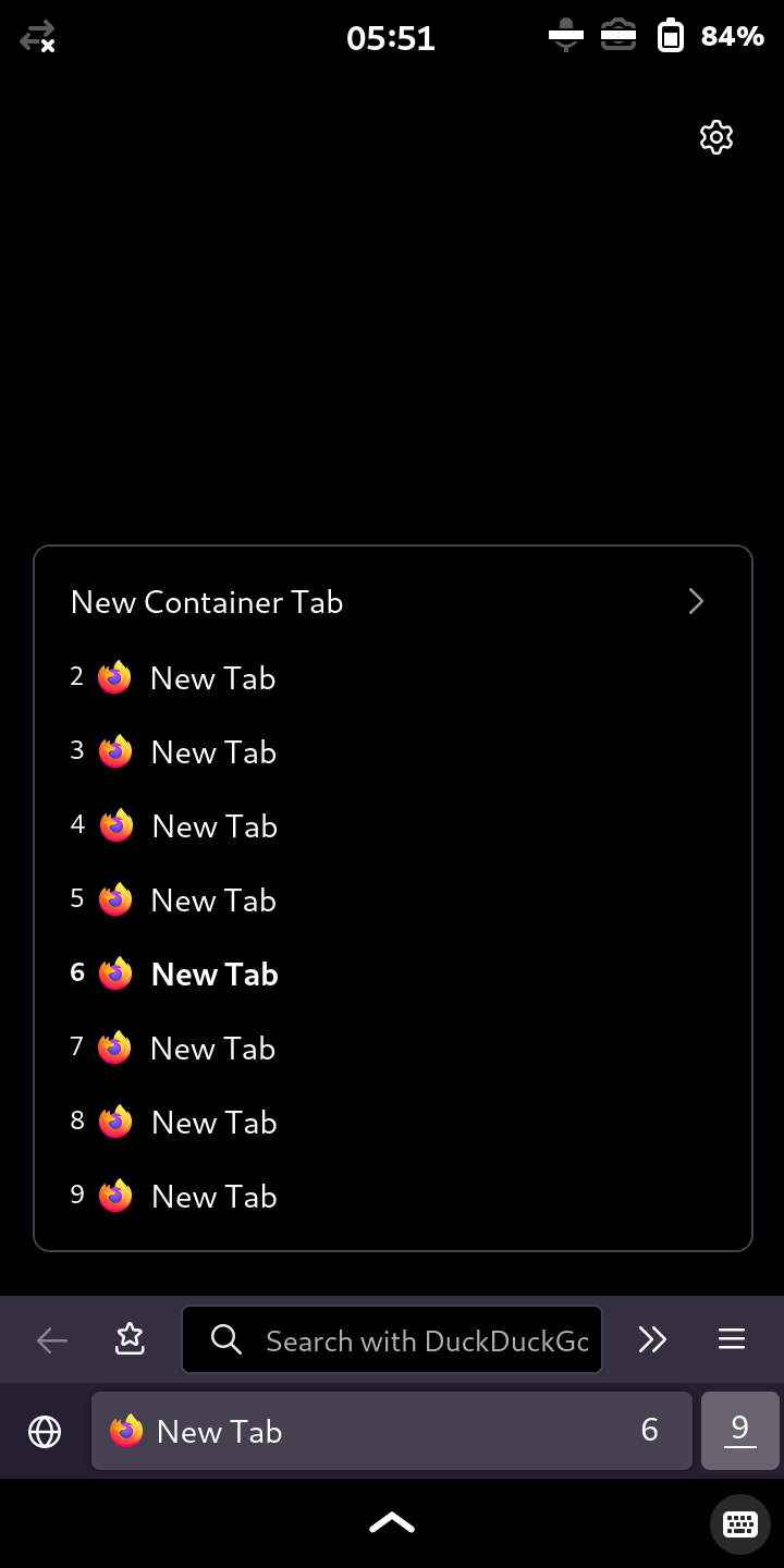


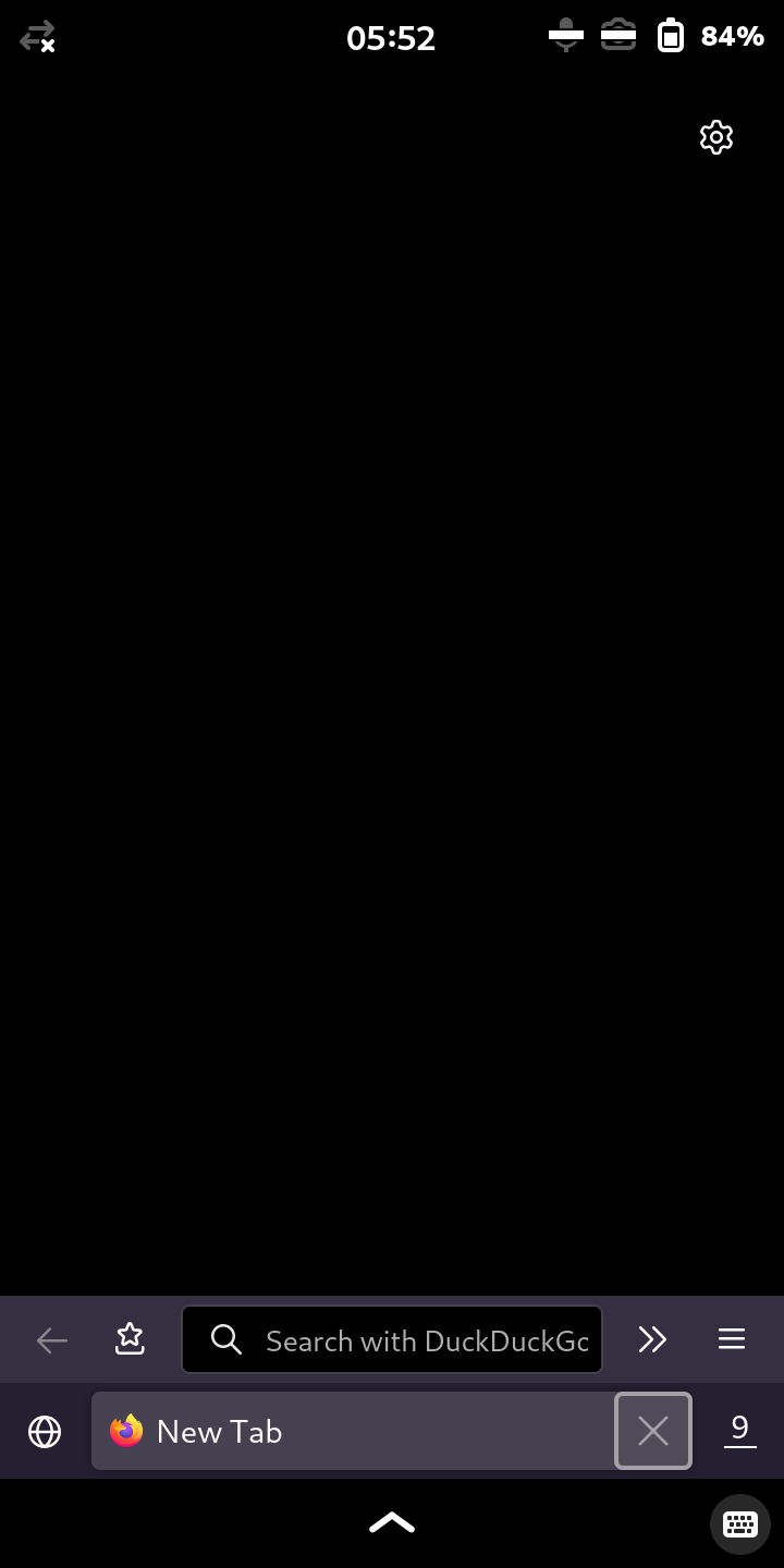
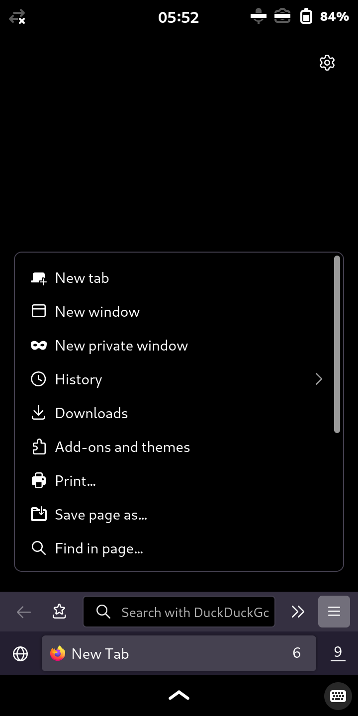
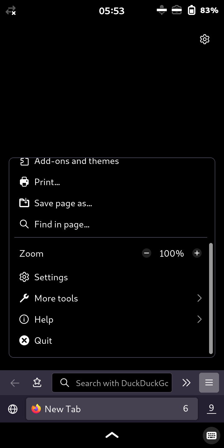
 Could you add a screenshot of the result, please?
 .
.