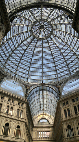
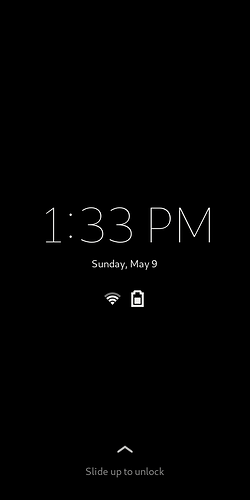
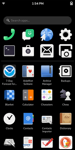
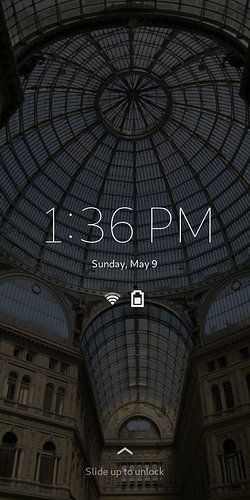
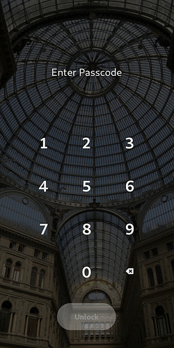
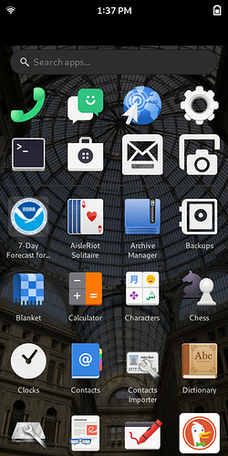
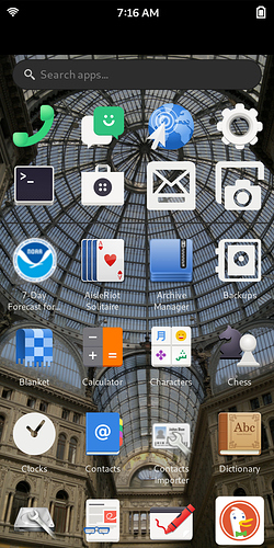
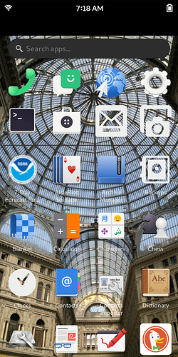
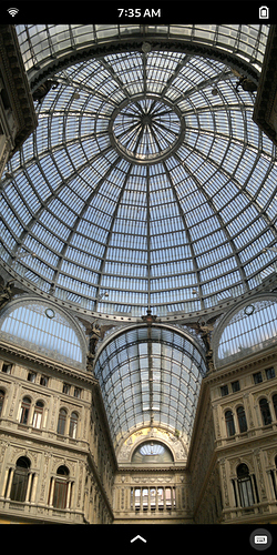
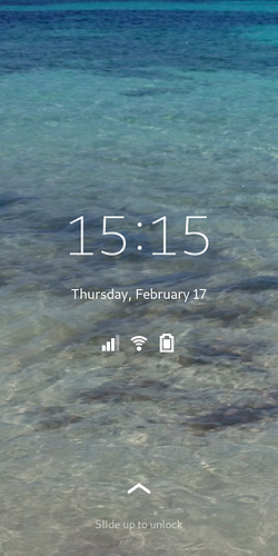
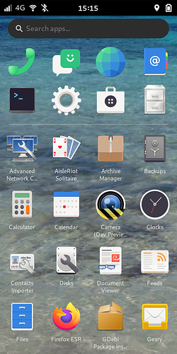
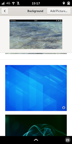
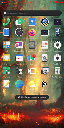
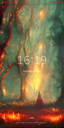
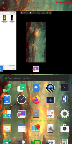
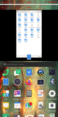
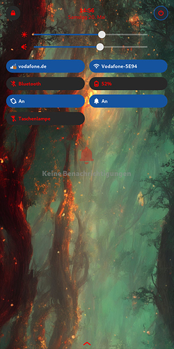
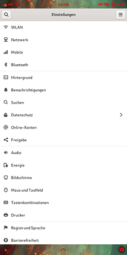
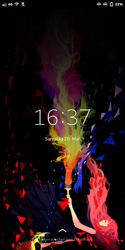
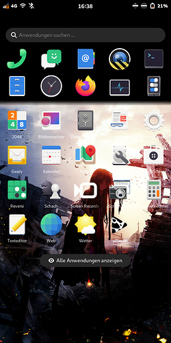
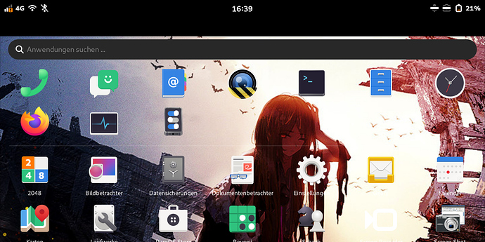
I also played a little bit around with backgrounds and will make a follow up tutorial. Why? Because I made a seamless picture for a full-screen-background image.
The lock-screen image was not perfectly designed (top and bottom), so it’s an issue of my picture, not of the technique, that there is a black stripe. I could look like the top of the desktop screen.
More pics from different views (click me)
It just has one downside. On Landscape it doesn’t match anymore, because images get scaled to double length each direction. Not sure, but I don’t think there is a way to fix this yet.
However, who want to get that advanced background, here is the guide:
First of all you have to find a picture that is big enough (and that will be not easy to find). It has to be 720 x 2832 pixel minimum. You also can try to find something half as big in both dimensions: 360 x 1418 pixel. But it will be a bit less sharp and you have to half all the numbers I will tell. As long as the dimensions are correctly also every other size would be okay, but it will make things even more hard to get it work.
I used stable diffusion to let my graphics card generate that image from my screenshots.
Okay, now we have to edit that gtk.css file from amaroks first post.
/*
* Set a background for the lockscreen.
*/
phosh-lockscreen, .phosh-lockshield {
background-image: linear-gradient(rgba(0, 0, 0, 0.7), rgba(0, 0, 0, 0.7)),
url('file:///home/purism/Pictures/MyLockScreenBackground.jpg');
background-size: cover;
  background-position: center;
}
/*
* Set a background for the app grid.
*/
phosh-app-grid {
background-image: linear-gradient(rgba(0, 0, 0, 0.7), rgba(0, 0, 0, 0.7)),
url('file:///home/purism/Pictures/MyBackground.jpg');
background-size: cover;
background-position: center;
}
/*
* Set a background for the top panel.
*/
phosh-top-panel {
background-image: linear-gradient(rgba(0, 0, 0, 0.7), rgba(0, 0, 0, 0.7)),
url('file:///home/purism/Pictures/MyTopPanelBackground.jpg');
background-size: cover;
background-position: center;
}
/*
* Set a background for the app-grid slider.
*/
phosh-home {
background-image: linear-gradient(rgba(0, 0, 0, 0.7), rgba(0, 0, 0, 0.7)),
url('file:///home/purism/Pictures/MyHomeBackground.jpg');
background-size: cover;
background-position: center;
}
As before, you are able to change directory and rgba-values. I myself created a folder “Backgrounds” in ~/Pictures and can setup new images just with replacing them.
That was the easy part. The next part needs precision, time and gimp (or something similar). We have to cut that one big picture into 4 pieces of the exact length and position. Each part has to be 720 x 1440 pixel (doesn’t matter how much will be displayed later) or any scale of 1:2 relation. But like I said before, it’s easier to have same numbers as I say.
Not cut parts in following positions:
Top panel image (also top of the image): pixel 1 - 1440
lockscreen image: 1392 - 2832
App-grid slider image: 1416 - 2856
App-grid image: 1446 - 2886
Wait: Did I say the image should be 2832 pixel high and I tell you to cut 2 images even longer than this? No worries, you can fill the bottom with what ever you want, it will be out of the screen and not be displayed. But it is important to get that length for the correct position and scale.
Now just name and copy all images to the directory as you wrote in your script. Finish your setup with one command sudo systemctl restart phosh (like amarok told before) or just restart your L5.
I guess you also can combine it with the real background (you can change in gnome settings), but I haven’t tried yet. But for those who just want the simple backgrounds like in the first tutorial, I also edited 2 other images to fit better to phoshs design (including better view in landscape mode):
Click me to view pictures
Turned pic 90° and cut it in a nice way that it makes still sense. Also faded into back on the top, but I did it in gimp, not in gtk.css file, because i needed more control and not just a linear gradient. .
Cut, changed color-curve-values, copied top of image, mirrored it and used stamp tool to look more natural to expend image. At least I added a black-transparency gradient to the top that it fades out to my “favorite apps” section.
If I would like to have a sharp picture on landscape, I would have to scale it up to 2880 x 1440 pixel (could do it with stable diffusion on my graphics card), but it would also be double as big on normal screen.
